-
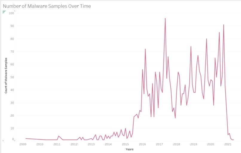
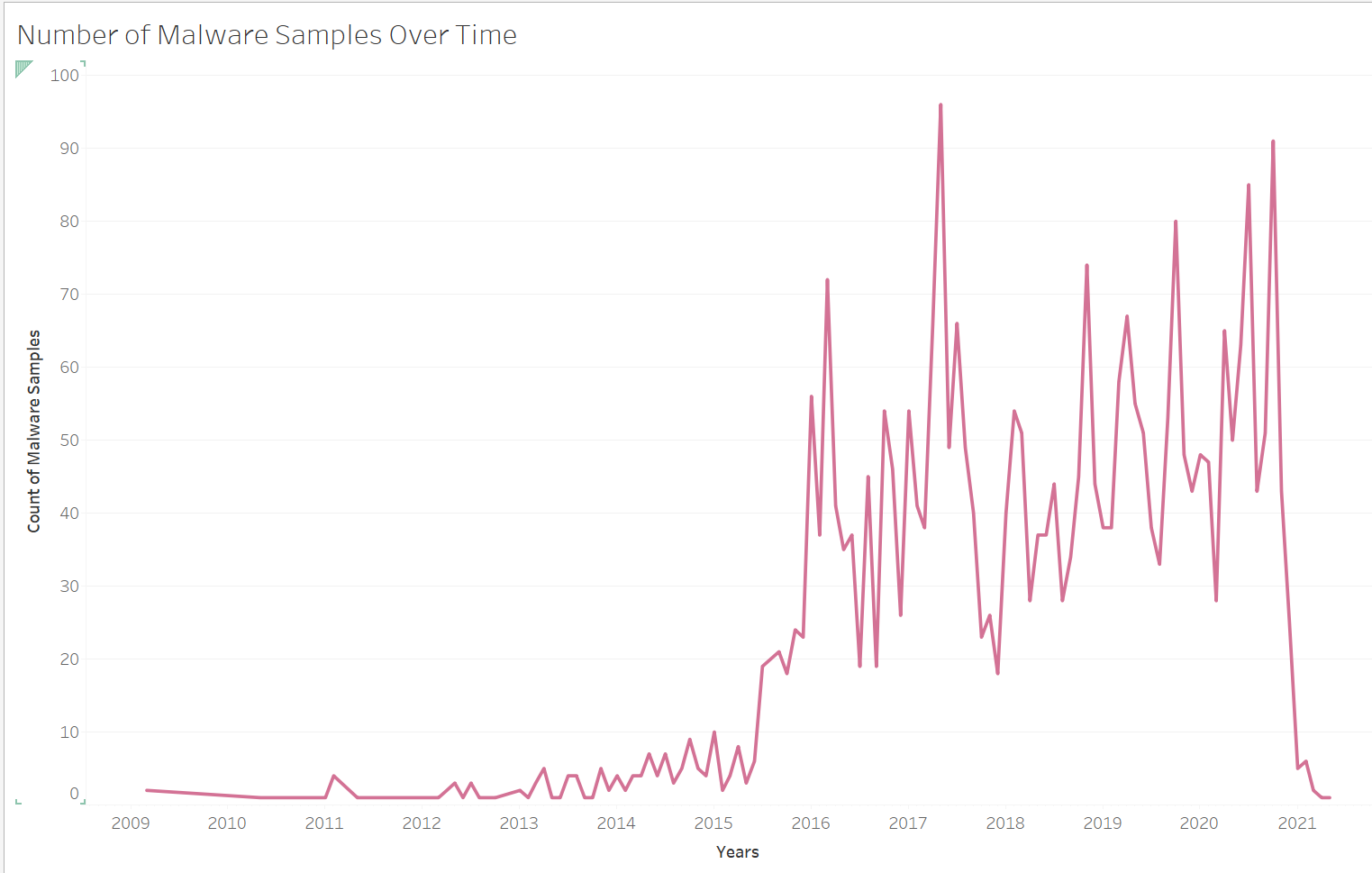
Number of Appeared Samples Over Time
-
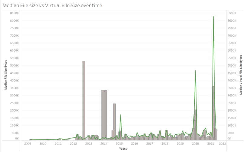
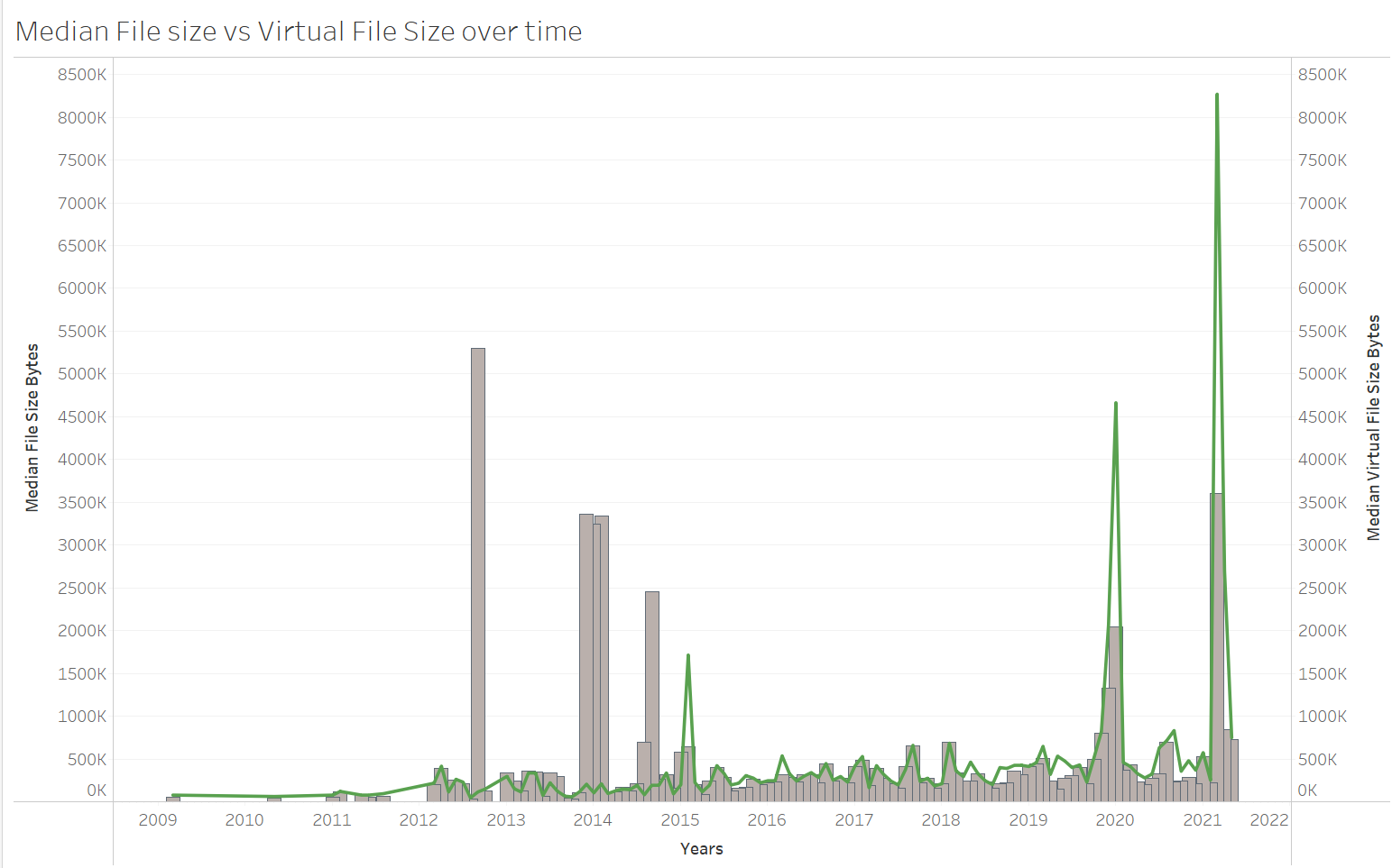
Virtual File size vs Actual File Size Over Time
-
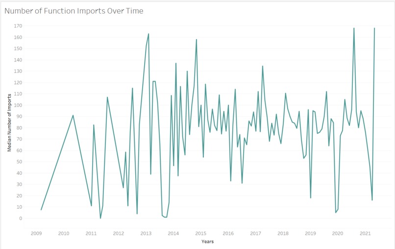
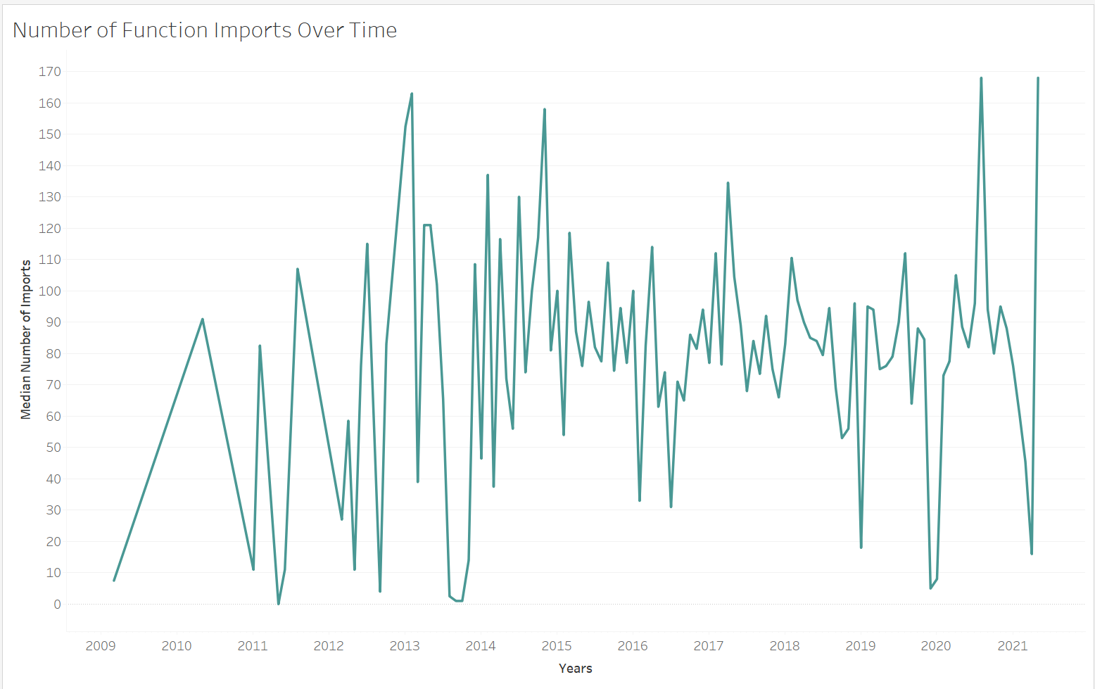
Number of Imports Over Time
-
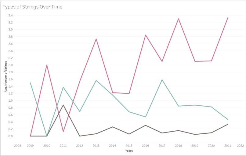
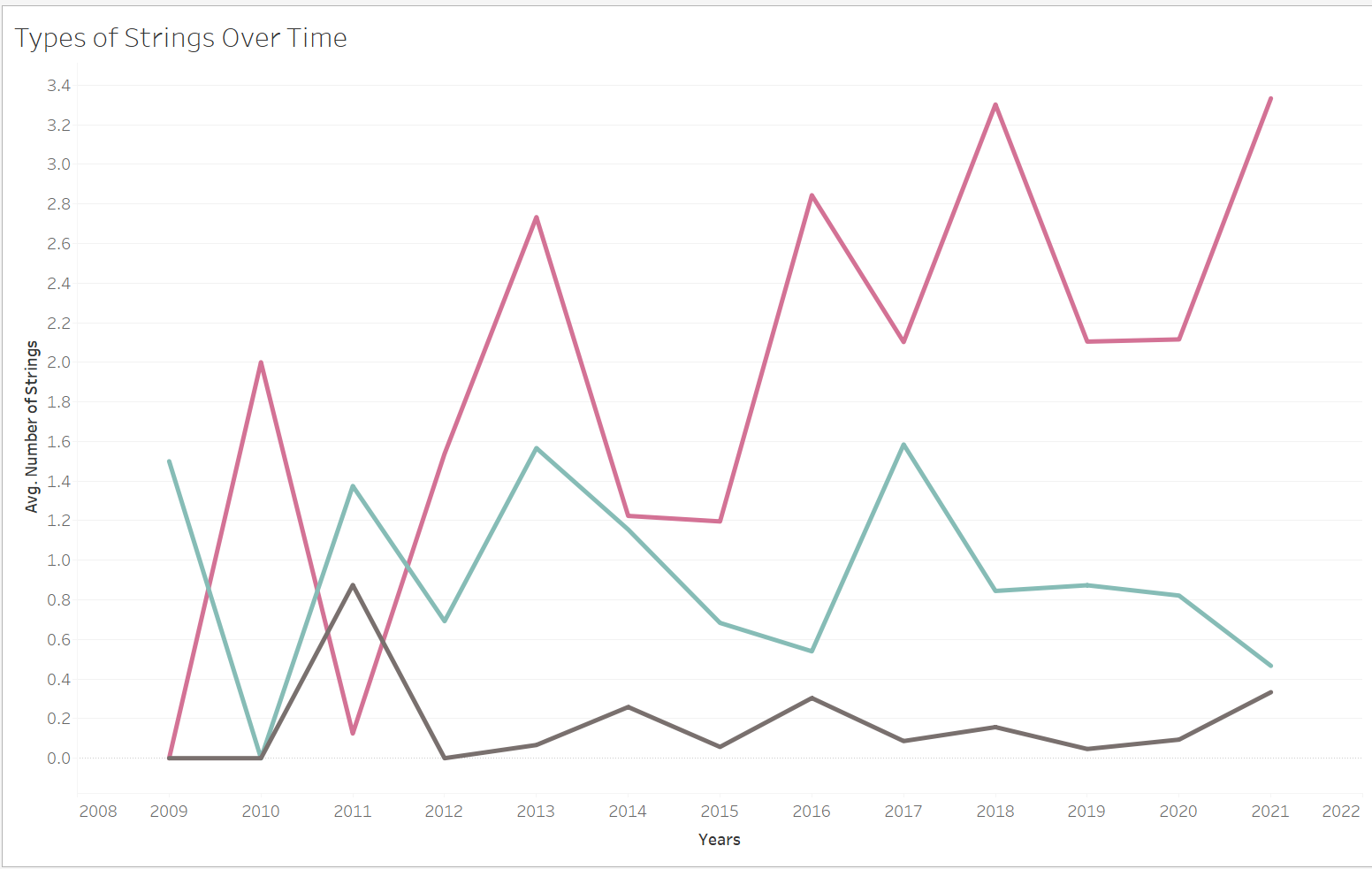
Number of Each String Type Over Time
Inspiration
I attend the meetings for the malware lab at my school and I also took the malware analysis class here. I love both and it has made me want to learn more about Malware. I also have some data science skills and I wanted to try combining the two interests.
What it does
The project is a Dashboard that shows various malware features over time such as: file size, how often certain strings appear over time, etc. This is done to see if there are trends in these specific features over time. For example, seeing if the number of strings indicating Registry Keys have increased over time.
How I built it
The data set that was used was the MOTIF malware dataset from Booz Allen Hamilton. The data was cleaned and features were derived in python utilizing Jupyter notebook. After that the cleaned data was exported as a CSV file and imported into Tableau which was used to make the visualizations and dashboard.
Challenges I ran into
I ran into some technical issues with my computer that led to me getting a late start on the project. The cleaning and feature engineering of the data was also challenging because I had to figure out what information I needed and what I had to visualize. It was also a major challenge in figuring out what Visualization tool to use. As stated earlier, I had gotten a late start on my project, so I didn't have time to learn things like HTML which limited the tools I had easy access too.
However, the biggest challenge I had was just learning how to use Tableau effectively. I had used it in the past, but only to make some basic visualizations and it was pretty hard because of the way that its UI looks. However, once I started getting the hang of some things and looking up some tutorials on how to make certain visualizations it got a bit easier and more rewarding.
Accomplishments that I'm proud of
I am very proud of how the final dashboard looks. I had never really made anything like that before, especially not as complicated. I messed with a lot of the settings to get things exactly the way that I want it and present it so it looked visually appealing.
What I learned
I learned a lot about Tableau and how, even though I struggled a bit with it over the course of the hackathon, is a really useful tool. The visualizations look really nice, and I like how it automatically makes everything interactive. I also learned a lot about how different malware samples can be while I was data cleaning. For example, there can be a bunch of different sections in a file's PE header. One file can have a header that the other just doesn't have like .reloc.
What's next for MOTIF Malware Trends Over Time
I would love to add a dashboard to show a more detailed view on malware imports over time. For example, seeing which .dll files were most common over time, the average number of .dll files the malware used over time, and which function calls were most popular each year.

Log in or sign up for Devpost to join the conversation.