Inspiration

Search results clustering from other apps and Tim's work on Workforce BackOffice
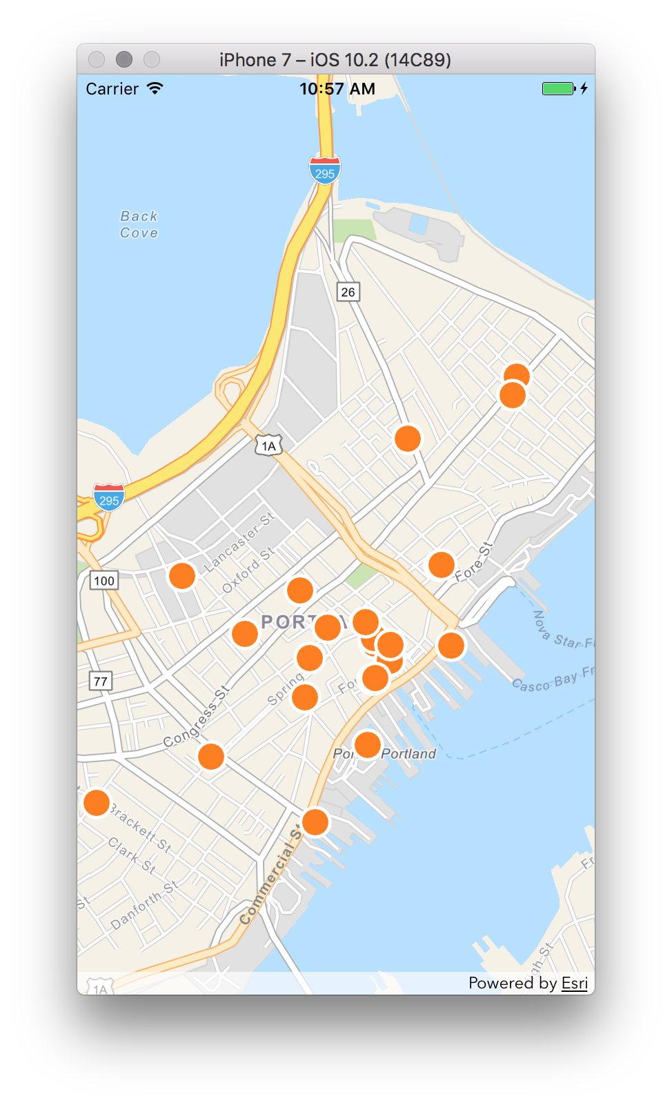
What it does

Detects collisions of points to dynamically represent them in a way to convey multiple points occur in the area and increase the map’s legibility. On the web, improves on the “eager” Workforce BackOffice implementation while testing the Javascript 4.2 api. On iOS, uses Apple Maps Search style zoom clustering, animation and group lists as inspiration with tweaks for the needs of our audience.

How we built it

Challenges we ran into

Accomplishments that we're proud of

What we learned

What's next for Mother Cluster

Built With

Share this project:

Updates

posted an update

Created a test app to help compare clustering algorithms. The code: https://devtopia.esri.com/timo7353/cluster-viewer

Hacked together 4 clustering algorithms

  • wf-baseline - mimics workforce backoffice's clustering
  • cluster-tree - front-loads all clustering effort. Takes a while to set up, but renders very fast. Clustering technique is similar to wf-baseline, but with different parameters.
  • density - Attempts to find dense pockets of assignments, and creates clusters at those locations.
  • graphy - Uses graph algorithms to find connected blocks of nearby features.

Log in or sign up for Devpost to join the conversation.

posted an update

QA

iOS: Tested out Jeff's implementation for clustering. Working well- noticed a couple of things- flashing symbols when clusters update on zoom.

Web: Tried out Tim's various implementations. Again- working well- but there were still some issues with conflict detection.

Design

UX for tapping on a cluster

In iOS- we decided to try a slightly different pattern for what happens in the iOS Maps app when you tap on a cluster.

In iOS Maps- they show the clustered items in a list. Instead we'd like to try zooming in to the extent of the clustered items; tapping on a cluster then just become a mechanism to zoom to a scale where you can see individual venues.

Jeff is working on this now....

Icon design

Mabel did a great job coming up with some initial concepts for the app icons. We decided to go with the idea of using a Russian nesting doll.

I took the initial sketch file and riffed on it a bit. I then found a good tutorial for easily generating the correct icon sizes for iOS (this would not have been trivial without the sketch plug in).

The tutorial is here: https://designmodo.com/icon-design-sketch/

Log in or sign up for Devpost to join the conversation.