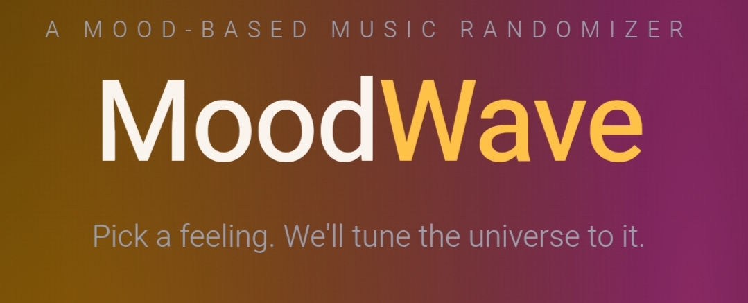
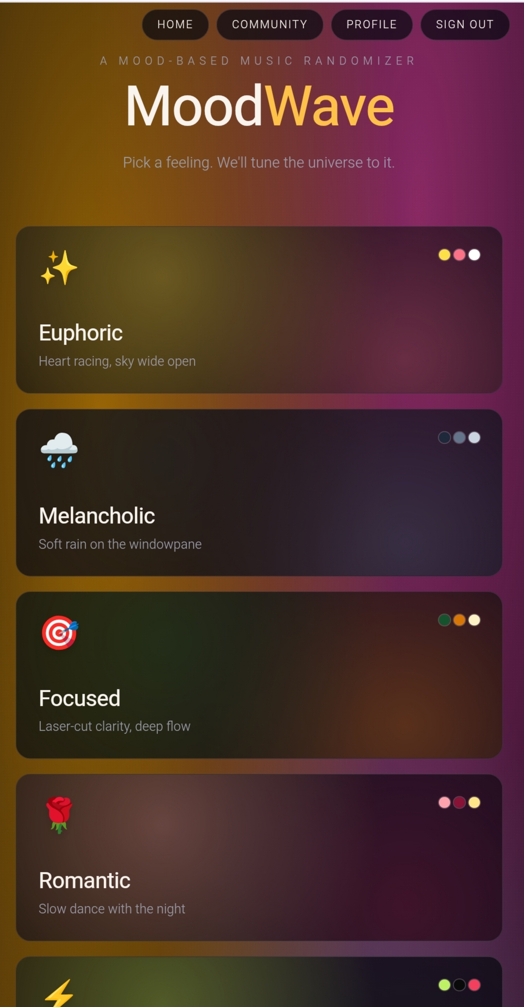
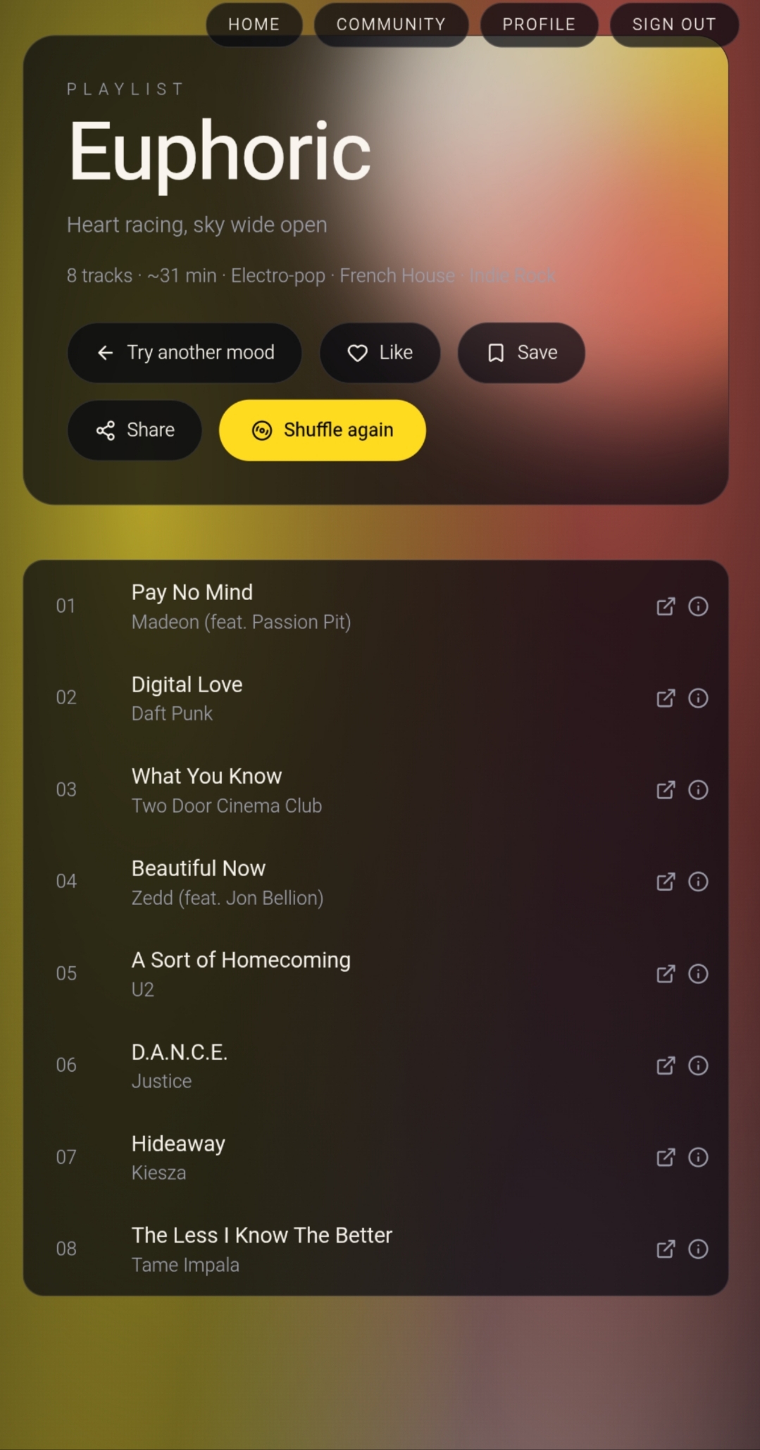
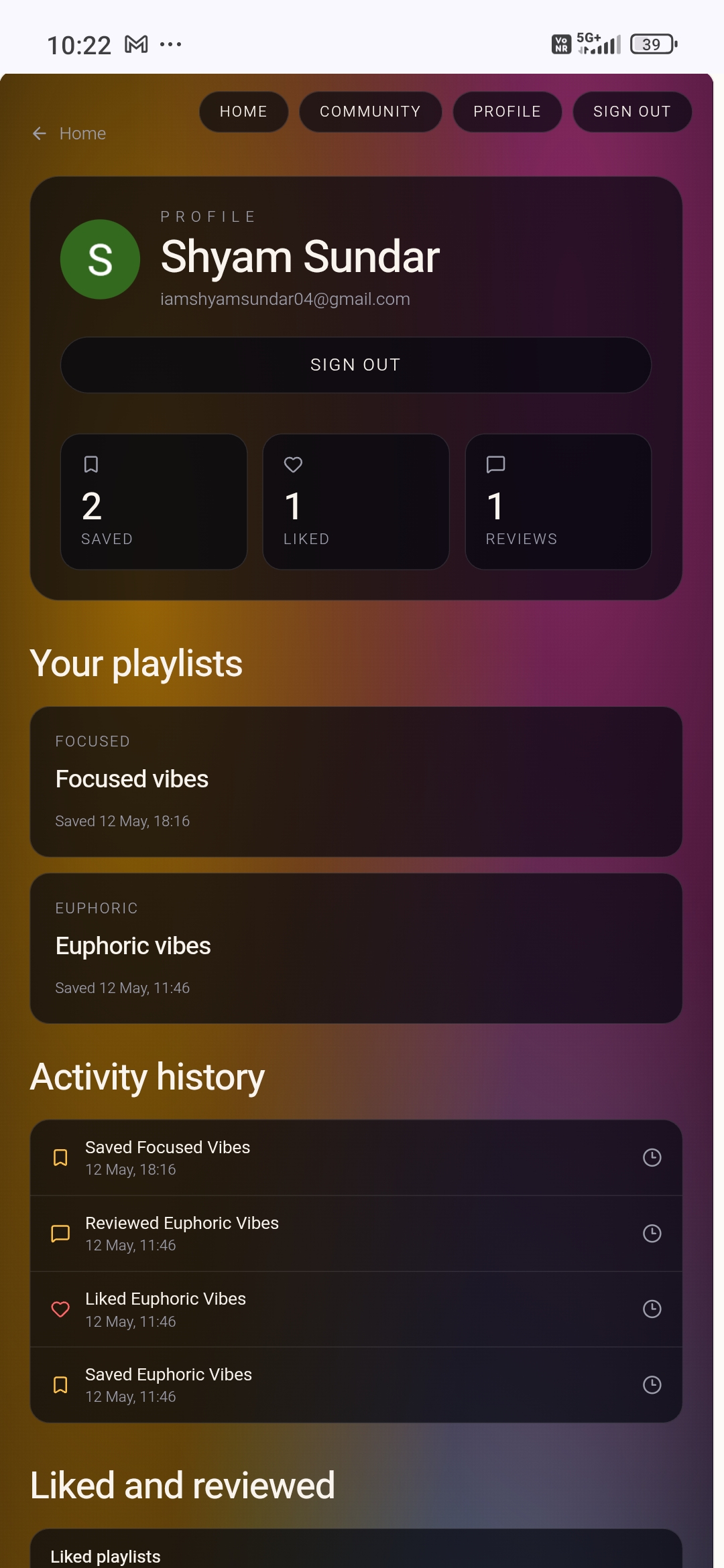
MoodWave is a mood-driven music discovery experience. Instead of searching for a song or artist, you start with a feeling — and MoodWave tunes a playlist to match it. Pick from moods like Euphoric, Melancholic, Focused, Romantic, Hype, Chill, Anxious, Nostalgic, Rebellious, or Dreamy, and the app instantly surfaces music that resonates with that emotional state.
The experience is designed to be synesthetic and immersive — the interface feels like the mood you're in, not just labels it.
#What Inspired Me
Music has always been deeply tied to emotion, yet most streaming platforms make you think about what you want to hear — artist, genre, BPM. But when you're in a 🌧️ melancholic state, you don't want to browse; you want to be understood. I was inspired by the idea that mood is the most honest search query. The project explores a core question: \text{Mood} \xrightarrow{\text{mapping}} \text{Music} Can we build a system where emotional state m \in \mathcal{M} maps to a curated musical space \mathcal{P}(m), so that the listener feels met rather than served?
🛠️ How I Built It
UI/UX First: Designed an immersive, minimal landing page where each mood card is an emotional entry point — hover and click interactions make browsing feel tactile.
Mood Taxonomy: Defined 10 distinct mood archetypes, each with its own visual identity (emoji, descriptor, short poetic tagline).
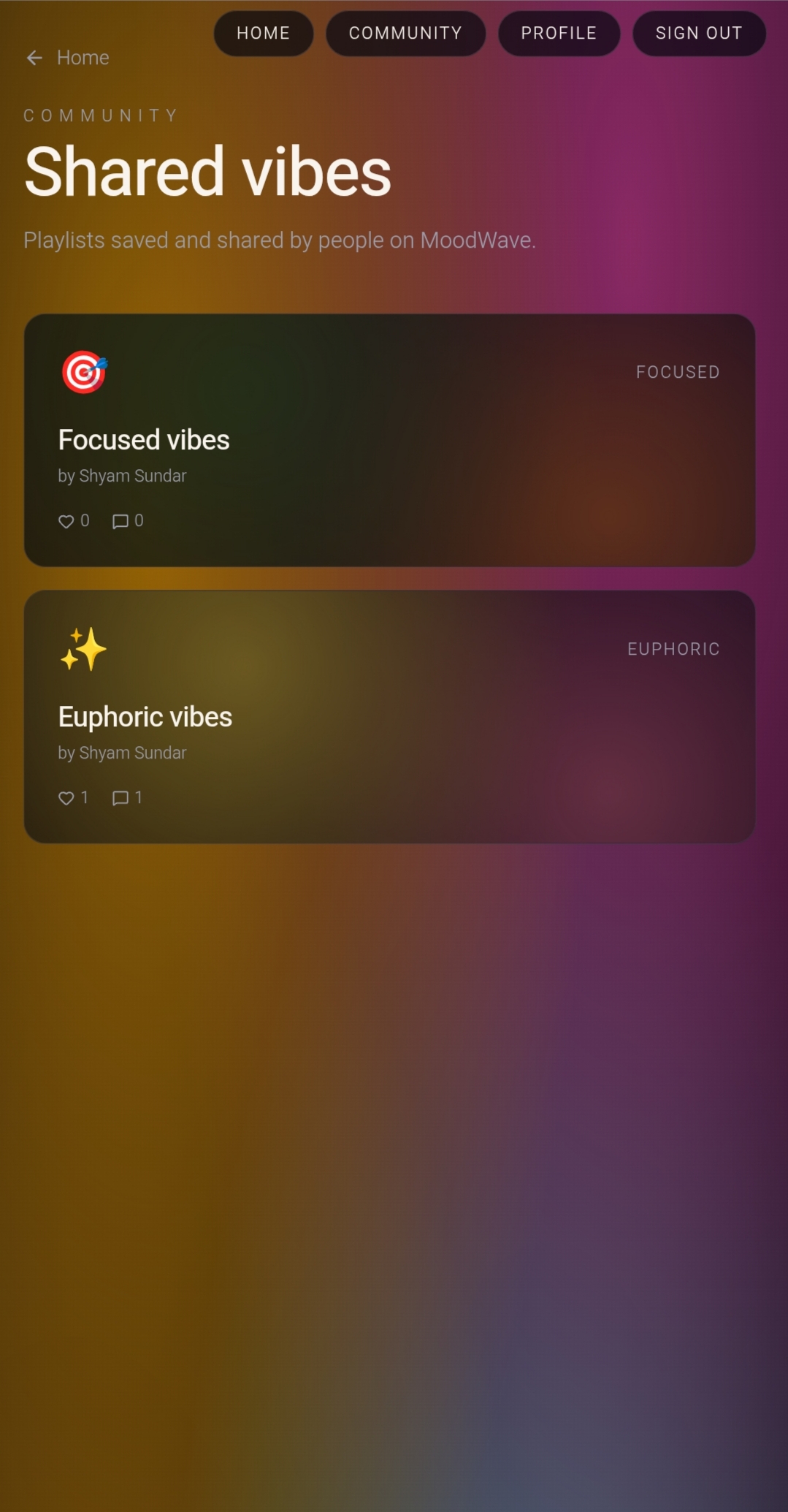
Community Layer: Built a /community route for shared discovery — letting users see what others are feeling and listening to.
Auth System: Integrated a /auth route for user sign-in, enabling personalization and saved mood histories.
Lovable Platform: Used Lovable to scaffold and iterate on the frontend rapidly.
📚 What I Learned
Emotional UX design — how copy, spacing, and micro-interactions can evoke feeling before a single note plays. Mood-to-music mapping is non-trivial. Moods aren't binary; they exist on a spectrum. For example, Anxious and Focused share high arousal \alpha but differ in valence v: Building with Lovable taught me how to move fast on UI while keeping the experience polished. The power of minimalist copywriting — "Pick a feeling. We'll tune the universe to it." does more than a paragraph of explanation.
🚧 Challenges Faced
Defining mood boundaries: Some moods bleed into each other (e.g., Dreamy vs. Chill). Crafting distinct taglines and visual identities for each was harder than expected. Making hover/click feel alive: The instruction "hover · click · listen" sets a high bar — the interaction had to feel immediate and rewarding. Community vs. privacy: Designing a community feed where users share moods required thinking carefully about what to surface publicly without feeling invasive.
Built With
- lovable
- react
- tailwind
- typescript

Log in or sign up for Devpost to join the conversation.