Inspiration
Most personal finance apps answer one question: where did my money go? We wanted to answer a more useful one: how does my money actually move?
Bank statements and budgeting apps typically reduce finances to lists of transactions or broad categories such as food, transport, and entertainment. While useful, these views can hide the relationships between income, recurring commitments, discretionary spending, and savings.
We created MoneyGraph to represent personal finances as a connected system rather than a spreadsheet.
What it does
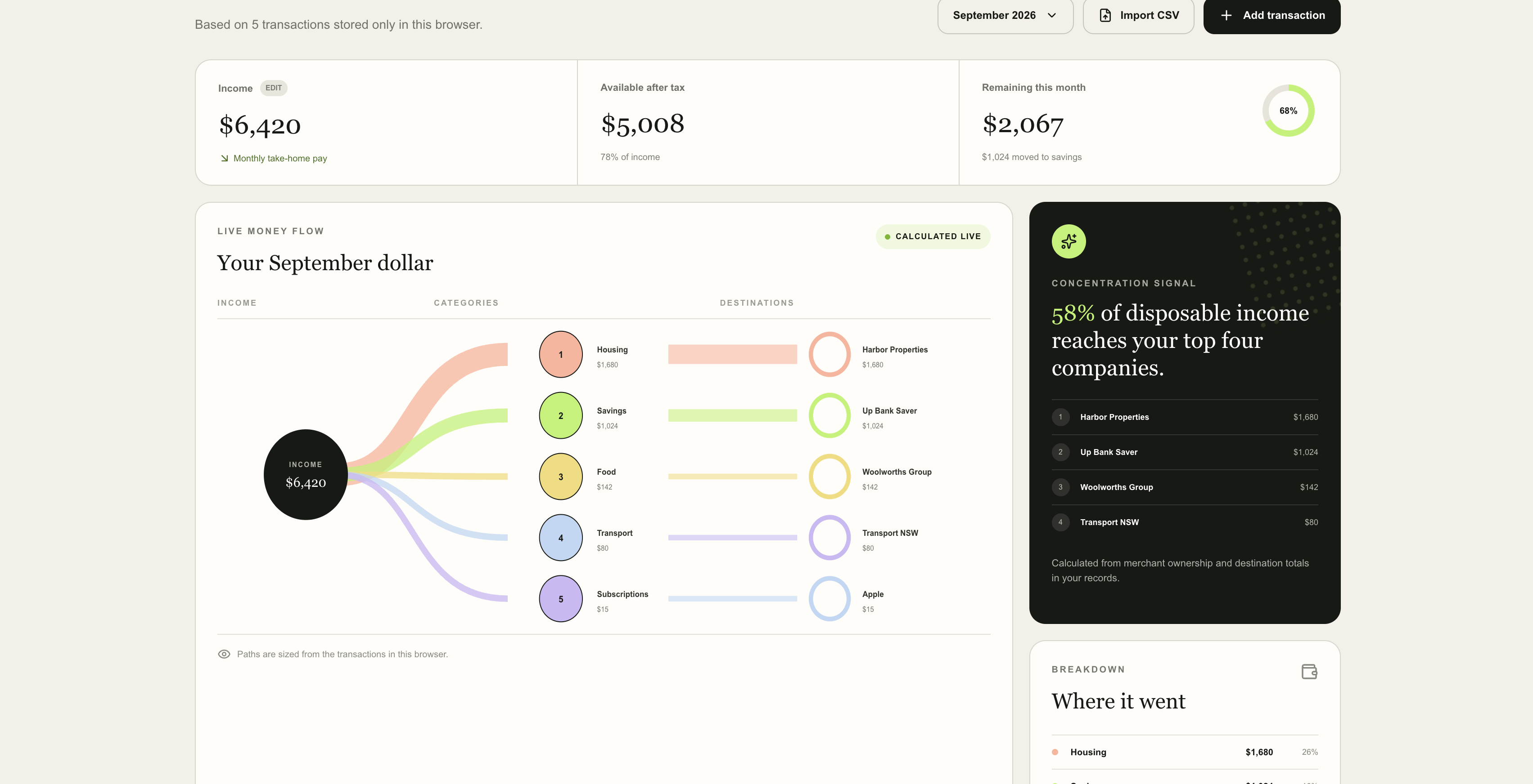
MoneyGraph transforms a user's financial data into an interactive network of their financial life.
Income enters the graph through sources such as salary or allowances, then flows between accounts and into categories such as housing, transport, subscriptions, food, entertainment, and savings. The width of each connection represents the amount of money flowing through it, making major expenses and financial dependencies immediately visible.
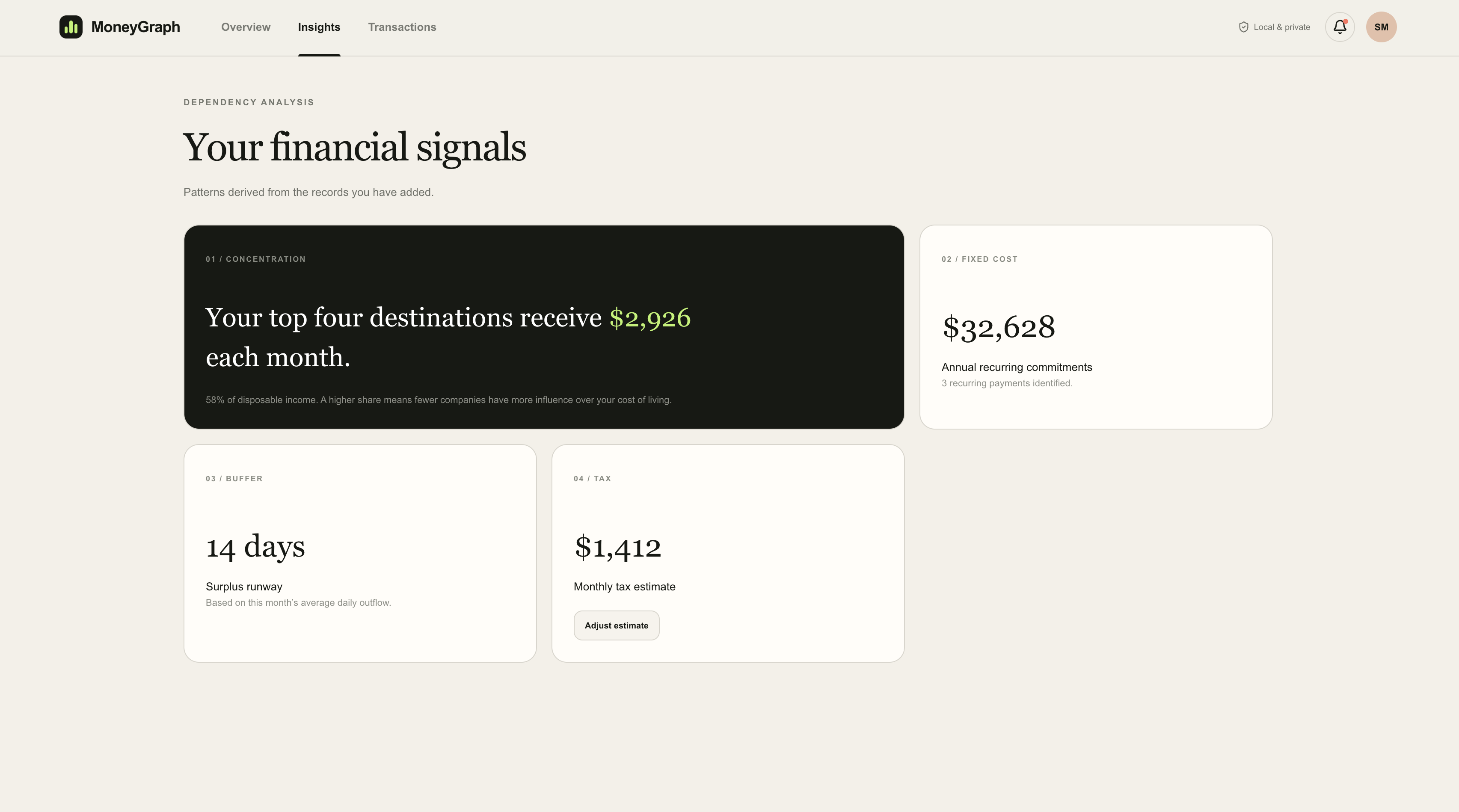
MoneyGraph also generates insights from these relationships. It can identify:
- categories consuming a disproportionate share of disposable income
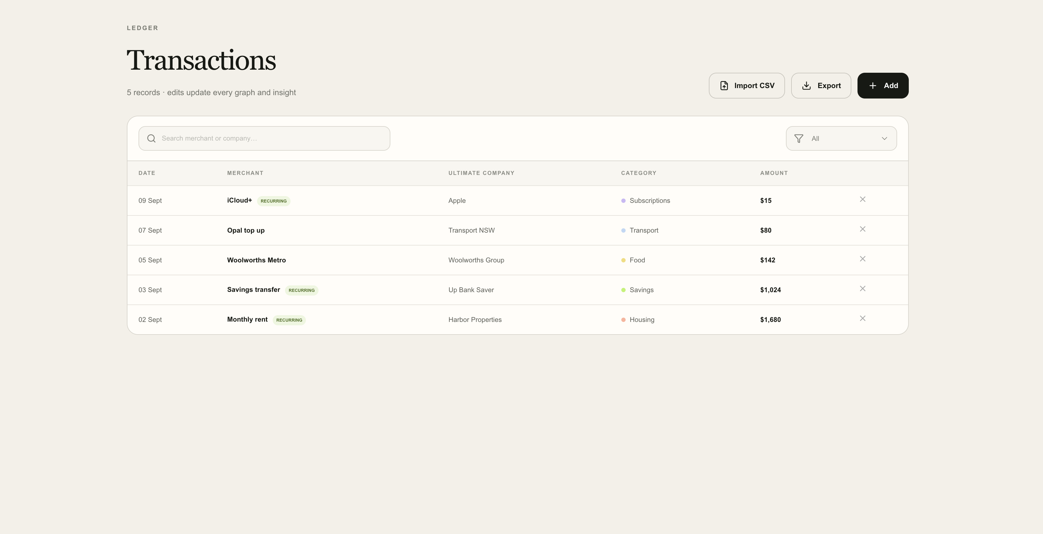
- recurring expenses and subscriptions
- concentration of spending across merchants or categories
- how much income ultimately reaches savings
- areas where relatively small changes could have a large effect on overall finances
Instead of simply reporting that a user spent $400 on a category, MoneyGraph provides the context of where that $400 came from, how significant it is relative to their income, and what effect it has on the rest of their financial system.
Your money, mapped.
How we built it
We designed MoneyGraph around a graph-based representation of financial data. Financial entities such as income sources, accounts, spending categories, merchants, and savings are represented as nodes, while transactions and transfers become weighted edges between them.
Transaction data is processed and categorised before being aggregated into the graph. We calculate metrics from these flows to identify significant spending patterns and generate personalised insights.
The frontend converts this data into an interactive visualisation where users can explore individual nodes and follow their money through the system. We focused heavily on making a potentially complicated financial network understandable at a glance.
Challenges we ran into
One of our largest challenges was deciding how much information to display. Real financial data can create hundreds of transactions and relationships, and displaying every transaction would produce an unreadable graph.
We therefore had to develop methods for grouping transactions into meaningful categories while preserving enough detail for the visualisation to remain useful.
Another challenge was distinguishing between an interesting visualisation and a genuinely useful financial tool. We did not want MoneyGraph to simply produce an attractive diagram. Each element of the graph needed to help users understand something that would be difficult to see in a conventional transaction history.
Accomplishments that we're proud of
We are particularly proud of turning something as abstract as personal cash flow into a visual system that can be understood quickly.
Rather than building another budgeting dashboard, we developed a different way of thinking about personal finance. MoneyGraph makes relationships between income, expenditure, and savings visible, allowing users to identify patterns that may otherwise remain buried across hundreds of transactions.
We are also proud that the underlying model is extensible. New accounts, transaction types, financial metrics, and analytical features can be incorporated without changing the fundamental graph structure.
What we learned
Building MoneyGraph taught us that presenting financial information effectively can be as important as calculating it.
A technically accurate financial model is not particularly useful if users cannot understand its output. We learned to balance detail with clarity and to design analytics around questions users can actually act upon.
We also gained experience working with transaction processing, graph-based data structures, financial metrics, data visualisation, and designing an interface around complex interconnected data.
What's next for MoneyGraph
Our next goal is to develop MoneyGraph from a financial visualisation into a financial simulation engine.
Users could modify or remove nodes and immediately see the consequences across the rest of their graph. For example, they could simulate losing an income source, cancelling a subscription, increasing rent, adding a loan, or reducing spending in a particular category.
We also want to introduce a Financial Resilience Score that measures how well a user's financial network can withstand unexpected shocks.
Eventually, MoneyGraph could securely connect to live banking data through open-banking infrastructure, automatically maintain the graph, detect changes in financial behaviour, and alert users when their financial structure becomes less resilient.
The long-term objective is simple: personal finance should not just be a record of what already happened. MoneyGraph should help users understand the structure of their finances and what could happen next.


Log in or sign up for Devpost to join the conversation.