-
-
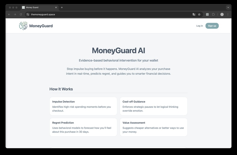
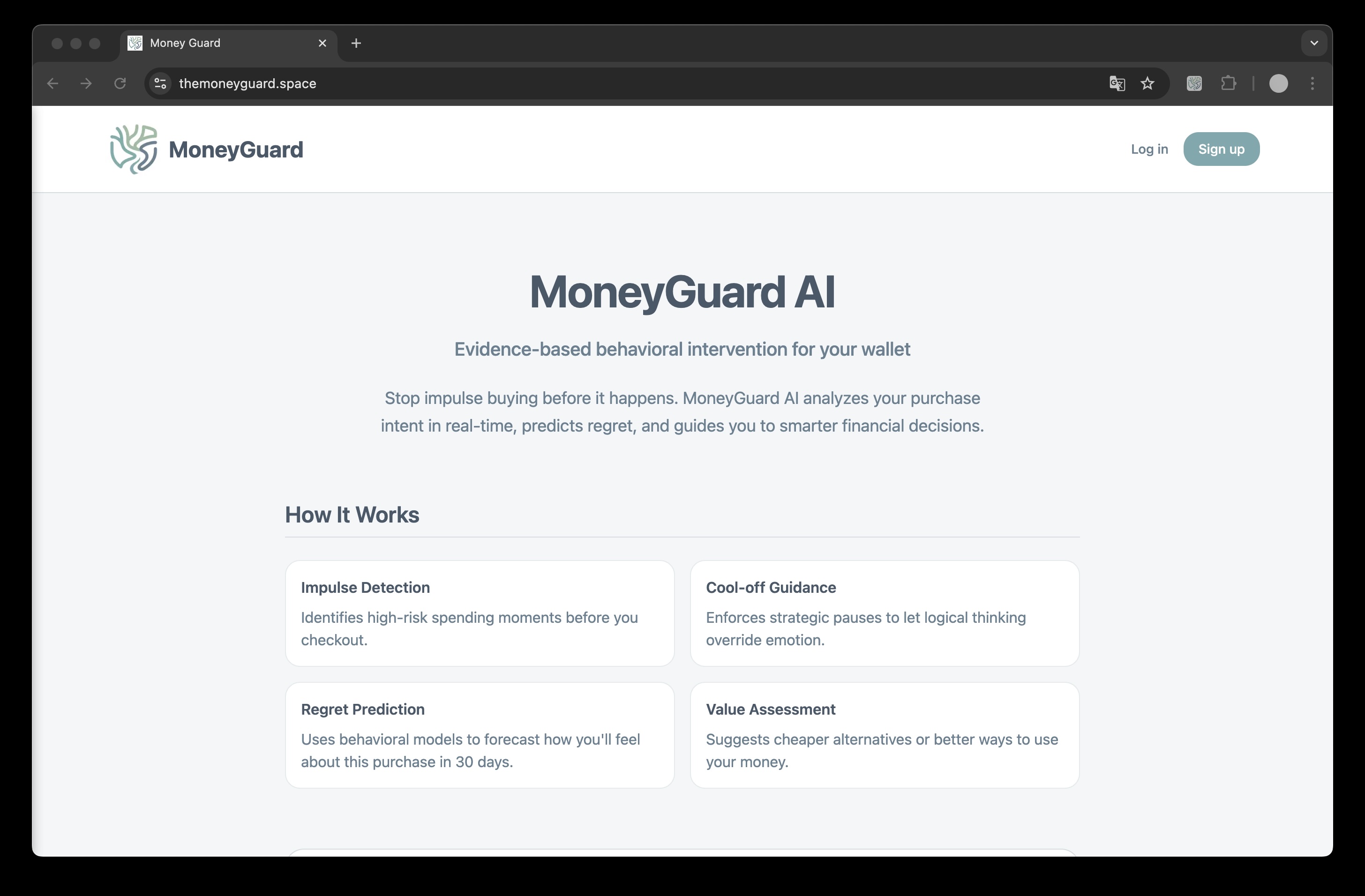
Welcome page
-
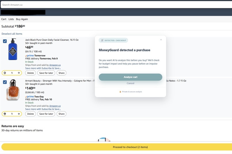
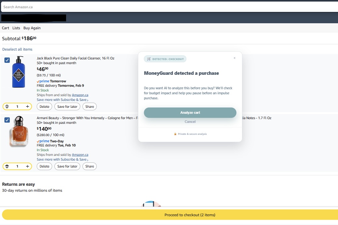
Pop-up when detect checkout
-
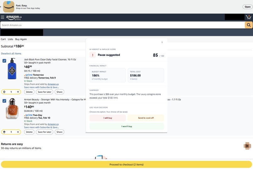
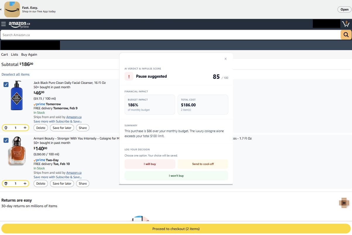
Analysis of user's shopping cart
-
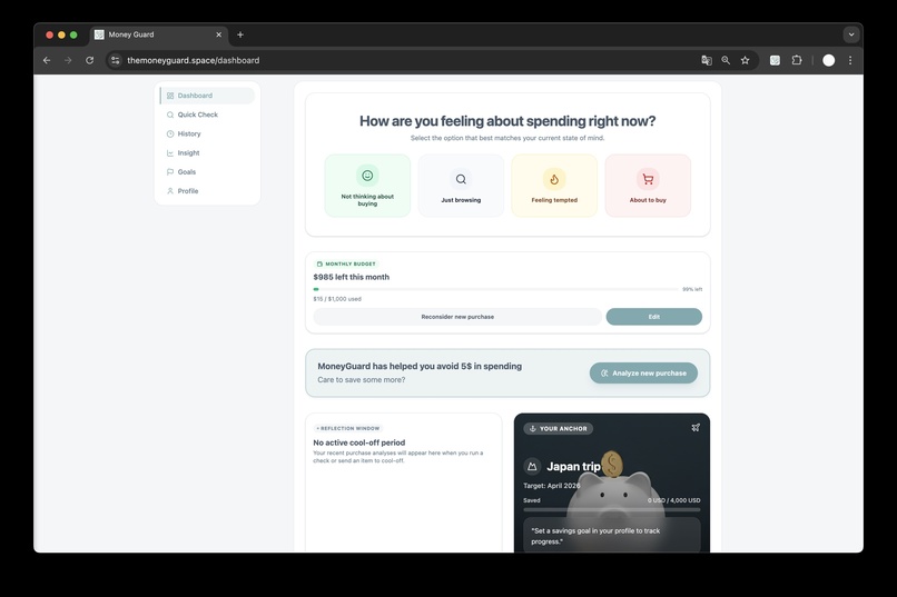
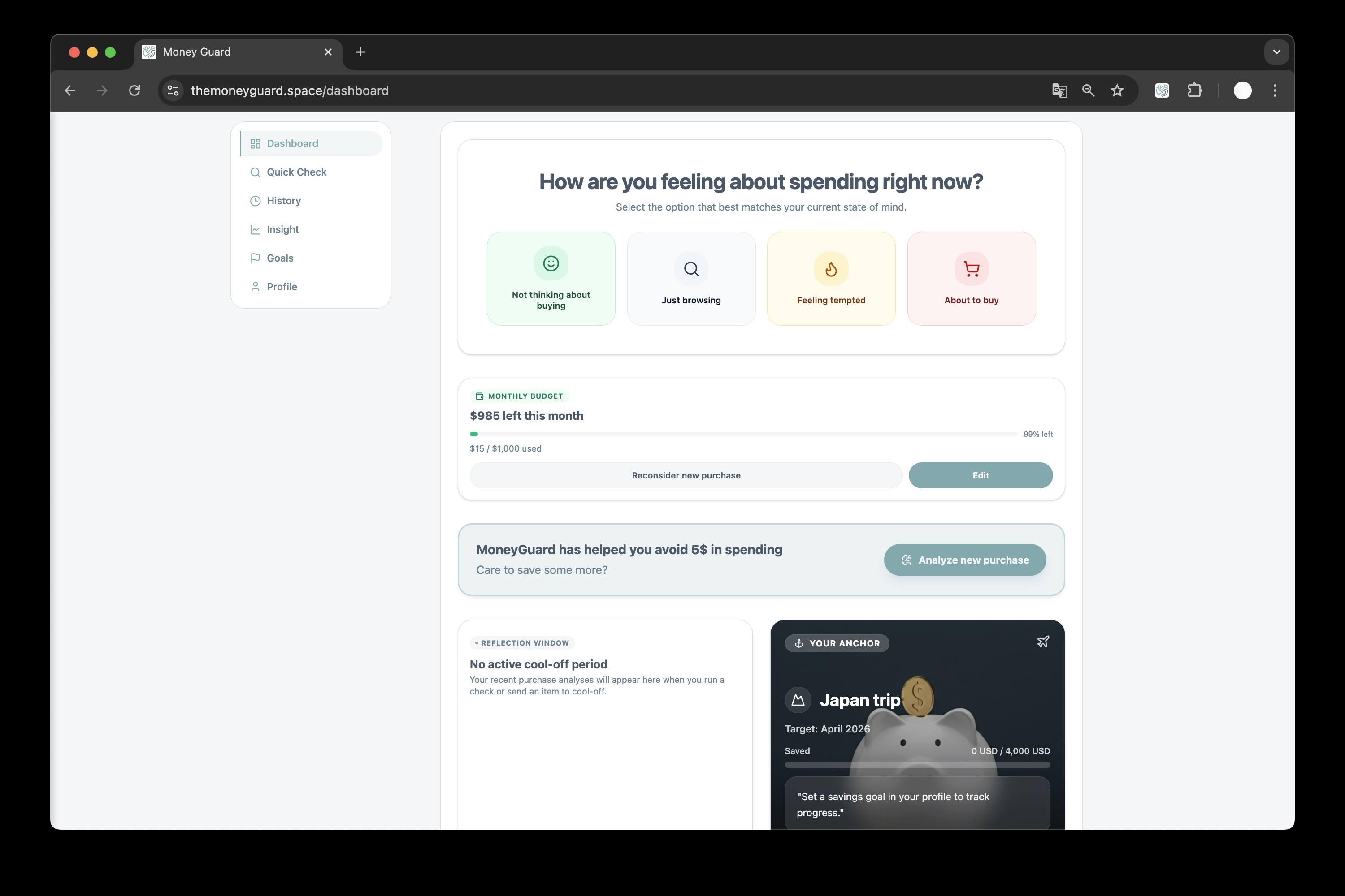
User dashboard
-

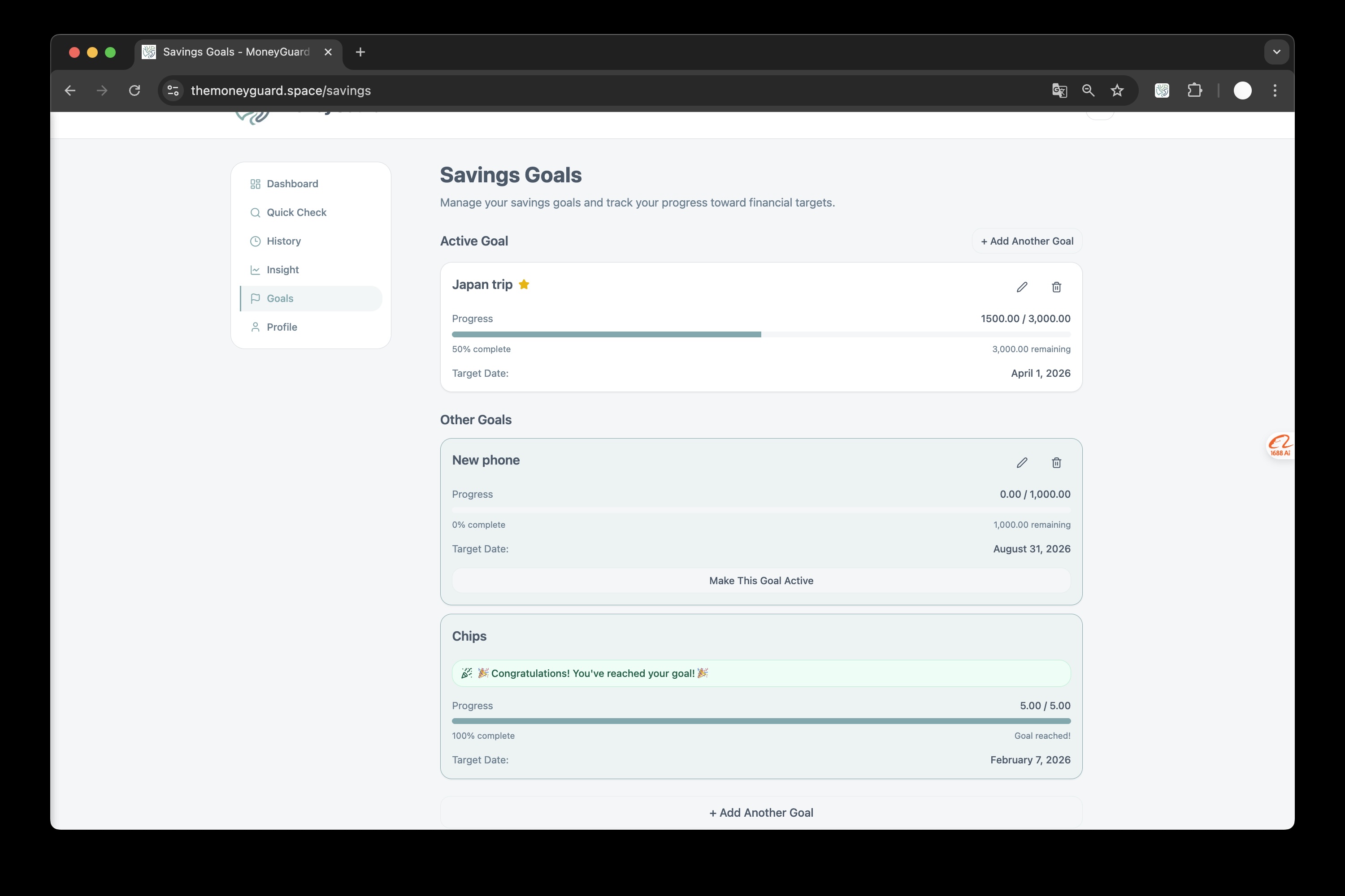
Saving goals
-

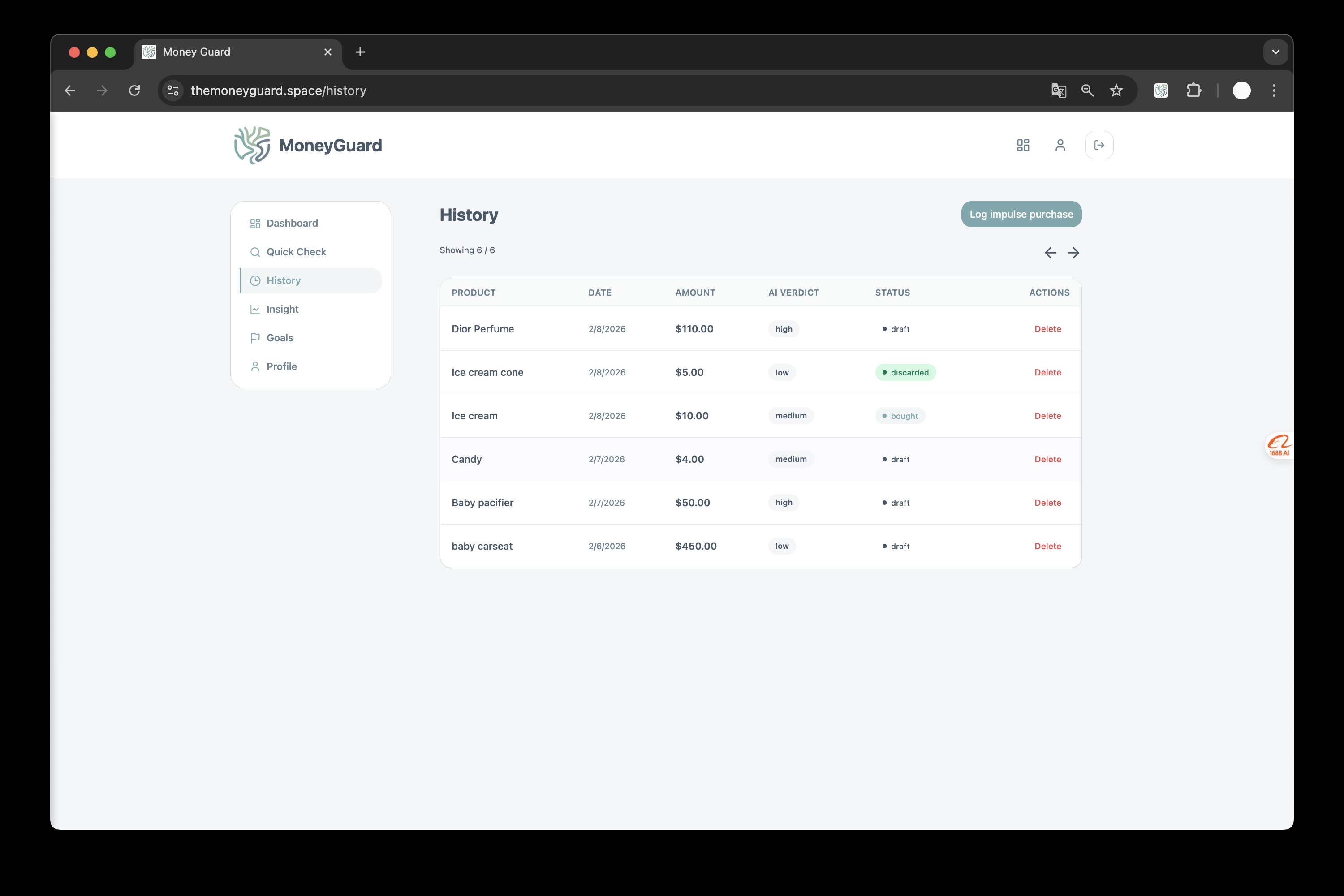
Analysis history
-

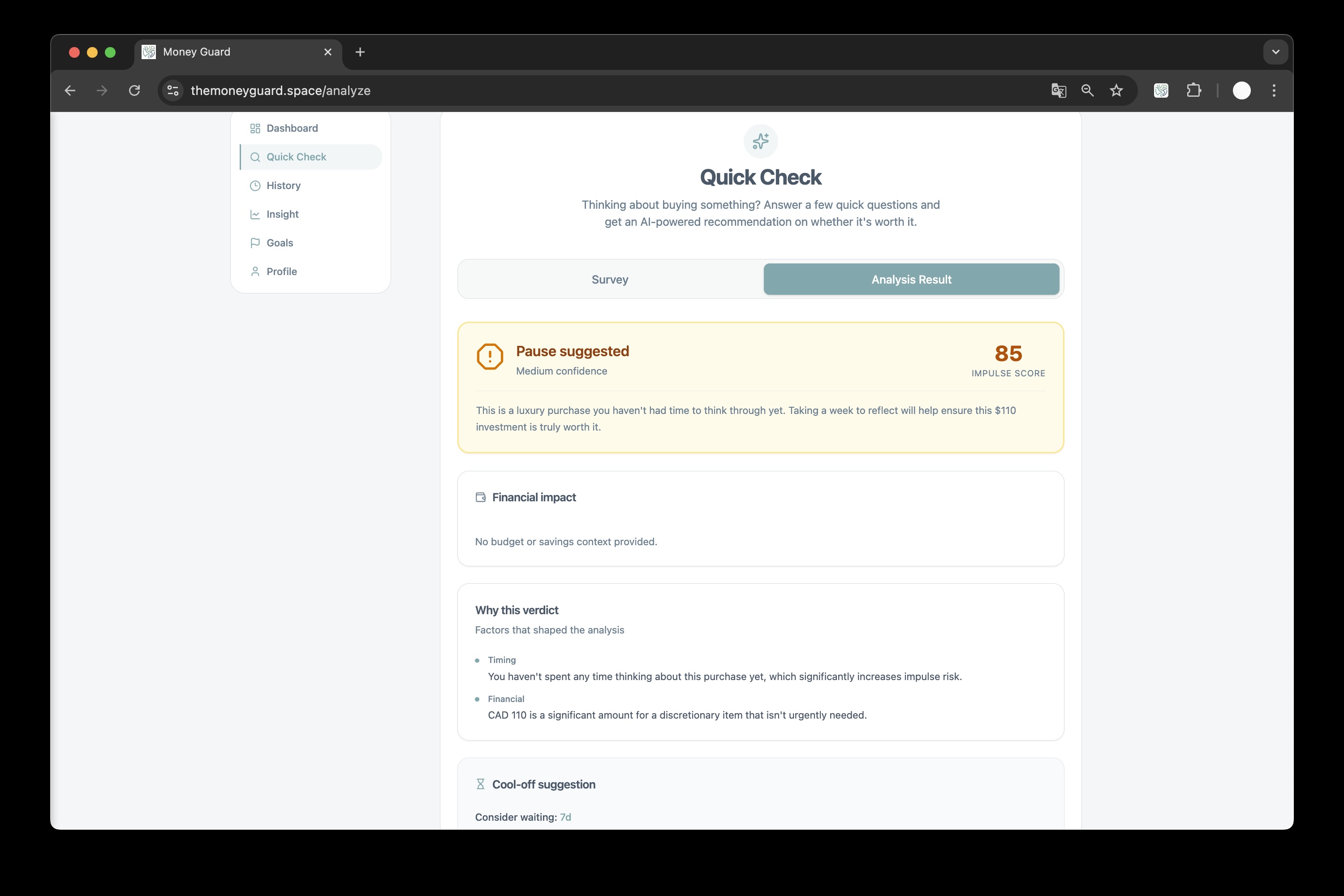
Analysis of buying thoughts
MoneyGuard — Project showcase
A short story of why we built it, how it works, and where it’s headed.
Inspiration
Budget apps usually show you the damage after you’ve spent. We wanted something that meets you at the moment of purchase—when the cart is full and the “Buy now” button is one click away. Research on impulse buying and regret shows that a short pause and a clear view of impact (budget, goals, “how will I feel in 30 days?”) can shift decisions without feeling punitive. We built MoneyGuard to be that behavioral firewall: evidence-based, in-the-browser, and tied to your real budget and savings goals so the nudge is personal, not generic.
What it does
In the browser: A Chrome extension detects when you’re on a checkout-like page (cart, payment, buy, etc.) and surfaces a lightweight overlay: “MoneyGuard detected a purchase. Want AI to analyze it before you buy?” If you say yes, you get a deliberate cool-off moment while the system analyzes your cart—then you see budget impact (e.g. % of monthly budget), a short AI take on regret risk and value, and two clear choices: Ignore budget (log the purchase and move on) or Save money (record the amount as saved and go back). No blocking, no shame—just a moment of clarity.
On the web: A Next.js app gives you one place for your financial behavior: dashboard, spending insight, savings goals, and manual or extension-synced analyses. One account, shared auth between web and extension, so your decisions and goals stay in sync everywhere.
How we built it
- Web app: Next.js 16, React 19, Supabase (auth + Postgres), Tailwind + shadcn/ui. Dashboard, analyze, savings, profile, and onboarding live in
src/; API routes handle analysis and extension callbacks. - Chrome extension: Manifest V3, built with Vite. A content script on
<all_urls>watches for purchase-intent URL patterns; when it matches, it injects the Permission UI, then (on “Analyze”) coordinates with a background service worker to load user + profile, call the analysis API, and render the Analysis UI. Session is persisted inchrome.storage.localand kept in sync with Supabase so the extension and web app share one login. - Shared layer: A
shared/module holds auth helpers and types used by both the app and the extension, so we don’t duplicate validation or API contracts. - AI: Google Gemini powers the analysis. We send cart items (or manual entry), user profile (budget, currency, savings goal, interests), and optional survey answers; the model returns a structured response (verdict, summary, key reasons, cool-off suggestion, opportunity cost) that we store and display in the UI.
Challenges we ran into
- Keeping extension and web in one auth world: We had to design a single Supabase auth flow that works in the browser (popup) and persists to
chrome.storage.localso the content script and background worker always see the same session. Getting token refresh and session sync right across tabs and the extension lifecycle took careful handling of Supabase client and storage listeners. - Reliable purchase-intent detection: We don’t scrape every page—only those that look like checkout (URL path hints like
checkout,cart,buy,payment, etc.). Balancing coverage (catching real checkouts) with avoiding false positives on blog posts or “buy our book” links required tuning the heuristics and keeping the permission step lightweight so users aren’t annoyed on non-shopping pages. - Structured AI output at the edge: We need consistent JSON from Gemini (verdict, summary, items, cool-off suggestion) for the DB and UI. Prompt design and response parsing had to be robust to model variation and partial responses, with clear fallbacks so the UI never breaks when the model output is odd.
- Content script ↔ background ↔ API: The extension has multiple surfaces (popup, content script, background). Routing messages (e.g. “get user”, “add transaction”, “update savings”, “navigate back”) and passing profile/analysis data through the right channels without race conditions or stale state required a clear contract and error handling (including toasts for “please log in” or “Gemini busy”).
Accomplishments that we're proud of
- Single account, two surfaces: One sign-up, one profile; the extension and web app feel like one product. Shared auth and
shared/code mean we ship features once and they work in both places. - Behavioral design, not just features: The flow is built around a real “cool-off” moment, optional analysis, and two explicit choices (log purchase vs. save). We’re proud that the UX reflects the research: nudge, don’t block; inform, don’t shame.
- Unified analysis pipeline: One prompt and response shape for both the extension (cart + page context) and the web (manual entry + survey). That made it easier to add verdicts, key reasons, opportunity cost, and cool-off suggestions without duplicating logic.
- Shipping a modern extension: Full MV3, Vite build, and a clean separation between popup, content script, background, and injected UIs. The extension is maintainable and ready to iterate on detection and analysis.
What we learned
- Intervention timing matters: Showing the nudge exactly when the user is about to pay (instead of in a separate app later) makes the “pause and reflect” moment much more effective. Meeting users where they are (in the browser) was the right product bet.
- Shared code pays off: Investing in
shared/authand shared types up front avoided drift between the extension and the web app and made it easier to add features (e.g. new profile fields) in one place. - AI needs guardrails: Structured prompts and response parsing are essential when the output drives UI and database state. We learned to design for partial or malformed responses and to keep the human in the loop (user always chooses “ignore budget” or “save money”).
What's next for MoneyGuard
- Smarter detection and onboarding: Better purchase-intent signals (e.g. DOM patterns, shop-specific rules) and a short onboarding flow so new users set budget and goals before the first nudge.
- Richer insights and goals: Deeper dashboard analytics, trend views, and more flexible savings goals (multiple goals, progress over time). Optional reminders and “cool-off completed” follow-ups.
- Mobile and cross-browser: Explore a companion experience (e.g. mobile web or future browser support) so MoneyGuard can follow you beyond Chrome on desktop.
- Research and ethics: Document our behavioral assumptions and iterate on the prompts and UX with an eye toward fairness, avoid dark patterns, and keep the product clearly “helpful pause” rather than “obstacle.”
MoneyGuard — Evidence-based behavioral intervention for your wallet.
Built With
- next.js
- psql
- react
- sql
- supabase
- typescript

Log in or sign up for Devpost to join the conversation.