-
v1 using deck.gl!
Inspiration
We're big fans of data visualization, and wanted to try our hands at creating an interactive map like the ones on /r/dataisbeautiful.
What it does
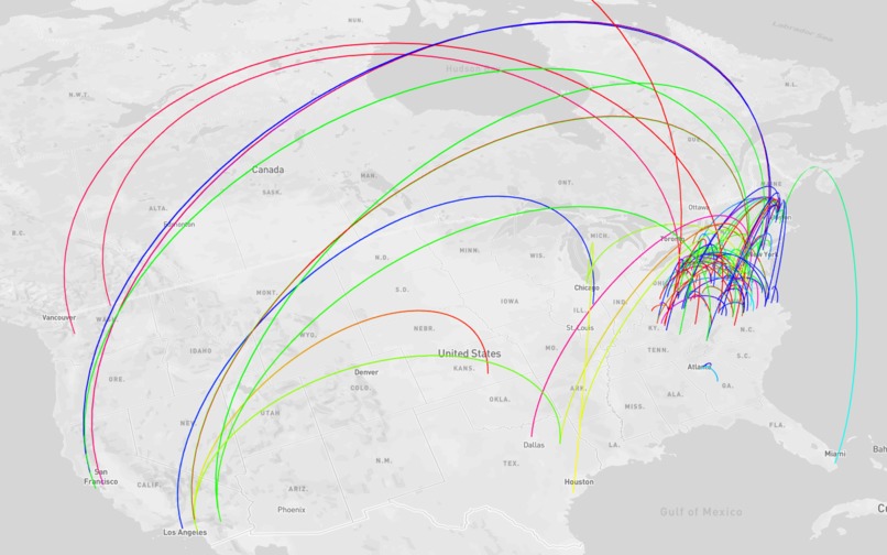
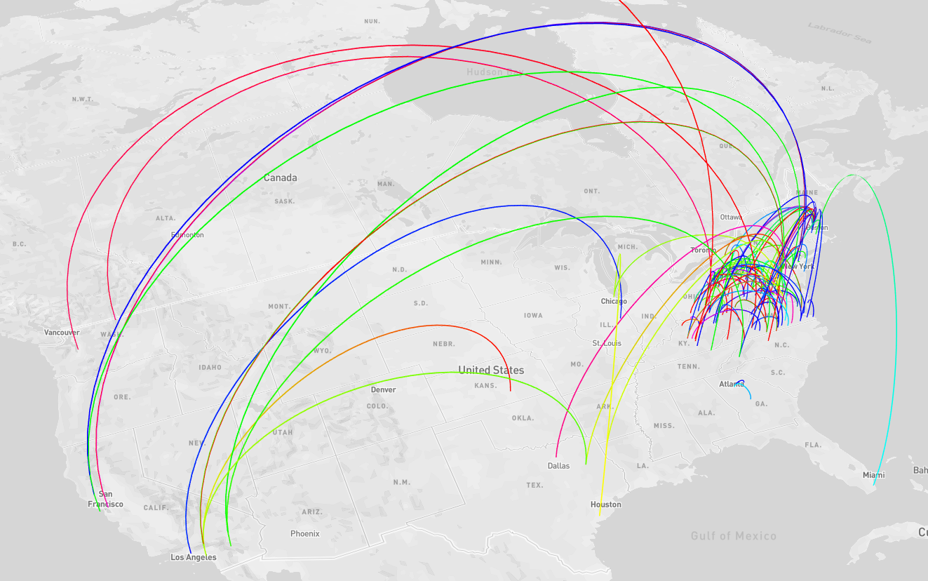
The website allows a user to interactively pan and zoom a visualization of financial transactions.
How we built it
We used the Nessie API to download large dummy data sets for the financial transactions happening under Capital One.
- Curl for data ingest
- Jupyter Notebook for data cleaning
- Google BigQuery for joining, feature engineering
- Tableau for prototyping, data exploration
- React.js for frontend
- Deck.gl and Mapbox for the map
Challenges we ran into
Missing data: We pivoted our idea a few times after realizing that the specific data we wanted did not exist. We initially wanted to group transactions by the purchase type using the consumer endpoint, but the enterprise data set did not have an equivalent endpoint and so we decided to reevaluate what we could do with the data we did have access to.
Data cleaning: We anticipated getting somewhat clean data because it was coming from an API; however, in reality, we encountered lots of null values, fake zip codes (12345), etc. After cleaning all the data, we went from 45k rows to a little under 2k rows of transactions occurring in the United States. Fortunately, this was still enough to plot.
Accomplishments that we're proud of
- Learning more about pandas and Tableau
- Augmenting the data with working longitude and latitude coordinates
- Seeing the actual data points appear on the map!
What we learned
- Real data is extremely difficult to work with, especially when parts of it may be anonymized or redacted.
What's next for MoneyFlow
- A prettier UI, filtering, plotting other features and layers on the map
Built With
- bigquery
- deck.gl
- google-cloud
- javascript
- mapbox
- react.js
- sql
- tableau

Log in or sign up for Devpost to join the conversation.