-
-
-
-
-
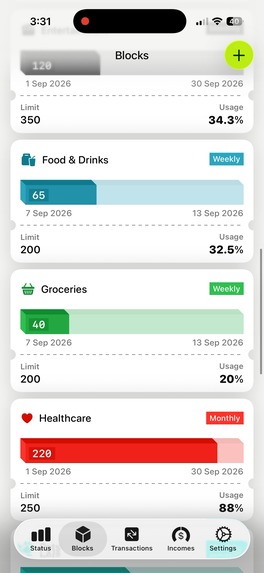
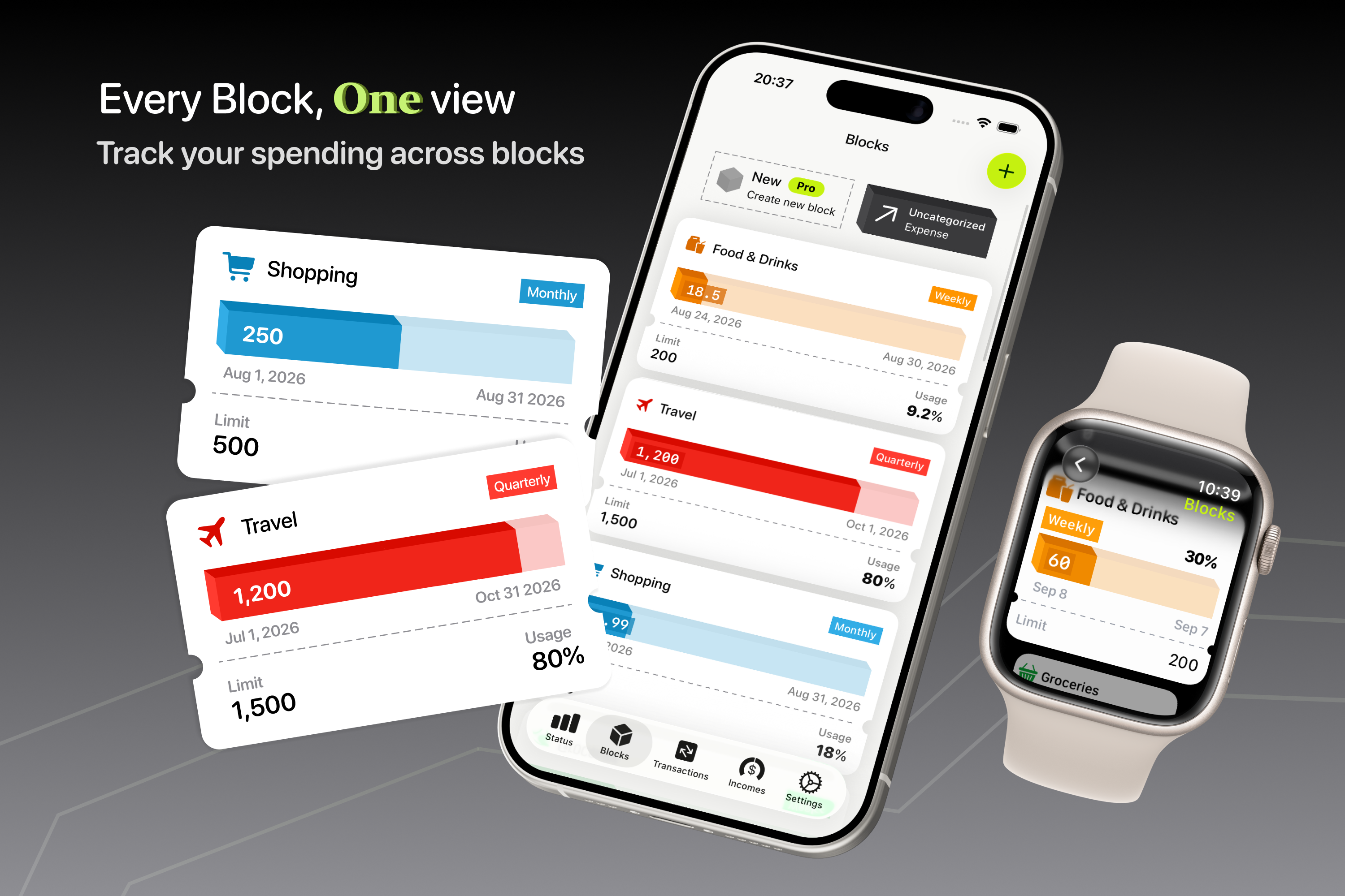
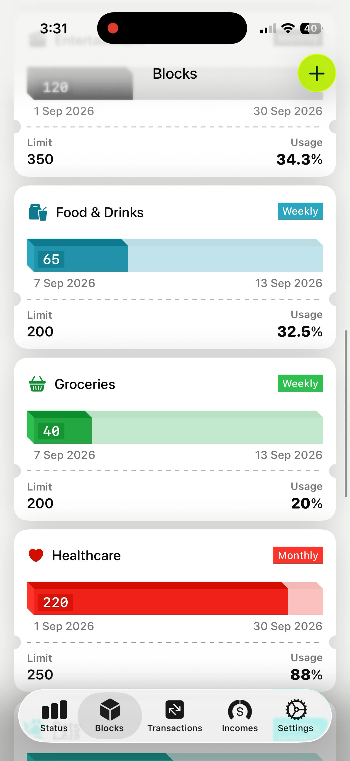
Blocks section raw screen
-
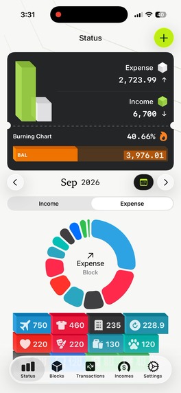
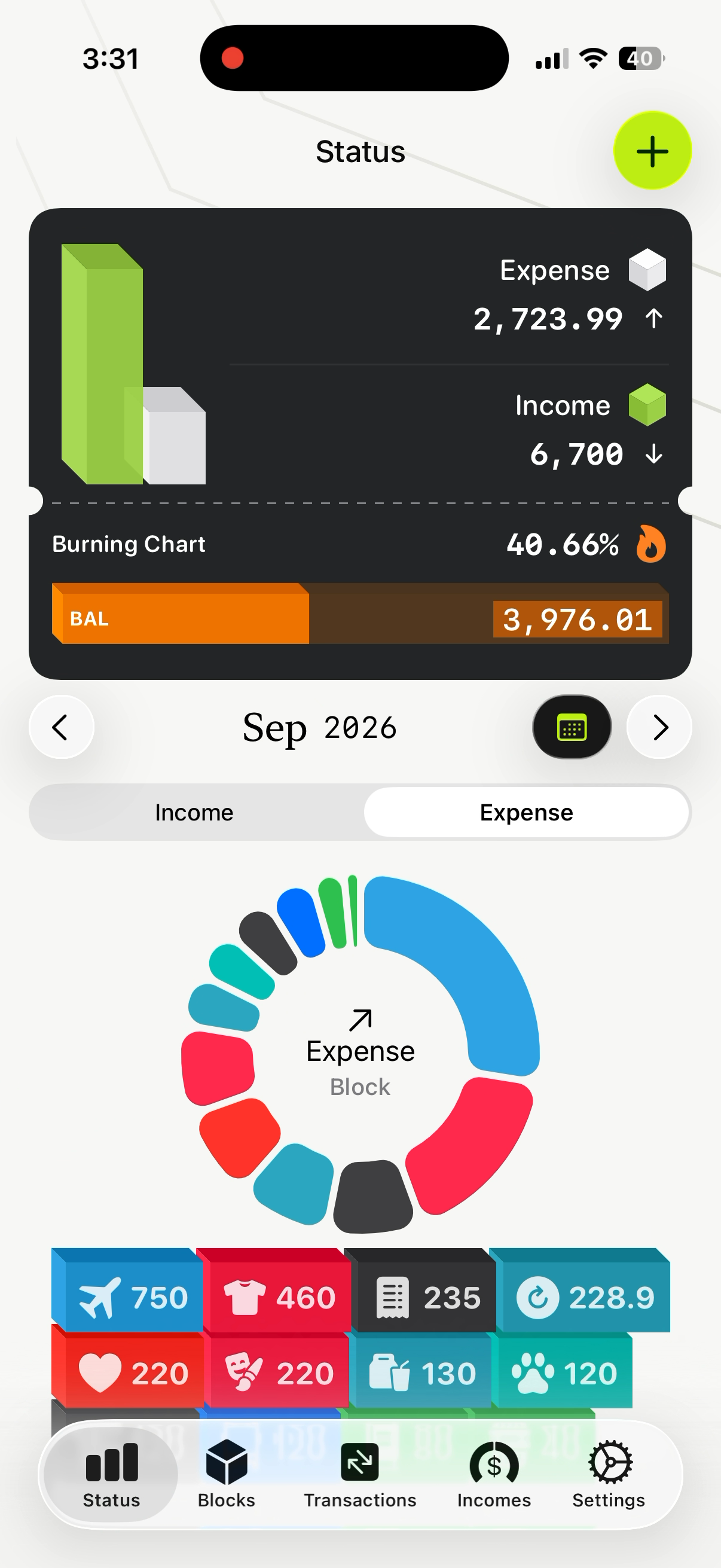
Status section raw screen
-
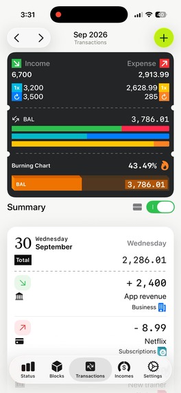
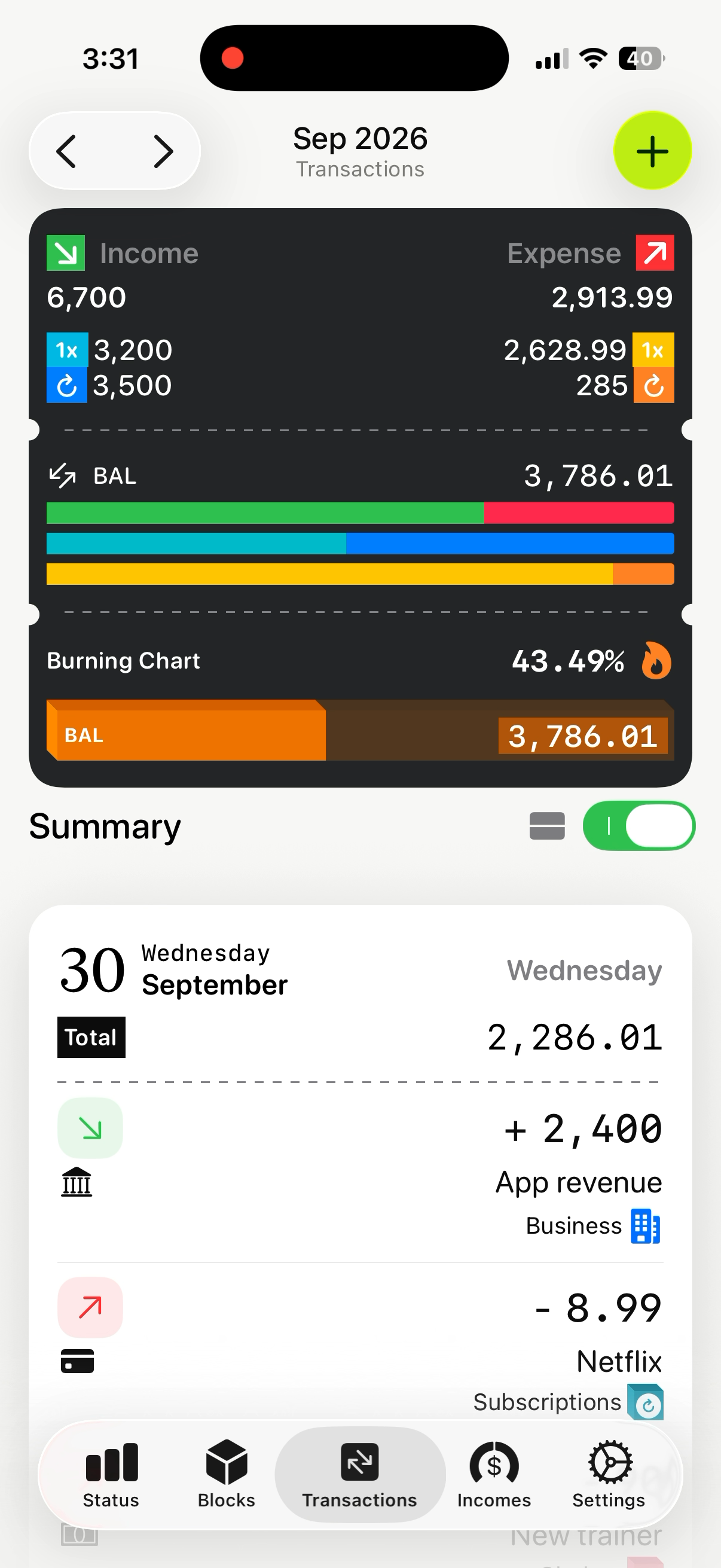
Transaction section raw screen
-
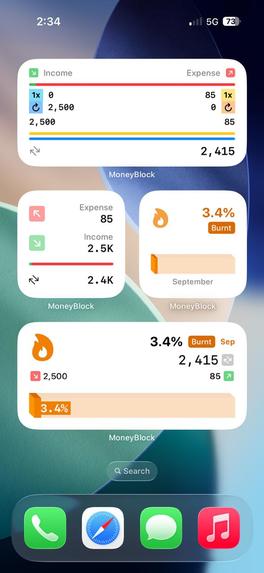
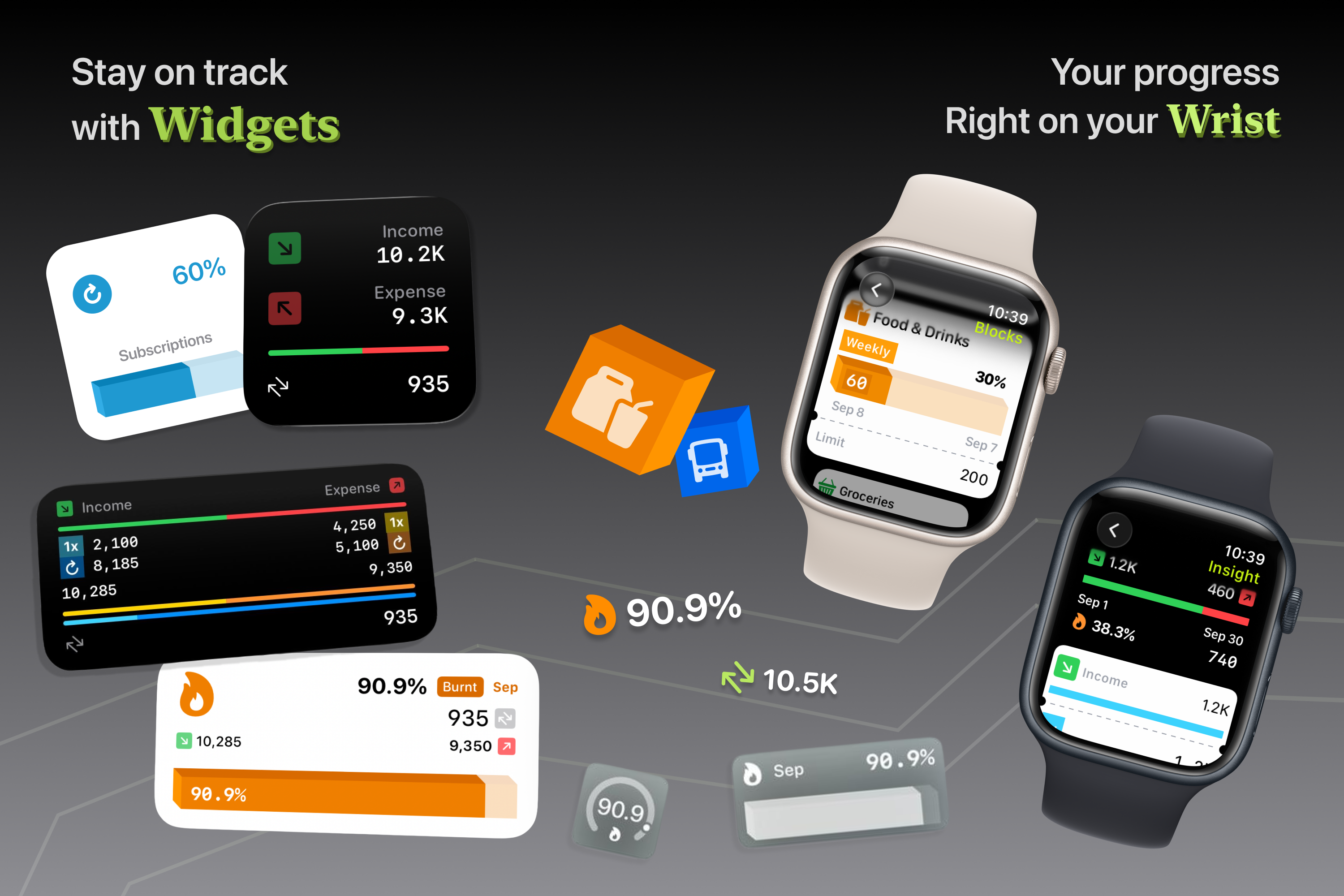
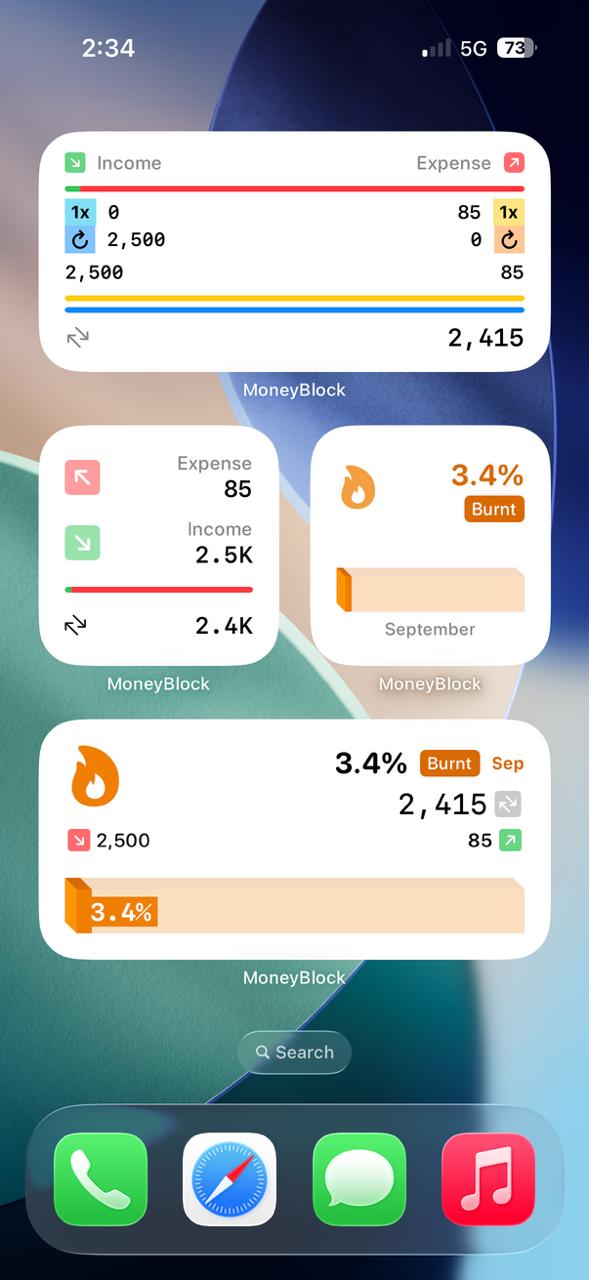
Widgets section raw screen
-
App Icon
-
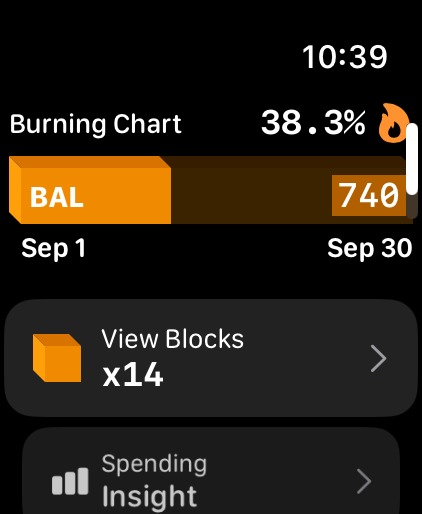
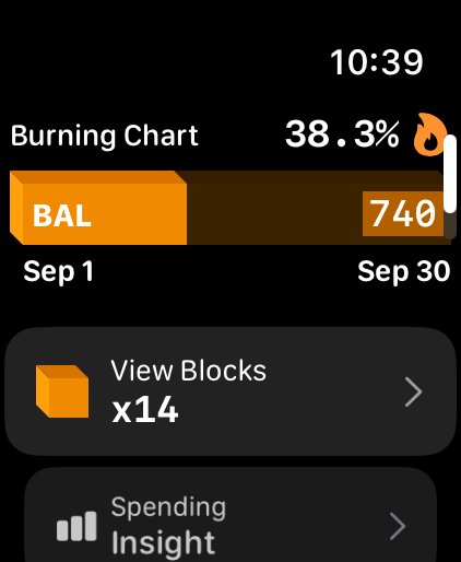
Watch App Home Screen
-
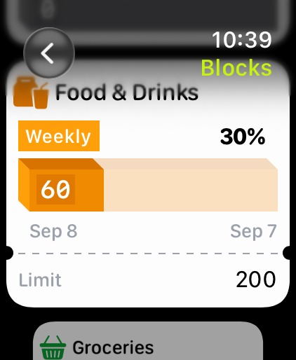
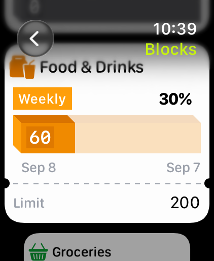
Watch Block Screen
-
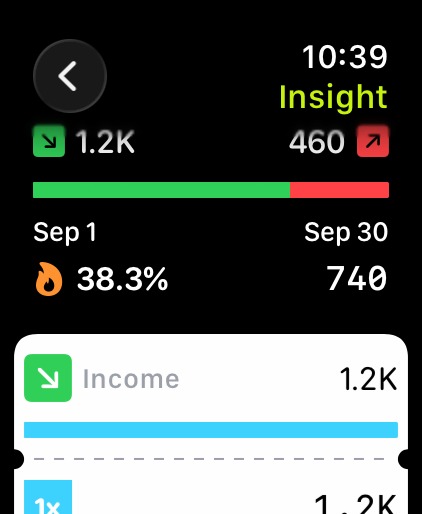
Watch Transaction Screen
Inspiration
Almost every budgeting app treats spending as one large monthly number. But in reality it doesn’t always work that way. Food might need a weekly limit, shopping may make more sense monthly and clothing could be planned quarterly.
The concept itself inspired making the Money block. A budgeting experience built around smaller, more meaningful spending boundaries called blocks. This way it’s very straightforward on structuring the spending around the way people live.
What it does
Money block helps users structure their finances through individual blocks. Each Block represents an area of spending, such as food, shopping, transport, or clothing. Users can give each Block a spending limit, choose a period that makes sense, and track how much of that limit has been used over time.
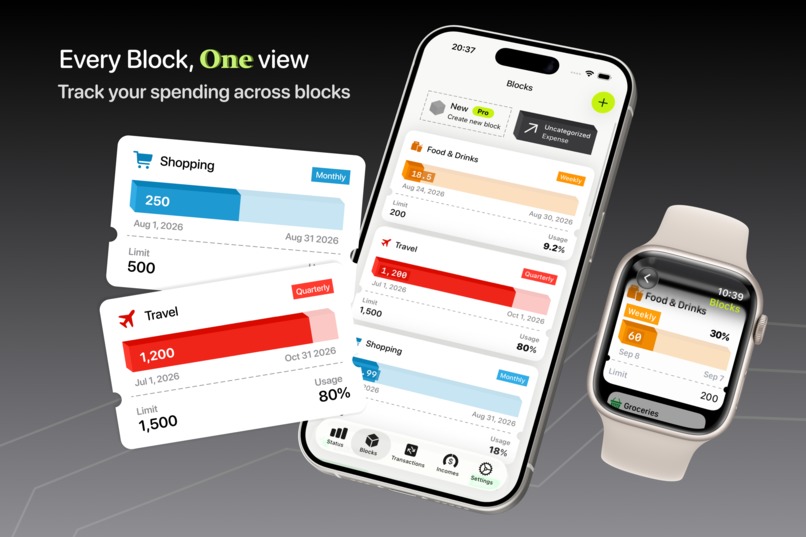
The Blocks section brings Blocks with different periods together in one place, making it easy to understand where each one currently stands.
The Transactions section provides a monthly timeline of income and expenses, regardless of which Block or income source they belong to.
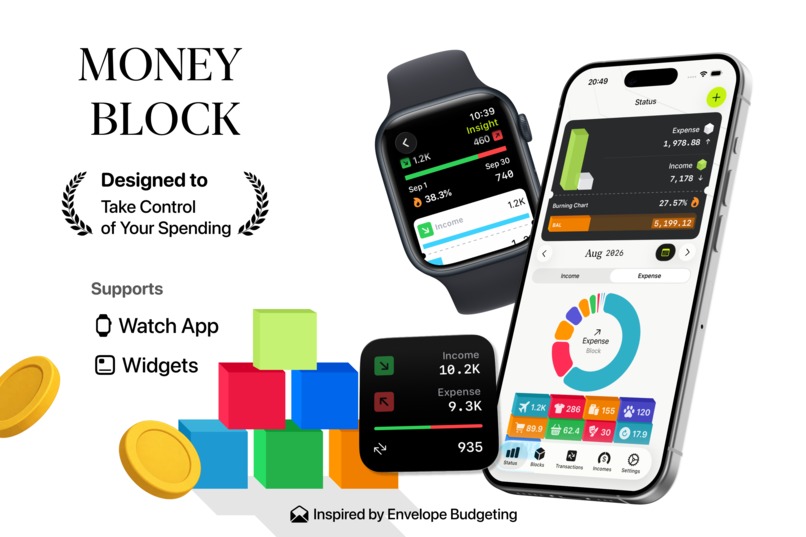
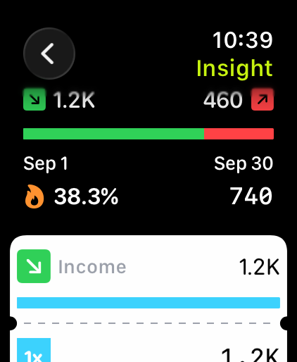
Money Block also turns financial activity into easy-to-understand visual insights, including spending breakdowns and the Burning Chart, which shows how expenses are progressing against income.
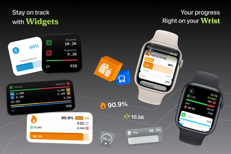
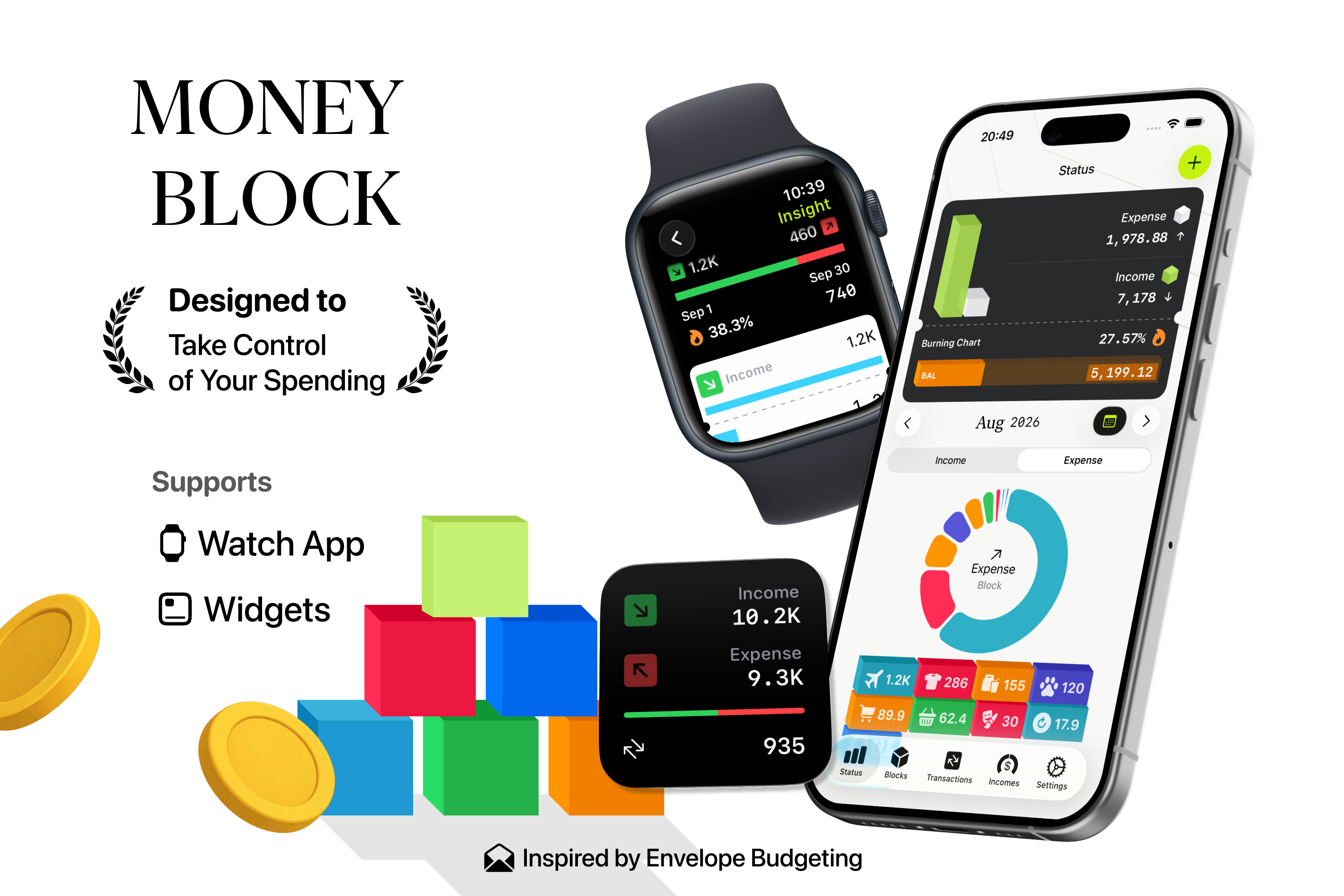
A variety of widgets makes important financial information available outside the app, while the Watch app gives users a quick way to check their Block progress and spending directly from their wrist.
How we built it
Money Block was designed around the Block concept from the start, rather than following a traditional monthly budgeting structure.
Even from technical level we built the block shape first (which almost defying the 2d UI boundaries) 𝕏 Swift 3d block materials
Each Block brings together a spending category, a limit, a time period, and its related transactions. From this foundation, the rest of the experience is organized to present financial information at different levels of detail. The Blocks section focuses on spending progress, while Transactions provides a detailed view of individual activity. Status and Insights offer a broader perspective on income, spending patterns, and overall financial health. The experience also extends beyond the main app through multiple widgets and a Watch app, making it possible to stay updated on finances without constantly opening the full application. Throughout the design, the focus remains on making financial information visual, approachable, and easy to understand at a glance.
Challenges we ran into
One of the biggest challenges was bringing Blocks with different time periods into a single experience. A weekly food Block, monthly shopping Block, and quarterly clothing Block cannot simply be treated as identical budgets. Money Block needed to represent each Block according to its own timeline while still making all of them understandable together.
Another challenge was deciding how much financial information to show without overwhelming the user. Transactions, income sources, Block progress, recurring activity, and charts can quickly become complex, so finding the right balance between detail and simplicity became an important part of the product.
We also had to think about how the experience should translate beyond the main app, especially when presenting useful information in the much smaller spaces available to widgets and the Watch app.
Accomplishments that we're proud of
Especially proud of turning the idea of budgeting into something more unique experience through blocks. It’s not just an app but a methodology to experience.
Blending with 2D and 3D UI is quite an accomplishment. This goes well with the unique concept, especially offering a great experience through 3D progress bars.
We are also proud of building an experience that connects detailed transactions with higher-level insights. Users can move from seeing their overall financial position to understanding a particular Block and then all the way down to the individual transactions behind it.
Extending that experience through multiple widgets and the Watch app also makes Money Block feel less like something users need to constantly open and more like information that is available whenever they need it.
What we learned
Building Money Block reinforced that financial tools do not necessarily need more complexity to become more useful.
Sometimes a clearer mental model can make a bigger difference. By turning spending categories into Blocks with visible boundaries, budgeting becomes easier to understand as a series of smaller decisions instead of one large monthly target.
We also learned how important visual hierarchy is when working with financial data. Totals alone rarely tell the whole story. Progress, distribution, timelines, and charts can give those numbers context and help users understand what is actually happening with their money.
Most importantly, we learned that a budgeting experience works best when it adapts to different spending habits rather than expecting every user and every category to behave the same way.
What's next for Money Block
Apple Intelligence powered: Generate summaries, log entries, and clarifies natural-language questions about totals and transactions
Shared Blocks: Joint accounts and shared blocks
Gen UI: Based on user interaction, usage behavior, and text queries dynamically generate different parts of the UI
Vision Pro Experience: 3D Block-based Vision Pro experience
The journey: Make everyday life a little better

Log in or sign up for Devpost to join the conversation.