
Monavo — the expense tracker built for week three
Inspiration
Almost everyone has downloaded an expense tracker. Almost everyone has abandoned one.
The problem isn't that people stop caring about their money. The problem is that tracking it can feel like work.
If entering a €3 coffee takes too much effort, eventually you stop doing it. A few days later, your data is incomplete. By week three, the app is useless and you've stopped opening it. It didn't fail because it lacked features. It failed because using it was too much effort.
I wanted to build an expense tracker around the few seconds that decide whether you'll use it again tomorrow.
What it does
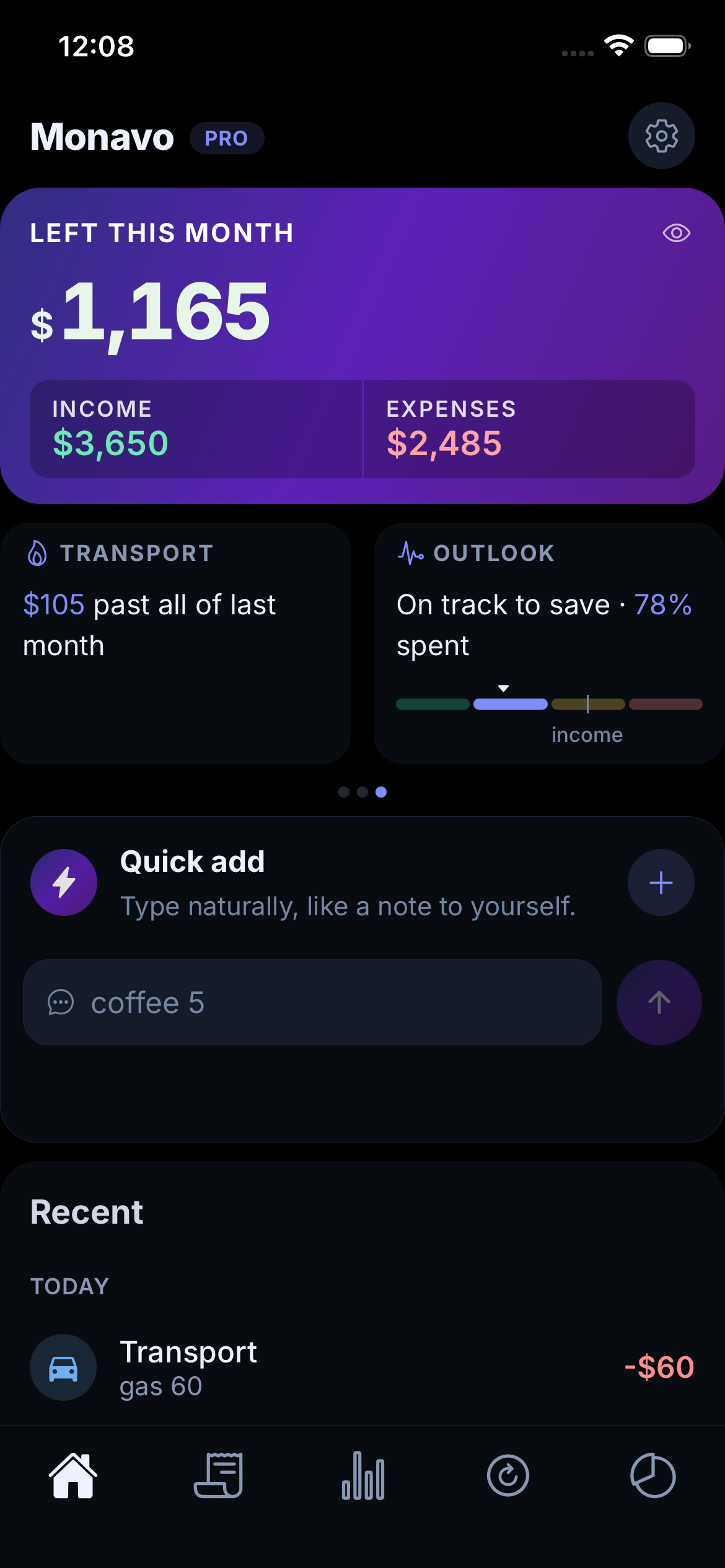
With Monavo, you type something like coffee 12 and you're done.
The app understands what you wrote, finds the amount and category, and records the expense. If it gets something wrong, you can correct it, and Monavo learns from that correction for next time.
There is no account to create and no bank to connect. It works without an internet connection, and your data stays on your phone. Cloud sync is optional.
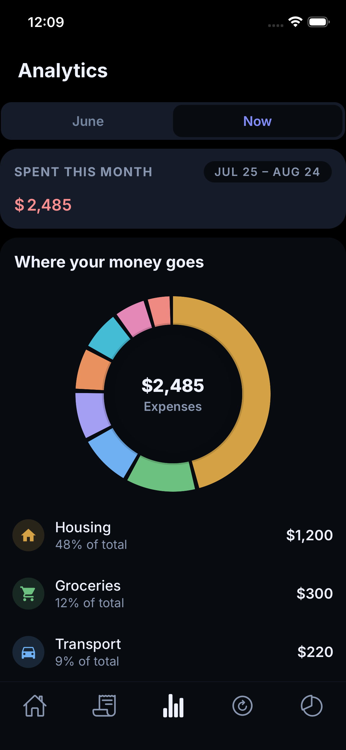
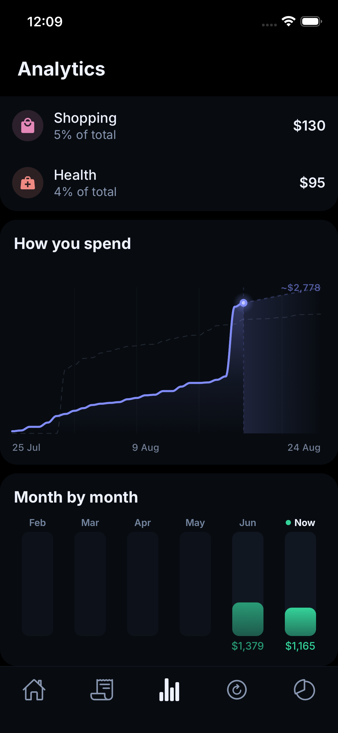
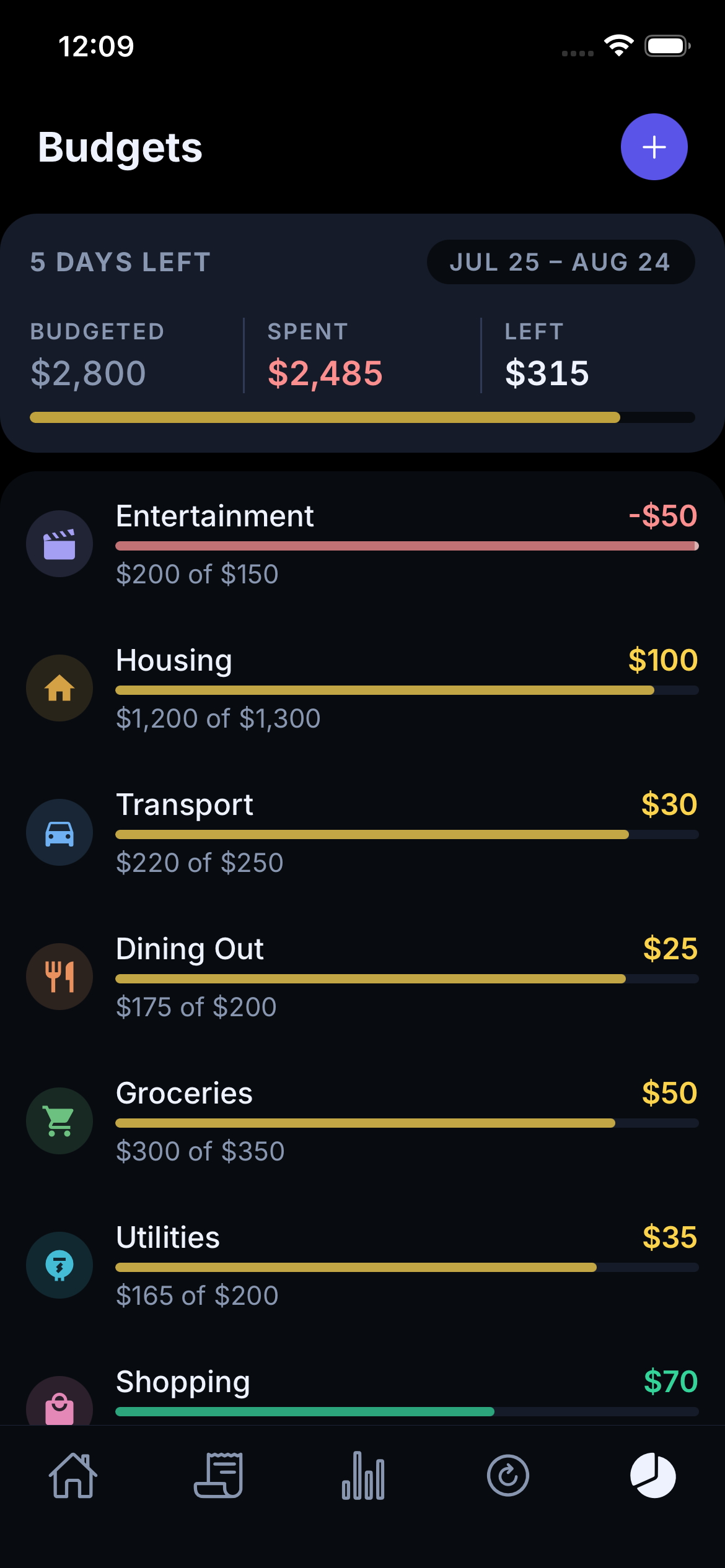
From the expenses you've already entered, Monavo can build budgets, insights, and a month-end outlook without making you configure everything first.
It's live on the App Store and Google Play in six languages, with multiple currencies and automatic currency conversion.
How I built it
I built Monavo with React Native and Expo.
The most important decision was to make it local-first. The app should work even when there is no internet, so the phone is the main place where the data lives. Sy cloud is something extra, not something the app depends on.
For the parts that need a server — such as optional sync, subscriptions, currency rates, and some of the harder language parsing — I use Supabase and a few small server functions.
I built the whole thing myself, including the app, backend, sync system, and the tools I use to test it.
Challenges I ran into
A release that crashed for everyone
One version of Monavo passed my normal tests and then crashed immediately when launched from the App Store.
The problem was in the packaging, not the code: the debug version of a core framework had been bundled inside a release build. That combination works fine while and cannot start on a device.
The fix was straightforward. The important lesson wasn't.
I added a check to the build process that inspects the finished app before it can be submitted, and fails the build automatically if it finds the same mismatch.
A process that can create the same serious mistake twice is the real bug.
A deleted item that came back
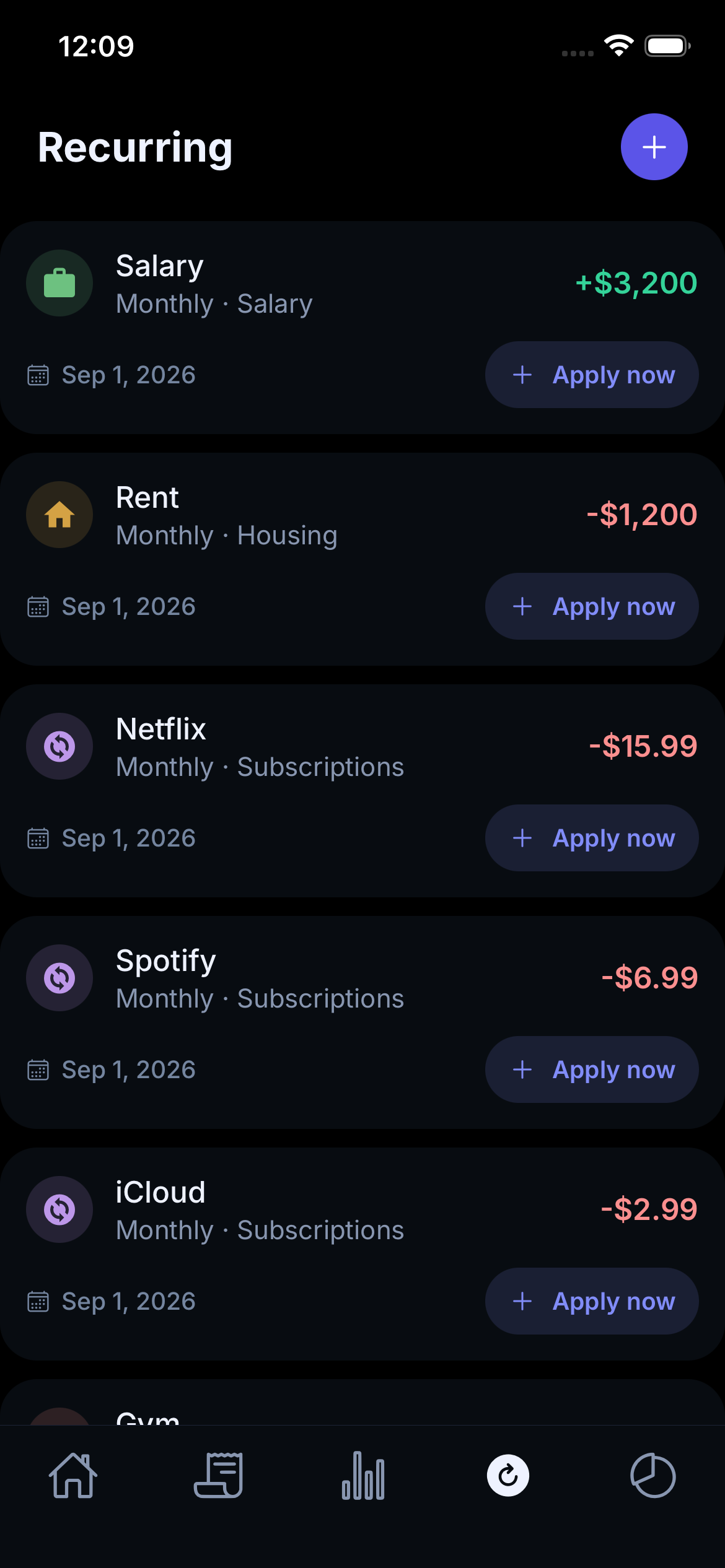
A user deleted three recurring rules. Two stayed deleted. One came back.
At first I thought the user had made a mistake. They hadn't.
The real problem was in syncing. I was using time to decide which changes nee uploaded. There was a small gap where a change could happen at exactly the wrong moment and be missed forever.
That meant the deleted rule could disappear locally, never reach the server, and later come back from the cloud.
I changed the system so that every local change now carries a simple "needs t uploaded" marker. That marker only disappears after the server confirms that
This was a much better rule: instead of asking "what changed recently?", the "what haven't I sent yet?"
I also added a system that periodically checks whether the phone and server have drifted apart and can repair the difference.
Deleting a feature by proving it was useless
I had built an insight that warned users when they were likely to exceed thei also had another insight that told them how many days their budget would last.
While testing them, I realised the second one always covered the cases where the first one could appear. In other words, the first insight could never actually win.
I proved it. Let $B$ be the total budget, $\bar{a}$ the average daily spend, $d$ the days in the period, $e$ the days elapsed, and $s$ the amount spent so far.
The first insight fired when the projected spend would pass the budget:
$$B < \bar{a}d$$
The second fired when the days of runway dropped below the days remaining:
$$\frac{B - s}{\bar{a}} < d - e + 1$$
Since $s = \bar{a}e$ by the definition of the average, that reduces to:
$$B < \bar{a}(d + 1)$$
which is a strictly weaker condition. Anything that triggered the first also triggered the second.
To be sure the algebra matched the real code, I swept 1,429 different configurations. The first insight reached the screen in zero of them.
So I deleted it, and left a test that asserts the surviving insight speaks wh deleted one would have.
Making text fit in every language
One of the insight cards looked fine in English but broke in other languages.
The cards are a fixed 130 pt tall, which leaves about 145 pt of usable text width on the narrowest phone I support. A sentence that fits in English can easily be too long in German.
At first I checked these by opening the app and looking at the screen. That wasn't good enough.
I wrote a small tool that reads the real font files, measures the actual letters, and checks whether every translated sentence fits inside the real card.
It found 19 of 24 versions that were too long — including English, which I would have sworn was fine.
One German word was particularly annoying. Monatseinkommens measures 145.09 pt against
145.00 pt of space. Because the app doesn't split words automatically, it cli
of wrapping — and because it still fit on the expected number of lines, my first version of
the tool reported it as passing.
Now I can check all of these cases automatically instead of discovering them by accident.
Icons that didn't look like they belonged together
The category icons came from the same icon set, but they didn't actually look
Some were visually tiny and others filled most of the space: the lightest covered 15.8% of its square, the heaviest 55.4%. That's a 3.5× spread. Put fourteen of them in they look like two different icon families, in a way that's hard to name.
I wrote another small tool that measures how much of each icon is actually filled and holds every one of them inside a 28–56% band.
It turned something difficult to describe — "these icons look wrong" — into something measurable.
What I learned
Measure the thing, don't just look at it
A lot of the problems I found looked fine at first.
The sync bug wasn't visible until a very specific timing happened. The transl looked fine until it was placed in the actual card. The icons came from the s still looked inconsistent.
Whenever something matters, I try to turn it into a measurement or an automated check.
The measuring tools are worth checking too. My text-measuring script has been wrong twice: once it counted lines while ignoring line width, and once it measured the wrong part of the screen. A check you never verify is a check that fails quietly.
A timestamp isn't the same as a record
The sync bug taught me an important distinction.
A timestamp asks:
"What happened after this time?"
A stored flag answers:
"What still needs to be sent?"
The second question is much safer, because it records a fact instead of trying to reconstruct one later.
Sometimes the right feature is no feature
I used to think every feature should be evaluated by testing whether people liked it.
Sometimes the better question is simply: can this feature ever provide something that another feature doesn't already provide?
If the answer is no, delete it.
Showing nothing can be better than showing something wrong
Monavo's insights are deliberately conservative. If there isn't enough information to make a useful statement, the app stays quiet. It doesn't guess.
A wrong financial insight is worse than no insight at all.
So there are rules for when an insight is allowed to appear: enough days have passed, enough expenses have been recorded, and every amount involved could actually to the user's currency.
Say which month you mean
One of the hardest bugs wasn't a calculation. It was a label.
An outlook card was showing a percentage based on the previous month's income screen simply said "80% of income."
The number was correct. The wording made it look wrong, because a different income figure was visible on the same screen.
When two numbers appear next to each other, a precise label matters.
What's next
There is still one place where Monavo can be clearer.
The home screen currently compares income received so far this month with spe this month. For someone who gets paid in the middle of the month, that can make their situation look far worse than it really is.
The fix is already clear from the work on the outlook card: use the same income reference, and make the month explicit.
That's also how I want to keep building Monavo — not by adding features for the sake of having more features, but by removing the small points of friction that make people stop using it.
Built With
- android
- claude
- deno
- eas
- expo-notifications
- expo-secure-store
- expo.io
- ios
- javascript
- kotlin
- node.js
- postgresql
- posthog
- react-native
- reanimated
- revenuecat
- sentry
- sqlite
- supabase
- typescript
- vercel
- zustand

Log in or sign up for Devpost to join the conversation.