
We were inspired by a simple gap in today’s finance tools: they are great at tracking what people spend, but not how spending feels.
A lot of spending decisions are not purely rational. Some are impulsive, some are social, some are necessary but stressful, and many only make emotional sense after the moment has passed. We became interested in the idea that money is not just a financial behavior, it is also a human sensory experience. Stress, hesitation, regret, relief, and confidence can all show up around spending, but most products never capture that layer.
That led us to Mochitta, a financial wellbeing experience that combines spending context, self-reflection, and body signals to help users become more aware of their patterns over time. Instead of building another budgeting app, we wanted to build something that helps people notice:
- when a spend is becoming a pattern,
- when their body might be reacting before they consciously realize it,
- and how repeated moments can turn into better decisions later.
We were especially motivated by young adults entering independent financial life, where spending habits form quickly but emotional awareness around money is often still underdeveloped.
What we learned
The biggest thing we learned is that awareness is a better starting point than control.
At first, it was tempting to make the product feel like it should stop bad spending. But as we explored the idea more deeply, we realized that was too simplistic. Not every stressful spend is bad. Some purchases are joyful. Some are necessary. Some are planned but still emotionally heavy. The goal is not to judge every transaction. The goal is to help users understand their own patterns.
We also learned that trust matters a lot in a product like this. If an app says, “you seem stressed,” it cannot feel random or invasive. That pushed us to make the system more explainable: if Mochitta nudges a user, it should show why that nudge appeared, based on context, history, and reflection.
Another major learning was about designing around correlation rather than certainty. We are not claiming that biometrics alone can explain financial decisions. Instead, we learned to frame the product more honestly:
- spending context gives situation,
- reflection gives meaning,
- body signals give possible stress indicators.
Together, they create a more useful picture than any one source alone.
In a simple way, our thinking became:
$$ \text{Awareness Signal} = w_c(\text{context}) + w_r(\text{reflection}) + w_b(\text{body signals}) $$
where the weights represent how strongly each input contributes to a meaningful nudge or insight.
How we built the project
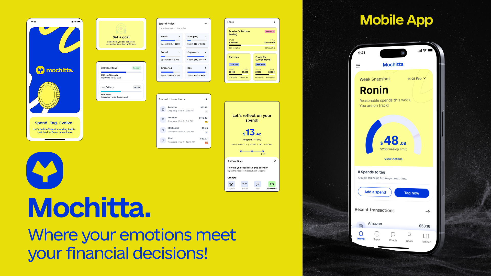
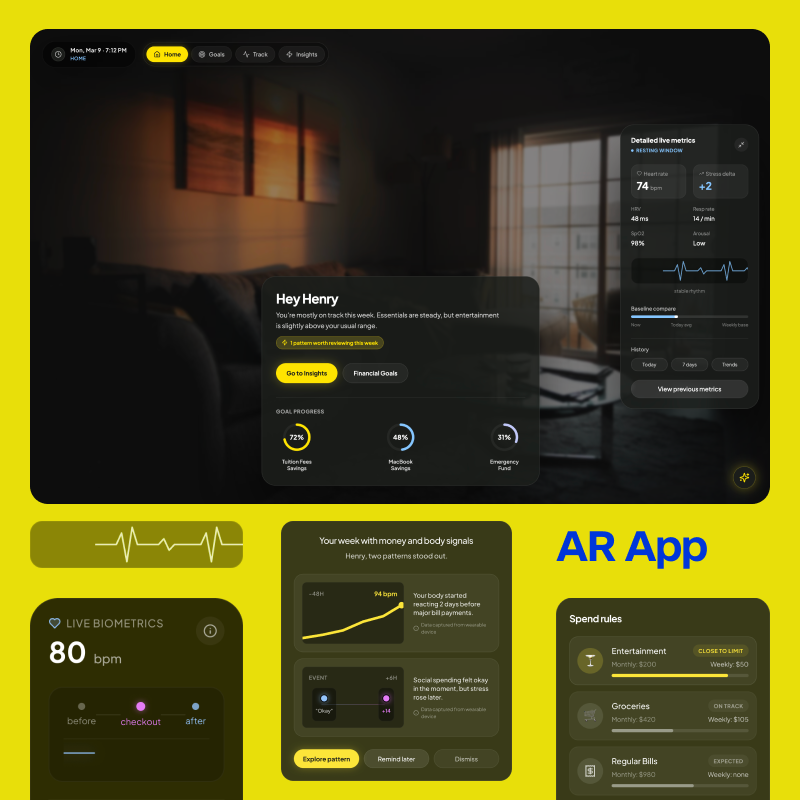
We built Mochitta as a speculative but highly designed prototype with two connected touchpoints:
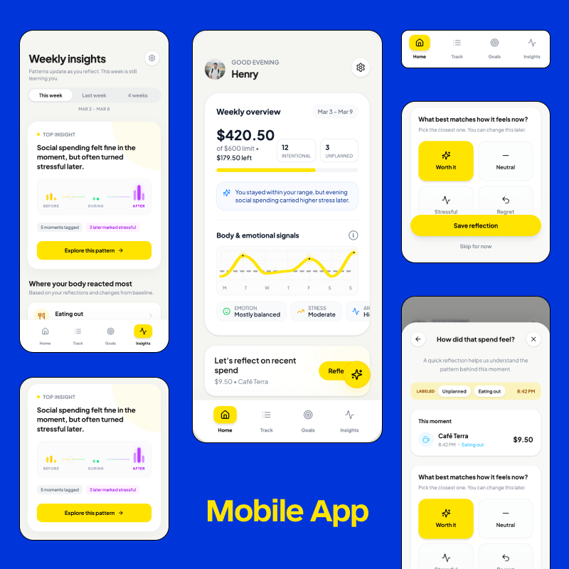
- a mobile app for summaries, reflection, insights, and goals
- an AR layer for lightweight in-the-moment interventions
We focused on three core flows:
1. Pause before the pattern
A user enters a familiar spending context and receives a gentle AR prompt before making a repeated discretionary purchase. The system gives a reason for the nudge and lets the user decide whether to continue, mark it intentional, or pause.
2. Reflect after the spend
If the moment is missed in real time, the mobile app still captures learning through a quick post-spend check-in. The user labels whether the purchase was planned or unplanned and how it felt afterward.
3. See the pattern over time
The app then turns repeated moments into weekly insights. Users can see emotional trends, possible stress-linked categories, and how spending behavior may be helping or hurting their goals.
For the interface itself, we designed:
- a richer Home screen that acts like a control center,
- weekly spending summaries,
- body and emotion signal cards,
- reflection prompts,
- standout pattern highlights,
- goals in progress,
- location-based AR alerts,
- and an AI entry point for follow-up questions.
We used Figma Make to rapidly generate and iterate on screens, then refined the experience screen by screen so both the mobile and AR touchpoints felt like parts of the same product ecosystem. Our process was less about creating a huge number of screens and more about identifying the smallest believable set that could communicate the concept clearly.
Challenges we faced
The hardest challenge was scope.
This idea can easily become too broad: finance, health, emotion, wearables, AI, AR, reflection, coaching. Very quickly, the product can start trying to do everything. We had to constantly reduce and refocus the concept around one clear value:
Mochitta helps users notice hidden emotional stress around spending and respond with more intention.
Another major challenge was balancing speculation with realism. We wanted the project to feel visionary, especially with AR and biometrics, but still grounded enough that judges could understand how it would work. That meant carefully choosing what to show in the prototype and avoiding exaggerated claims.
A third challenge was designing for sensitivity. Money is personal. Emotions are personal. Body signals are personal. We had to make sure the experience felt supportive, not controlling; informative, not intrusive. That influenced our tone, our UI language, and the way we structured interventions.
Finally, one of our biggest design challenges was making the home screen useful without making it overwhelming. Since Mochitta brings together spending, goals, reflections, biometrics, and insights, the home screen had to do a lot of work. We spent time reorganizing it so that it felt like a meaningful weekly overview rather than a collection of disconnected widgets.
Why this project matters to us
Mochitta is our attempt to imagine a healthier future for financial technology.
We believe the next generation of personal finance tools should not only optimize budgets and transactions. They should help people build better relationships with money, with more self-awareness, more emotional clarity, and more agency.
This project pushed us to think beyond tracking behavior and toward understanding the human experience behind that behavior. That shift is what made Mochitta meaningful for us, and it is what we hope makes it meaningful for others too.
Built With
- figma
- figmamake


Log in or sign up for Devpost to join the conversation.