-
-

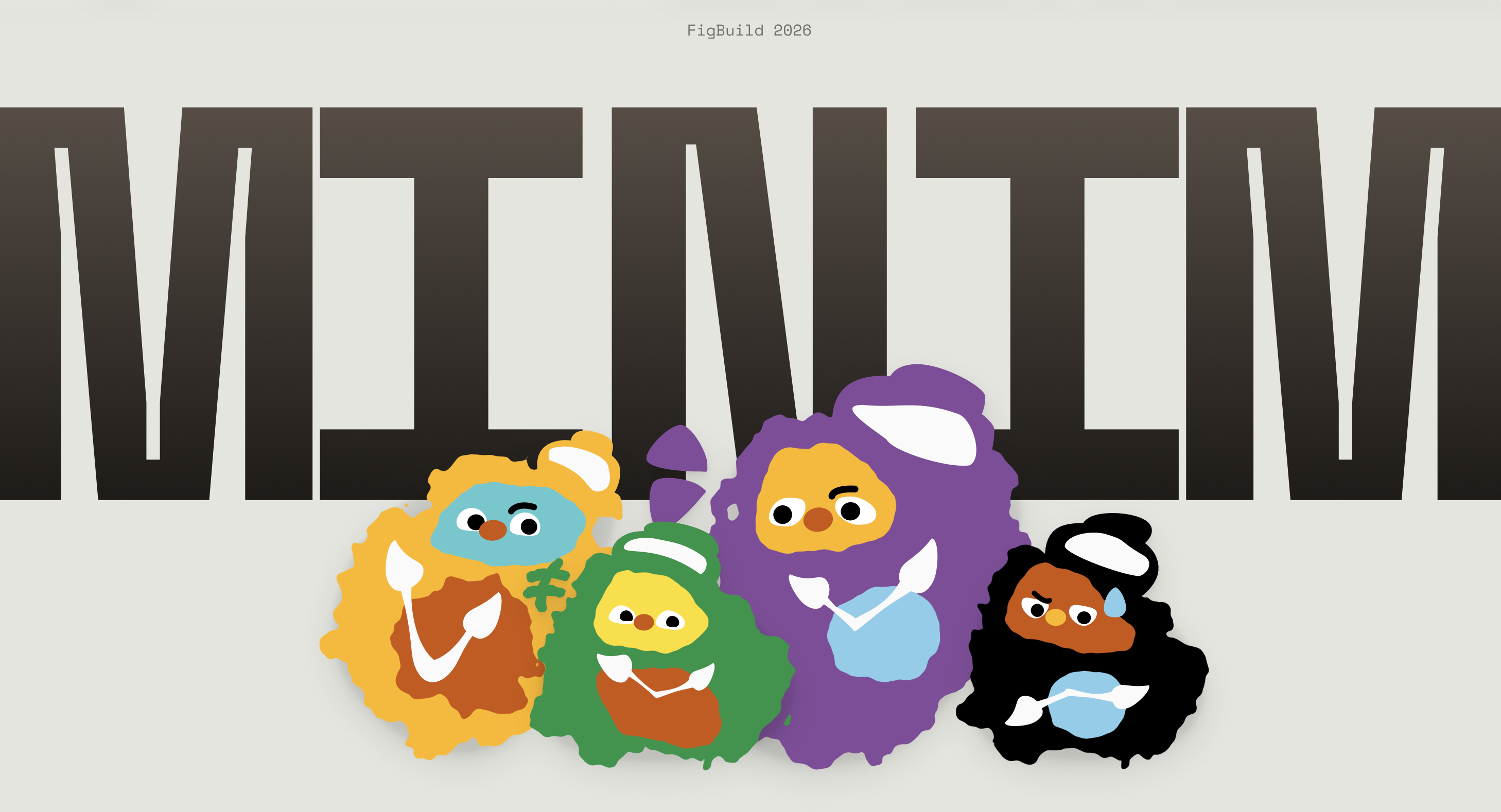
Minim Cover
Inspiration
We kept noticing the same thing happening to us. You open TikTok for a few minutes and look up to find an hour has disappeared. Not because you are weak or distracted, but because the feed is genuinely engineered to dissolve your sense of time. We wanted to know: how bad is the gap between the time we feel and the time that actually passes? And why has nobody made that visible?
That question led us to chronoception, the human sense of time perception. It is a real neurological sense, and like all senses, it can be measured, visualized, and trained. MINIM was built around that idea.
What it does
MINIM is a chronoception visualizer. When Psychea scrolls TikTok, MINIM runs quietly in the background using Auto Eye Tracking to monitor session duration and scroll frequency. After 45 minutes of continuous use, a notification surfaces one simple question: "How long do you think you've been scrolling?" She makes a guess. MINIM reveals the real number. The gap between the two is her chronoception score for that session.
Every session becomes a collectible daily card stamped with her deviation score and a character that reflects how her day went. Over time, a weekly calendar and a 365-dot year view build up a full picture of when and where her internal clock drifts the most.
How we built it
We designed MINIM entirely in Figma, using Figma Design for interactive prototyping and Figma Slides for our presentation. Every character in MINIM was designed from scratch directly in Figma Design using vector-based tools, with no external illustration software. The organic blob forms, grainy textures, and expressive dot eyes were all built and refined within Figma itself. The design system was built around a warm dark palette with flat illustration characters inspired by organic, grainy illustration styles. Every screen was designed with iOS native components as the structural base, with the brand personality layered on top through typography, color, and character art.
Challenges we ran into
The hardest design problem was the reveal moment. Showing someone they were wrong about time — sometimes by a factor of three or four — without making them feel judged or surveilled took many iterations. Every early version that led with the raw number felt like an accusation. A bold "You spent 4 hours on Instagram" lands like a parent catching you in a lie. We kept pulling the framing back, softening the entry point, until the data spoke entirely for itself and the copy stayed completely neutral. The insight had to feel like a mirror, not a verdict.
Designing the 168-cell weekly grid and the 365-dot year view to feel intuitive rather than overwhelming also took significant work. Dense data visualizations have a tendency to read as medical or clinical, the kind of screen you scroll past rather than sit with. The interaction model needed to be simple enough that a single tap felt rewarding, almost tactile. We tested many versions where the grid felt like a spreadsheet. Getting it to feel like a journal took a lot of restraint.
Storytelling for video production was its own mountain. Communicating a concept as abstract as time perception in a short-form demo video, without resorting to voiceover exposition or a feature walkthrough, pushed us to think cinematically. How do you show someone feeling the gap between two minutes and twenty minutes? We went through multiple narrative directions before landing on one that let the product's visual language carry the weight. Every second of the video had to justify itself, and that kind of economy is genuinely hard to write and direct under a hackathon timeline.
Accomplishments that we're proud of
We coined a product category that does not exist yet. Chronoception visualization sits in the space between wellness tools and self-quantification apps, and MINIM carves out its own territory in that gap. It is not a screen time tracker, not a meditation app, not a mood journal, but something new that borrows the best of all three without belonging to any of them.
The daily card collection mechanic turned a passive data point into something people actually want to open and share. That shift, from information to artifact, was the design breakthrough that made everything else click. A card feels owned. A statistic feels imposed.
We are also deeply proud of the character and the branding. The MINIM mascot is not decoration. It carries emotional tone across the entire experience, softening what could easily feel like surveillance into something warm and even a little playful. The palindrome logic embedded in the name, the logotype, and the visual system gives the brand a conceptual backbone that most apps never have. Every touchpoint feels considered because it is. And the year view, 365 dots with the remaining days still dim, gives users a visceral and almost uncomfortable sense of time that no bar chart or pie graph has managed to replicate. It is not data. It is a feeling. That is the hardest thing to design, and we got it right.
What we learned
Designing for perception is fundamentally different from designing for behavior. Most wellness apps tell you what to do differently. MINIM only shows you what already happened. That constraint forced every design decision to be more honest, more visual, and less preachy.
We learned that restraint is a design tool, not a limitation. Every time we were tempted to add a nudge, a recommendation, or a streak, we had to ask whether it served perception or whether it was just defaulting back to the familiar grammar of productivity apps. Most of the time, the answer was to remove it. The hardest version of any feature is the one that does exactly one thing and trusts the user to do the rest. We also learned how much framing shapes feeling. The same number, presented two different ways, can make someone feel empowered or ashamed. We spent more time on copy than on almost anything else, because neutral language is surprisingly difficult to write. English defaults toward judgment. Getting a sentence to carry zero emotional valence while still being interesting to read is a skill we did not expect to develop at a hackathon.
Building MINIM also clarified something about the difference between data and meaning. Most apps give you data and hope meaning follows. We had to design for meaning directly, which meant the visual language had to do work that numbers alone could not. The dots, the cards, the mascot, the color temperature of the interface at different times of day. All of it was in service of a single feeling: this is your time, and here is what you did with it.
That is a harder brief than "increase engagement." But it is a much more interesting one.
What's next for MINIM
Wearable integration with Apple Watch and future AR glasses. On-device AI that learns each user's personal drift patterns and surfaces check-ins at the exact moments their chronoception is most likely to break down. And a social layer where friends can compare deviation scores and watch each other's internal clocks sharpen over time.
Built With
- figma-make
- figmaslides


Log in or sign up for Devpost to join the conversation.