💡 Inspiration
Every day, people switch between apps, trends, and topics — from studying to scrolling, from focus to distraction. I realized that our attention behaves like a currency — it moves, grows, and fluctuates just like money in a market. So I built Mindly, a dashboard that helps us see how attention flows across different areas like education, gaming, work, and entertainment. The goal was simple: to make something that turns human focus into data we can visualize and understand.
⚙️ What It Does
Mindly is an interactive data visualization project that treats attention like a market. It tracks and predicts how people’s focus shifts across the digital world using charts, AI summaries, and insights.
Here’s what it shows:
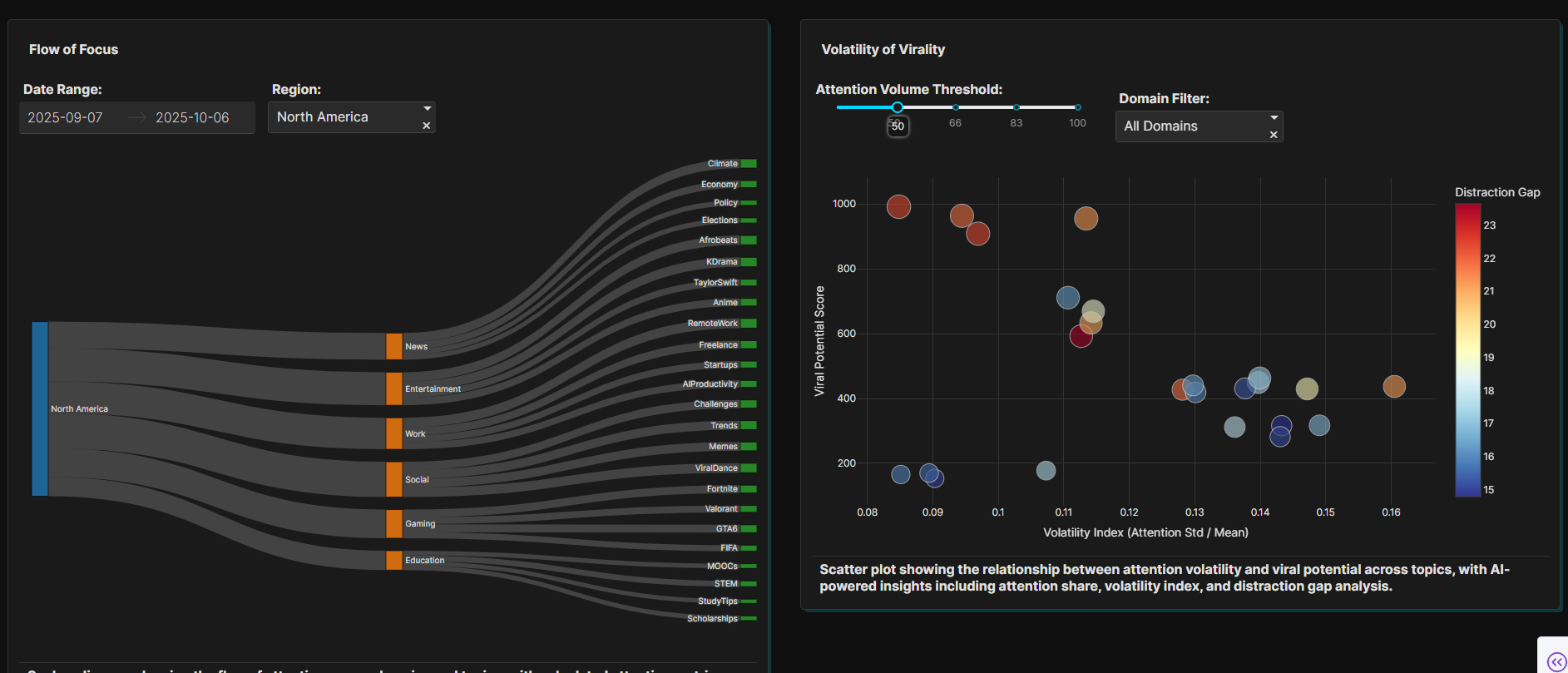
- 🌎 Flow of Focus: See how attention moves between regions and domains — like a river of curiosity.
- 📈 Volatility of Virality: Discover which topics are stable and which are trending fast.
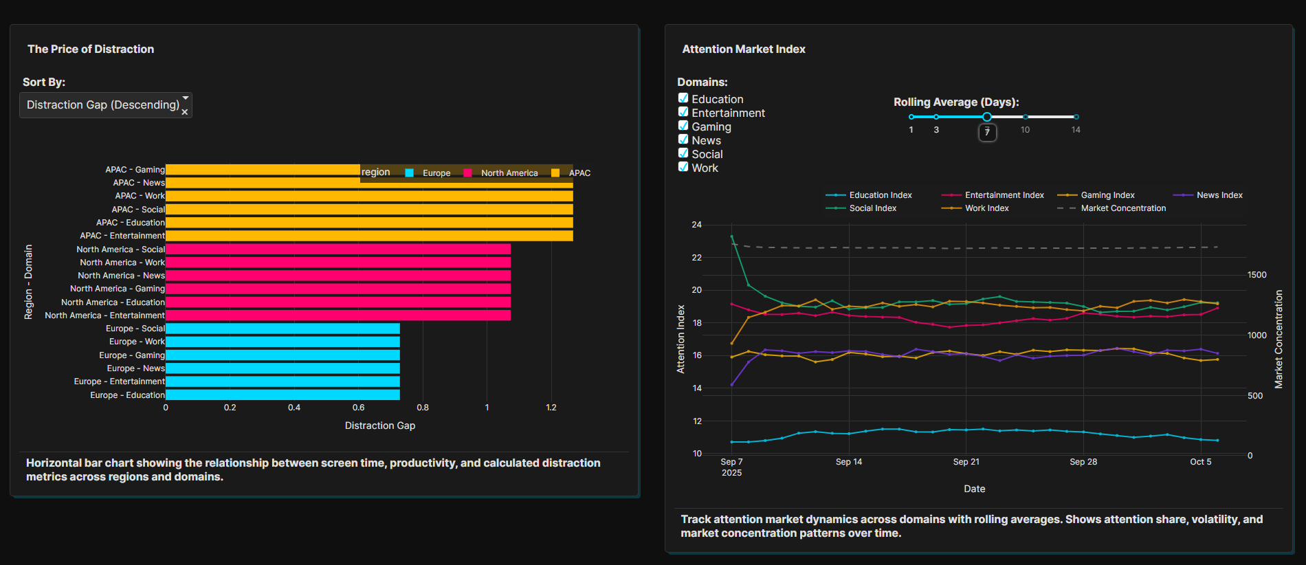
- 💸 Attention Price Board: A heatmap showing which regions hold the most valuable attention.
- 🔮 Attention Forecast: Predicts how global attention might rise or fall over the next 24 hours.
In short, Mindly turns attention into measurable data, showing how we focus, what we value, and how digital trends change.
🧩 How We Built It
- Built the dashboard with Plotly Studio for data visualization.
- Used CSV data to represent attention metrics across different categories.
- Added AI-generated summaries to explain what the data means in simple language.
- Designed clean, modern charts that make complex patterns easy to understand.
🚧 Challenges We Ran Into
- Finding realistic data to represent something abstract like “attention.”
- Balancing visuals so they’re detailed but not overwhelming.
- Designing new metrics like distraction gap and attention value.
- Keeping the dashboard interactive and fast while processing multiple datasets.
🏆 Accomplishments That We’re Proud Of
- Created a full interactive dashboard in under a week.
- Made attention, something intangible, visible through data.
- Designed visuals that feel both artistic and analytical.
- Combined design, psychology, and data science into one creative project.
📚 What We Learned
- How to use data visualization to tell a human story.
- That even simple charts can reveal deep patterns in behavior.
- How AI insights can make data more relatable and easier to understand.
- And that attention, just like money, flows and changes, and we can learn from that.
🔮 What’s Next for Mindly
- Add real-time social data (like trending hashtags or video views).
- Create a personal attention tracker that helps people reflect on how they spend time.
- Build an Attention Index, a daily score that shows global focus levels.
- Add more AI forecasting tools to predict trends over longer timeframes.


Log in or sign up for Devpost to join the conversation.