-
-
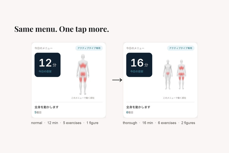
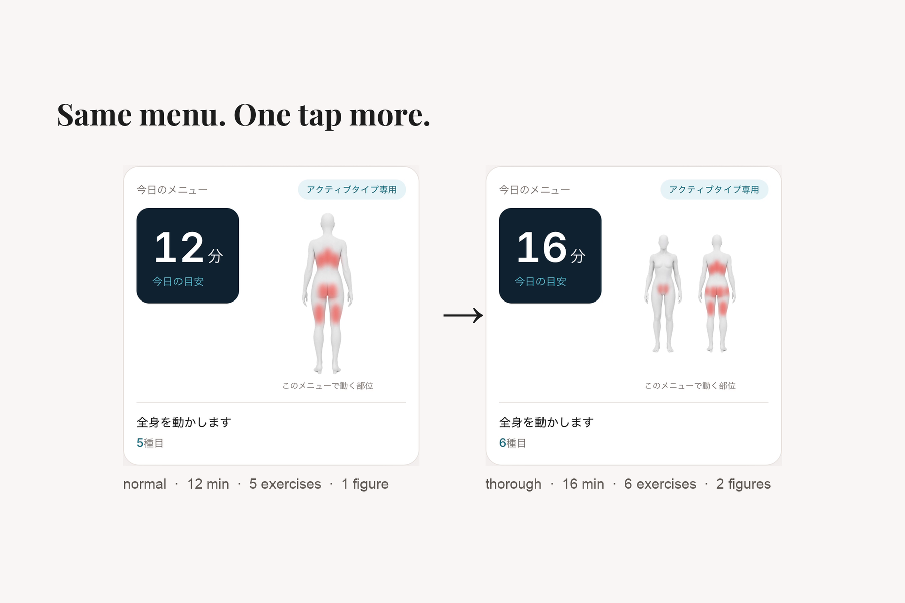
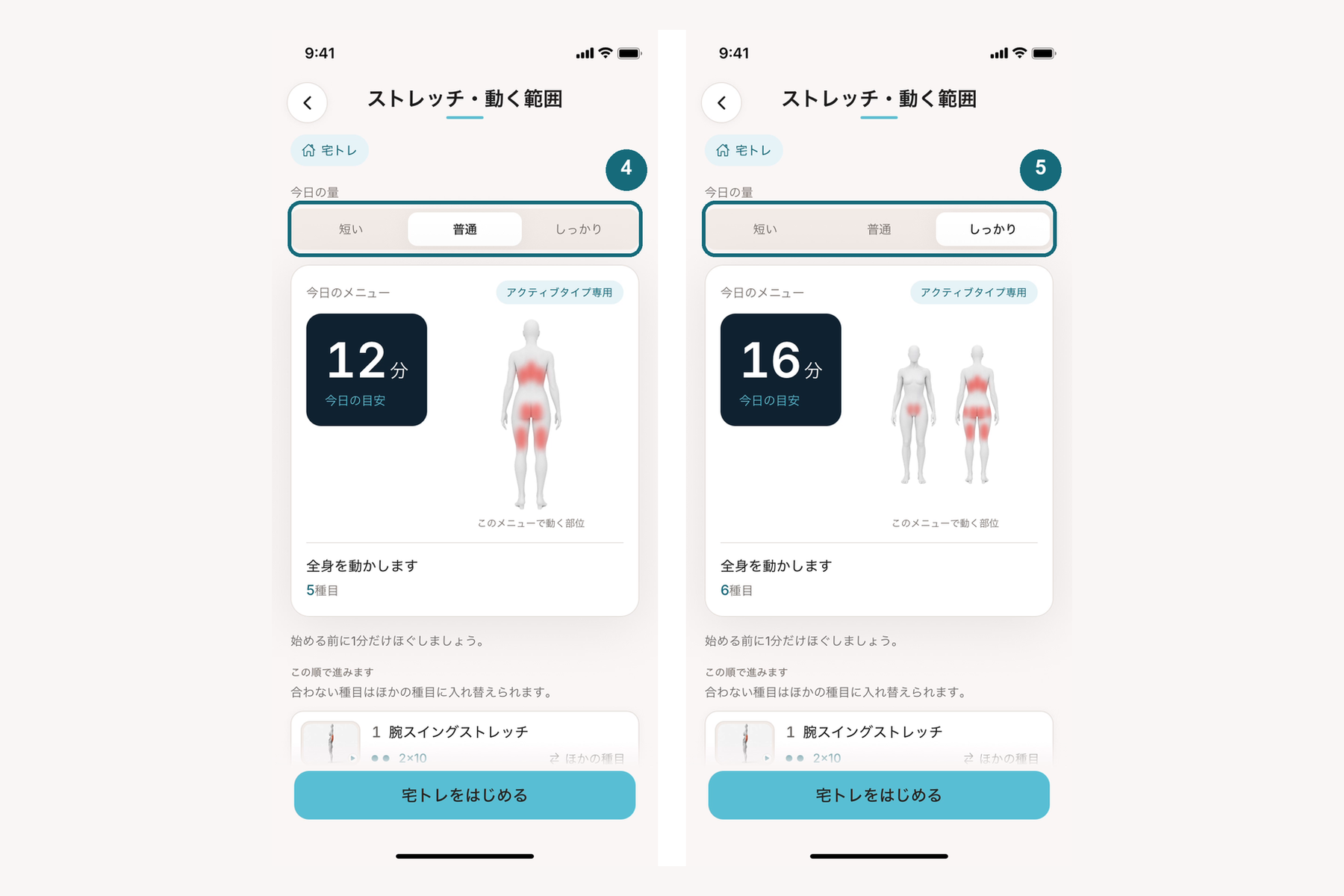
The figure is computed from today's exercises. Same session, one tap more: 12 min / 1 figure → 16 min / 2 figures.
-
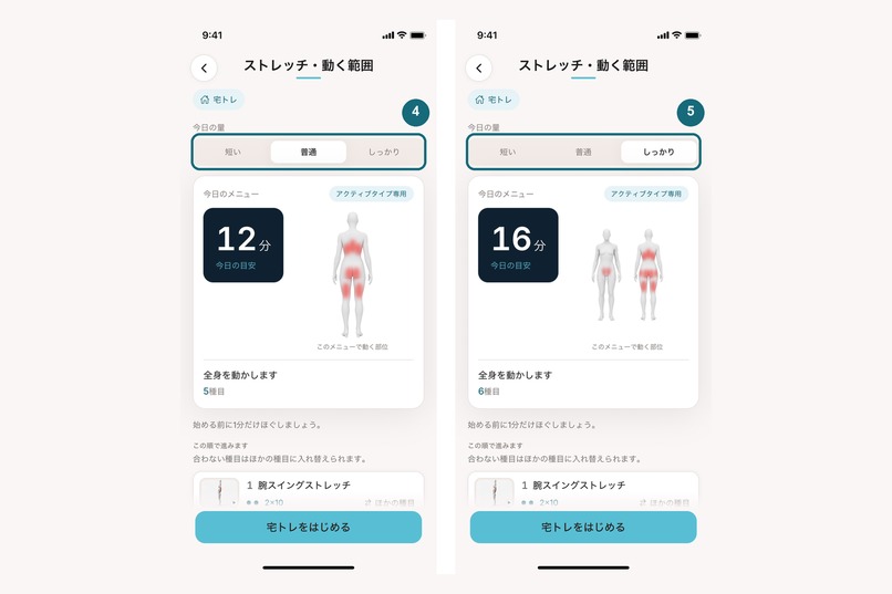
The 3-way selector (short / normal / thorough). Switching to thorough makes a second, front-facing figure appear.
-
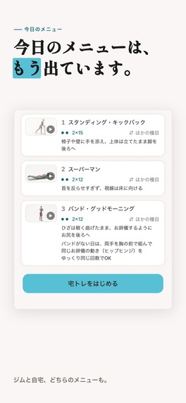
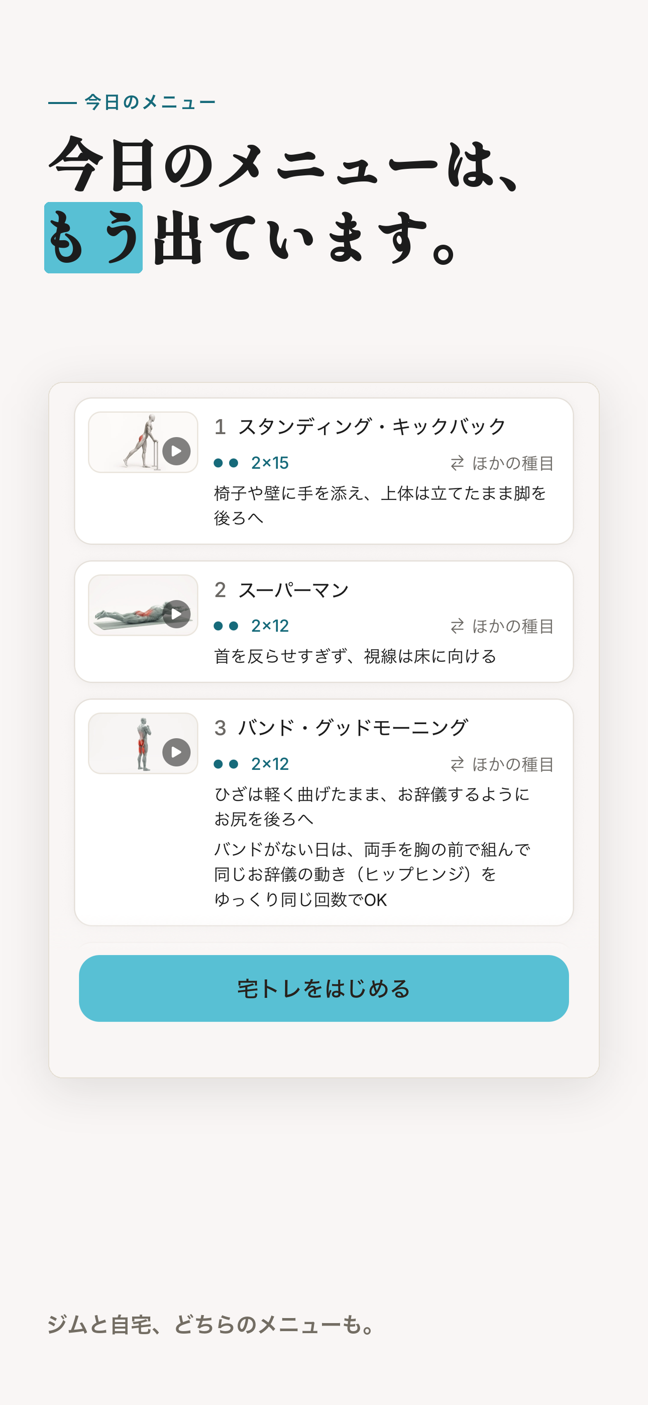
Today's session, already on the screen: exercises in order, sets and reps per line, one swap link each. Home or gym.
-
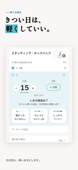
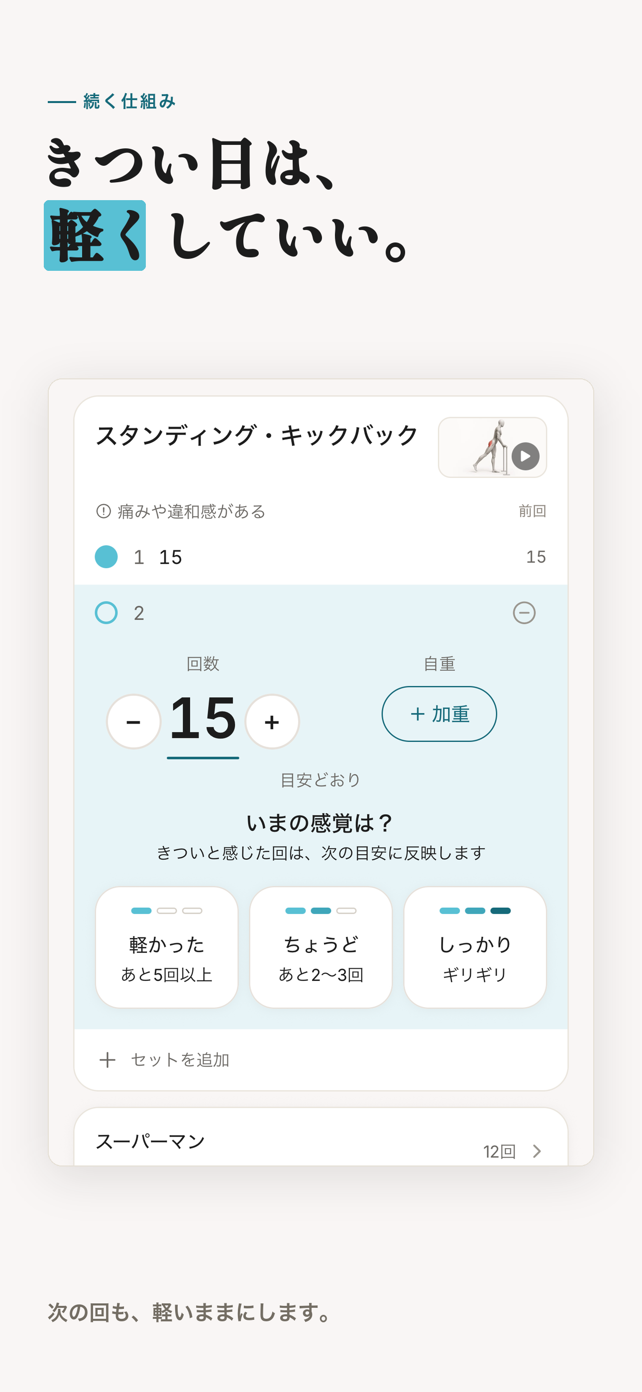
After every set: light / just right / heavy. That's the whole input. Next session's reps and weight come from it.
-
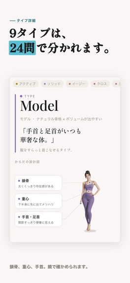
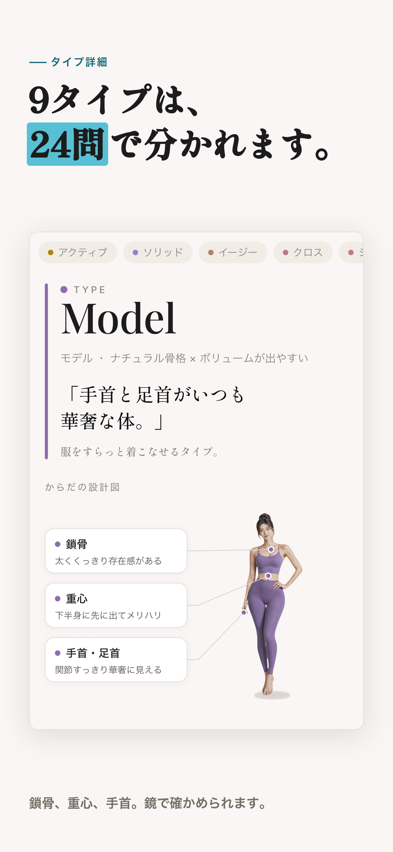
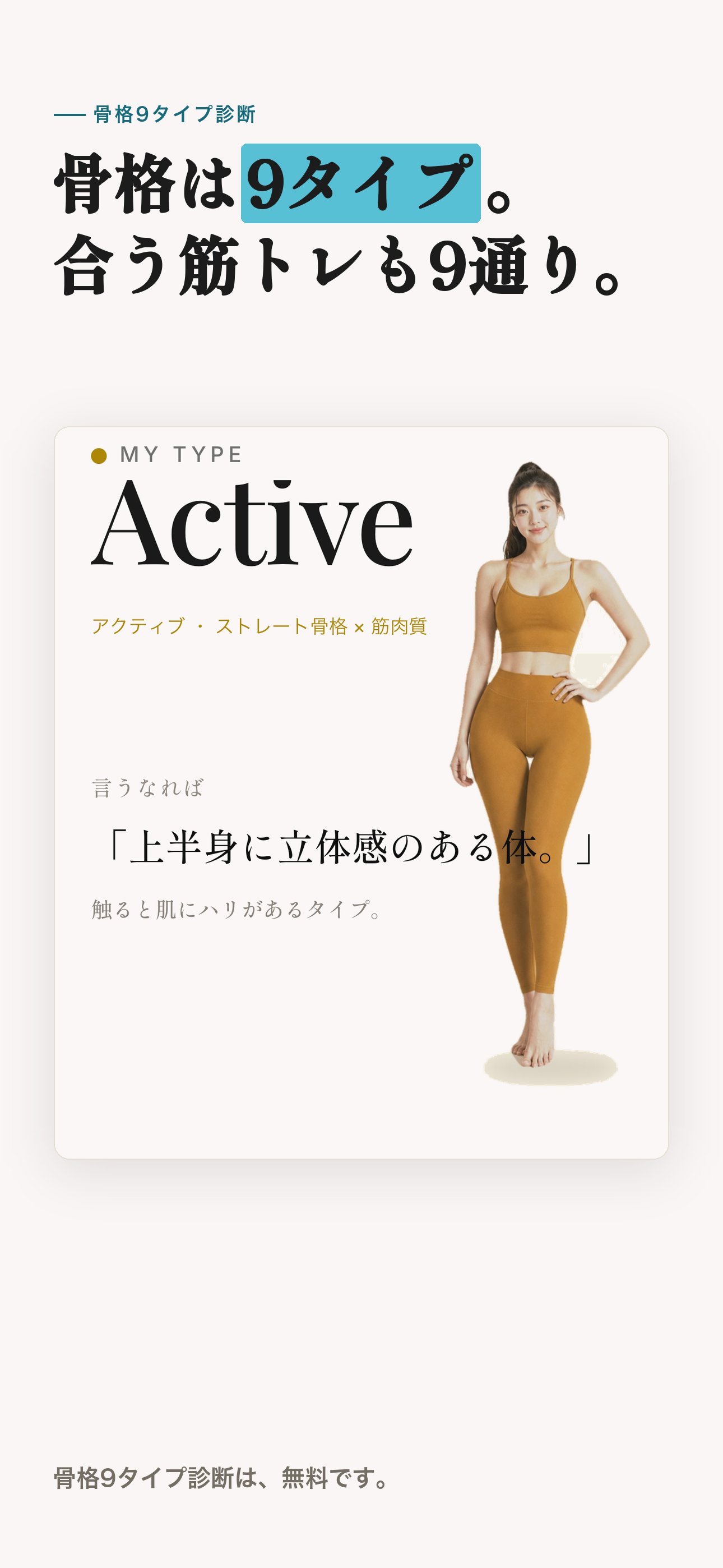
What the type is read from: collarbone, centre of gravity, wrists. Things you can check in a mirror. No photos.
-
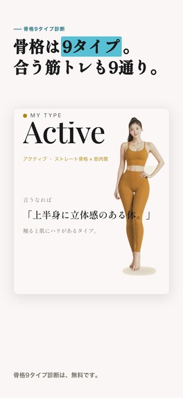
The result: one of nine body-frame types, with the reasoning. A styling framework, not a medical assessment.
-
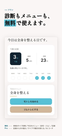
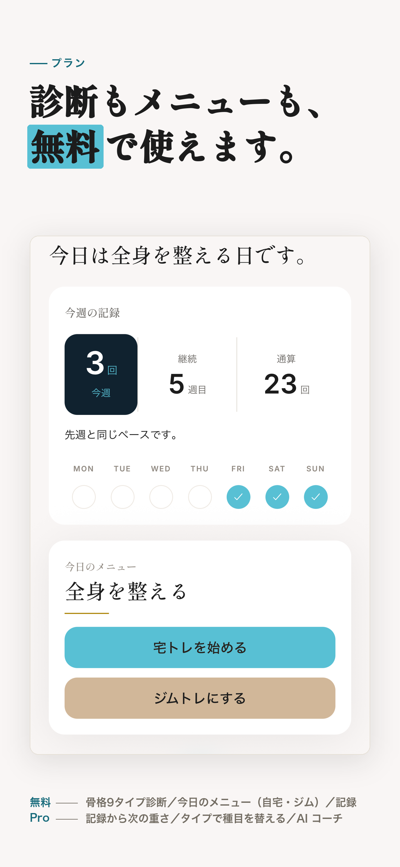
Home. One card for the week, one for today. No score, no percentage, nothing that says you failed.
-

App icon, 1024 × 1024, uncropped.

Inspiration
Generic workout apps hand everyone the same exercise list. But proportions differ — someone with a longer torso and shorter legs will not be comfortable at the same squat depth or bar path as someone built the opposite way. We wanted the shape of your frame to be a first-class input, not an afterthought.
The harder problem turned out to be the opposite of personalization: restraint. Early builds asked for your height and weight, then showed you a target BMI and a target weight. A tester told us what it felt like to open that screen. We removed the target figures, then removed the height and weight questions that fed them — the app does not ask any more. Completion rates, deltas against last time, personal bests and total volume lifted went the same way. Most of this project is the story of taking things away.
What it does
Mimu starts from one of 9 body-frame types, identified by a 24-question test (about 6 minutes), and builds a plan that is actually yours:
- Exercise selection per type, split by where you train (home or gym) and how much time you have today (short / normal / thorough — the minutes are set per session, not fixed).
- A per-equipment weight ladder. Dumbbells step 1 kg up to 10 kg, then 2 kg. Kettlebells offer only the sizes that physically exist — there is no 12.5 kg kettlebell. Machines move one stack plate at a time (5 kg) and never sit at zero. Barbell and cable stay at 2.5 kg, because 1.25 kg a side is the physical floor. A flat "+2.5 kg" is wrong for three of those four, and it had been quietly hiding the 2 kg and 3 kg dumbbells that are the real working range for most of the people we build for.
- A figure generated from the session in front of you — not a stock illustration. The red areas are composed from body-region coordinates, and the app decides which ones to paint by aggregating the muscles of the exercises in this session, rather than from a category label. Change the session and the figure changes with it, so it cannot light a muscle the session never touches.
- One screen for today. The home screen is two cards: this week's record, and today's plan. That is the whole surface.
After each set you tap how it felt. A hard day makes the next session lighter — automatically, and the app tells you in one line what it changed and why.
Body-frame typing is a styling framework — in Japan it is how people choose clothes, not a medical or genetic classification. Mimu treats it exactly that way: an input for choosing exercises, never a verdict about a person. Your bones do not change; how a line reads can.
One thing stated up front: the app ships in Japanese only. We did not translate it for this contest — a rushed English build would have made the product worse for the people who actually use it. Japanese-only is a focus decision, not a shortcut: the product's premise — body-frame typing before you shop — only exists in Japan today, and we would rather be exact for that market than approximate for a wider one. Instead we wrote a short guide for judges in which every step is a tap position, not a word you have to read.
How we built it
React Native / Expo (iOS), Supabase for the backend, RevenueCat for entitlements.
- The figure's highlight is composed from body-region coordinates and chosen at run time by aggregating the muscle sets of the exercises in today's session. Getting it right across 9 frame types meant solving coordinate-space transforms so the wash reads as anatomy rather than a skin-coloured blob.
- A per-equipment ladder engine replaced the old flat "+2.5 kg" progression.
- An AI coach (OpenAI) is the one genuinely AI-driven part of the app: it explains plan changes in plain language and lets you renegotiate by chatting instead of hunting for toggles. Plan generation itself is deterministic and rule-based — we are deliberate about not calling that AI.
- Haptics and motion live in single shared modules — around 90 call sites, and exactly one file in the entire codebase imports the haptics API at all. The whole app can be re-tuned in four lines.
Challenges we ran into
- Japanese typography fails silently. Naive CJK rendering falls back to the wrong glyphs or the wrong weight without throwing anything. We line-break at phrase boundaries (BudouX) and pin weights explicitly, and we verify by rendering real font files at real size — never by eye on a mock.
- Restraint is harder to ship than features. Removing the completion percentage was a bigger argument than building it.
Accomplishments that we're proud of
The day-detail screen states a working weight once per exercise and nothing else. No completion rate, no delta against last time, no personal best, no total volume. Every one of those was built, reviewed, and then deleted on purpose.
What we learned
Personalization is cheap to claim and expensive to keep honest. We shipped six static figures first, one per session category. On the full-body session they left the shoulders and upper arms unpainted while the session was full of push-ups, and painted the calves, which no exercise in it touched. One picture per category cannot be right when the contents change per person. We deleted all six and made the figure compose itself from the session instead. The moment a visual stops being derived from the real thing, it starts lying.
What's next for Mimu
Refining the adaptive ladder against real logs, and widening what the coach can renegotiate.
Built With
- expo.io
- nativewind
- openai
- postgresql
- react-native
- reanimated
- revenuecat
- supabase
- typescript
