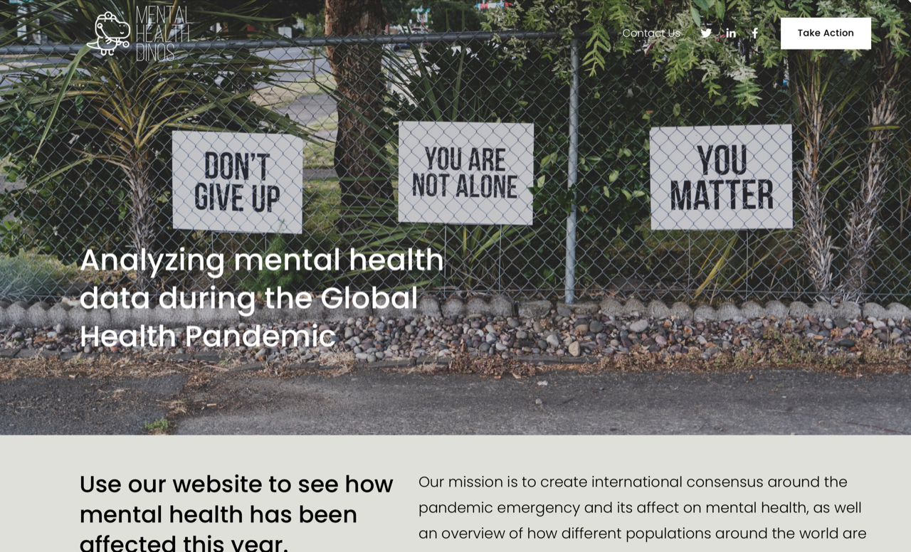
Inspiration
We were inspired to create this project because we have seen how COVID-19 has affected the mental health of many of our peers. We wanted to create a way to visualize both how common and how severe these problems are while at the same time providing resources (eg. mental health hotlines) for people to access, if needed.
What it does
Our website has a few different functionalities.
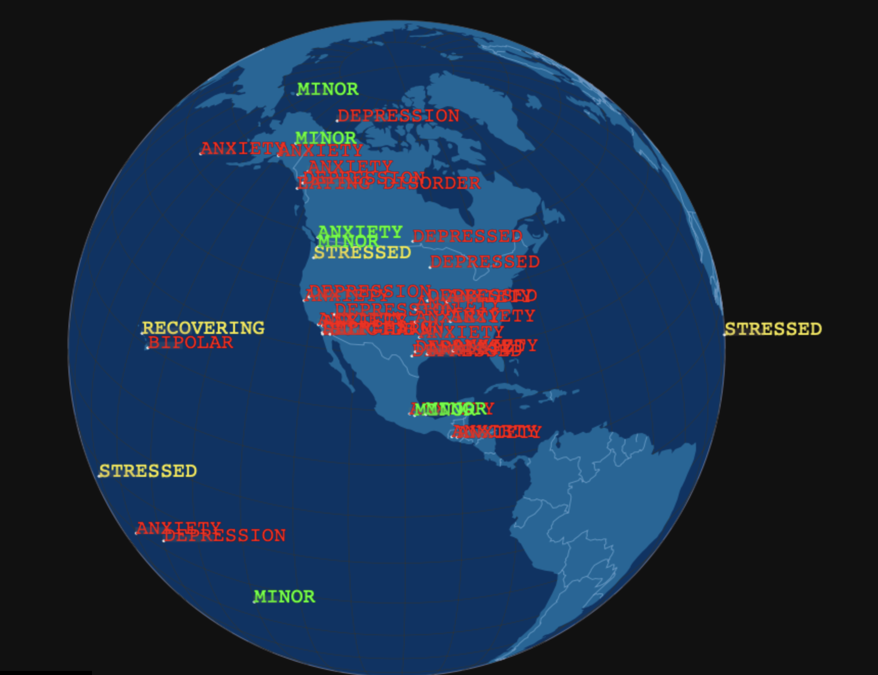
The main aspect of our website is an interactive map displaying where and how people have reported that they are being affected by mental health problems. We are using a NLP tool to analyze sentiments (aka severity of the mental health issues) of a given tweet's text (harvested with the Twitter API). This sentiment data is then plotted with the location data also harvested by Twitter's API.
We hope to later implement a feature relating to this app that would allow users to create their own maps by choosing to map given subsets of data (eg. a map only displaying user reports of "depression", or a map only displaying data collected from individuals of a certain age range or race). For example, if we were able to allow users to display maps with data collected from specified time ranges, we would be able to demonstrate how COVID-19 has affected the mental health of people globally.
Finally, we also created a section of our website dedicated solely to resources that users can access if they are currently struggling with a mental health issue. This section provides the phone numbers to local mental health hotline numbers, as well as other resources that might be beneficial to these individuals.
How we built it
We split our project into four main parts. First, we used Java to access Twitter's API for tweet collection. We were able to harvest the text of tweets themselves, along with the location (a general longitude and latitude) of these tweets. Second, we used a NLP platform to attach a given sentiment for these tweets. Next, we used sentiment analysis to map these locations along with their sentiments (For example, Red words = "sever mental health issue", while green words = "mild / moderate health issues"). Finally, we created a website to display this mapped information, along with additional resources we decided were important to include. If we had more time, we would further develop our mapping process so that users can see the prevalence of mental health issues given subsets of demographics.
Challenges we ran into
Our main issue was finding a way to integrate all of our separate tasks into one larger project, because we all used separate platforms to implement our tasks. We were able to link our map to the website, but we had to hard-code the individual data points for our sentiment analysis and maps to work. Another large challenge we ran into was harvesting the actual Twitter data. We were not very familiar with APIs in general, so we had a lot of help from our mentor Eric in figuring out to harvest data from individual tweets.
Accomplishments that we're proud of
We're very proud of the full website we were able to develop in such a short amount of time. We're also very proud of how we were able to integrate all of our individual projects into a larger project that can help people in seeing how they're not alone in dealing with mental health issues (both in general and as a result of COVID-19).
What we learned
We learned a lot from this hackathon! We learned about mapping data, collecting tweets, and sentiment analysis.
What's next for Mental Health Dino
We hope to better integrate the individual projects we worked on. We also hope to gather more data for our map, and allow users to filter certain data for the map.
WEBSITE PASSWORD: mentalhealthdinos
** Demo will be uploaded on our website too.


Log in or sign up for Devpost to join the conversation.