-
Our website

Inspiration
We wanted to have a way to compare the musical tastes of different countries and cultures, and then compare that with other social and cultural factors such as wealth, happiness, or average temperature.
What it does
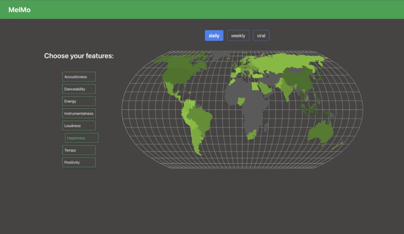
Melmo gathers data from Spotify's Weekly, Daily, and Viral playlists for each country, and averages the features of each country's favourite songs before displaying the comparison on a map. The features - with values determined by Spotify - that we used are:
- Acousticness
- Danceability
- Energy
- Instrumentalness
- Loudness
- Mode (major or minor - renamed to Happiness for user clarity)
- Tempo
- Valence (renamed to Positivity for user clarity)
How we built it
We gathered the data using Spotify's API and saved it to a Django database. This is then read and processed using the React JS.
Challenges we ran into
We found it difficult to show the tooltip when hovering over countries on the map, so we instead displayed the information we wanted to below the map.
Accomplishments that we're proud of
We were able to animate the maps such that the country lights up and the associated value shows up below the map.
What we learned
We learned to use Tailwind to create Content Style Sheets more efficiently.
What's next for MelMo
We could combine other forms of visualization for other social and economic features that could be interesting to compare

Log in or sign up for Devpost to join the conversation.