-
-
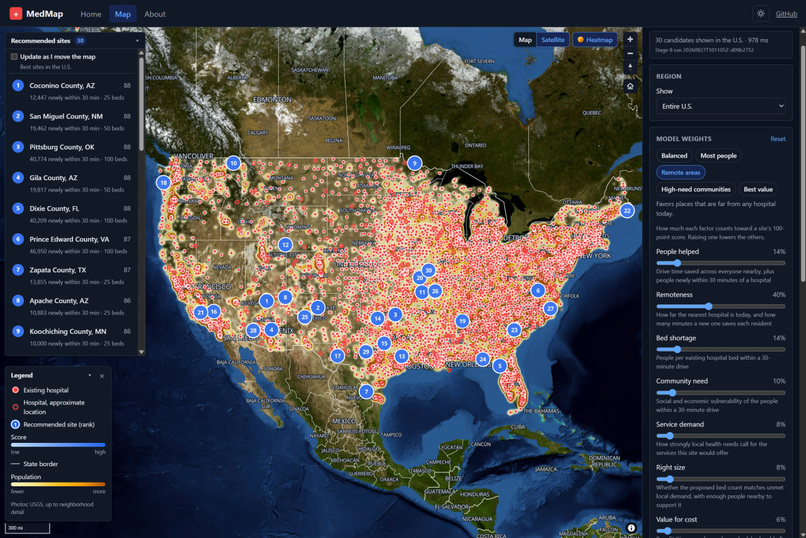
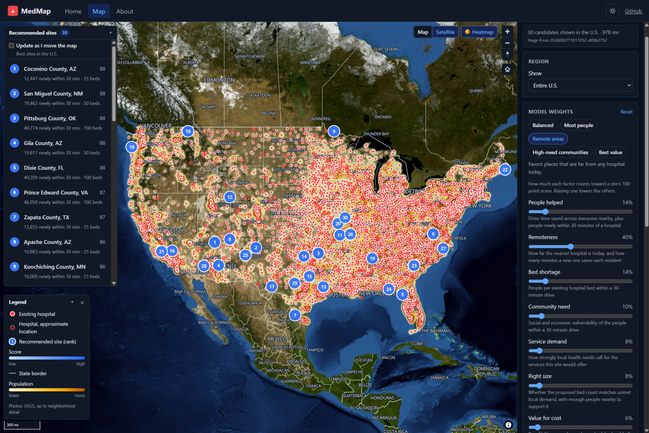
The "Remote areas" preset ranks the top 30 U.S. sites, many in the rural Southwest far from today's hospitals (red).
-
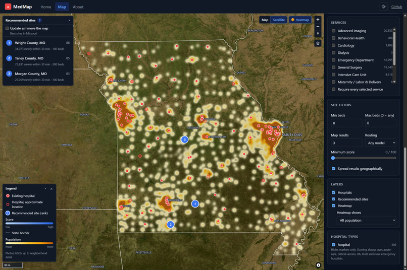
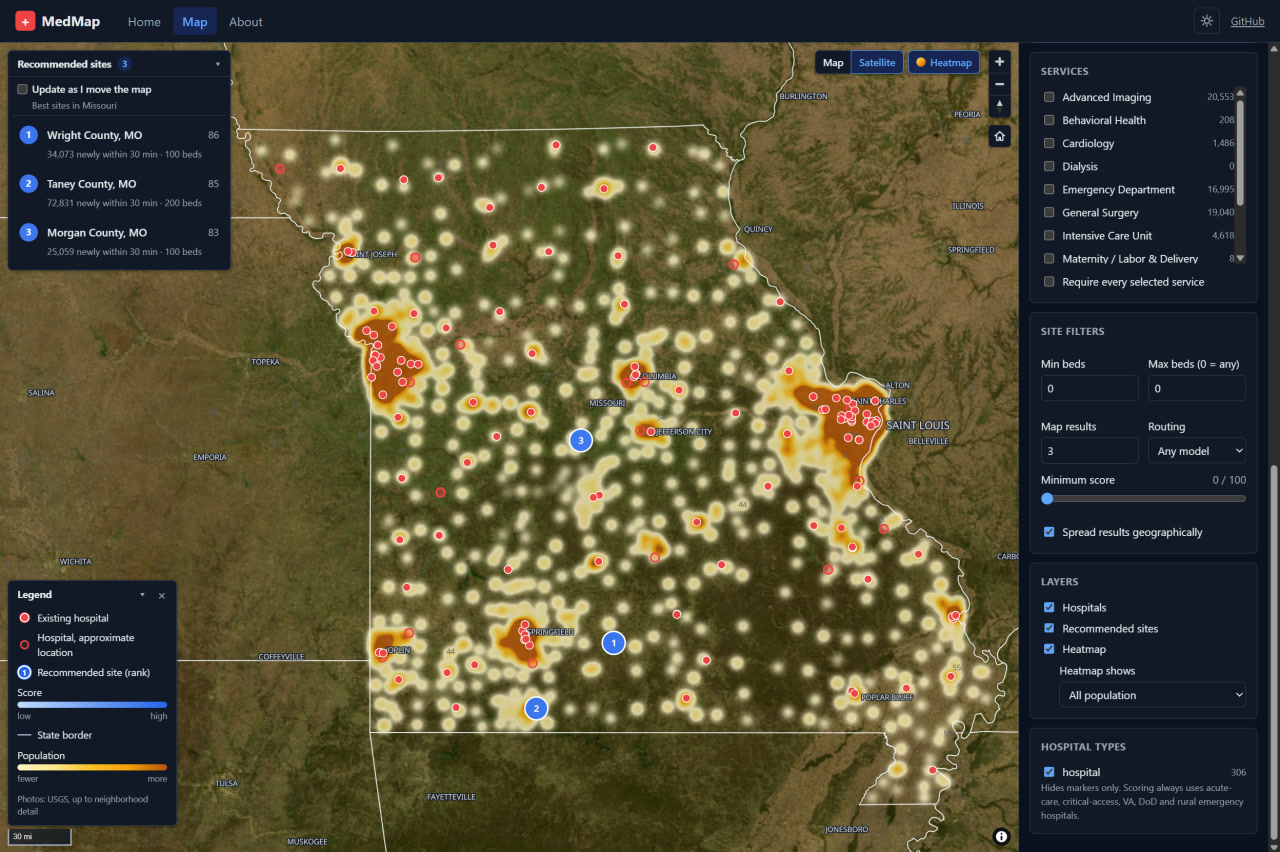
Top 3 recommended hospital sites in Missouri (blue), shown over a population heatmap and existing hospitals (red).
-
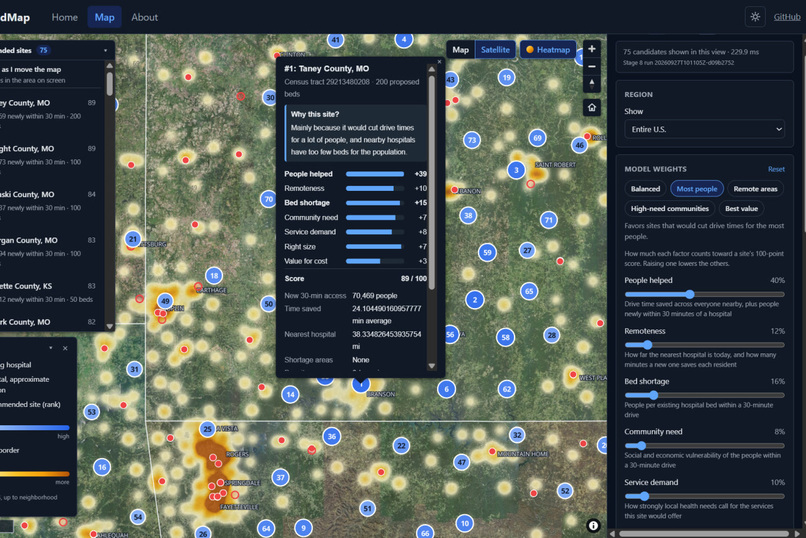
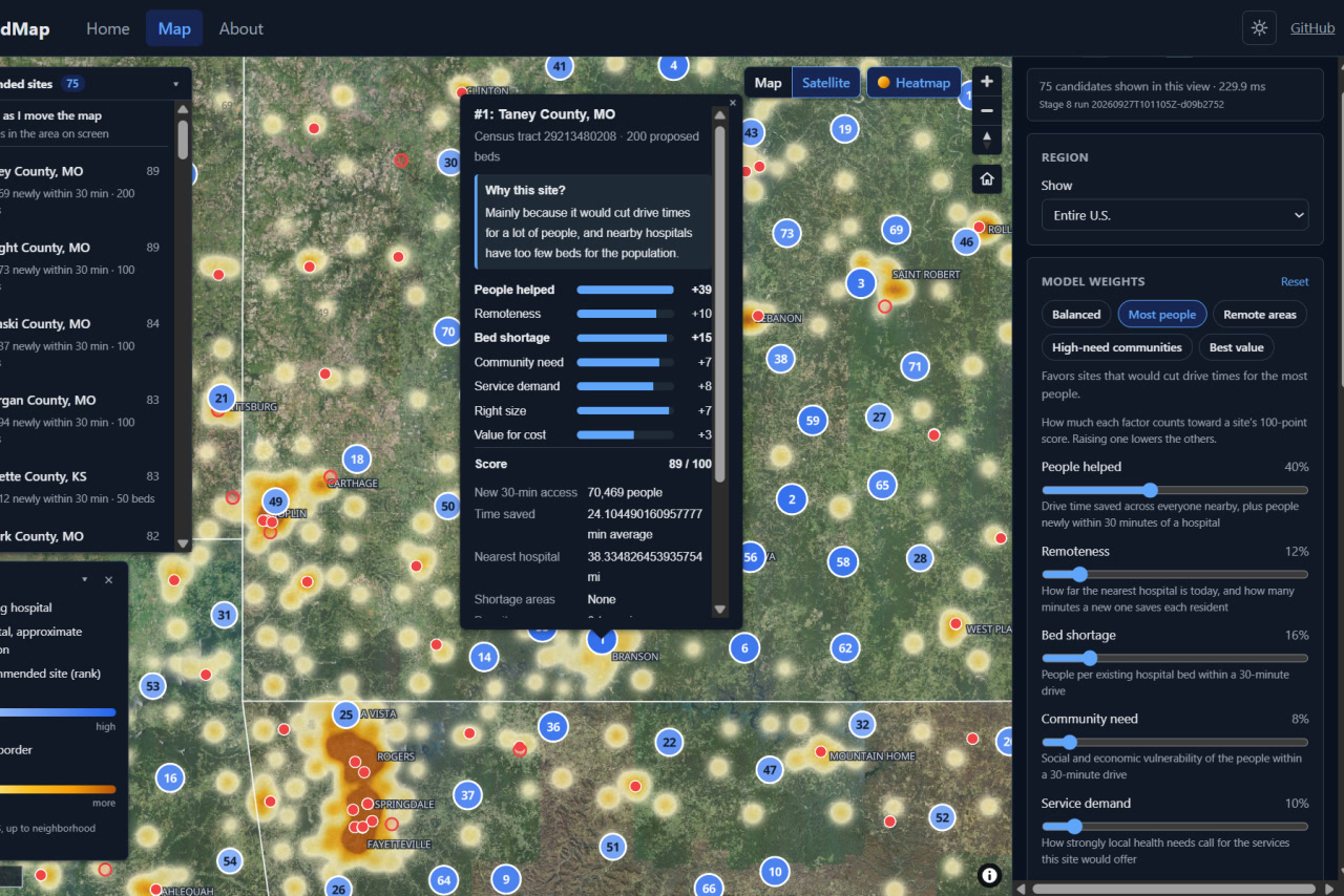
The "Most people" preset re-ranks sites on screen. #1 Taney County, MO would put 70,469 more people within 30 min of a hospital.
Inspiration
We spent the first stretch of this hackathon convinced we'd never land on an idea. Every pitch was either already built or too big to finish in a weekend. Then someone asked a simple question: if you could build one hospital anywhere in the U.S., where should it go?
None of us knew the answer. We couldn't find anyone who had answered it for the whole country using only public data. Meanwhile, rural hospitals keep closing, and millions of people live more than 30 minutes from emergency care. Those places usually have the worst health outcomes too. That became our project.
What it does
MedMap scores every census tract in the United States on how much a new hospital would help, then recommends specific sites. For each site, it shows:
- Access: estimated drive time to the nearest existing hospital, and how many people a new hospital would bring within reach
- Need: chronic disease rates, social vulnerability, and federal shortage-area designations
- Fit: a suggested bed count and the services the surrounding population most likely needs
- Why: the factors that pushed the site up the ranking, so anyone can check the reasoning
How we built it
MedMap is an eight-stage Python data pipeline feeding an interactive map:
- Raw staging: collects CMS hospital and facility registries, Census ACS demographics, CDC PLACES health measures, the CDC Social Vulnerability Index, USDA rural–urban codes, AHRF county data, and HRSA shortage areas (HPSA and MUA/P)
- Normalization: cleans and standardizes every source into consistent tables
- Geography: geocodes thousands of facilities using the Census geocoder with OpenStreetMap fallbacks, and joins everything to 2023 census tracts and counties
- ACS enrichment: adds population, income, age and insurance data
- Screening features: builds a need-and-access profile for every tract
- Candidate sites: shortlists underserved tracts and generates candidate locations, with drive times adjusted for urban and rural roads
- Optimization: scores sites on access, capacity, vulnerability, configuration fit and cost efficiency
- Final enrichment: refines drive access and recommends services for each finalist
Every stage writes a versioned, checksummed snapshot, so results can be reproduced and every number traces back to its source file. We used pandas, GeoPandas, Shapely, PyArrow and GeoParquet, and packaged the pipeline with Docker.
Challenges we ran into
- Federal data doesn't agree with itself. The same hospital shows up with different IDs, addresses and names across datasets. We chose to flag conflicts rather than silently merge records, which meant a lot of careful matching.
- Geocoding is hard. Hospital addresses often use P.O. boxes or campus names. We built fallbacks: resolving Census ties, alternate addresses under the same provider number, and name-matched OpenStreetMap hospitals.
- Boundaries change. Sources use different census vintages, so we joined only on exact identifiers and kept every unmatched record for review instead of guessing.
- Scale. Running national data through spatial overlays and drive-time estimates meant a lot of time spent on caching and parallelizing the slow steps.
Accomplishments that we're proud of
- A complete national pipeline, from raw public downloads to ranked hospital sites
- Every recommendation is explainable and traceable to public data
- The pipeline is conservative by design: it never merges records it can't justify, never invents capacity numbers, and never treats missing data as zero
What we learned
Most of the work was cleaning data, not modeling. Getting the joins, geocodes and boundaries right took far longer than the scoring. We also learned how uneven healthcare access is in the U.S., and how clearly that shows up once you put it on a map.
What's next for MedMap
- Road-network drive times in place of adjusted straight-line estimates
- Letting users adjust the weights on access, need and cost and watch the map re-rank sites
- Modeling hospital closures, to show which communities lose the most when a hospital shuts down


Log in or sign up for Devpost to join the conversation.