

Inspiration
This idea honestly came from a random thought that stuck with me, like why are medical reports so hard to understand when it’s literally about our own health. I’ve seen reports with all these numbers and terms and even I couldn’t make sense of it properly, and that just felt weird.
What it does
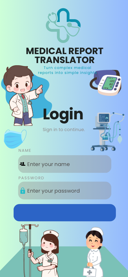
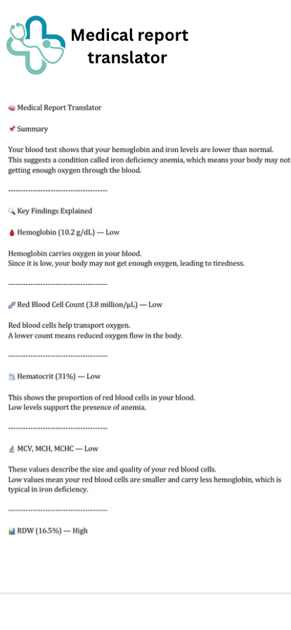
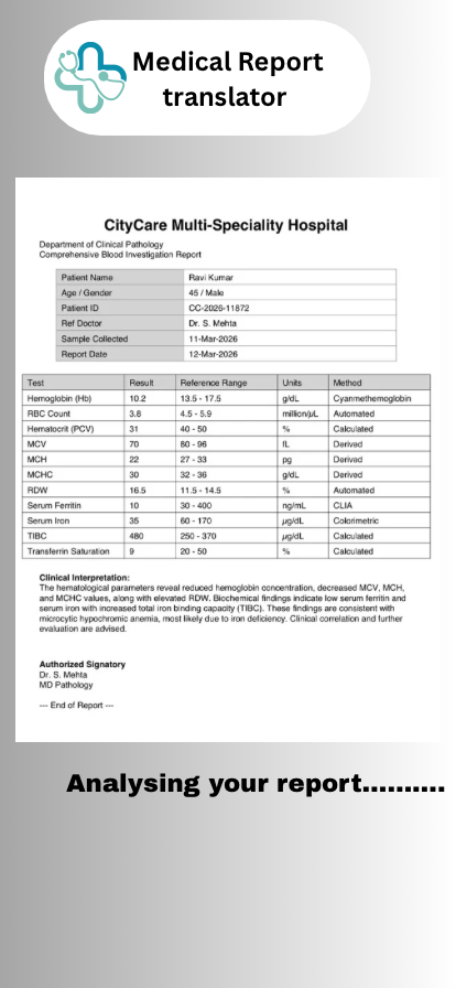
So I thought what if there was something that could just take all that complexity and explain it like a normal person would. This project takes a medical report and converts it into simple, structured insights that are easy to understand.
How we built it
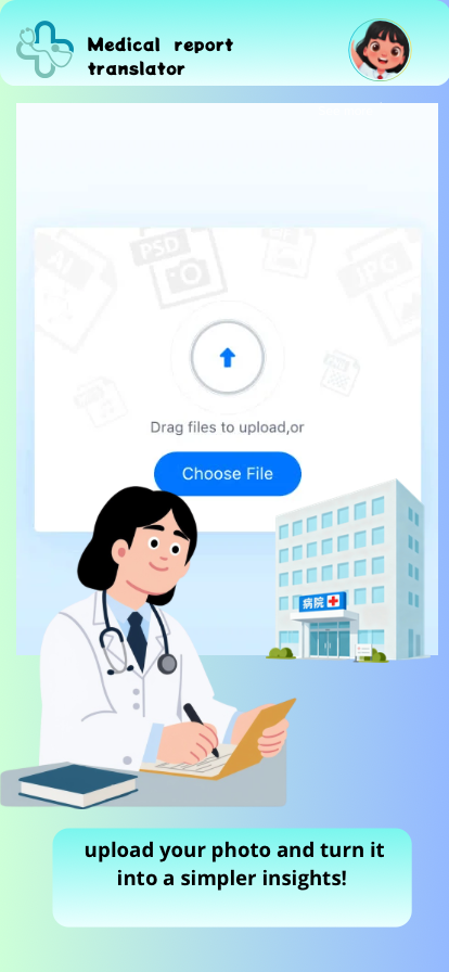
I approached this more from a UX perspective than just design. I focused on the flow uploading a report, analyzing it, and then breaking everything down into meaningful explanations instead of just raw data.
Challenges we ran into
One of the biggest challenges was managing this along with academics. I had limited time, around a week, so I had to be really focused. Another challenge was simplifying medical information without losing its actual meaning.
Accomplishments that we're proud of
I’m proud that this doesn’t just look like a design but actually feels like something useful. It takes something complex and makes it understandable.
What we learned
This project made me realize that UI/ UX is not just about visuals, it’s about making things make sense. Also, simplifying something is actually harder than making it complex.
What's next for Medical report translator
Going forward, I would like to improve accuracy, support more types of reports, and maybe even add features like multi-language explanations or voice output.
Built With
- canva


Log in or sign up for Devpost to join the conversation.