-
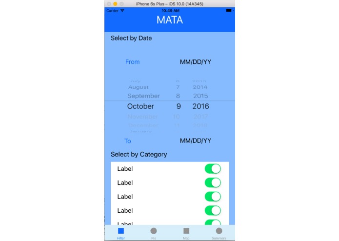
Filter Page
-
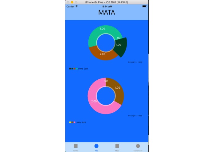
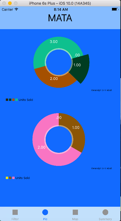
Pie Charts
-
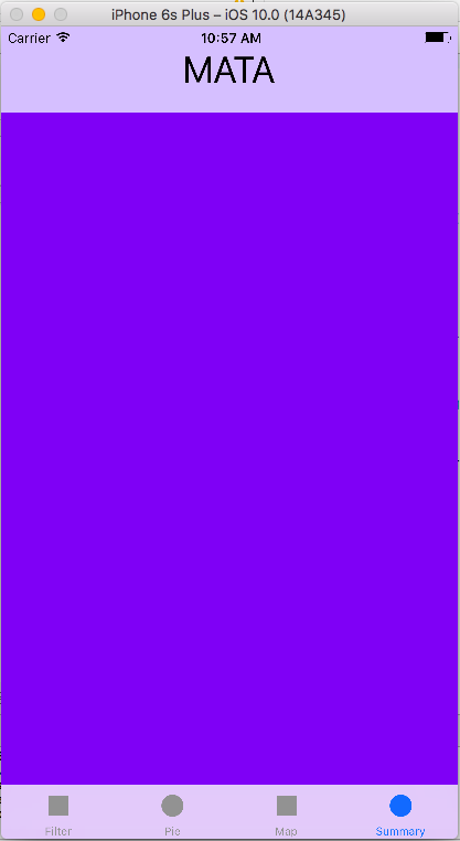
Map Page (*Still developing)

Inspiration
Inspired by Truquire, a website to visualize big data. I want to make an mobile app for it so people can easily check the data
What it does
It has a filter page to select the data that the user wants to check. Then there are some pie charts and scatter charts to visualize the data. There is also a little map to show the geographical distribution of some data (*Still working on it). Finally, there is a summary page (*Still working on it).
How I built it
Using Swift 3.0 and Xcode. iOS Chart API
Challenges I ran into
This is my first time to build an iOS Mobile App. I had a lot of troubles in setting up constrains and make the user interfaces. Another big trouble was that most tutorials and documents are using Swift 2.3, but I have Swift 3.0. There are a lot of minor differences. Unfortunately, I lost the data and codes during the middle of coding because I changed the name and path of the resource folder and deleted the original one. I had to start over again.
Accomplishments that I'm proud of
I'm still building it, but I'm really happy to see what I have now. I've learnt so much! Though the App doesn't look super fancy, it's really cute and clearly demonstrate the data.
What I learned
Swift syntax and usage. iOS Chart API. Xcode: Tab View Controller, Table View Controller, Scroll View and many other features.
What's next for Mata
Finish the rest of the App, make a logo and add more decorations and features.

Log in or sign up for Devpost to join the conversation.