-
-
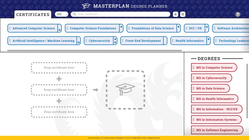
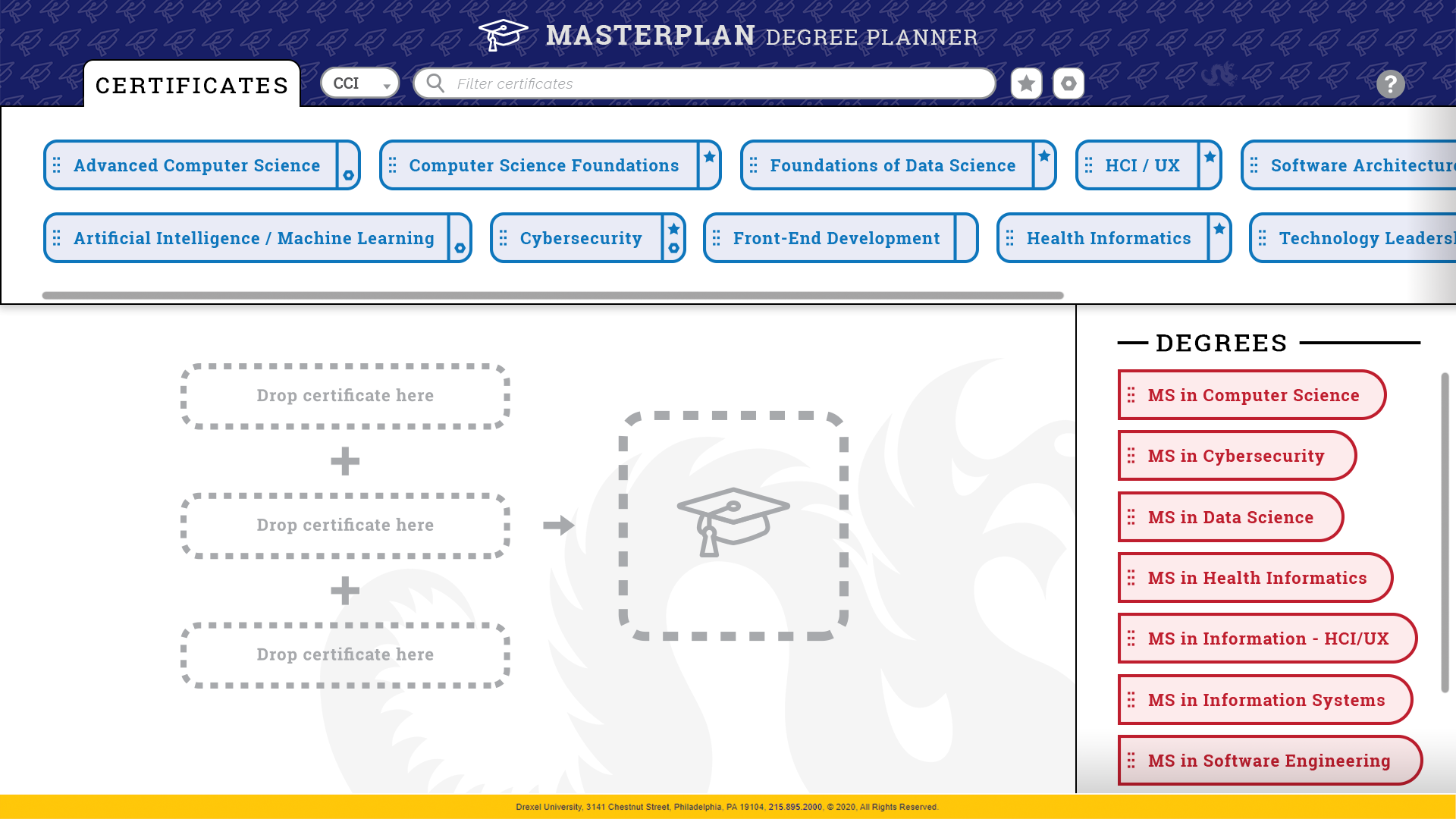
MasterPlan home screen
-
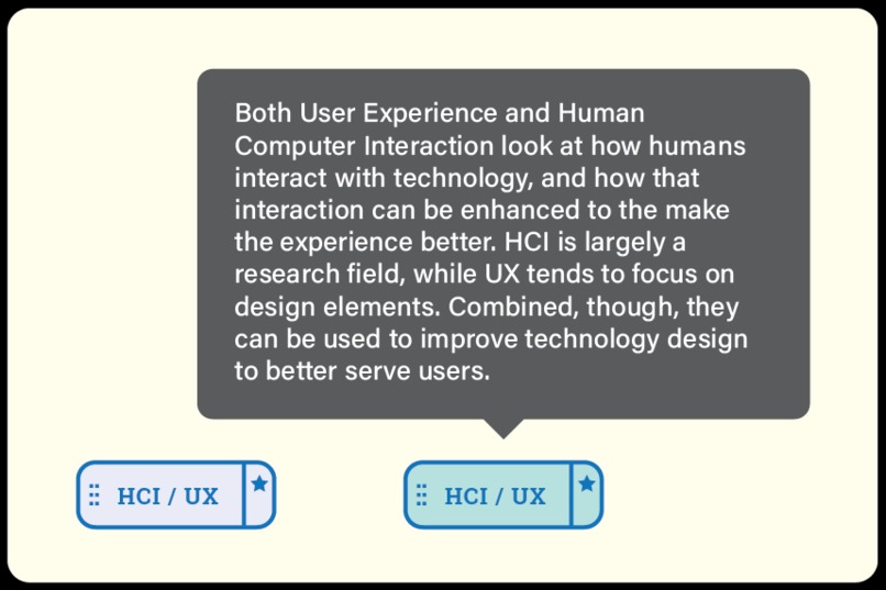
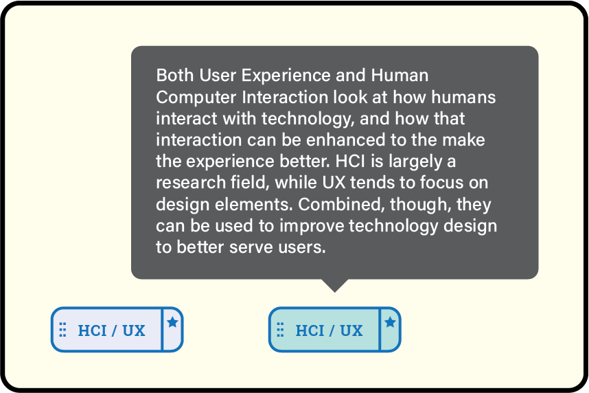
Certificate mouseover example
-
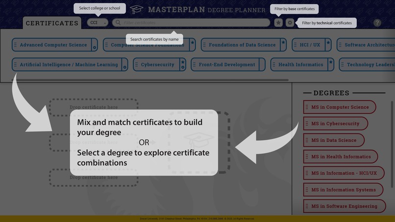
Help tooltips
-
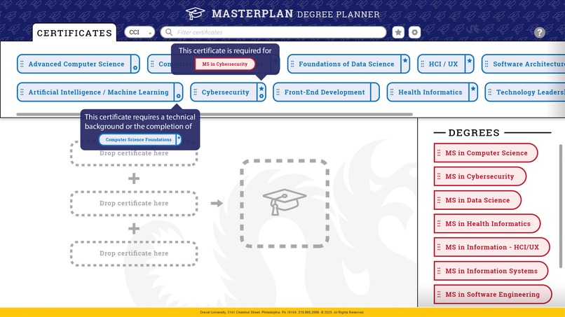
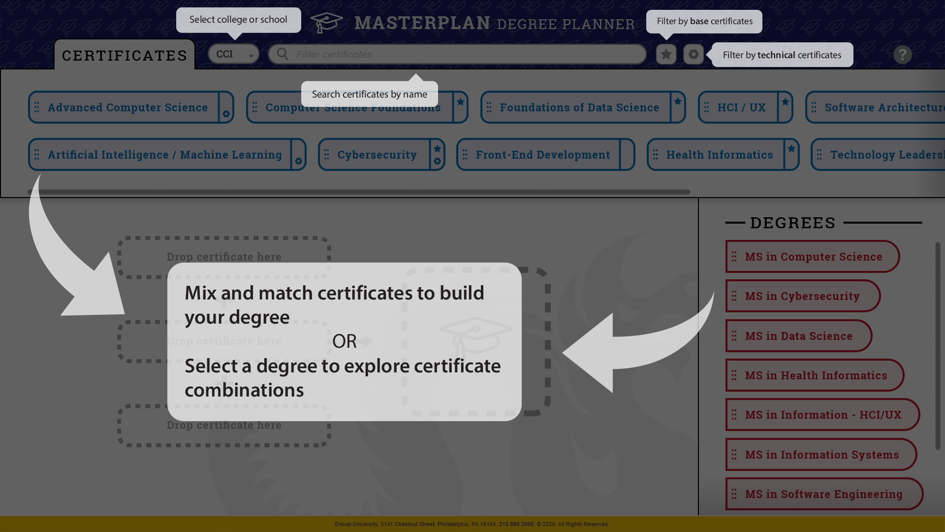
Technical and Base Tag tooltips
-
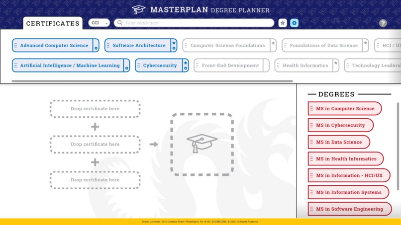
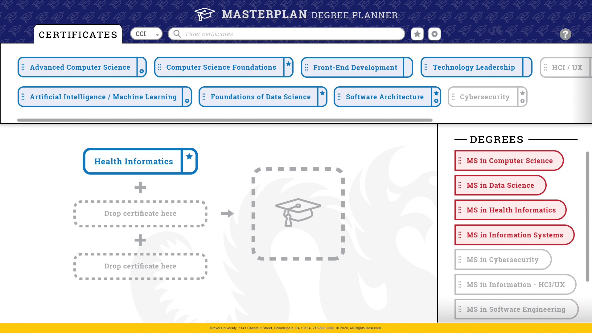
One certificate selected
-
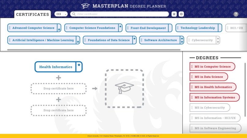
Completed degree
-
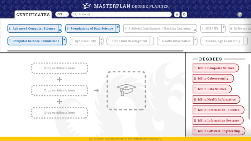
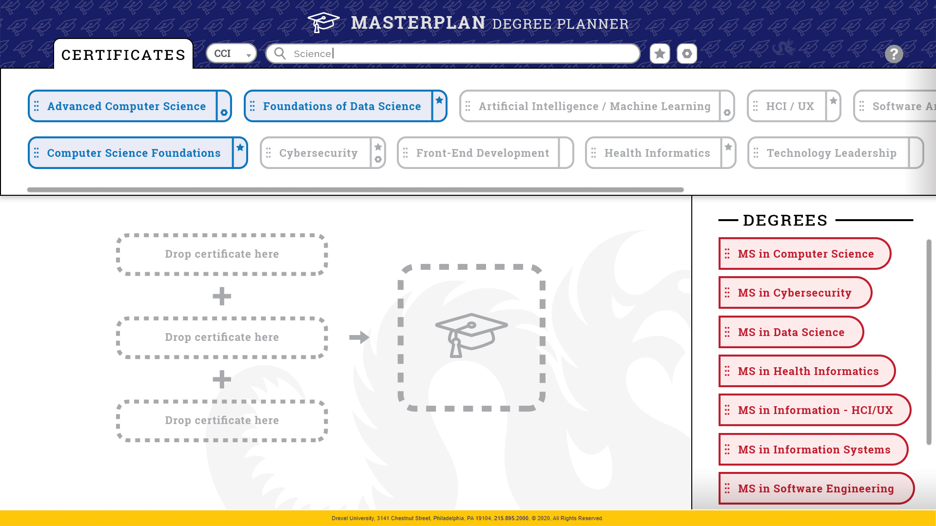
Text filter
-
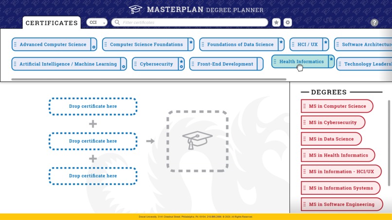
Certificate grabbed
-
Technical tag filter
-
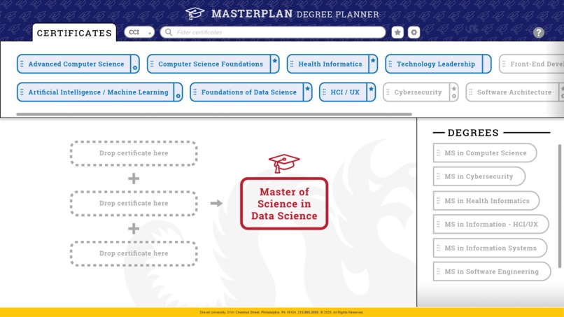
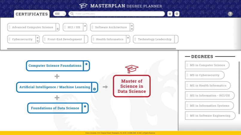
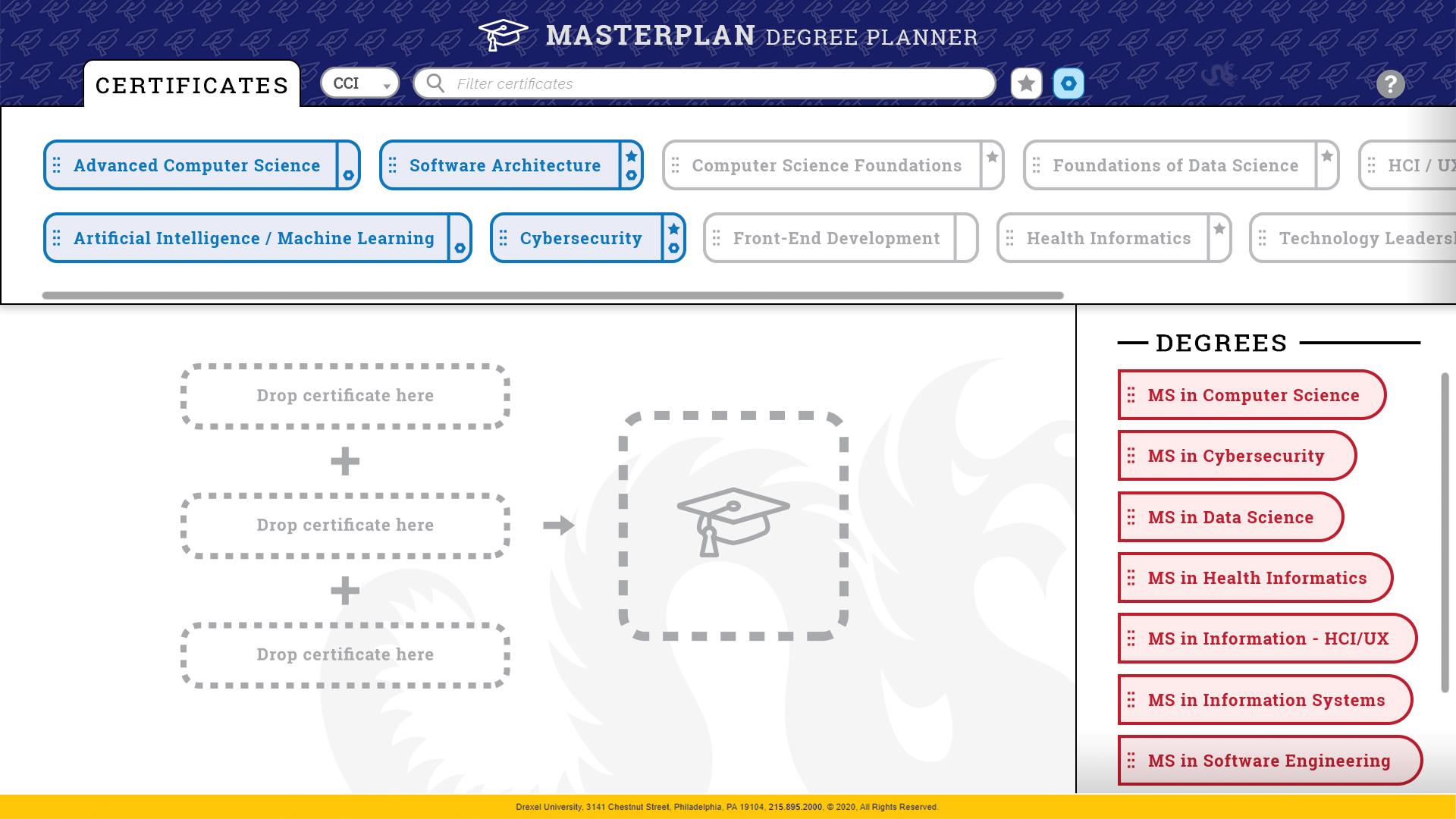
Degree selected
-

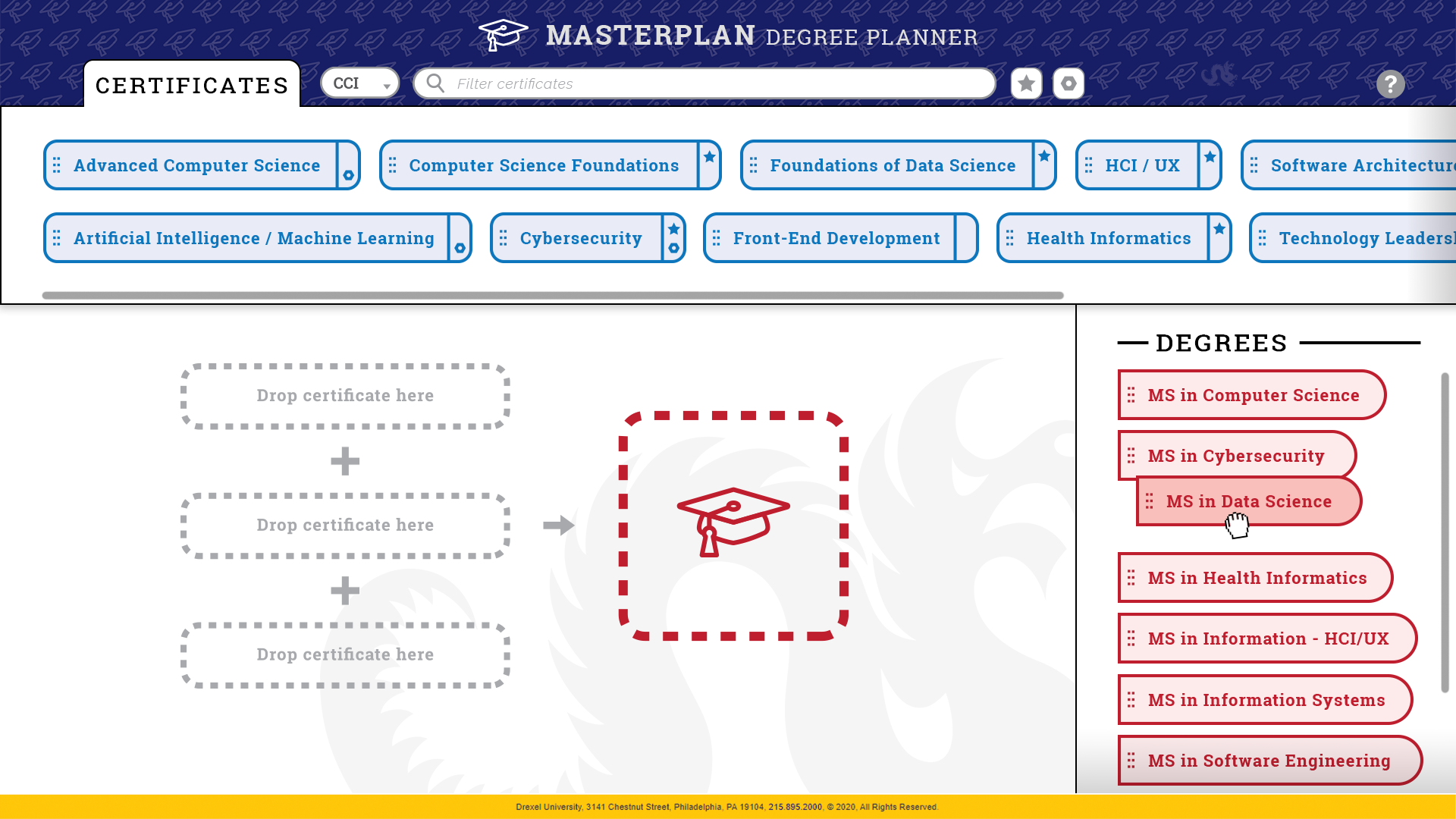
Degree grabbed
-
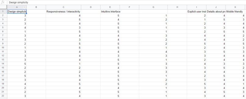
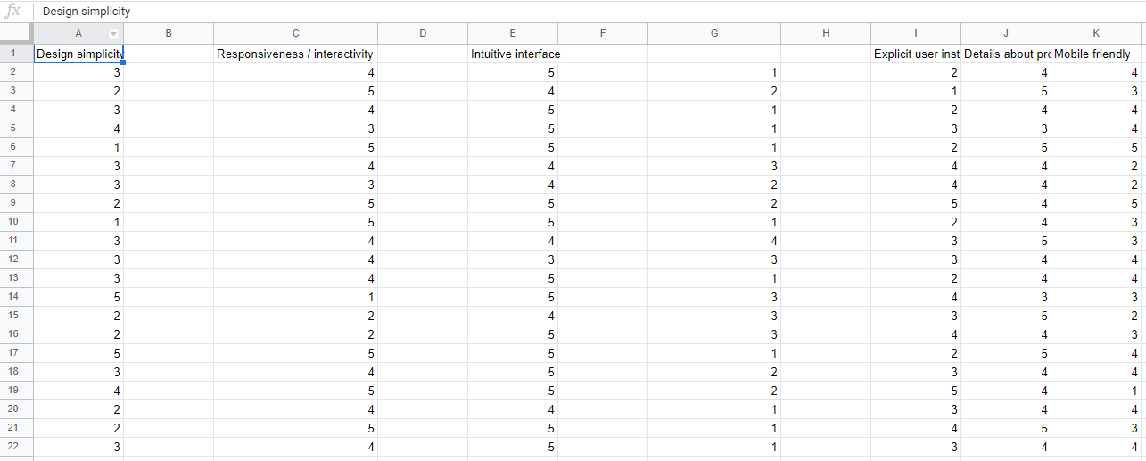
Survey responses
-

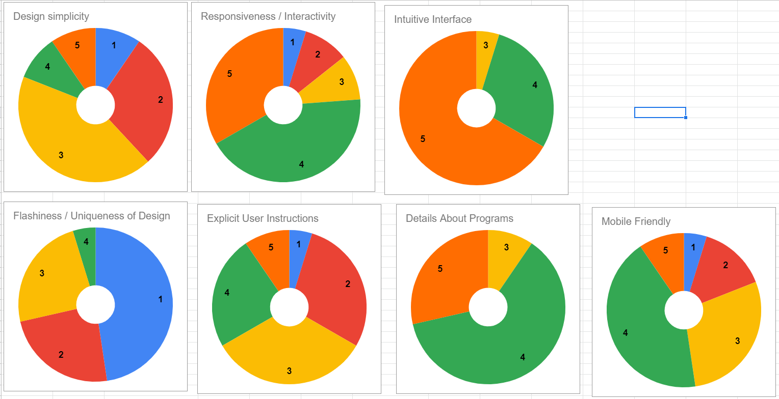
Survey response graphs


Inspiration
When we started prototyping designs for a new degree planning interface, we wanted to draw inspiration not only from existing academic websites, but different kinds of user-friendly tools that we were familiar with. We were particularly inspired by minimalist and modern applications such as Trello and Google web-apps which have demonstrated the capability to provide a lot of functionality within a minimal design framework.
What it does
MasterPlan implements a drag-n-drop interface that allows students to combine three certificates to create a degree. As certificates are added, only the compatible certificates and degrees remain available to select, which prevents confusion that may result from combining certificates that don't make a degree. This provides visual feedback as the user is interacting with the tool.
Additionally, MasterPlan allows for filtering certificates by search term or keyword, or by technical and base certificate tags. Mouseover functionality provides additional details about base certificates, technical certificates, and more information about the different certificate programs.
Watch the demo video for a detailed visual explanation!
How we built it
MasterPlan was designed with Adobe Creative Suite, with individual elements designed in Illustrator, prototype screens mocked up in Photoshop, and the demo video compiled in Premiere Pro. We used Google Forms for our user survey, which we used to gather information about what factors students wanted to see in a degree planning tool. We used Google Sheets to compile and visualize the data.
Challenges we ran into
We ran into a few challenges at different stages of the design process. Early on, one of the things that we struggled with most was figuring out what our initial designs were lacking. We wanted to be sure to include all the information that is necessary, without overwhelming the user. By placing the certificate and degree names at the forefront of the design, we were able to keep the aesthetic minimal while hiding additional information in abstracted icons and mouseover text.
We also struggled with coming up with an effective way to convey information about the different available certificate combinations. The drag-n-drop solution that we ended up with works nicely because it provides feedback to the user as they are interacting with the tool, and it works well across different devices and platforms.
Accomplishments that we're proud of
One of our proudest accomplishments was finalizing a design that appropriately abstracts a lot of information, making it user-friendly while still providing additional details about certificates, degrees, and different combinations.
We were also proud of how we organized the project and managed our time. By planning out what we would do each meeting, we were able to stay productive and not get bogged down by the work of designing, prototyping, user testing, and video demo creation.
What we learned
We learned a lot about project management over the course of designing MasterPlan. We also learned about designing tools that prioritize the user's experience. It can be hard to distance yourself from a project that you're working on and look at it objectively, but working in a team helped provide different perspectives on each of our ideas.
What's next for MasterPlan Degree Planner
We built MasterPlan with scalability in mind. Our hope is that when other schools have similar certificate programs, it will be easy to integrate those programs into the current MasterPlan framework. We're excited for you to experience MasterPlan!


Log in or sign up for Devpost to join the conversation.