-
-
Explanation of the different heatmaps
-
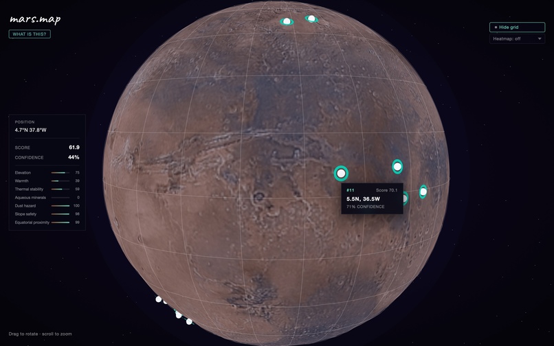
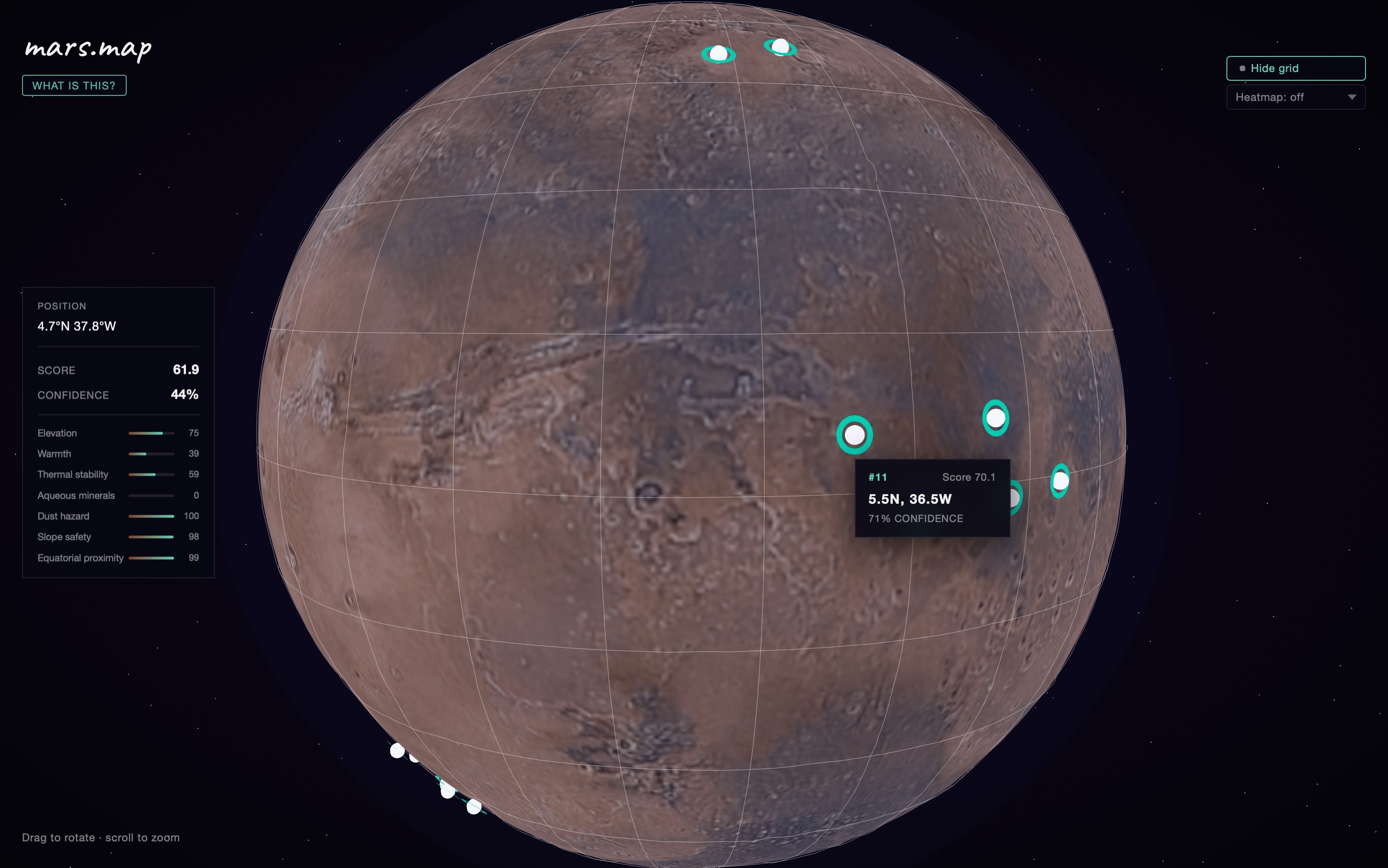
Without the heatmap
-
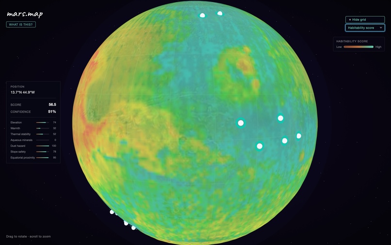
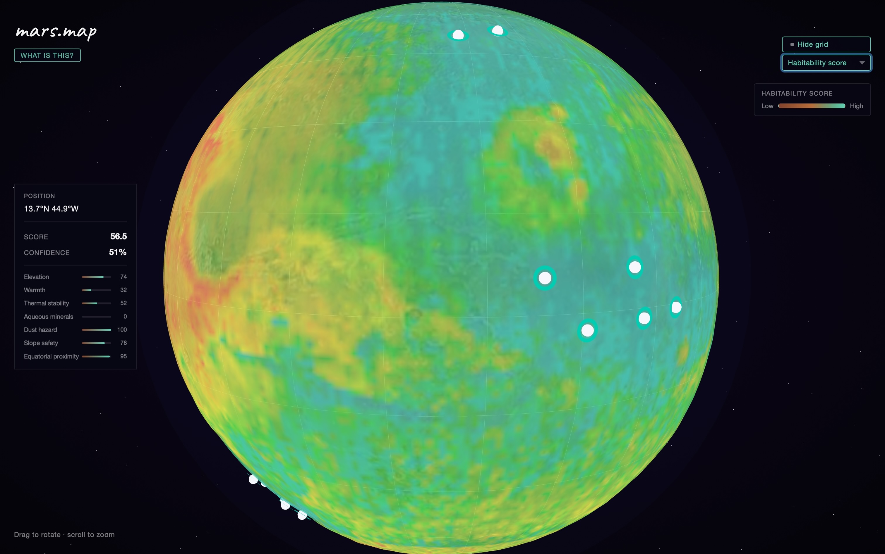
Heatmap of habitability score
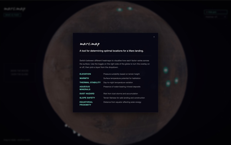
Inspiration
We were inspired by existing Mars data to provide a way to visualise it. We incorporated the on-theme idea of being at the brink of modern space travel, where this information would need to be easily accessed by large amounts of users who would be looking to land on Mars.
What it does
mars.map lets you explore Mars surface habitability through an interactive 3D globe. It pulls real NASA orbital datasets and combines them into a single score across seven factors — elevation, surface warmth, thermal stability, water mineral presence, dust hazard, slope safety, and distance from the poles. Hover anywhere on the planet and you get an instant breakdown of that location. The top candidate sites are ranked automatically. The goal is to make planetary data accessible without needing to dig through raw science archives.
How we built it
The backend is a Python pipeline that downloads raw PDS files directly from NASA's data archives: MOLA topography, TES albedo and thermal inertia, and mineral abundance maps from ASU. It normalizes everything onto a shared 1°×1° global grid and computes the habitability scores, then writes the result to a single JSON file. The frontend is React and TypeScript using Three.js for the 3D globe rendering. The processed JSON gets bundled as a static asset so the whole thing runs in the browser with no backend required at runtime.
Challenges we ran into
The raw NASA files are in formats designed for scientific software like PDS images and ENVI hyperspectral cubes, not web apps. Writing parsers for these from scratch was tedious. The thermal inertia dataset also only covers roughly 60°N to 50°S, which meant cells outside that range had to be handled carefully so they didn't produce misleading scores. Getting all the datasets onto the same grid resolution without introducing artifacts took several iterations.
Accomplishments that we're proud of
The pipeline pulls from real NASA archives end to end with no manual steps. The confidence layer is something we're particularly happy with — it's honest about where the data is incomplete rather than presenting a false sense of accuracy. The interface went from raw science data to something a non-expert can immediately understand and navigate.
What we learned
How NASA actually structures and publishes planetary data, and how much work goes into just getting it into a usable format. We also learned that making complex data simple is mostly a design problem the hard part isn't the algorithm, it's deciding what to show and what to hide.
What's next for mars-map
Finer resolution data where it's available, particularly HiRISE and CTX imagery for specific regions. Adding Moon support since the same approach applies directly. A way to adjust the weighting yourself so you can prioritize different factors depending on the mission type. Longer term, as more orbital data becomes available from commercial missions, a live data pipeline rather than a snapshot.
Built With
- beautifulsoup4
- fastapi
- nasa-pds
- numpy
- python
- react
- three.js
- typescript
- uvicorn
- vite

Log in or sign up for Devpost to join the conversation.