-
-
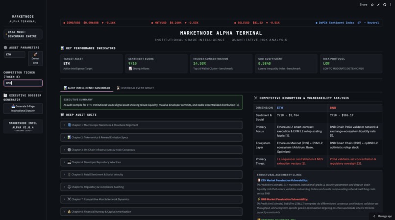
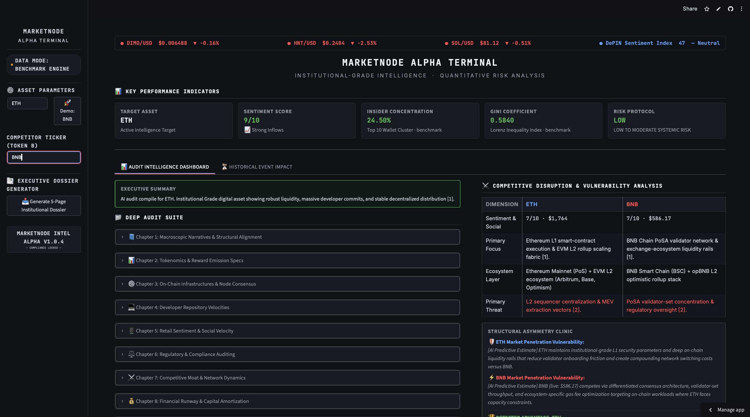
Main dashboard layout with a quick overview of token metrics and a side-by-side comparison tab.
-
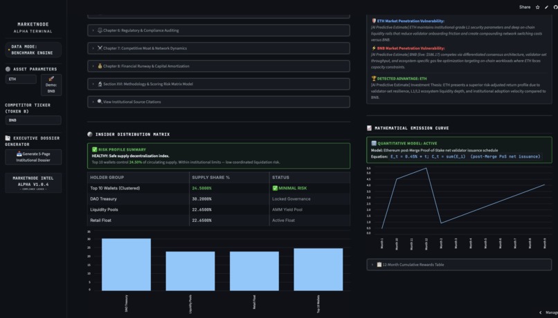
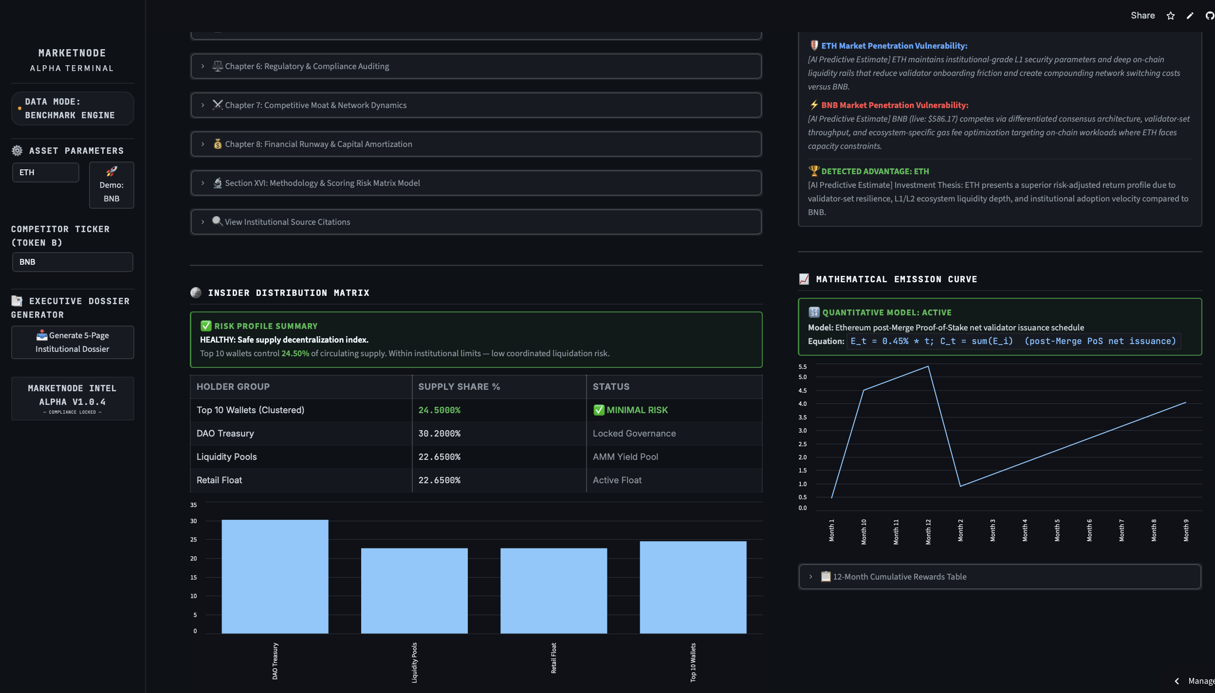
Wallet holder breakdown table and a chart tracking token rewards over time.
-
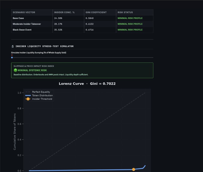
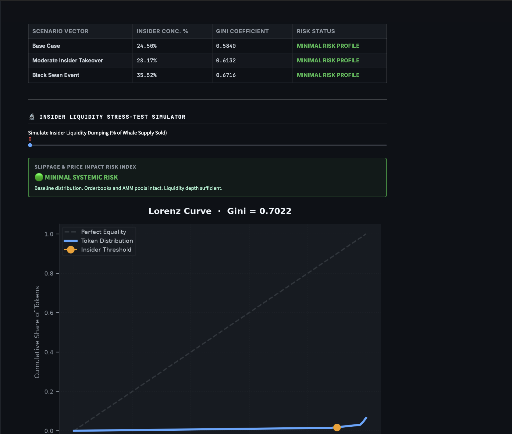
The Lorenz Curve plot showing the calculated Gini coefficient for wallet distribution.
-
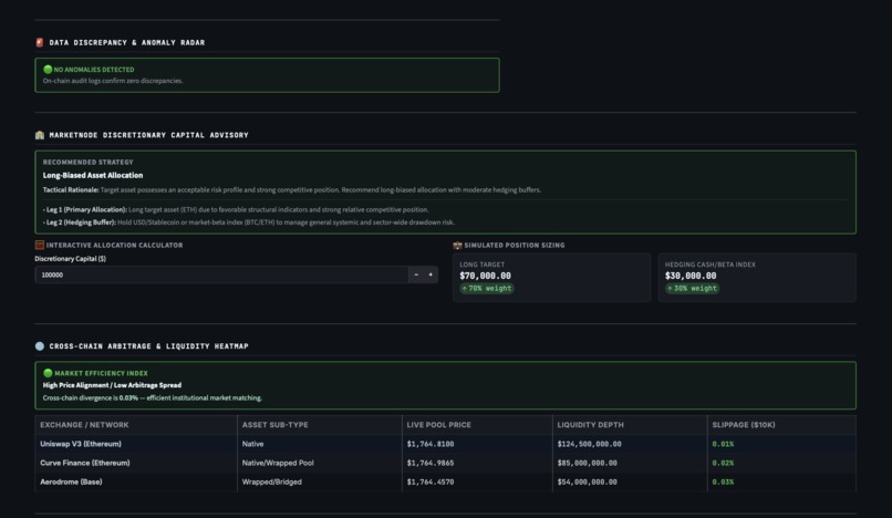
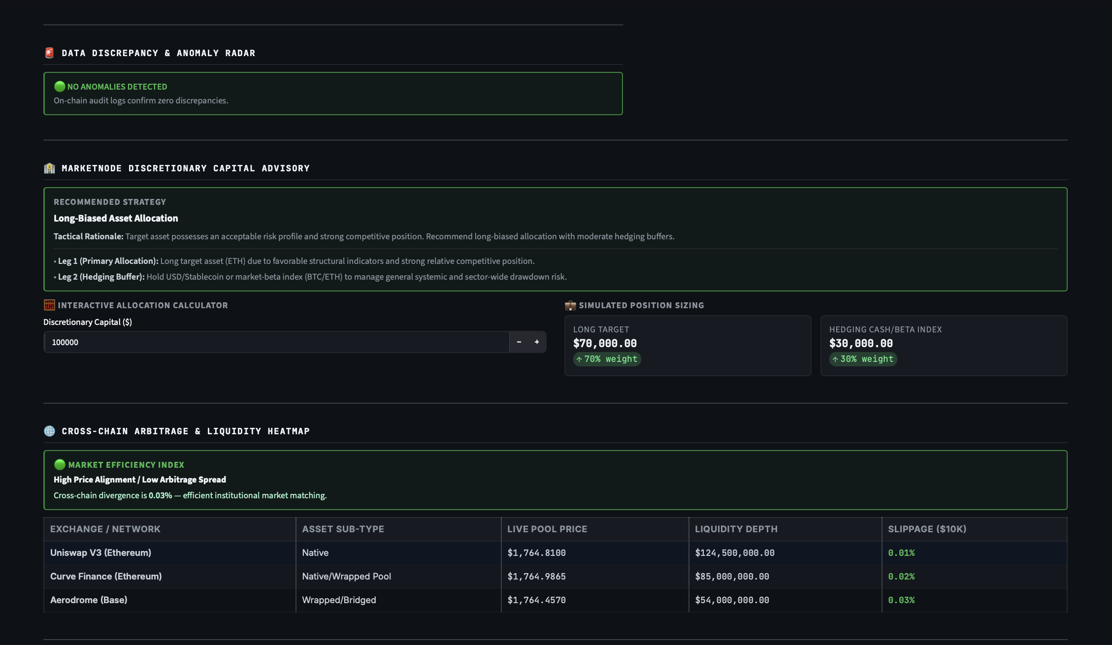
Position sizing input controls and a dynamic liquidity table across different exchanges.
-
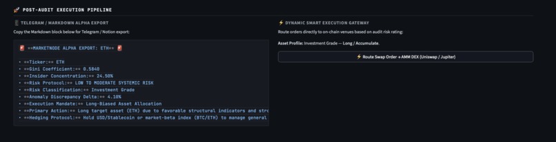
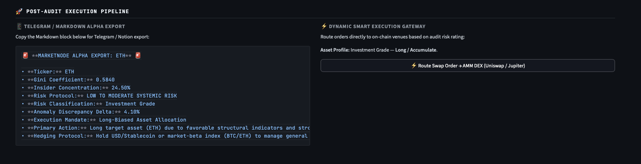
The generated Markdown summary text, ready to be copied into Telegram or Notion.
-
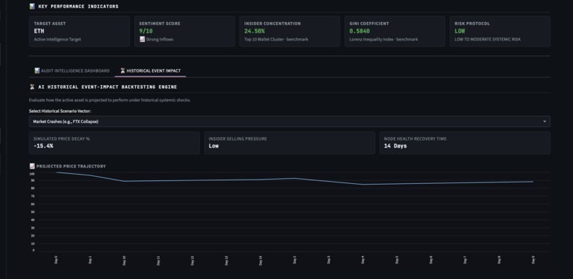
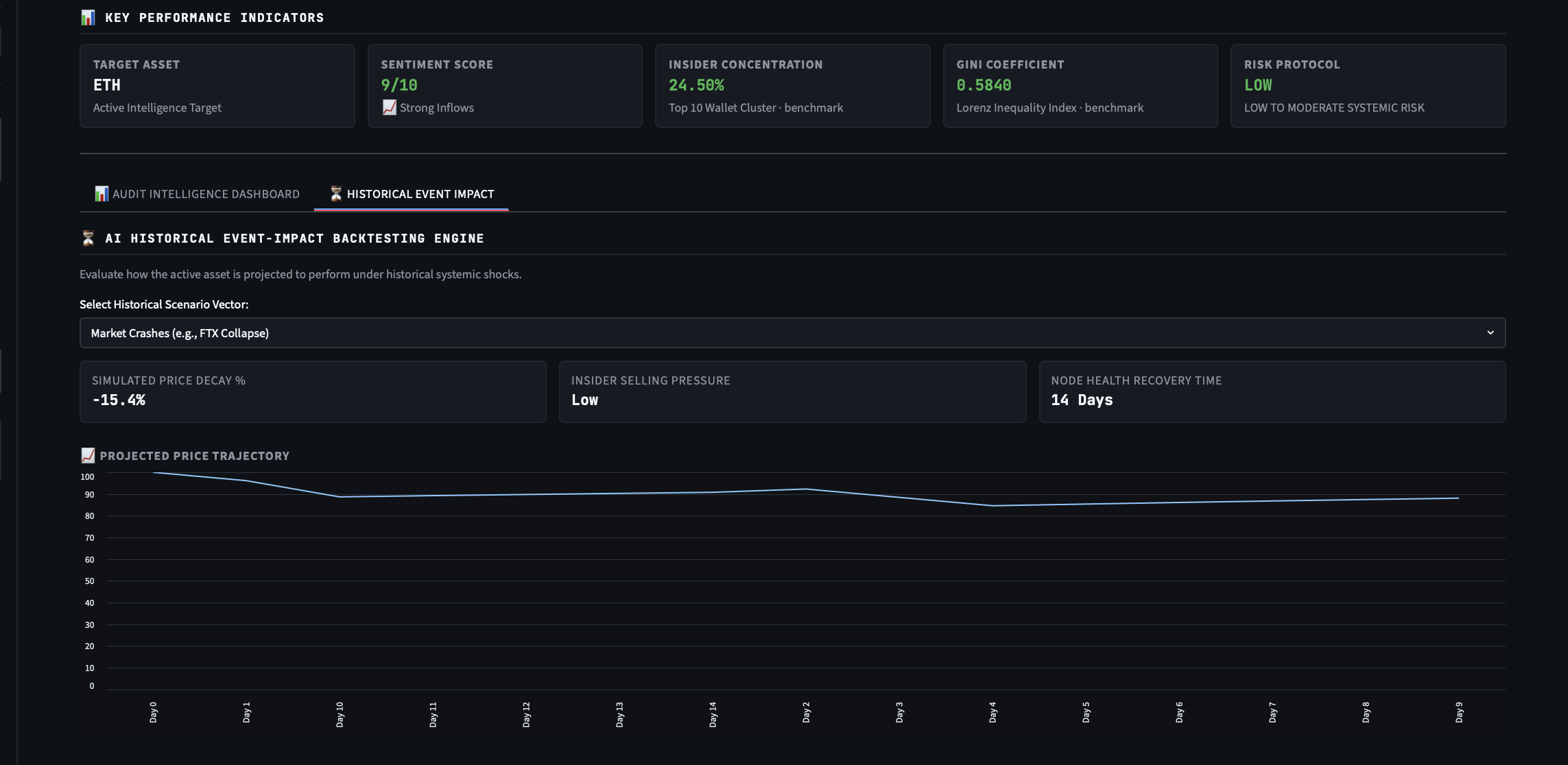
Historical shock simulation screen, showing price drops and estimated recovery days.
Inspiration
The inspiration for this project came from personal frustration. While working on my own crypto tools and researching different tokens, I realized how broken and fragmented the whole analysis process is. Every time I wanted to check a project, I had to jump between a dozen different tabs: looking at charts on one site, manually checking top holder addresses on a block explorer to see if insiders were dominating, and searching for recent news elsewhere.
It was a tedious, manual routine that wasted a lot of time. I wanted to build a straightforward tool to fix my own workflow, a simple terminal where you type in a ticker and let a unified Python script do the heavy lifting: fetch the data, run the math on supply distribution, and wrap it all into a clean, readable PDF report.
What it does
MarketNode is a modular analytical terminal designed to automate the initial research and due diligence phase for crypto assets. When you input a ticker, the system processes the asset across several practical vectors:
- Supply Concentration Analytics: The terminal analyzes top holder metrics to calculate how the token supply is actually distributed among wallets.
- Liquidity Stress-Test Simulation: It tracks localized pool depths to simulate what happens to the price and slippage, if major whales decide to dump their tokens.
- Ecosystem Shock Modeling: Processes historical price decay to estimate how fast an asset typically recovers after sharp market drops.
- Automated Report Generation: Natively compiles all generated charts, tables, and text summaries into a structured 5-page PDF dossier that is easy to read and share.
The Mathematical Core
Instead of just showing basic numbers, the terminal uses formal statistical metrics directly inside the calculations.py module to analyze token centralization.
1. Token Wealth Distribution (Gini Coefficient)
To accurately measure supply centralization, I implemented the discrete Gini Coefficient. For a sorted array of token holdings per address, the coefficient is calculated using the formula:
$$G = \frac{\sum_{i=1}^{n} \sum_{j=1}^{n} |y_i - y_j|}{2n \sum_{i=1}^{n} y_i}$$
This distribution is plotted as a Lorenz Curve, showing the gap between perfect equality and actual token ownership. A coefficient close to 1 clearly flags high centralization risk.
2. Whale Slippage & Price Impact Matrix
To model liquidity depth, the system estimates execution slippage across pools by applying the constant product formula showing the immediate price impact of an adversarial token liquidation.
How I built it
The project is built entirely in Python, utilizing a modular, decoupled architecture where each file handles one specific job:
UI & Viewport(ui_components.py): Built using Streamlit, styled with a clean, high-density dark theme inspired by Bloomberg layouts to keep data scannable.
Math Core (calculations.py): The algorithmic heart that runs the discrete Gini matrix loops, maps Lorenz matrices, and simulates pool depletion.
Data Pipelines (api.py, scraper.py): Handles connection to external data sources, endpoint resolutions, and scraping qualitative text metrics.
AI Synthesis (llm_service.py): Ingests the raw numbers calculated by the math core and uses an LLM to translate them into a structured narrative risk brief.
PDF Engine (report_generator.py): Uses native ReportLab flowables to dynamically assemble the final tables, Plotly charts, and text summaries into a clean 5-page PDF document.
Challenges I ran into
The main challenge I faced was making the mathematical plotting code work seamlessly with dynamic PDF generation. Ensuring that the Lorenz curves and data tables rendered perfectly inside native ReportLab layouts without breaking layout boundaries or clipping pages required constant tweaking. I also spent a lot of time on defensive engineering inside the API modules to ensure that incorrect user inputs or API timeouts wouldn't crash the entire system layout.
Accomplishments that I'm proud of
I am proud of building a fully functional, end-to-end tool with a clean interface that solves a real operational problem. Combining raw financial math (like the Gini distribution) with LLM automation to output a concrete, generated product, a structured 5-page PDF - was a huge milestone for me.
What I learned
This project emphasized the value of strict separation of concerns. By keeping the analytical math completely isolated from the web scraping scripts and UI code, debugging became incredibly easy, allowing me to update individual features without breaking other parts of the system.
What's next for MarketNode
The next step on my roadmap is to add real-time multi-chain telemetry, expand the stress-test simulations to support dynamic concentrated liquidity ranges (like Uniswap v3), and automate developer commit scraping directly from public GitHub repositories.


Log in or sign up for Devpost to join the conversation.