💡 Inspiration
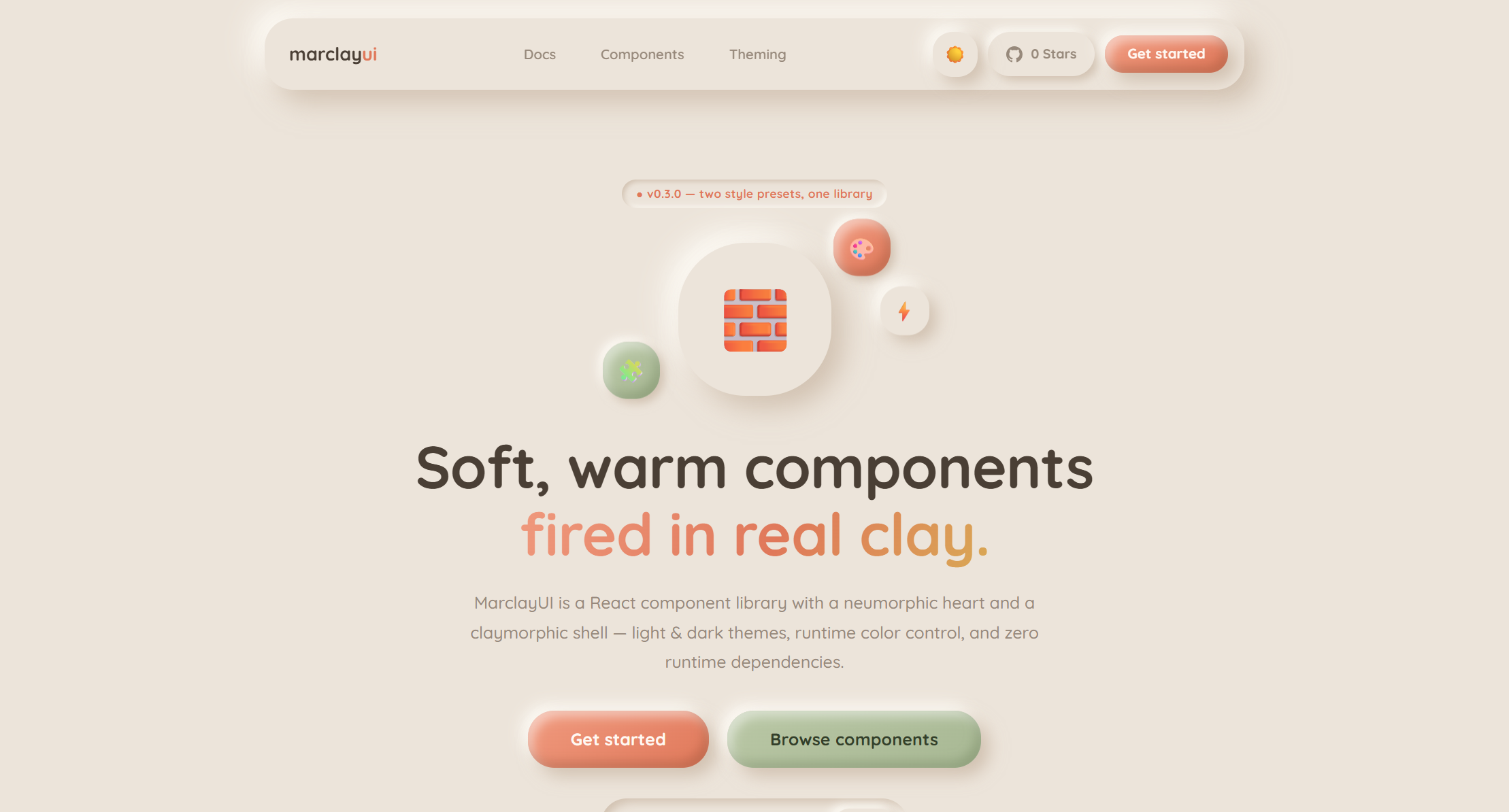
Modern web design has become incredibly efficient, but sometimes it feels a bit too flat, rigid, and reliant on the same utility frameworks. We wanted to bring tactility, warmth, and a sense of playfulness back to digital interfaces. A few years ago, Neumorphism introduced soft, extruded UI elements, but it often struggled with accessibility and contrast. Recently, Claymorphism emerged, adding beautiful 3D depth, inner light, and softer, fluffier shapes. We decided to bridge the gap between the two. Our inspiration was to create a design system that feels like soft, warm components fired in real clay—creating a tactile digital experience that is both visually stunning and highly usable.
⚙️ What it does
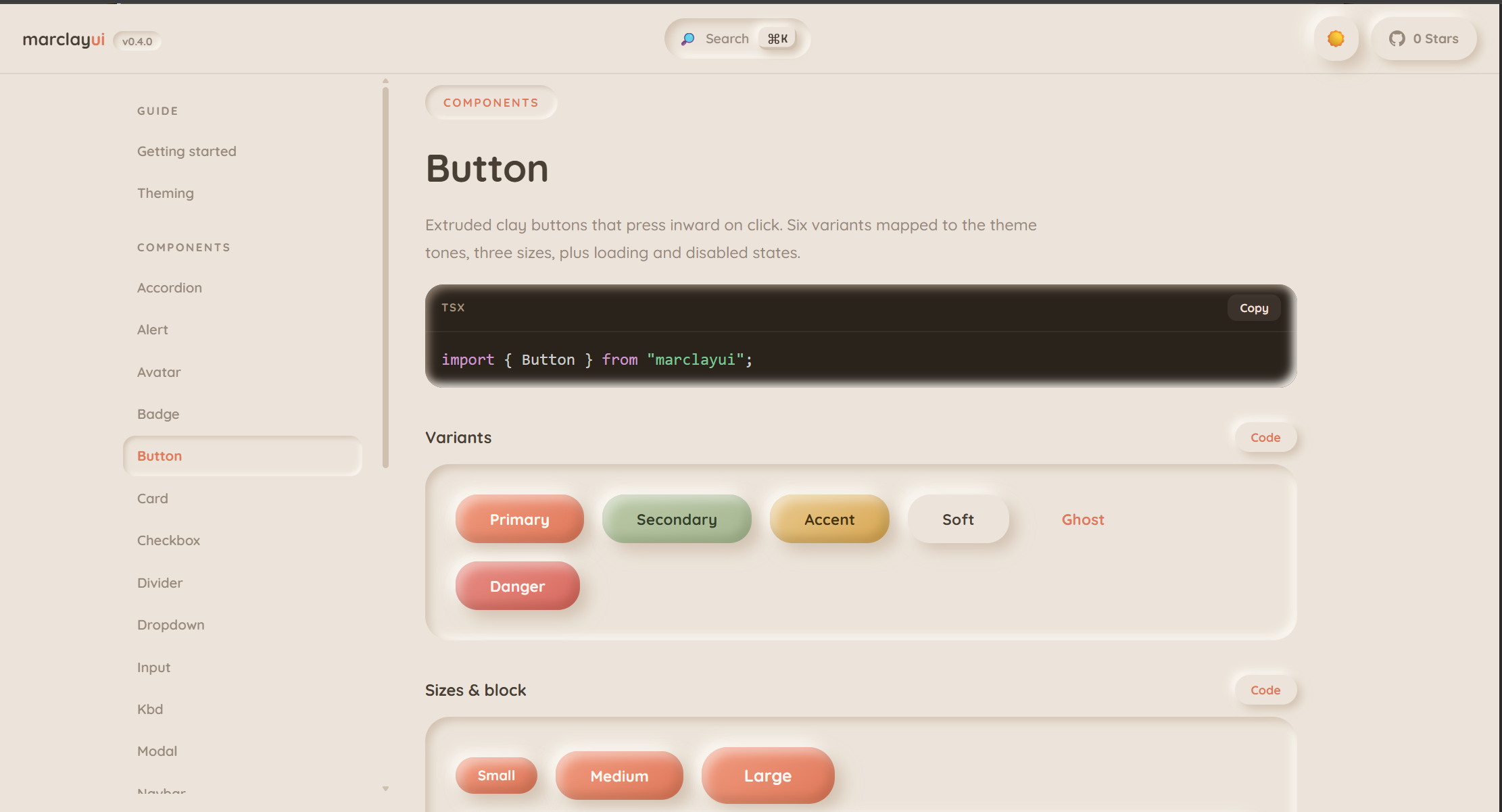
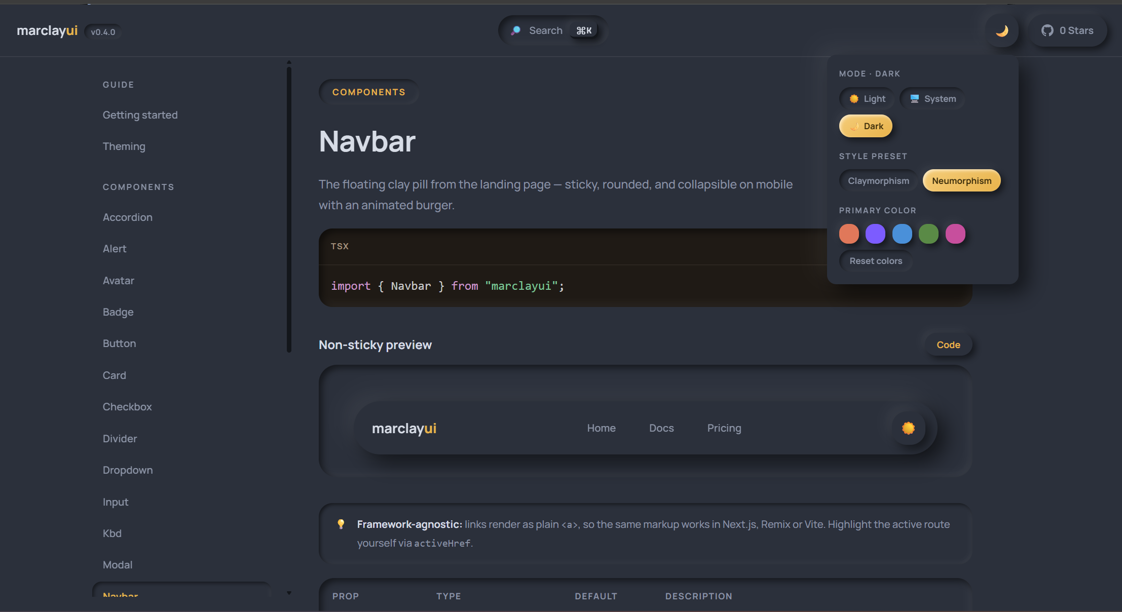
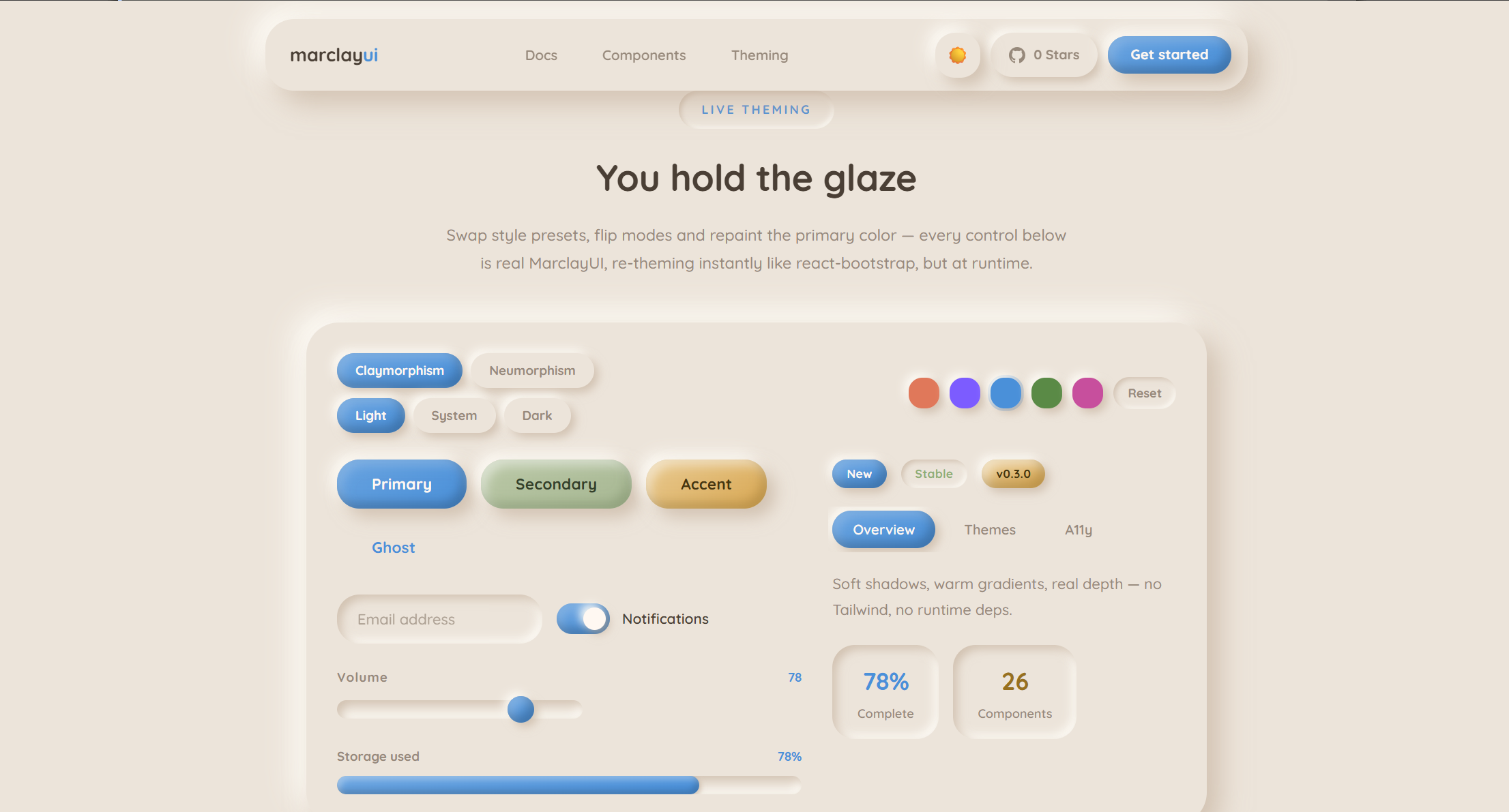
MarclayUI is a fully-featured, zero-dependency React component library. It provides developers with 26 production-ready components—ranging from buttons and inputs to complex modals, dropdowns, and toast notifications. Beyond just providing components, it acts as a complete design engine. It features a powerful runtime theming system that allows developers to instantly change the primary, secondary, and background colors of their app on the fly. Because of how we engineered the styles, updating a single base color automatically recalculates the complex inner glows, clay dropshadows, and neumorphic inset shadows perfectly across both Light and Dark modes.
🛠️ How we built it
We built MarclayUI from the ground up using React, TypeScript, and pure CSS variables. We intentionally avoided Tailwind and heavy CSS-in-JS runtimes to keep the library incredibly lightweight and fast. We set the project up as a monorepo workspace: The Core Engine (ui/): The npm package itself, containing the highly-typed React components and a deeply mapped CSS variable system (--mcl-primary, --mcl-clay-p, etc.) to handle the intricate dual-shadows required for claymorphism. The Documentation Site (src/): A sleek, interactive web app built with Next.js (App Router). This site acts as a live playground, demonstrating the instant runtime theming and showcasing every component's layout and micro-interactions.
🚧 Challenges we ran into
Creating the illusion of "clay" using CSS is incredibly difficult if you want it to be dynamic. The Shadow Math: Neumorphism and Claymorphism rely on complex layered box-shadows (combining inset highlights and multiple drop shadows). Ensuring these shadows adapted beautifully when a user injected a custom hex code at runtime was a massive mathematical and CSS architecture challenge. Accessibility vs. Aesthetics: Soft UI trends notoriously suffer from poor contrast. We spent hours tweaking the depth, focus rings, and active states to ensure that keyboard users and visually impaired users could still easily navigate the interface. Monorepo Bundling: Configuring tsup and Next.js Turbopack to correctly bundle and hot-reload our local package during development took a lot of debugging.
🏆 Accomplishments that we're proud of
Zero Runtime Dependencies: We achieved a beautiful, rich design system using only React and native CSS. 26 Fully Sculpted Components: We didn't just stop at buttons; we built a comprehensive, everyday UI kit that developers can actually use to build full applications. The "Magic" Theming Engine: Watching the entire Next.js documentation site instantly repaint its clay gradients and shadows the moment you pick a new color from the live playground feels like pure magic.
📚 What we learned
Building MarclayUI was a masterclass in advanced CSS architecture. We learned how to push CSS variables to their absolute limits to create dynamic 3D lighting effects. We also learned a great deal about the intricacies of open-source package development, from structuring a monorepo to generating strict TypeScript definition files for seamless developer experience. Most importantly, we learned how vital micro-interactions—like a button visually "squishing" inward when clicked—are to creating an engaging user experience.
🚀 What's next for MarclayUI: Soft UI library for React
This hackathon is just the beginning. Our next steps include: Expanding the Kit: Adding more complex data-display components like advanced Tables, Date Pickers, and interactive Charts styled in claymorphism. Theme Builder Dashboard: Creating a dedicated web interface where designers can visually tweak shadow spread, curve radius, and light intensity, then instantly export the CSS tokens. Open Source Growth: We want to grow the community and see what kind of friendly, beautiful, and creative web applications developers can sculpt using our clay.
Built With
- css
- css3
- frontend
- next.js
- npm
- react.js
- typescript
- ui-design
- ux-design

Log in or sign up for Devpost to join the conversation.