Inspiration
Chicago publishes every crime report since 2001 - over 8.5 million records, freely available. But the data portal is a spreadsheet. It tells you nothing about whether your block is getting safer, what time to avoid the parking garage, or whether the trend you heard about on the news actually applies to your neighborhood.
We wanted to build the thing that should have been built on top of that data a long time ago: a citizen-facing intelligence tool that takes 10 years of crime history and turns it into a briefing you can act on in the next 10 minutes.
What it does
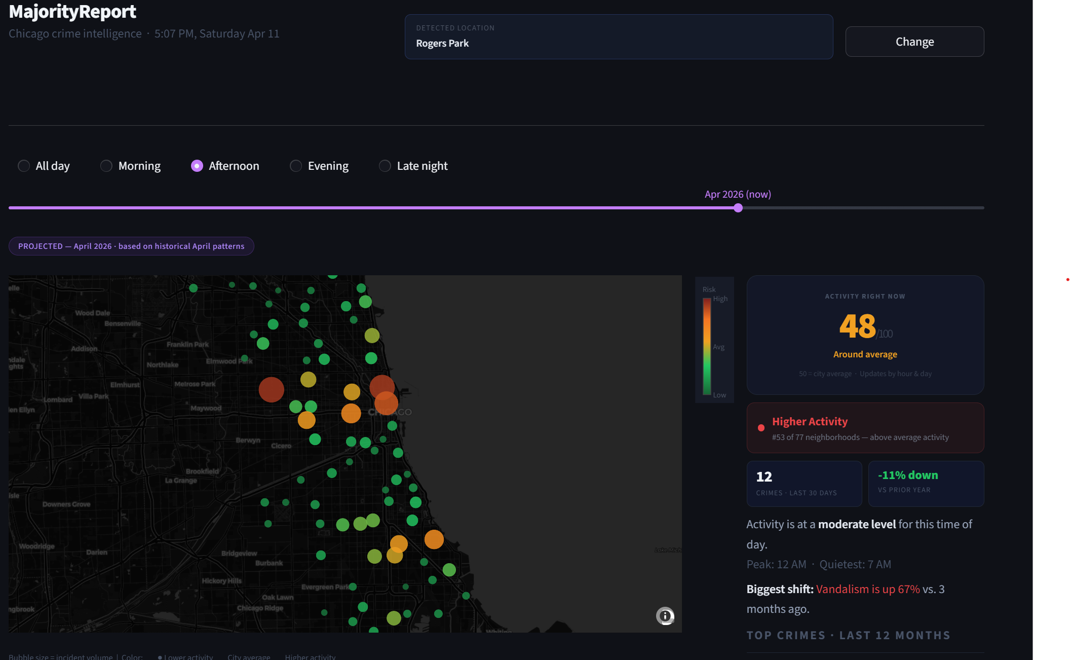
MajorityReport auto-detects your location, identifies your Chicago neighborhood, and delivers a plain-language safety briefing backed by data.
The moment you open the app:
- Your browser location is snapped to the nearest of Chicago's 77 official neighborhoods
- A live safety score (0–99) tells you how active your area is right now, this hour, today
- A neighborhood rank puts that in context: "#34 of 77 neighborhoods"
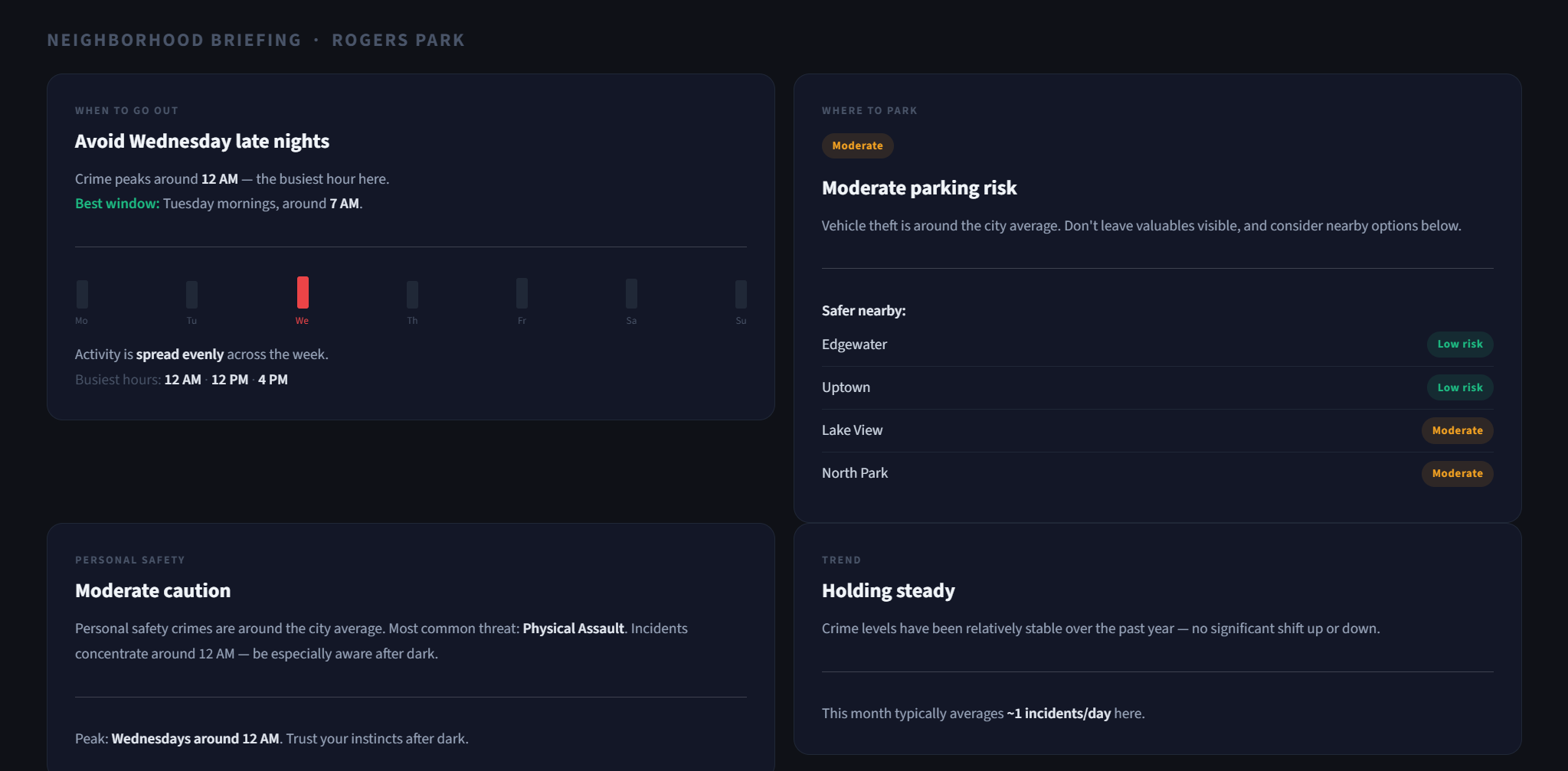
The briefing — 4 actionable cards:
| Card | What it tells you |
|---|---|
| When to go out | Peak crime day and hour, safest window, weekend vs. weekday split, busiest hours mini-chart |
| Where to park | Vehicle theft risk vs. city median, 4 nearby lower-risk alternatives with risk ratings |
| Personal safety | Violent crime rate vs. city average, top threat type, peak hour to stay aware |
| Trend | Year-over-year trajectory, biggest crime type shift in the last 90 days |
The map: An interactive bubble map of all 77 neighborhoods, colored green-to-red by relative risk. Scrub 18 months of history and 6 months of projected future. Filter by time of day.
Deep-dive tabs:
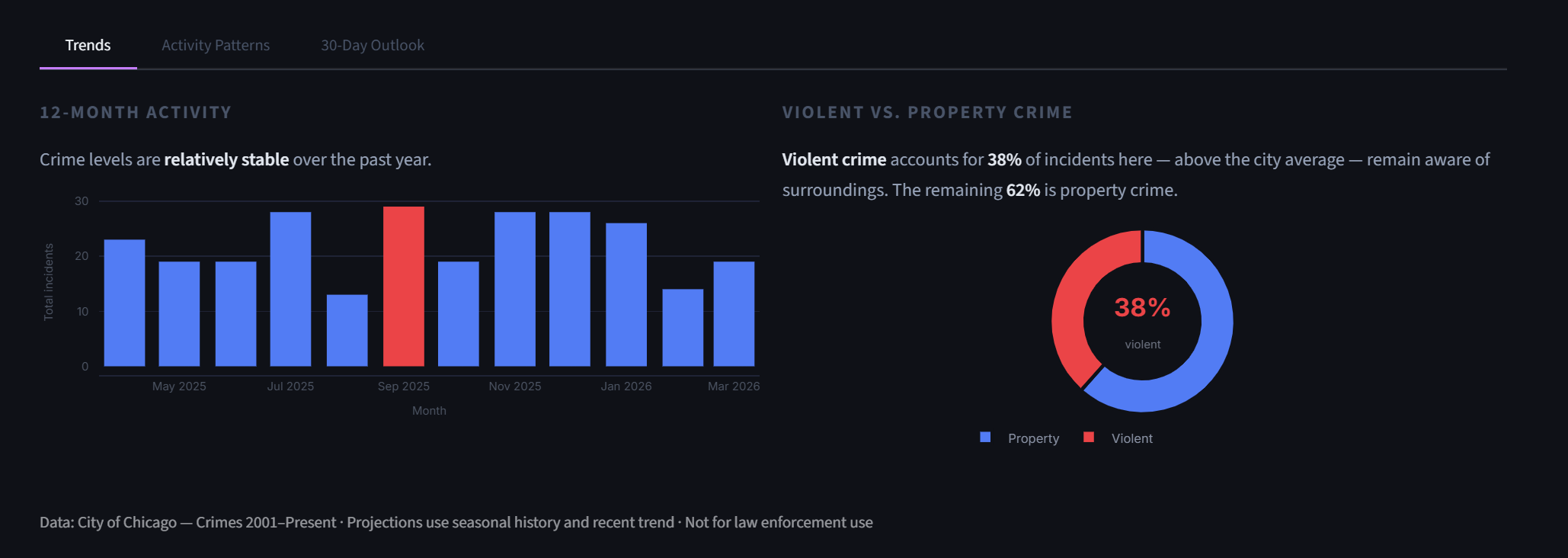
- Trends — 12-month bar chart, violent vs. property split
- Activity Patterns — 24-hour curve, day-of-week breakdown, live "right now" rank
- 30-Day Outlook — Prophet forecast, risk calendar, seasonal monthly averages
How we built it
Data pipeline
2.5 million rows from the City of Chicago Crimes dataset (2015–2026), cleaned and enriched with neighborhood labels and time features. For deployment, we stratified-sampled 8% (~200k rows) into a parquet file that runs on Streamlit Cloud without hitting memory limits. The app automatically uses the full dataset if present.
Composite safety score
The live 0–99 score combines three signals:
score = (hour_frac × 0.4 + dow_frac × 0.35 + base_risk × 0.25) × trend_factor × 50
hour_frac— how active this specific hour is vs. the average hour for this neighborhooddow_frac— how active today's day of week is historicallybase_risk— neighborhood's percentile rank across all 77 neighborhoodstrend_factor— year-over-year multiplier that adjusts for improving or worsening trends
Score of 50 = city average. Above 65 = elevated. Below 35 = quiet.
Prophet forecasting with partial-data correction
Facebook Prophet generates per-neighborhood 30-day crime forecasts. A critical fix: the current in-progress calendar month is clipped from training data before fitting. Without this, partial month counts compress the model's baseline and produce near-zero projections for recent months.
Geolocation
streamlit-js-eval exposes browser geolocation to the Python backend. Coordinates are matched to the nearest neighborhood centroid using Euclidean distance on a precomputed coordinate map of all 77 neighborhoods. Manual override always available.
Timezone correctness
Streamlit Cloud runs on UTC. All live time references (the safety score's hour/day-of-week inputs, the displayed clock, the activity rank) are converted to America/Chicago at a single point at module load, so "right now" always means Chicago right now.
XGBoost arrest probability model
A separate FastAPI backend (see framework/) serves an XGBoost model trained to predict arrest likelihood given neighborhood, crime type, and time features. Built with scikit-learn preprocessing pipelines and deployed on Railway.
Frontend
React + Vite frontend (see framework/frontend/) deployed on Vercel. Connects to the FastAPI backend for the arrest probability feature.
Challenges
The partial-data problem. Prophet trained on data through April 11 would see April with only 11 days of counts — roughly 1/3 of a normal month. The model interprets this as a real drop and forecasts near zero for future months. The fix was to clip training to the last complete calendar month.
Uniform calendar colors. The 30-day risk calendar was showing all green for low-crime neighborhoods because the color scale used absolute city-wide bounds. Every day looked identical. Per-neighborhood min-max normalization fixed this — now every neighborhood shows meaningful variation regardless of its overall crime level.
"4 AM is safest." Early versions of the briefing cards computed "safest time of day" and kept returning late night hours — technically correct for volume, but dangerously misleading as advice. We constrained the "quietest window" recommendation to 7 AM–10 PM so the app gives advice a person can actually use.
Streamlit Cloud memory limits. The full 53 MB parquet file hit Streamlit Cloud's free tier limits. Stratified sampling by neighborhood and year preserved statistical representation while reducing file size to 4.9 MB.
Accomplishments
- A genuinely useful civic tool built on public data in 24 hours
- Live geolocation to neighborhood snap with no third-party geocoding API
- Prophet forecasting with production-grade partial-data correction
- Composite score that responds correctly to time of day, day of week, and trend — not just raw incident count
- Minimalist dark UI that looks professional on mobile and desktop
What we learned
- Prophet is powerful but brittle with partial periods — always clip to complete intervals
- The hardest part of data storytelling is knowing what not to show
- Stratified sampling is the right answer for deployment constraints, not just downsampling
- Citizens don't want crime statistics — they want answers to specific questions ("should I park here?")
What's next
- Block-level granularity using the full lat/lon data (currently aggregated to neighborhood)
- Push notifications for elevated risk alerts in your home neighborhood
- Transit safety overlay — crime risk along CTA lines by time of day
- Commute planner — optimal route timing based on activity patterns across neighborhoods
Stack
| Layer | Technology |
|---|---|
| App | Streamlit |
| Map | Plotly Scattermapbox (CartoDB Dark Matter, no API key) |
| Forecasting | Facebook Prophet |
| ML model | XGBoost (arrest probability) |
| Geolocation | streamlit-js-eval |
| Data | City of Chicago Crimes 2015–2026, 2.5M rows |
| API | FastAPI |
| Frontend | React + Vite |
| Deployment | Streamlit Cloud / Railway / Vercel |
Team
- Corey Zhang — data pipeline, Streamlit app, Prophet forecasting, safety briefing, geolocation, composite score
- Xiaohu Wang — FastAPI backend, React frontend, XGBoost framework
- Ishrak Rahman — dataset cleaning, data modeling, prediction analysis, FastAPI tweaks
Built With
- matplotlib
- pandas

Log in or sign up for Devpost to join the conversation.