-
-

Welcome
-

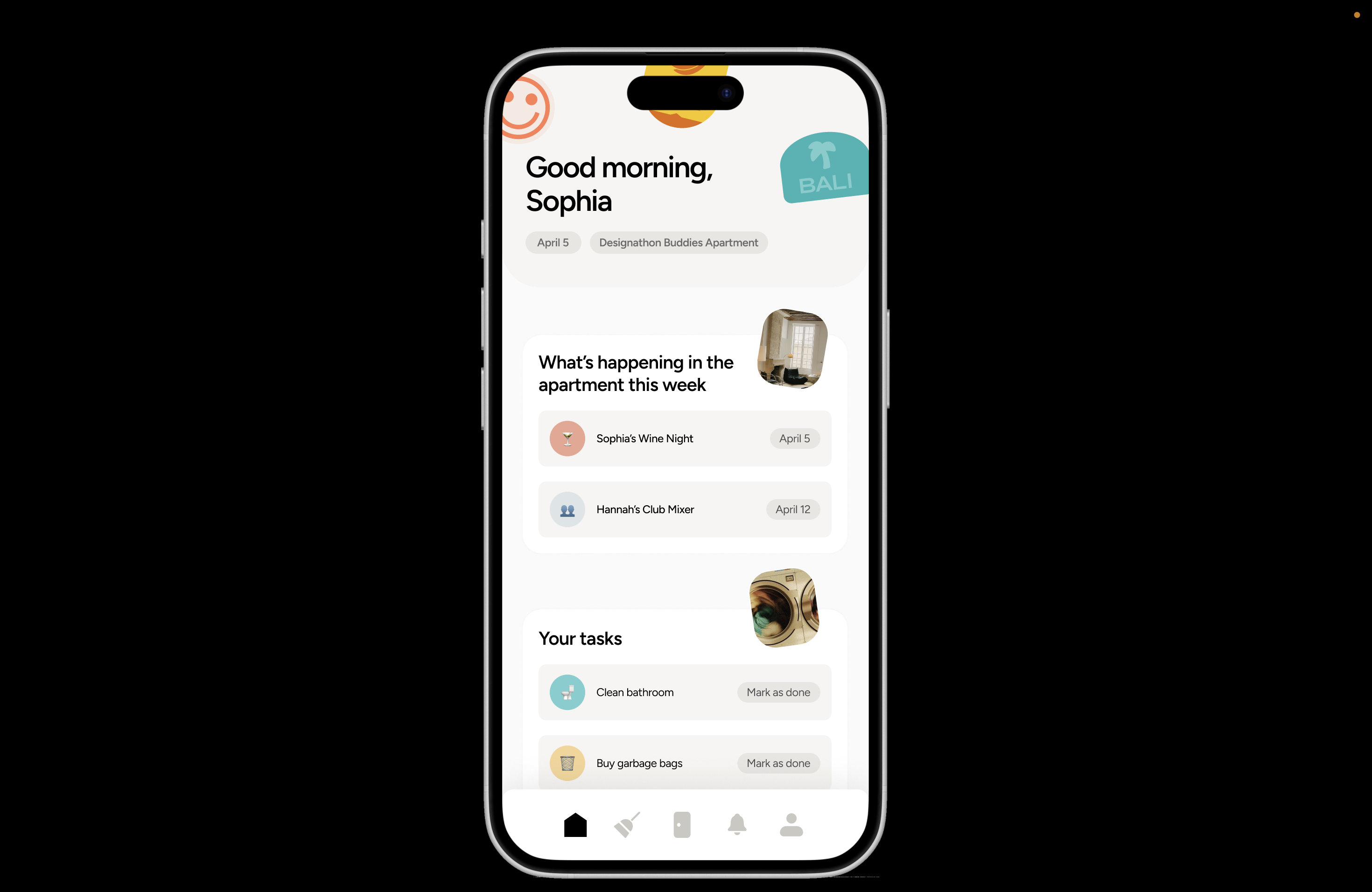
Dashboard
-
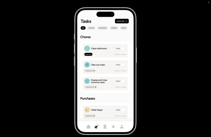
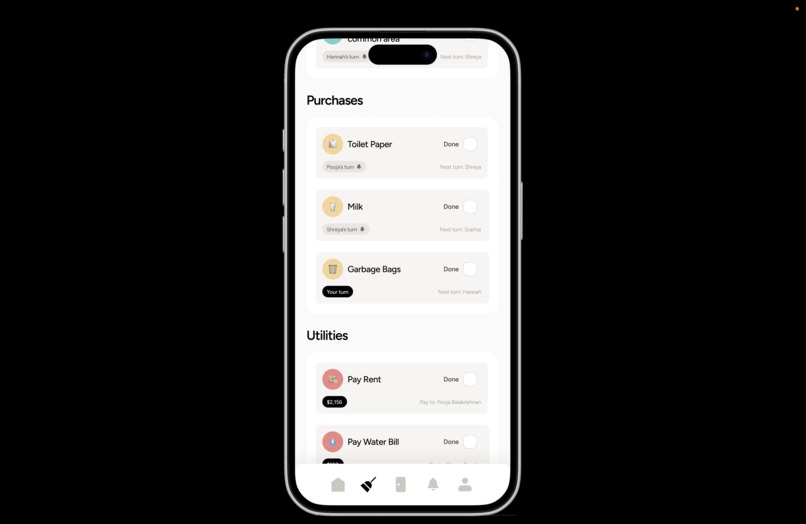
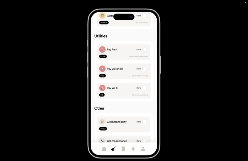
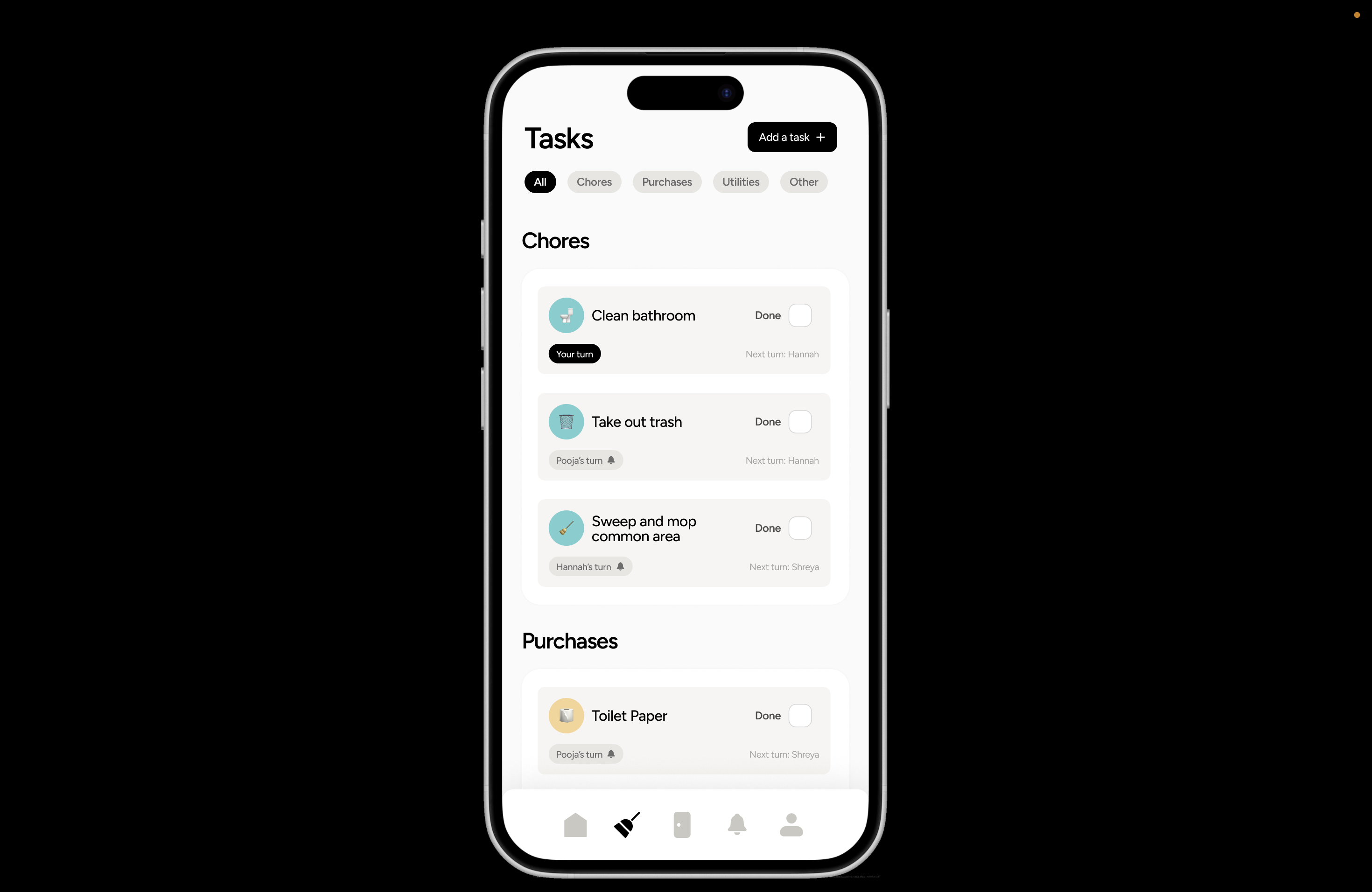
Tasks
-
Tasks 2
-
Tasks 3
-

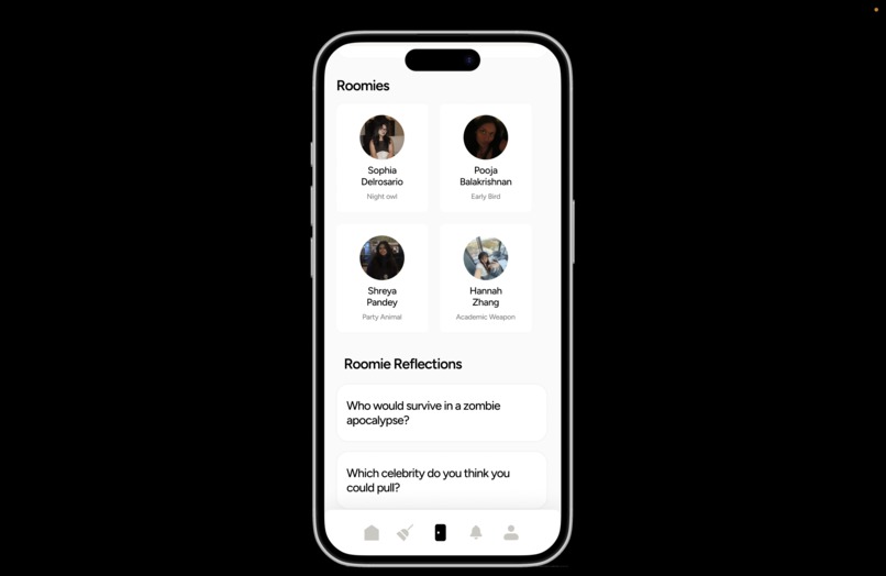
Our Space
-

Photo Gallery
-
Our Space 2
-
Our Space 3
-

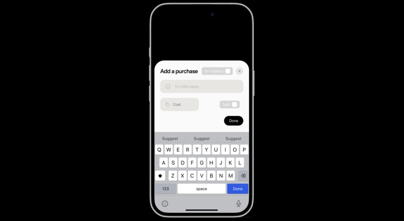
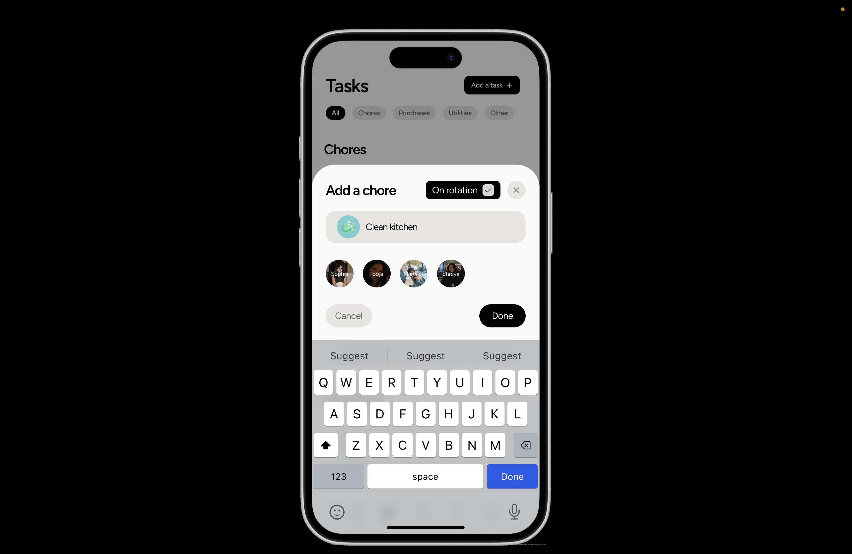
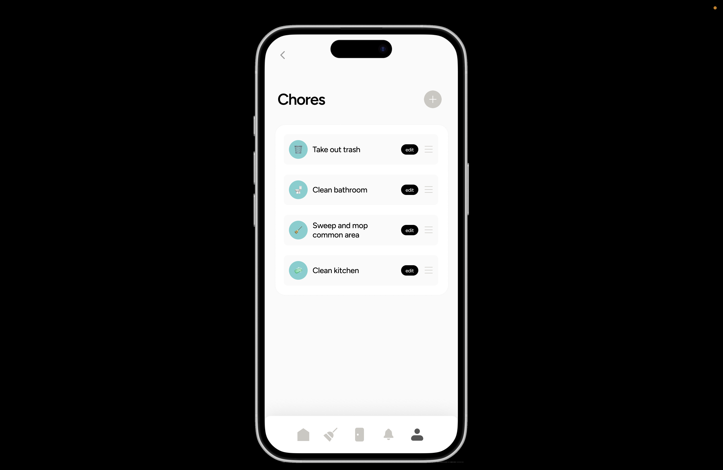
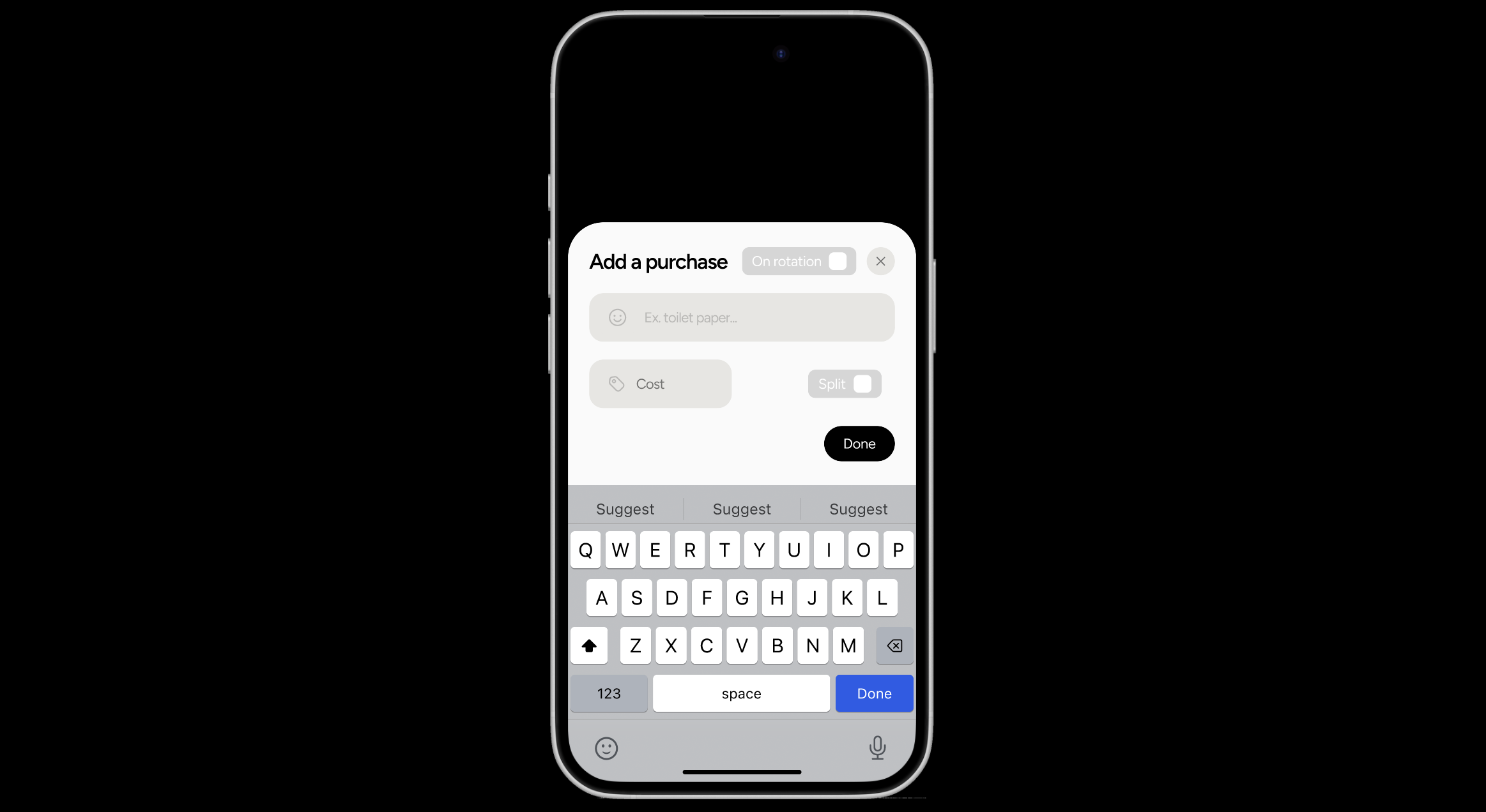
Add Task
-
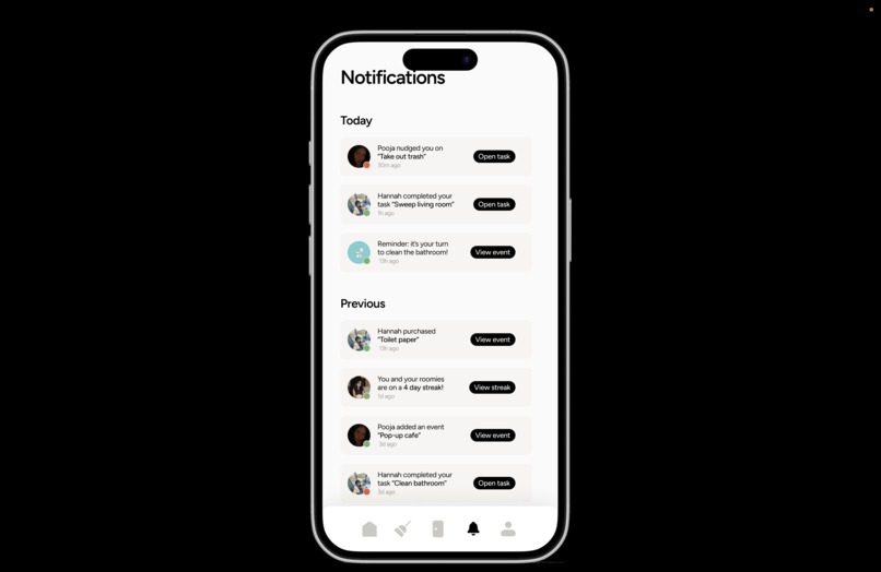
Notifications
-
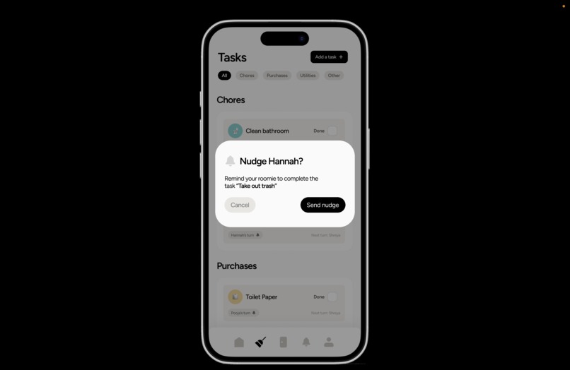
Nudge
-
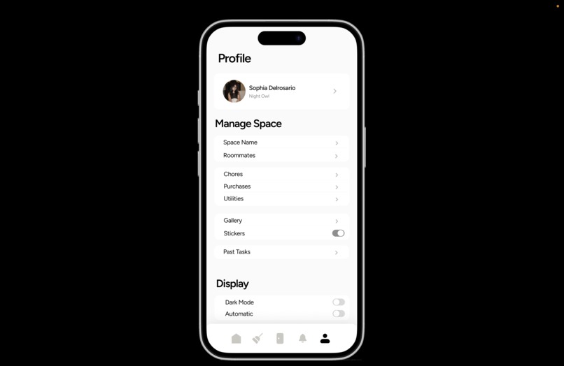
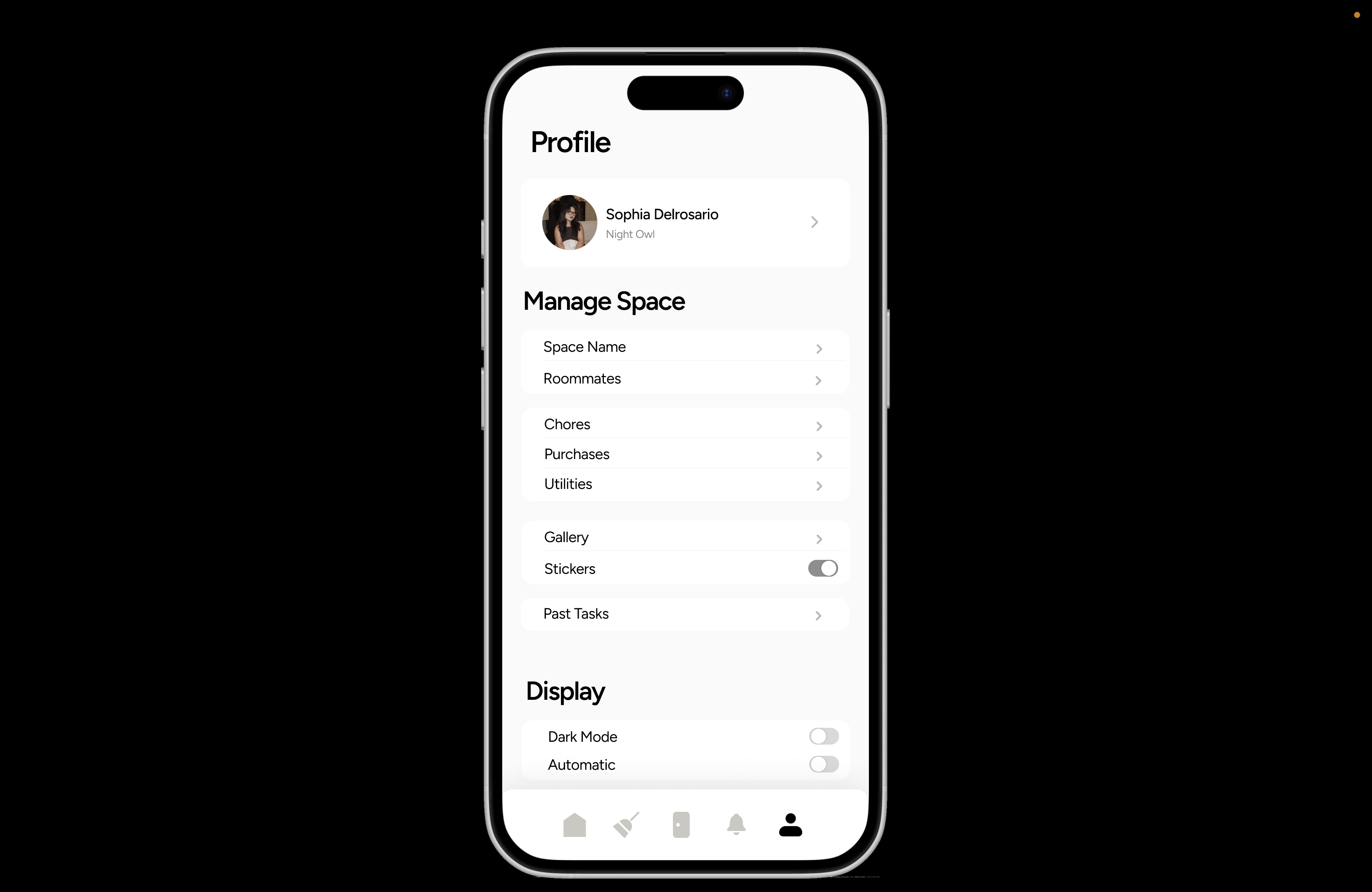
Settings/Profile
-

Edit Recurring Tasks
-
Ex. Add Task Flow
-

Ex. Add Task Flow 2
-

Ex. Add Task Flow 3
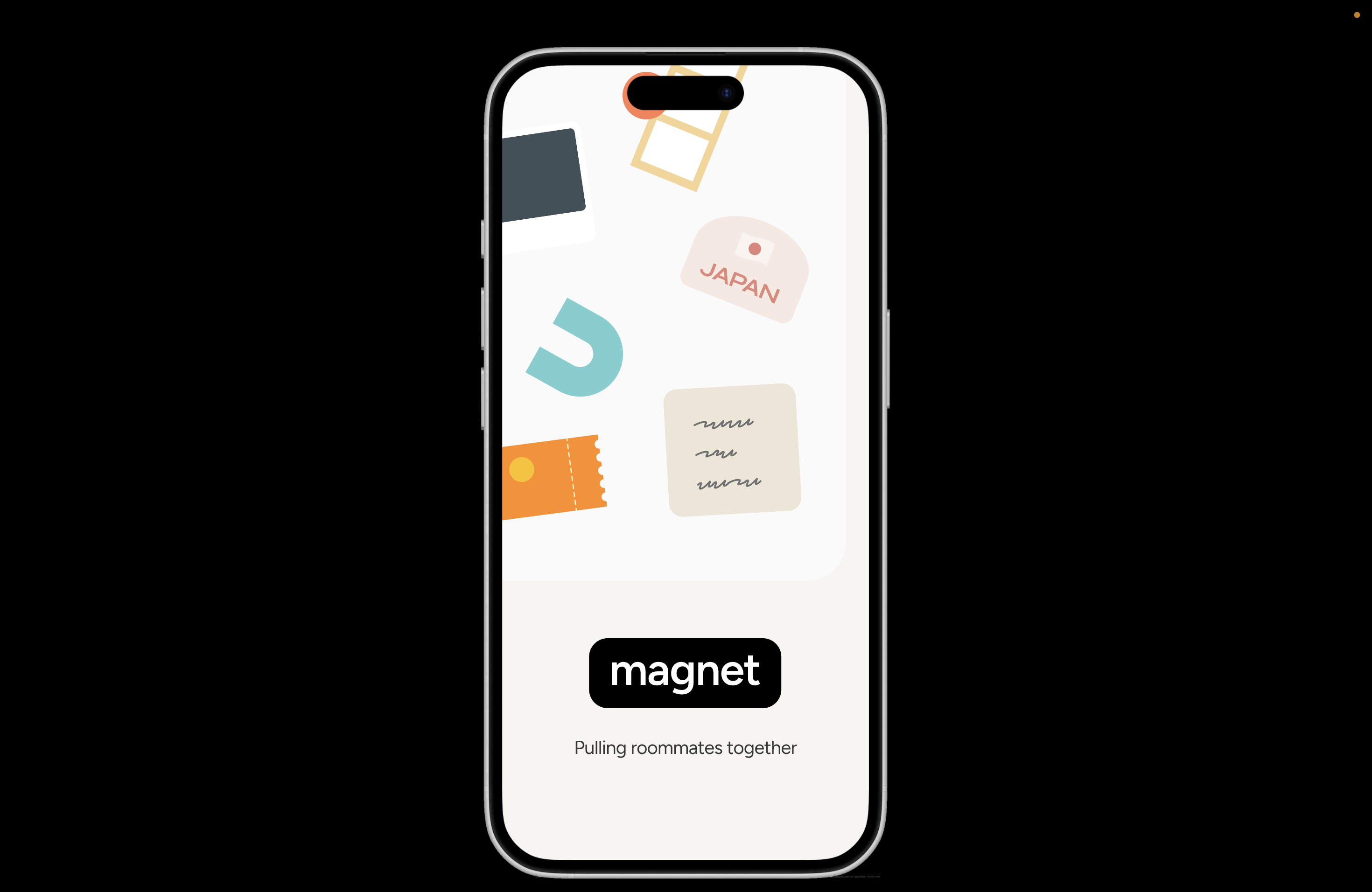


Inspiration
From collectible travel magnets, to chore lists, to event invitations, to photobooth strips with friends, an apartment’s fridge can be a time capsule of the intertwined lives of those in a shared space. We’ve been obsessed with the viral TikTok trends of friend groups bonding and updating each other with anecdotes scribbled on the fridge, but the beauty of that joy and closeness is oftentimes tainted by the tension of shared responsibility.
We wanted to create something useful, something practical, something that solves a collective pain point. We built this because we have lived it. We have all entered university and had to room with people we didn’t know very well. Some of us have had wonderful experiences. Others have had horror stories. In real life, new roommates negotiate chores, set social boundaries, navigate finances, host guests, and manage tension, all through a mix of verbal agreements, occasional passive-aggressive notes, and awkward texts. Between us, we’ve had our fair share of attempts to start conversations about dividing up cleaning, handling communal purchases, or asking if we can have friends over, especially when we’re starting a lease with people we don’t know very well beyond an initial Instagram or Facebook screening. We wanted to create something that acknowledges the initial struggles of living together and gives people a better tool for handling those small, daily frictions with empathy, structure, and humor. The refrigerator whiteboard became our metaphor. This is a highly tangible, emotional, and social experience that doesn't have a cohesive or effective digital translation yet. It creates this shared space to hold everyone accountable, but also creates a platform that can break the tension and bring them together.
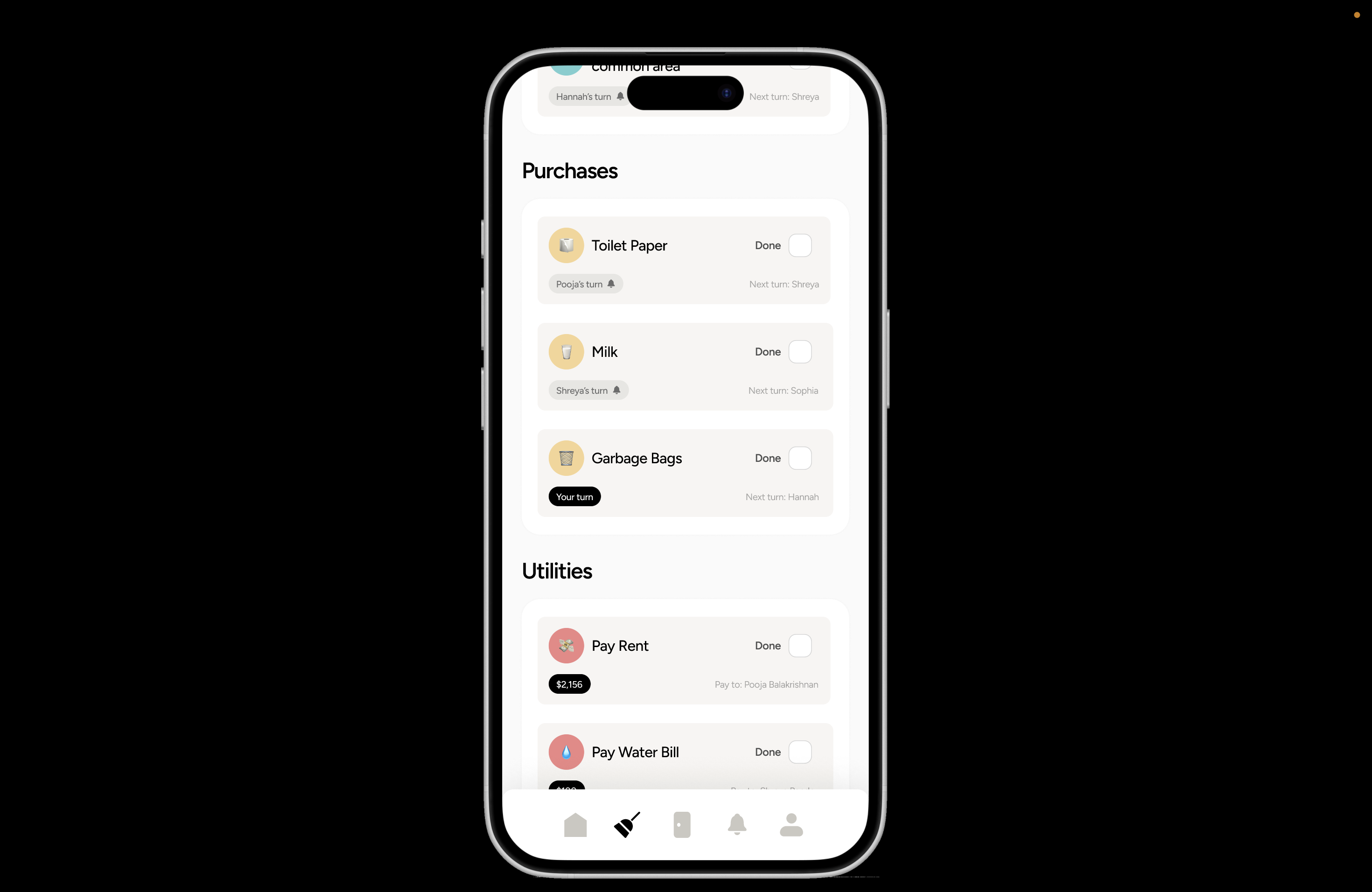
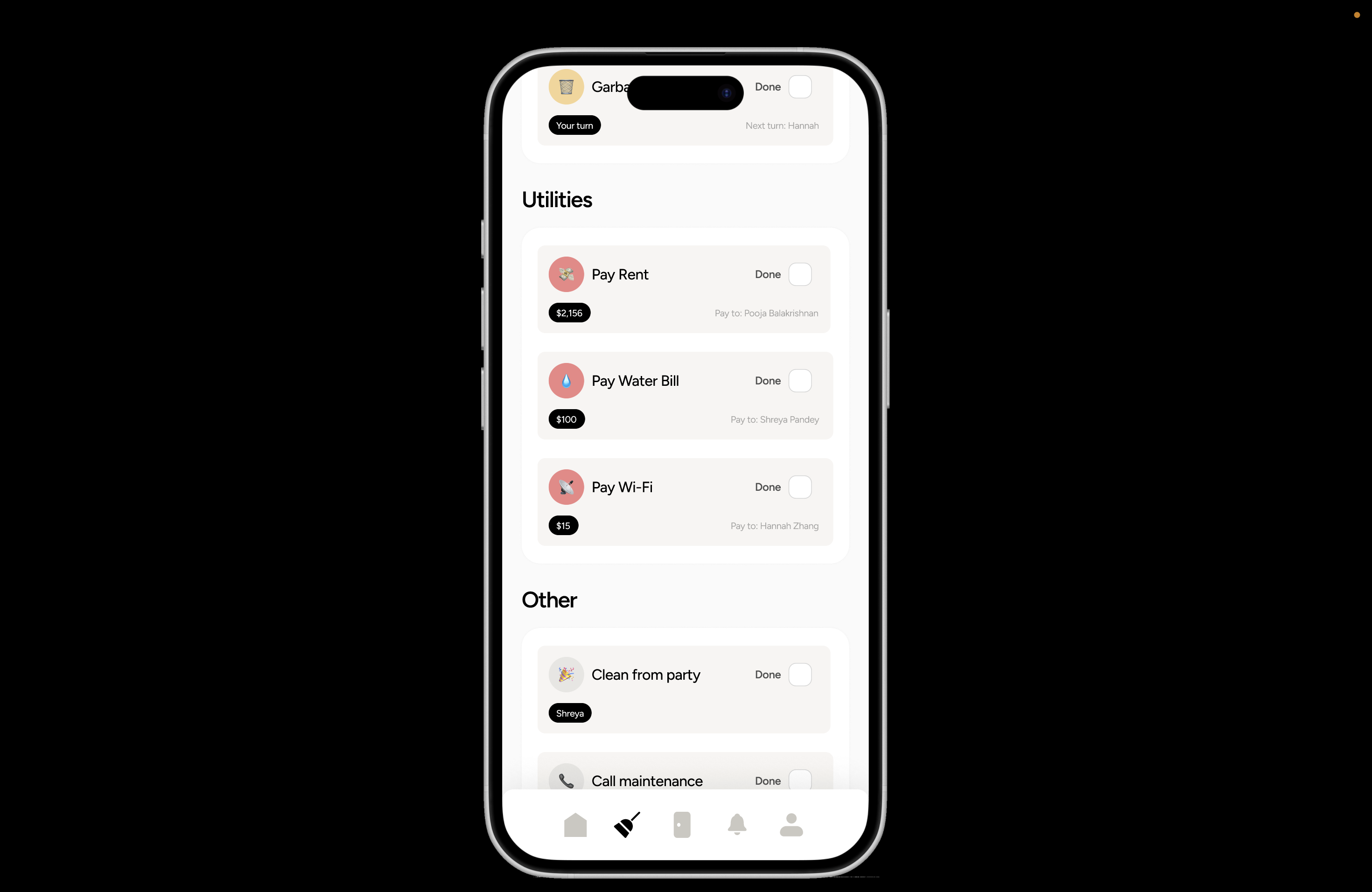
What it does
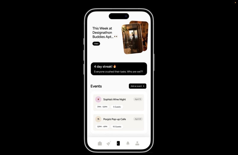
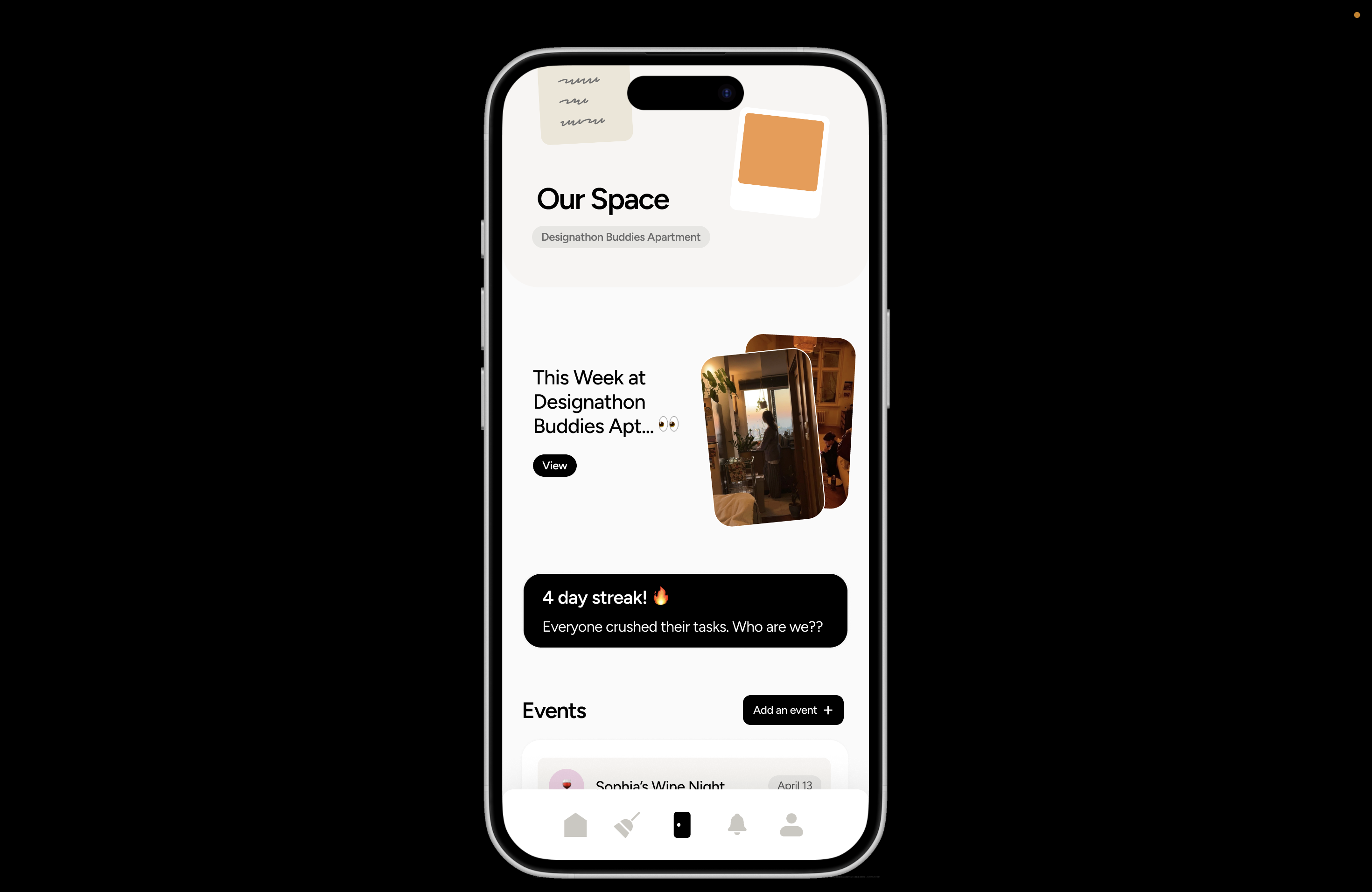
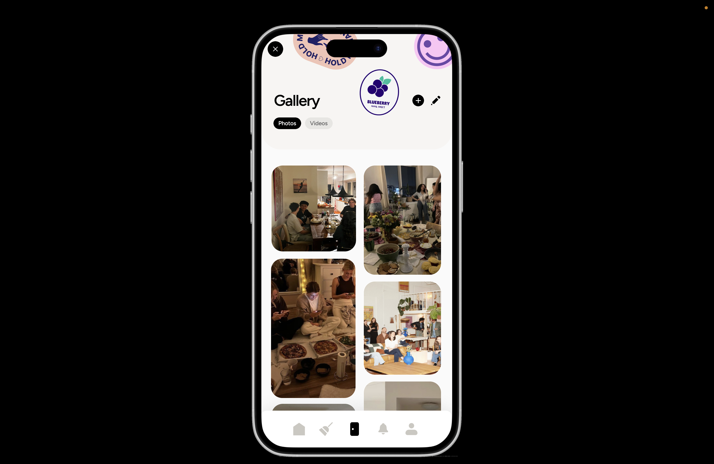
Magnet is a mobile app for roommates that essentially digitizes the refrigerator whiteboard. It’s a communal online hub where roommates coordinate chores, track purchases, split costs, and share space through a generated “turn-based” rotation. But Magnet goes beyond just task management, it allows users to add photos, answer daily conversational prompts, track a household streak, and create guest-hosting events to keep roommates in the loop about the day-to-day happenings as well as bring them closer together. Additionally, notifications also let users know when a new task is assigned or completed, and users can“nudge” their roommates to help keep people accountable without awkward confrontations. By recreating this familiar surface in an emotionally intelligent, playful interface, Magnet reduces awkward conversations, automates routines, and brings people together through a shared rhythm.
How we built it
Our primary software to build the initial prototype was Figma. Upon hearing the prompt for CreateSC, our team first dived right into ideation, where we shared some of our favorite physical experiences that we considered “phone-free” and then had an “a-ha” moment when it came to the shared struggle of having to nudge our roommates to do chores they haven’t done. After we landed on the idea, we looked into figuring out the user journey, which was aided by sketching out ideas on iPads, notebooks, and creating quick, scrappy, lo-fi designs to determine varying components of our app. From how many pages there were going to be, to figuring out the “rotational” aspect of the tasks, to mocking up modals and settings, building out the skeleton played a major role in enabling us to be able to design from a starting point. After finishing up each lo-fi screen, we planned out our design system, name, brand, typography, colors, and tone, and then split up each screen and began applying this to the lo-fi screens. We used plugins like Shaper, Iconify, component libraries from Apple, and vector libraries with stickers, to aid us with certain elements and the visual design. There were several iterations of varying screens, such as the notifications screen and homepage. We voted as a team to determine which ones were most valuable and smooth for the user. Once we finished with high-fidelity designs, we started on prototyping the flow, which then made us realize there were multiple discrepancies that we had to fix, such as consistent transitions between overlays or missing buttons in an empty state.
Challenges we ran into
A challenge we ran into was figuring out how to keep a simple design flow that didn't include an overwhelming amount of features. During brainstorming, we came up with numerous features, such as a progress bar, reactions, and personal streaks. However, we soon realized we may be taking on too much and that we were over-complicating our design. Thus, diverting attention away from the key components. As a result, we limited our design to focus on five pages: a centralized homepage that gives a summary of what’s coming up in the house, a task page that includes chores, purchases, utilities, & other (for one-time tasks), an Our Space social feature for roommates, a notification page for reminders and nudges, and a profile/setting page for easy account access.
We also initially struggled with finding a way to differentiate Magnet from other functional roommate-splitting apps like Splitwise, Chap, and Dwell during our ideation phase. It was our main goal to bring the fridge chore chart to the mobile screen, but translating that feeling of roommate connection and the playfulness of fridge magnets, stickers, and polaroids was something that we realized was equally important to us! Thus, the idea of an Our Space page was born. To truly emulate a lived-in and shared refrigerator board, we included daily prompts for roommates to answer, a collaborative photo gallery, events being hosted, and a streak indicator for whenever group members complete tasks multiple days in a row. With these social aspects of the app, Magnet is a standout amongst its other roommate-related app competitors.
Accomplishments that we're proud of
Finishing, honestly! From previous experiences with designathons, some of our teammates remember how we could be prototyping down to the last wire. But with strong team chemistry and organization, alongside motivating ourselves to be mindful of time, we realized that this is, in fact, a project we can finish (even if it didn’t seem like the case at 4AM). We are so proud that we were able to get a project done that we can showcase to our friends and family, share on our portfolios, and maybe even get developed one day!
What we learned
In the beginning, we were focused on creating something functional and useful for our potential users. Something that solved the clear logistical pain points of roommate life. We thought the goal of the app was to take pressure off of assigning chores, to increase efficiency, and reduce the need for potential nagging. While this was a good starting point, the app was feeling a little stiff. It wasn’t until we started reflecting on the emotional side of sharing a space that everything started to click. The fridge was covered in sticky notes with funny reminders, the photos that held fond memories, and the cute magnets personalized to each roommate.
As we dug deeper into the purpose of this app, we realized it wasn’t just about the logistics; it was about the relationships behind them. Leaning into that, with the refrigerator whiteboard as a metaphor, we stopped trying to build something purely functional and started thinking about how people feel when they live together. It’s not just digitizing tasks, but recreating the rhythms, tensions, and connections that come with sharing a home. This shift in perspective made the entire app what it is. Designing for people doesn’t just mean designing what they need to do, but also how they feel.
Our team ranged from varying levels of experience with Figma, but we were determined to pull from our greatest strengths as designers (creativity, speed, product thinking, detail orientation) to use this as a learning experience to pick up more skills. From learning about the 4-point grid spacing system that most designers use, mastering auto layouts, recognizing the importance of components, understanding how to communicate about errors or suggestions both virtually and in-person, trying to reduce clutter, working off of a previous iteration, and more; our team feels confident that we’ve left CreateSC as better designers.
What's next for magnet
We would love to expand the social side of Magnet so that we can fully encompass that fun, playful, witty experience of leaving sticky notes on the fridge for your friends. From customizable themes (dark mode, fancy, food-themed, travel-themed) to gamifying your chores productivity more by adding progress bars and more streaks, we’d love to lean more into team bonding to help ease the initial stress and awkwardness of having roommates you’re not as close with! We’d also love to expand more on the “roomie reflections” section, which was inspired by TikTok trends of hilarious prompts that friends put on their fridge, to really remind both users and ourselves as designers that third spaces online are supposed to be fun and bring you joy as well as ease. We’d love to share this with our coder friends, so hopefully it can exist one day, as all of us wish we had this during our freshman years in college while we were learning how to be confrontational.
Pitch Deck
https://www.figma.com/slides/yxkr9oTun1DLBg0hlMKrQc/Pitch-Deck?node-id=1-42&t=YfnBRvhhrTeS1fm5-1
Built With
- figma

Log in or sign up for Devpost to join the conversation.