Inspiration
The inspiration for MagentaMonitor came from a desire to connect abstract customer feelings with concrete technical performance. We wanted to answer the question: "Can we see how network outages and poor 5G quality directly impact customer happiness?" We set out to build a tool that would correlate live social media sentiment and a "Customer Happiness Index" (CHI) with real-time network performance data.
What it does
MagentaMonitor is a real-time dashboard that provides a comprehensive overview of customer sentiment and its relationship to network quality. Its key features include:
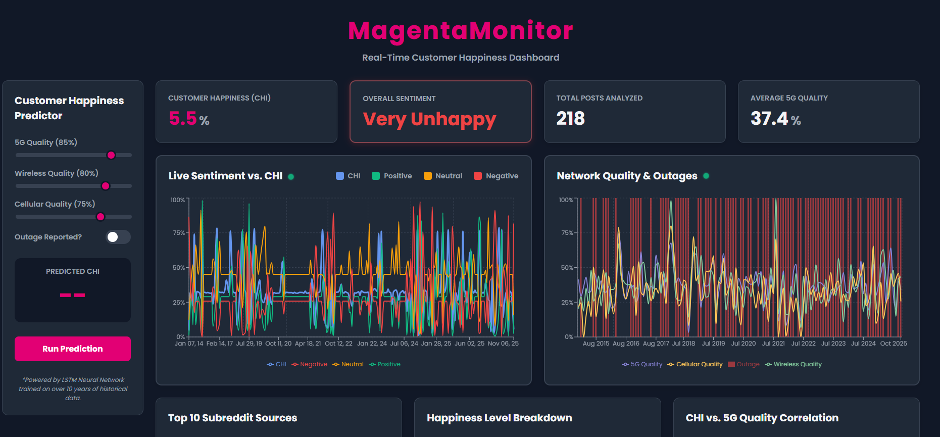
- KPI Dashboard: At-a-glance metrics for the overall Customer Happiness Index (CHI), live sentiment (which blinks red when "Very Unhappy"), total posts analyzed, and average 5G quality.
- Live Sentiment vs. CHI: A time-series chart that plots live positive, negative, and neutral sentiment from Reddit directly against the calculated CHI score, complete with a "live update" pulse animation.
- Network Quality & Outages: A time-series chart that tracks 5G, Wireless, and Cellular quality over time, overlaying reported outages as red bars.
- Interactive CHI Predictor: A "what-if" tool that allows a user to adjust sliders for network quality (5G, Wireless, Cellular) and toggle reported outages, then submit those inputs to a (simulated) API to get a predicted CHI score.
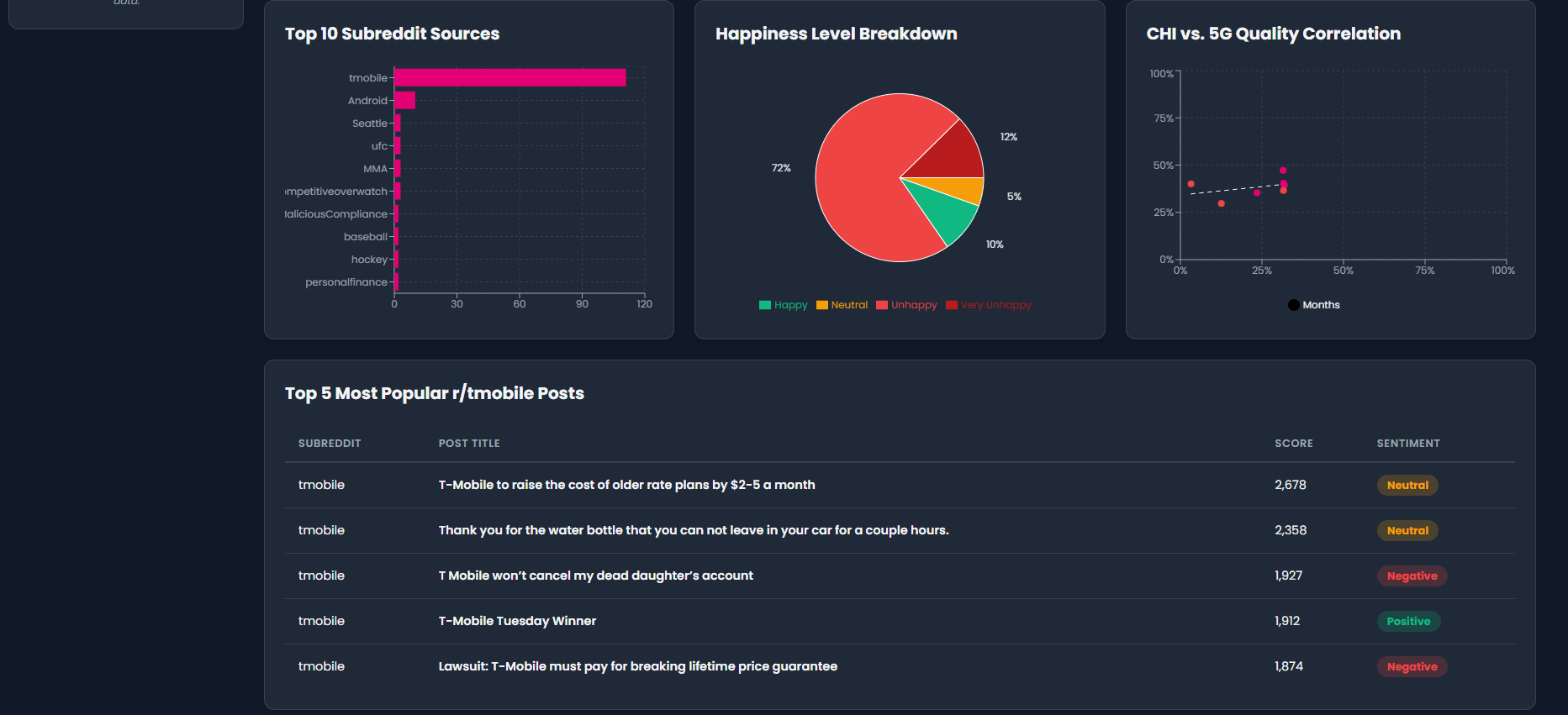
- Correlation Scatter Plot: An interactive chart plotting CHI vs. 5G Quality to visualize their correlation. Clicking on any month's dot (colored red for outages) instantly filters the post table to show data for that specific month.
- Live Post Table: A filterable table showing the most recent, relevant posts from Reddit, which updates based on selections from the scatter plot.
- Sentiment Breakdowns: Pie charts and bar charts that show the distribution of happiness levels (Happy, Unhappy, etc.) and the top sources of Reddit discussion.
How we built it
MagentaMonitor is a single-page application built entirely in React.
- Frontend: We used React with functional components and hooks (
useState,useEffect,useMemo). - Data Visualization: All charts were custom-built using the Recharts library, including
LineChart,ComposedChart,BarChart,PieChart, andScatterChart. - Data Handling: Data is currently loaded from static JSON files (
customer_happiness_index.json,reddit_data.json,network_data...json). We useuseEffectto fetch this data on load andsetIntervalto re-fetch every 10 seconds, creating a "live" update illusion. - Prediction Model: The scatter plot's trend line and the CHI predictor's score are calculated using a simple linear regression model we built in JavaScript to find the correlation between 5G quality and CHI.
- Styling: All styling was done from scratch using CSS, including a dark mode theme, responsive grid layouts, and custom
@keyframesanimations for the blinking KPI, pulsing "live" indicators, and chart update glows.
Challenges we ran into
We encountered several challenges along the way:
- Data Integration: Merging three different JSON sources (CHI, Reddit, Network) that shared a
datekey was a primary challenge. We solved this usinguseEffectto process the data anduseMemoto create combined datasets for the charts. - Layout & Responsiveness: We iterated on the layout multiple times, moving from a simple 2x2 grid to a complex layout with a vertical sidebar. This required significant adjustments to our CSS grid and component structure.
- Debugging: We ran into "Failed to load data" errors, which we traced back to a simple typo in a JSON filename (
netowrkvs.network). - Interactivity: Implementing the scatter-plot-to-table filter was complex. It required managing a new state for the
selectedMonth, adding click handlers to the scatter plot, and writing filter logic to update thefilteredRedditPostsstate. - Simulating an API: Building the predictor required us to refactor our code, changing it from a live-updating calculation (
useEffect) to a button-click (onSubmit) model that simulates an API call withasync/awaitand asetTimeout.
Accomplishments that we're proud of
We are particularly proud of the features that make the dashboard feel dynamic and interactive:
- The CHI Predictor: Building the full UI for the predictor and wiring up the "Run Prediction" button to a simulated API call and a real regression model was a huge success.
- The Interactive Scatter Plot: The "click-to-filter" functionality that links the correlation chart directly to the Reddit post table is a powerful analysis tool.
- The "Live" Illusions: We successfully used
setInterval, CSS animations (@keyframes), and state triggers (isPulsing) to make the dashboard feel alive, with blinking KPIs and pulsing charts that glow on data refresh.
What we learned
- Power of Correlation: We learned how to visually and programmatically connect two seemingly different datasets (customer feelings and network stats) to find a real correlation.
- React Hooks for Data: We gained a deep understanding of how to use
useState,useEffect, anduseMemoto fetch, process, merge, and display complex data from multiple sources. - Advanced Recharts: We went beyond simple line charts to implement complex
ComposedCharts, interactiveScatterCharts with trend lines, and custom-styledPieCharts. - CSS Animations: We learned how to use
@keyframesto create dynamic UI elements like blinking, pulsing, and glowing effects that significantly improve the user experience.
What's next for MagentaMonitor
The current version is a powerful, data-driven prototype. The next logical steps are:
- Connect to a Real ML Model: Replace our simple linear regression with a fetch call to a real, Python-based machine learning model (e.g., in a Flask/FastAPI backend) that can run a multi-variable prediction using all the slider inputs.
- Connect to Live Data Streams: Replace the static JSON files with calls to live APIs. This would mean polling a live network monitoring endpoint and streaming data from the Reddit API to make the dashboard truly "real-time."
- Enhance the Predictor: Use the outage toggle and other sliders (Wireless, Cellular) as inputs in the real prediction model to provide a more accurate and holistic CHI forecast.


Log in or sign up for Devpost to join the conversation.