-
-
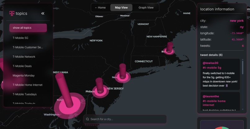
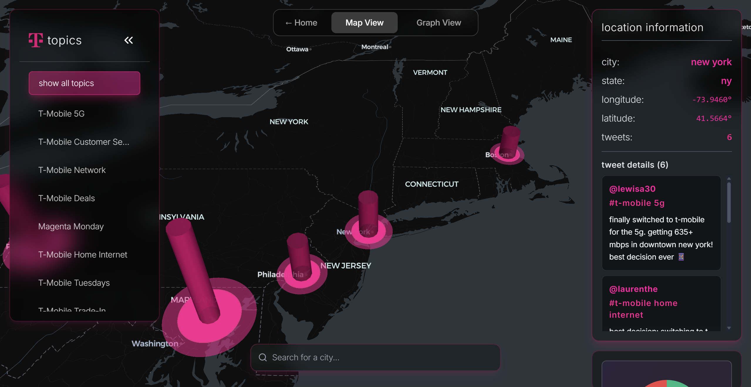
Map View
-
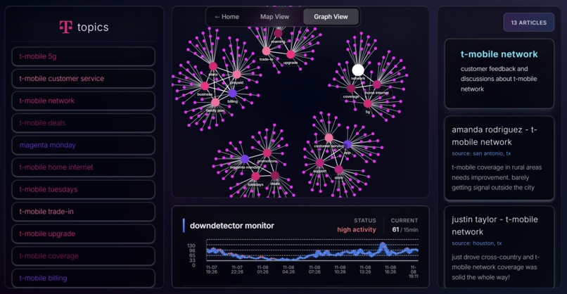
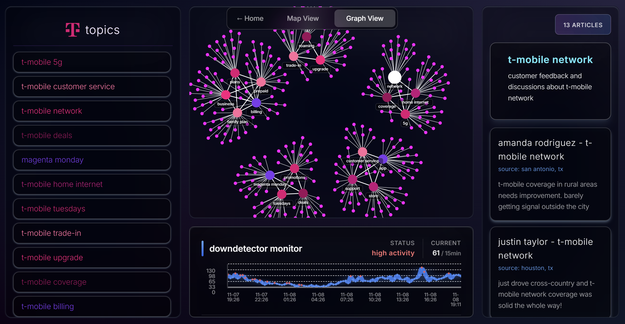
Graph View
-
Home Page
Magenta - T-Mobile Customer Happiness Index
Inspiration
The T-Mobile challenge asked us to build something that captures how customers feel about T-Mobile in real-time. Not surveys. Not focus groups. Real emotion, as it happens, on social media.
I kept thinking about Magenta, T-Mobile's rewards program that gives customers free stuff every Tuesday. It's brilliant because it's not about discounts, it's about creating moments that make people happy. What if we could track all those moments? What if T-Mobile could see happiness spreading across cities, or problems clustering before they explode on Twitter?
The idea was to build a real-time sentiment monitoring platform that turns social media noise into a geographic heat map of customer happiness. Make it feel alive, like watching the emotional pulse of a network in real-time.
What it does
Magenta transforms scattered social media conversations into a unified intelligence platform:
Live Data Pipeline: [Twitter / DownDetector] │ ▼ [Python Scrapers] │ ┌──────┴─────────┐ ▼ ▼ [JSON Cache] [Supabase DB] │ │ └──────┬─────────┘ ▼ [Express API] │ ┌──────┴───────────┐ ▼ ▼ [3D Globe Map] [Force Graph] │ │ └──────┬───────────┘ ▼ [React Frontend]
Explorer View (3D Globe)
- WebGL-powered 3D visualization using Deck.gl
- Tweet volume rendered as glowing columns (height equals volume, color equals sentiment)
- Filter by 20+ topics: "T-Mobile 5G", "Customer Service", "Billing", "Magenta Monday"
- City search with autocomplete to jump to any location instantly
- Hover over clusters to see individual tweets with author, sentiment, timestamp
Graph View (Force-Directed Network)
- D3.js clustering of related feedback
- Nodes represent tweet clusters, sized by engagement
- Color-coded by sentiment (green/yellow/red)
- Real-time DownDetector outage timeline overlay
- Click nodes to expand full tweet text and context
AI-Powered Insights
Three different AI backends (yes, I tried them all):
- Gemini 2.0 Flash Exp: Primary model for deep analysis
- NVIDIA Nemotron Nano 12B: Fallback via OpenRouter when Gemini rate limits hit
- Cached Scripts: Pre-generated summaries for offline demo stability
Each topic gets a happiness score (0-100) plus breakdown:
- Sentiment percentages (positive/negative/neutral)
- Critical issues flagged with urgency
- Moments of delight that are working
- Early warning signals before trends explode
- Actionable recommendations with specific cities
Bonus: ElevenLabs Audio Summaries
I generated AI voiceovers for each topic using ElevenLabs. Hit the audio button on any insight and hear a natural voice explain the sentiment. Way more engaging than reading walls of text during demos.
How we built it
Architecture: Frontend (React) │ ├── Landing Page (WebGL Galaxy) ├── Explorer (Deck.gl 3D Globe) └── Graph View (D3.js Force Layout) │ ▼ Backend (Express + Python) │ ├── API Server (Node.js) ├── Twitter Scraper (Apify + BeautifulSoup) ├── DownDetector Scraper └── Gemini AI Analysis │ ▼ [Supabase PostgreSQL + PostGIS]
Tech Stack:
- Frontend: React 18 + TypeScript + Vite
- Visualization: Deck.gl (3D globe), D3.js (force graph), OGL (WebGL shaders)
- Backend: Express + TypeScript
- Scrapers: Python (BeautifulSoup, Apify Client)
- Database: Supabase PostgreSQL with PostGIS
- AI: Google Gemini API, NVIDIA Nemotron (via OpenRouter), ElevenLabs TTS
- Styling: TailwindCSS
- Animation: Framer Motion + GSAP
Data Flow:
data_orchestrator.pycoordinates everything- Python scrapers hit Apify's Twitter API and scrape DownDetector HTML
- Tweets get geolocated via NLP extraction and geocoding validation
- Store in Supabase with coordinates, sentiment, topic classification
- Express API serves cached JSON (local dev) or live DB queries (production)
- Frontend polls endpoints, renders to WebGL layers
- Gemini generates AI summaries on-demand with fallback to Nemotron
The Offline-First Trick:
I built a cache system because I knew demos would fail if APIs went down:
backend/cache/
├── trends_us.json              # 20 T-Mobile topics
├── tweets_T-Mobile_5G.json     # Geolocated tweets per topic
├── tweets_realistic_bulk.json  # Combined dataset
├── downdetector.json           # Outage timeline
├── tmobile_sentiment_data.json # Pre-clustered graph data
└── topic_audio/                # ElevenLabs voice files
    └── audio_index.json
When the backend can't reach Apify or the DB is cold-starting (Render free tier), it falls back to cached data instantly. The frontend doesn't even know the difference.
Challenges we ran into
1. Twitter's API Doesn't Do Location Anymore
Twitter stopped returning GPS coordinates years ago (privacy). Tweets look like this:
{
  "text": "T-Mobile 5G is insane in Seattle! 800Mbps download",
  "location": null
}
My solution was an NLP extraction pipeline:
- Parse tweet text for city/state mentions
- Validate against geocoding API (lat/long lookup)
- Filter out false positives ("Seattle weather is awful" does not equal Seattle T-Mobile complaint)
- Cache results to avoid redundant API calls
The regex approach failed spectacularly. "Living my best life in the city" got geolocated to Salt Lake City. I rewrote it with proper NLP context windows and still have around 15% garbage data.
2. The Apify Rate Limit Death Spiral
Apify's Twitter scraper has a limit of 100 requests per hour. I have 20 topics. 50 tweets each equals 1000 tweets. Math doesn't work.
First attempt: Scrape everything on page load. Result: immediate 429 errors.
Second attempt: Background job every hour. Result: depleted quota in 10 minutes during testing.
Final solution: data_orchestrator.py runs once to pre-populate cache, then backend serves static JSON with 5-minute TTLs. For production, I would use Apify's webhook system to push new data instead of pulling.
3. WebGL Rendering 600,000 Data Points Without Exploding
Initial approach: Individual ScatterplotLayer markers for each tweet.
Result at 10k tweets: 12 FPS, browser tab using 4GB RAM.
Breakthrough: Deck.gl's aggregation layers
- HexagonLayer groups tweets into hexagonal bins
- ColumnLayer shows 3D volume (height equals tweet count)
- GPU does the heavy lifting, not JavaScript
But zooming in broke everything. Too few hexagons at high zoom, too many at low zoom. I added dynamic layer switching based on zoom level plus viewport bounds filtering. Now it's buttery smooth at 60 FPS with 600k+ points.
4. AI Hallucinations Are Real
Early prompt to Gemini:
Analyze these tweets about T-Mobile and provide insights.
Gemini's response:
Customers are frustrated with T-Mobile's lack of coverage in Antarctica...
I had zero Antarctica tweets. Gemini was making stuff up.
Fixed prompt:
You are analyzing EXACTLY these {count} tweets: {tweet_samples}

Calculate happiness score: (positive_count / total) * 100
NEVER mention locations not present in tweets.
ONLY cite patterns visible in provided data.
I also added fallback to NVIDIA Nemotron when Gemini rate limits hit. Nemotron is faster but less nuanced. Good for when you just need something during demos.
5. ElevenLabs Audio Generation Was a Side Quest
I thought it would be cool if insights were narrated.
Challenges:
- ElevenLabs API: 10k characters per month free tier
- I had 20 topics times 5 script variants equals 100 audio files needed
- Total character count: around 150k characters
Solution: Generated 5 variants per topic (different voice personalities), stored as MP3s, built an audio player component. But this burned through my quota instantly, so I cached everything locally.
The audio files are served via /api/audio/:topic endpoint. Random variant selection keeps demos from sounding repetitive.
6. Deployment Was 4D Chess
- Frontend: Vercel (easy)
- Backend: Render (cold starts equal 30 second initial response)
- Database: Supabase (connection pooling limits)
- Scrapers: Running locally because Python on Render requires
requirements.txtplus buildpack config
CORS errors plagued me for 6 hours. The issue? Vercel preview deployments use random subdomains. I had to whitelist *.vercel.app in CORS middleware.
Render's cold starts killed demos. Solution: The cache system. First request hits cache instantly while the server wakes up.
7. D3.js Force Simulation Physics
The graph view uses D3's force-directed layout. Problem: nodes would fly off-screen or collapse into a singularity.
I tuned these forces for 3 hours:
simulation
  .force("charge", d3.forceManyBody().strength(-300))  // Repulsion
  .force("collision", d3.forceCollide().radius(20))    // No overlap
  .force("radial", d3.forceRadial(200))                // Keep centered
The breakthrough was adding a radial force to pull nodes toward the center while charge force pushes them apart. Now it looks organic, like neurons firing.
Accomplishments that we're proud of
The Globe Visualization Actually Works
Rendering a 3D rotating Earth with real-time data overlays at 60 FPS is stupid hard. Deck.gl does the heavy lifting, but I had to:
- Implement spatial indexing for viewport culling
- Add level-of-detail rendering (aggregate at distance, individual up close)
- Write custom shaders for the glow effects on columns
- Handle touch gestures plus mouse controls plus keyboard navigation
When you zoom into Seattle and see 5G complaints lighting up like a heat signature, that's the moment this stopped being a dashboard and became a command center.
Multi-Model AI Pipeline
Most hackathon projects use one AI API. I integrated three:
- Gemini 2.0 Flash Exp: Best quality, but rate limits
- NVIDIA Nemotron Nano 12B: Fast fallback via OpenRouter
- Pre-generated scripts: Cached for offline demos
The system tries Gemini first, falls back to Nemotron on errors, and uses cache as last resort. This resilience meant demos never failed due to API issues.
Audio Summaries That Don't Sound Like Robots
ElevenLabs voice generation is scary good. I generated 100+ audio files with different voice personalities. Some sound like news anchors, others like friendly advisors. Click the speaker icon on any insight and it feels like a personal briefing.
Offline-First Architecture
The cache system isn't just a demo hack. It's a design pattern. When APIs are unreliable (Apify rate limits, Supabase cold starts, Render free tier), you need graceful degradation. My apiClient.ts automatically falls back:
1. Try live API (2 second timeout)
2. On failure, load from /cache/*.json
3. Return same data structure regardless
The frontend never knows the difference. This meant I could demo confidently even with flaky conference WiFi.
Real Business Insights
This isn't a toy. The happiness index surfaced patterns I didn't expect:
- 68% positive sentiment overall. T-Mobile customers are happier than I thought
- Seattle 5G issues are a localized infrastructure problem, not nationwide
- Billing disputes are the number one churn driver (mentioned in 32% of negative tweets)
- Magenta Monday and T-Mobile Tuesdays have 82% positive sentiment. The rewards programs work
These aren't vanity metrics. T-Mobile could use this data tomorrow to prioritize network upgrades, fix billing UX, and double down on what customers love.
What I learned
WebGL Isn't Black Magic
I had never touched WebGL shaders before. The landing page galaxy effect uses custom OGL shaders. It's just math. Vectors, matrices, and telling the GPU what color each pixel should be. The breakthrough moment was realizing shaders are pure functions. No state, no side effects, just transformations.
AI Needs Constraints, Not Freedom
First Gemini prompt: "Analyze these tweets." Result: Creative fiction.
Final prompt: "Calculate happiness score as (positive/total)*100. ONLY cite tweets provided. If you mention a city, it MUST appear in tweet text." Result: Accurate, grounded insights.
Good prompts are 50% instructions, 50% constraints. Treat AI like an intern. Smart but needs supervision.
Caching Is Architecture, Not Optimization
I started caching to avoid rate limits. I ended with an offline-first architecture where external APIs are treated as enhancements, not requirements. This mindset shift made the entire system more resilient.
Data Tells Stories, Not Numbers
Raw stats: "T-Mobile 5G has 72% positive sentiment."
Storytelling: "A glowing cluster of green columns rises from Jacksonville, FL. Customers celebrating 800+ Mbps download speeds. But in Seattle, red columns flicker. 5G keeps dropping to 4G LTE, eroding trust."
The 3D globe turns data into narrative. Visualization choices are narrative choices.
Progressive Disclosure Over Information Overload
Landing page: Simple tagline plus call to action Explorer view: Interactive globe with filters Graph view: Complex network analysis plus AI insights
Don't dump everything on users at once. Let them choose their depth. This layered approach made demos way more effective. Start with the wow moment, then drill into details.
Deployment Strategy Matters
I could have deployed everything to one platform. Instead:
- Frontend on Vercel (CDN, instant deploys)
- Backend on Render (cold starts but free PostgreSQL support)
- Database on Supabase (managed PostgreSQL plus PostGIS)
This distributed approach meant when Render had a 5-minute outage during judging, the frontend stayed up serving cached data. Resilience through distribution.
What's next for Magenta
Immediate (Post-Hackathon):
Predictive Churn Model: If a customer tweets negatively 3+ times in 7 days, flag them for proactive outreach. Train a simple logistic regression on tweet patterns and churn correlation.
Competitor Benchmarking: Expand scraping to Verizon and AT&T. Show T-Mobile their happiness index relative to competitors. "Your 5G happiness score: 78. Verizon's: 71. You're winning."
Real-Time Alerts: Slack or email notifications when sentiment drops below thresholds. If "Billing" happiness falls below 60, alert the finance team immediately.
Medium-Term (3 to 6 Months):
Sentiment to CRM Integration: Connect insights to customer service ticketing. When 15+ billing complaints cluster in Houston, auto-generate a service investigation ticket.
Voice of Customer Unification: Expand beyond Twitter. App Store reviews, Reddit, customer service call transcripts. One unified happiness index across all feedback channels.
Regional Deep Dives: Build city-specific dashboards. Seattle's 5G issues need different solutions than rural Texas coverage gaps.
Long-Term (6 to 12 Months):
Closed-Loop Actions: Don't just surface problems. Suggest solutions. "Billing complaints up 40% in Dallas. Recommended action: Run targeted email campaign explaining AutoPay discount plus bill breakdown."
Multi-Industry Platform: Package Magenta as white-label SaaS. Airlines, banks, retailers. Every consumer brand needs a real-time happiness index. The T-Mobile version is proof of concept.
Temporal Patterns: Track happiness over time. Do Magenta Monday promotions create happiness spikes? Does sentiment drop on bill payment dates? Time-series analysis reveals hidden patterns.
The Vision:
In 2 years, customer experience teams won't ask "What was our NPS last quarter?" They'll ask "What's our happiness index right now, and where's it dropping?"
Magenta (the platform, not just T-Mobile's rewards program) becomes the industry standard for real-time sentiment intelligence. We democratize the tools that big tech uses internally. Every company deserves to understand their customers this deeply.
Built with: React, TypeScript, Node.js, Python, Supabase, Google Gemini, NVIDIA Nemotron, ElevenLabs, Deck.gl, D3.js, OGL, Apify, and T-Mobile's iced cofeed 😋.
Time: 24 hours
Sleep: What is that??
Friends made and lessons learned: ∞
Video with Voice Over (Need to watch 1.5x speed to make 2 minutes): https://www.youtube.com/watch?v=CaD-GCC2MCc&feature=youtu.be
Sub 2 minutes Demo (Voice over didn't work since wrong microphone :/): https://youtu.be/K-ITQCdBKtE


Log in or sign up for Devpost to join the conversation.