-
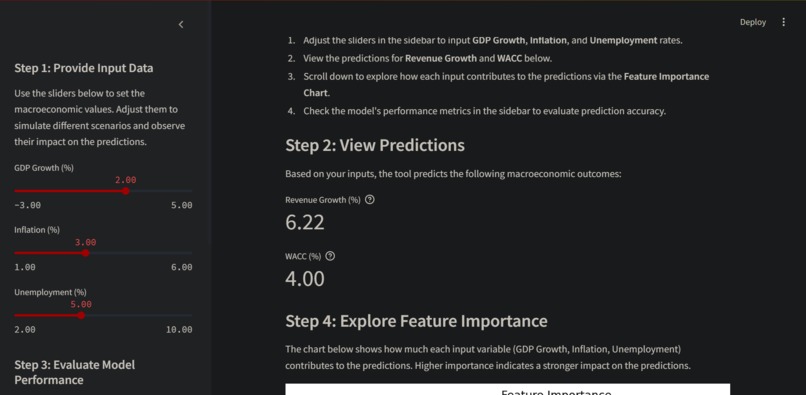
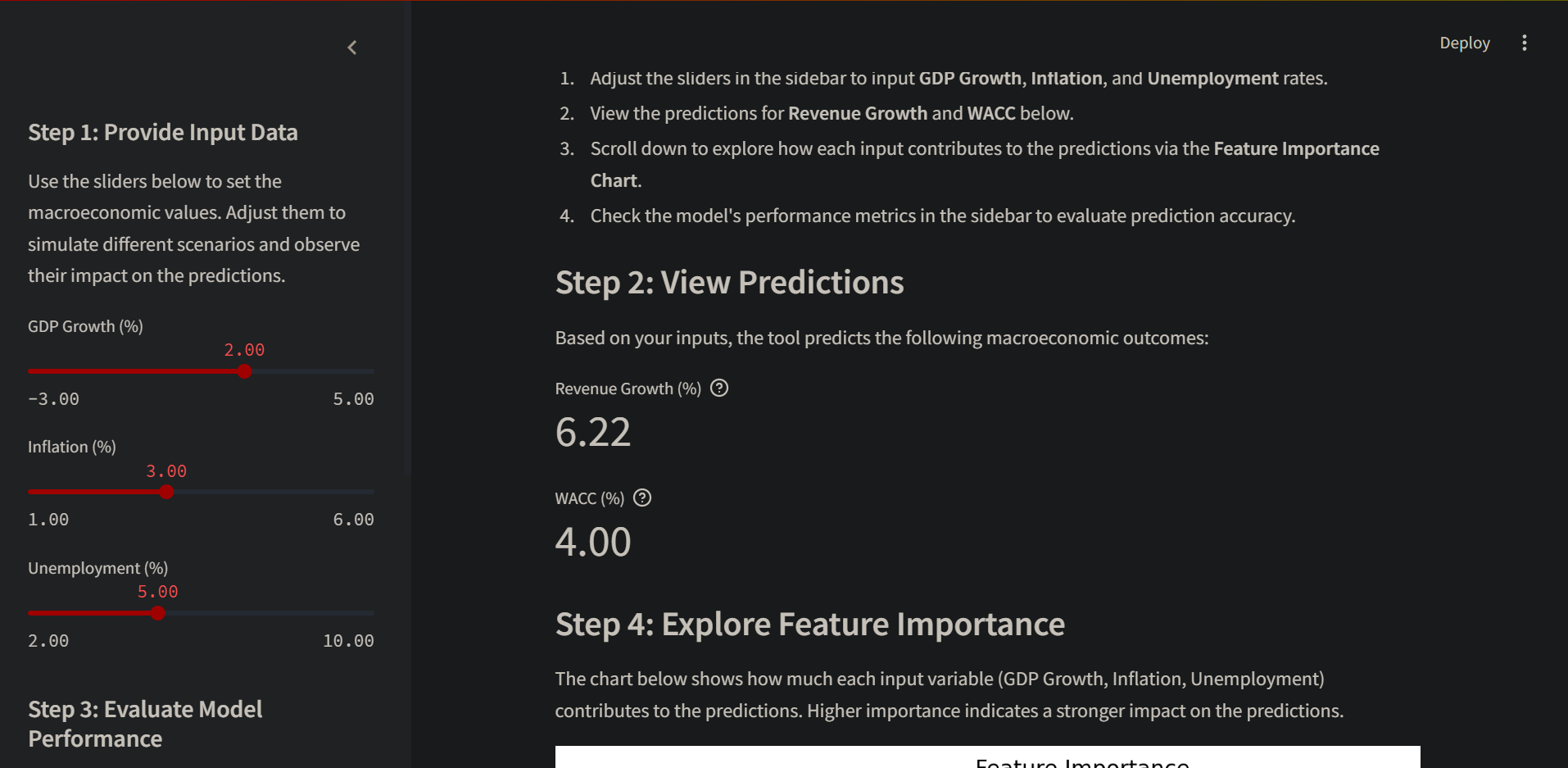
Steps 1-2
-

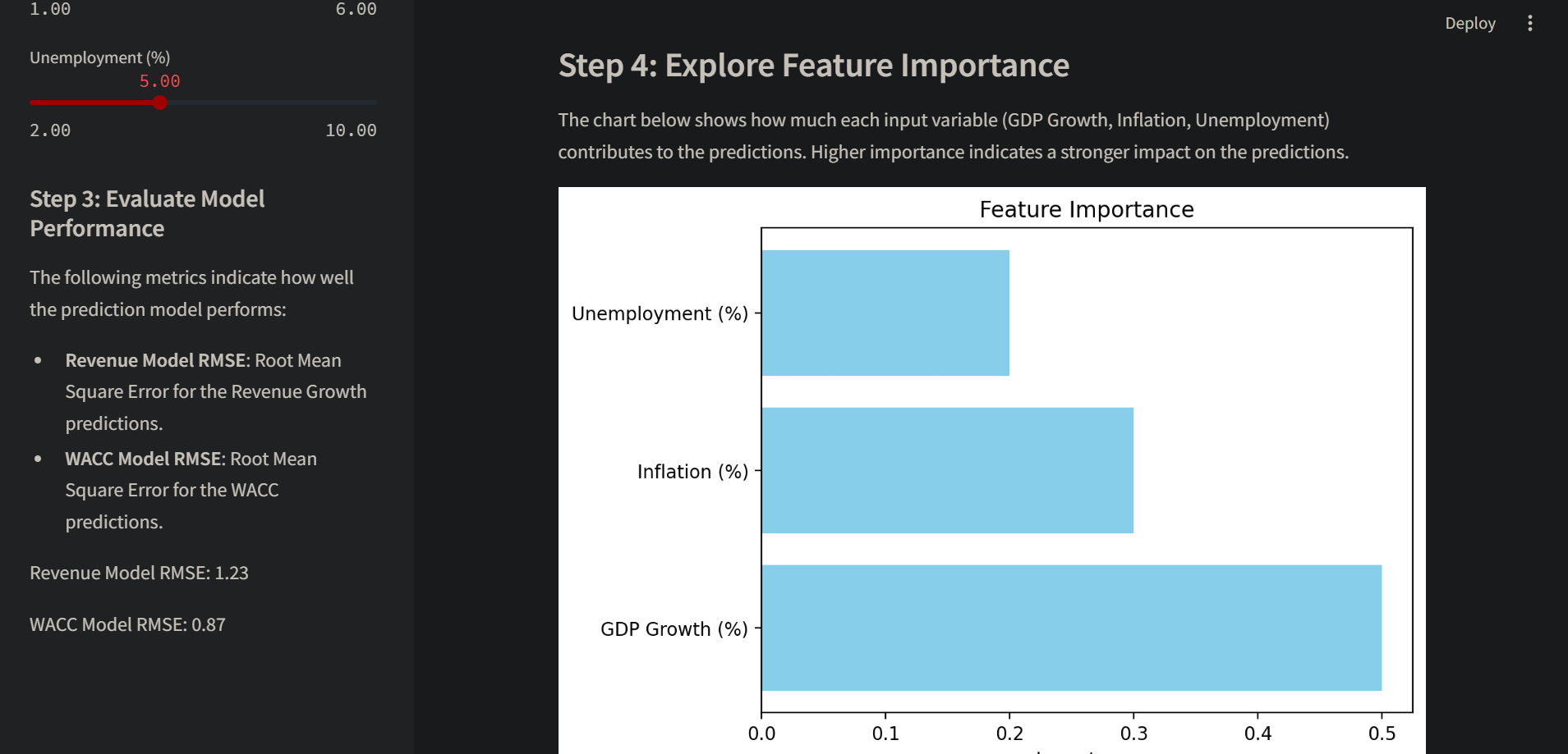
Steps 3-4
Inspiration
The Macroeconomic Prediction Tool was inspired by the need for accurate and interactive macroeconomic forecasting. With the advancements in machine learning and big data, there is a growing opportunity to improve traditional econometric models. The tool draws inspiration from various studies and projects that have successfully integrated machine learning into macroeconomic forecasting
What it does
The tool allows users to input macroeconomic variables such as GDP growth, inflation, and unemployment rates through intuitive sliders. Based on these inputs, the application generates predictions for financial metrics like revenue growth and the weighted average cost of capital (WACC). It also visualizes the relative importance of each macroeconomic factor in determining the predictions and provides performance metrics to evaluate the accuracy of the underlying model. The tool is designed to help users explore and understand how different economic scenarios affect financial outcomes.
How we built it
The Macroeconomic Prediction Tool was built using Python and the Streamlit framework. Streamlit was chosen for its simplicity and ability to create interactive, data-driven applications quickly. The inputs provided by users are processed using NumPy, and mock predictions are generated to simulate the behavior of a real model. Matplotlib was used to create a horizontal bar chart that visualizes feature importances, helping users understand the significance of each input variable. The application was developed iteratively, starting with core functionality and gradually enhancing the interface and usability to ensure a seamless user experience.
Challenges we ran into
Instead of focusing on predictive accuracy, we had to shift our efforts toward creating a dynamic and interactive interface that could demonstrate the application's functionality. Another obstacle was developing a feature importance visualization that was both insightful and easy to interpret, requiring us to carefully design mock data that aligned with the intended narrative. Additionally, balancing simplicity and depth in the user interface to accommodate users with varying levels of expertise proved to be a complex yet rewarding task.
Accomplishments that we're proud of
We successfully created an interactive tool that provides users with an engaging and educational experience. The real-time updates of predictions and visualizations based on user inputs showcase the tool's dynamic nature. The feature importance visualization effectively communicates the role of each input variable, enhancing user understanding. Moreover, the tool's design is highly extensible, allowing for easy integration with real models and data sources in the future. These accomplishments reflect the effort put into making the tool both functional and user-friendly.
What we learned
Building this tool reinforced the importance of clear and intuitive interfaces in data-driven applications. We learned how powerful Streamlit can be for rapidly prototyping and deploying interactive dashboards. The process highlighted the value of visualizations in simplifying complex relationships, as the feature importance chart became a central element of the tool. Additionally, we gained insight into the challenges of building applications that cater to both technical and non-technical audiences, emphasizing the need for clear instructions and explanations.
What's next for Macroeconomic Prediction Tool
The next steps involve integrating a trained machine learning model to replace the current mock predictions, providing more accurate and actionable insights. We plan to incorporate live data through APIs such as those offered by the World Bank or IMF to make the tool more relevant and dynamic.


Log in or sign up for Devpost to join the conversation.