-
-
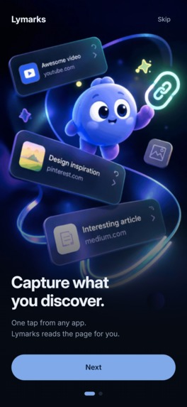
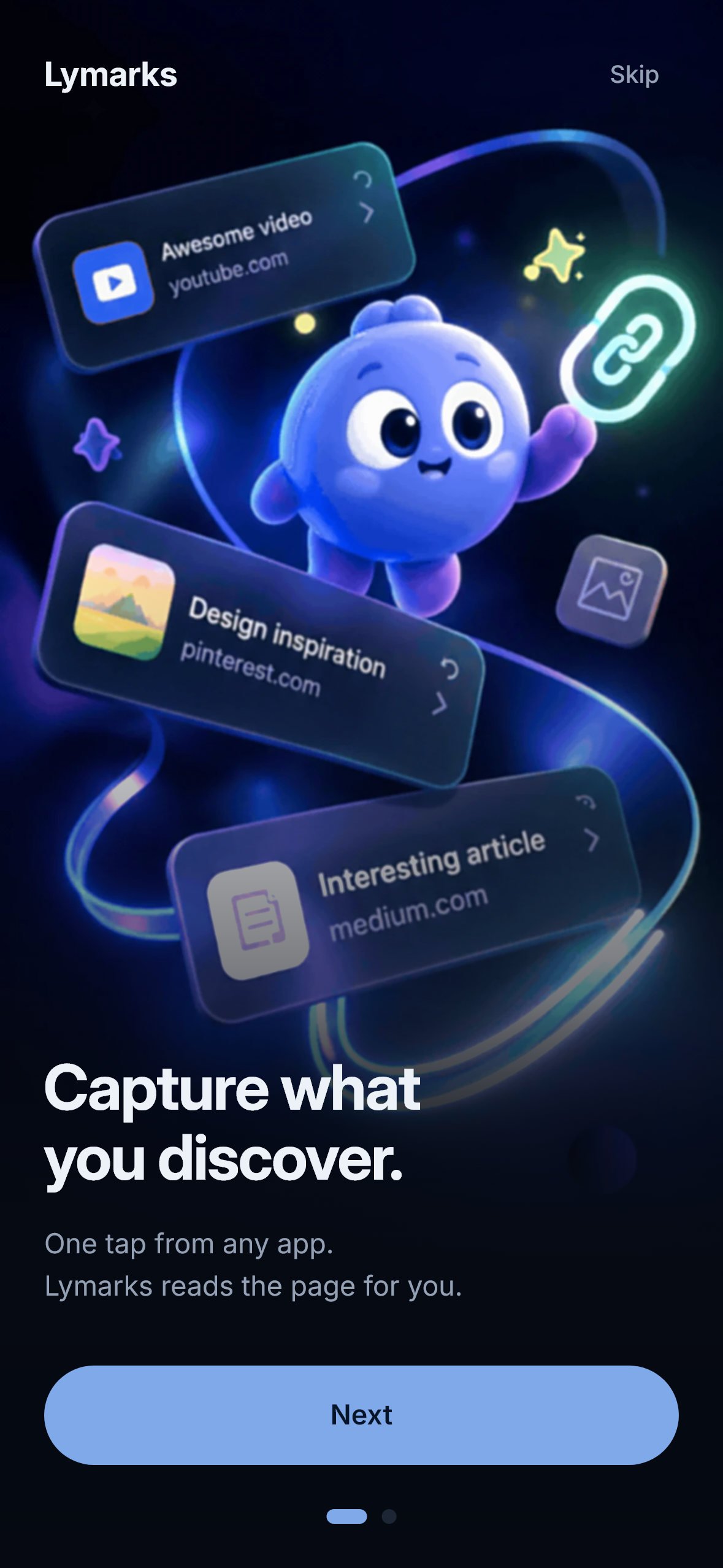
onboarding-capture.
-
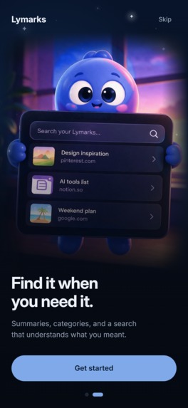
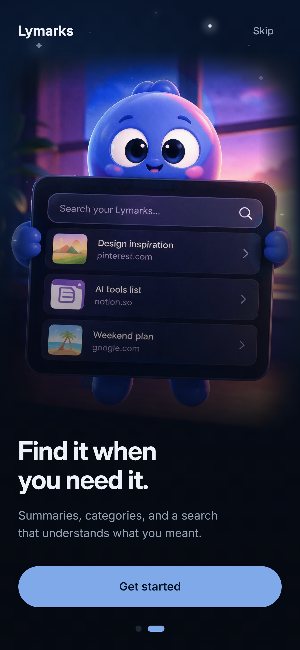
onboarding-find.
-
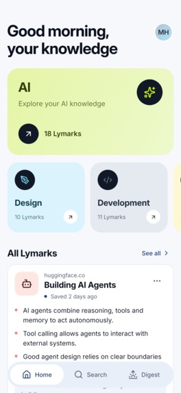
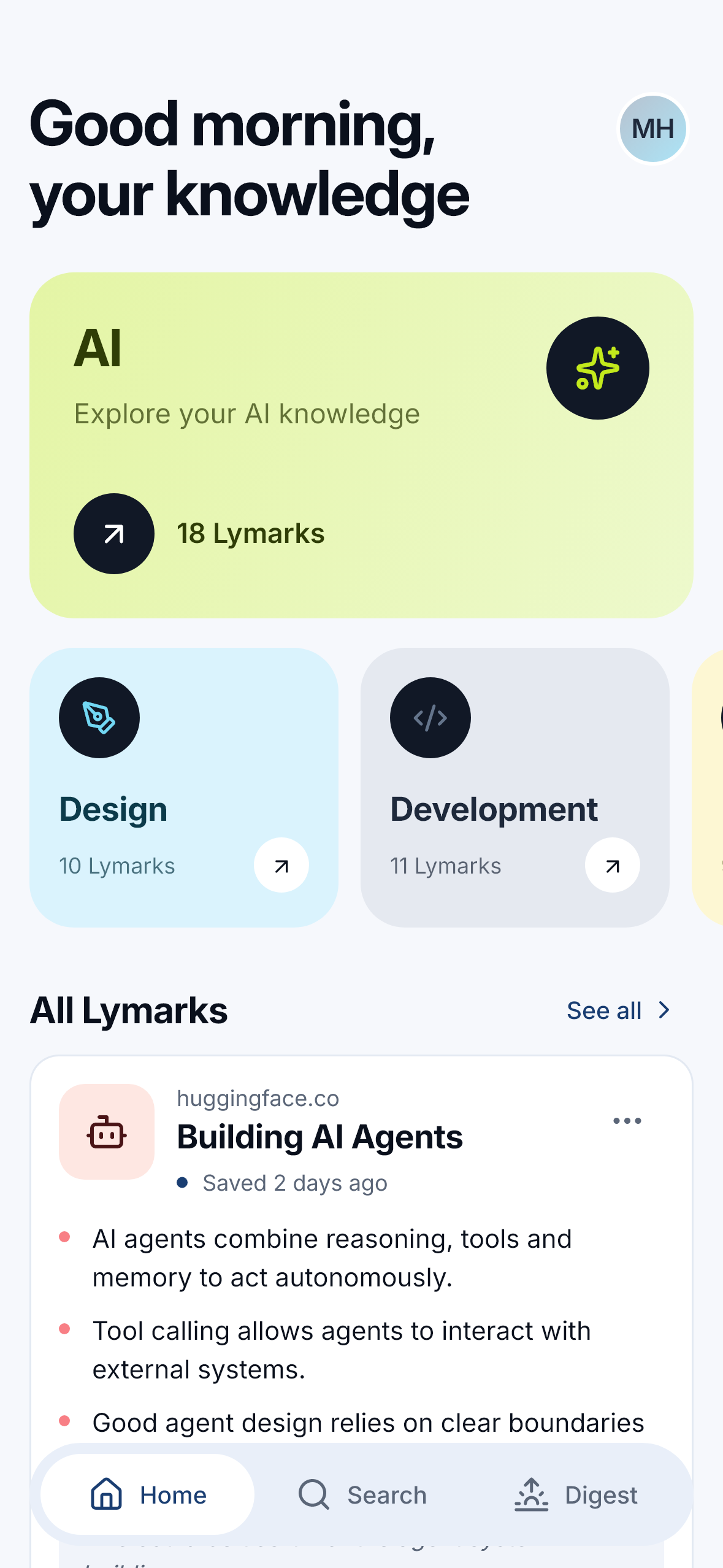
Home
-
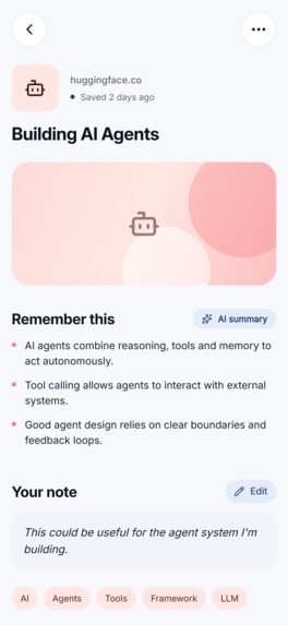
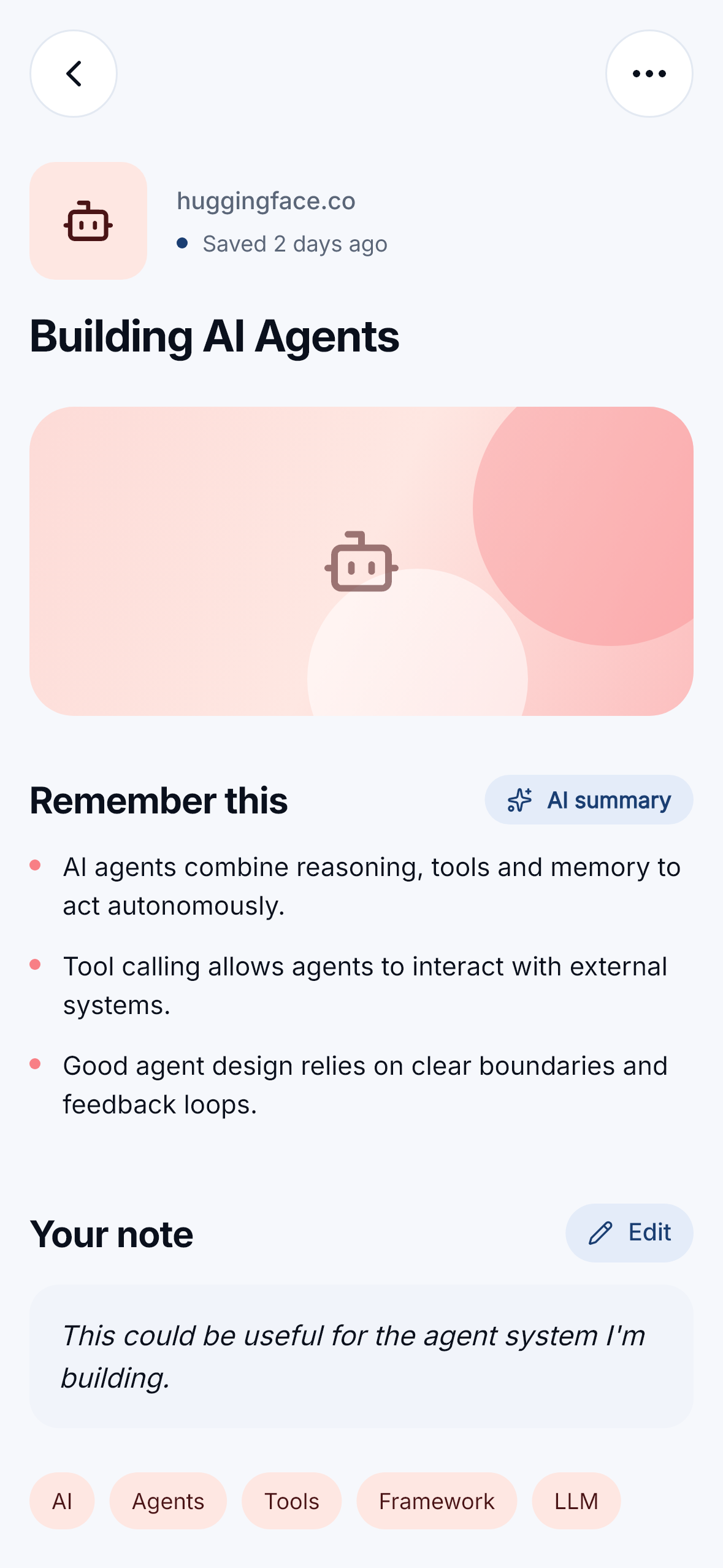
Lymark
-
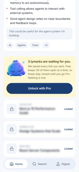
Locked
-
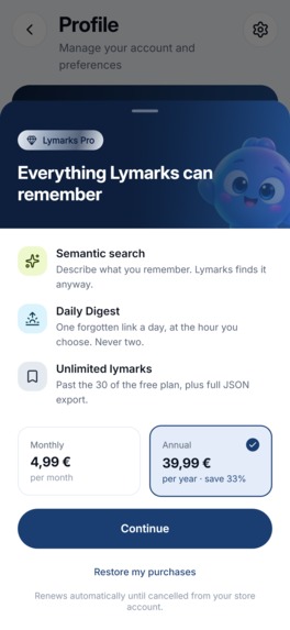
Paywall
-
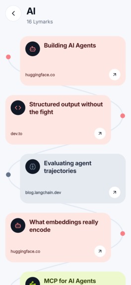
category-path
-
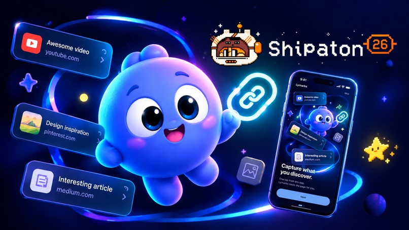
Thumbnail
The category I'm entering, and why
Next Gen — I'm a student, there's no paid developer account behind this. The whole app runs from source, and the repository is the submission.
One category, on purpose. The app could be argued into others and I'd rather not: the design is good, but it isn't a design product.
Inspiration
I spend my days saving links: tips I want to revisit while coding, a tool someone mentioned, an article I'll need "later." When that "later" finally arrives, I find it impossible to locate the specific item buried under the pile of saved links and videos in my bookmarks — because I've forgotten the title, the source site, and the exact wording used.
Raindrop (which I've tried extensively) and even note-taking apps filled with copy-pasted URLs solve the storage problem beautifully. They offer folders, tags, highlighting, full-text search... Yet, each one requires you to remember a specific detail about the content — its title, the words it contained, or the category you filed it under. None of them solve the problem of retrievability.
That is the core idea behind Lymarks: a saved link is worthless if you can't find it again when you only have a vague memory of it.
This isn't a problem I invented just for my own convenience. Anyone who saves more content than they actually read ends up with the same digital "graveyard": people who email articles to themselves all week, those who keep four hundred tabs open, or those for whom a "read-it-later" app has quietly become a place where links go to die.
The app is built on a simple promise: you don't need to remember the link itself. You only need to remember what you were looking for.
What it does
You share a link from any app. That's the entire interaction — one tap, no form, no folder to pick. Two seconds later the sheet is gone and you're back where you were.
Behind that, Lymarks fetches the page, extracts the text, and asks a model for three bullets and a category. The card fills itself while you've already moved on. From then on the link is findable by what it said, not by what it was called — including semantic search, where you describe what you half-remember and it surfaces anyway.
Some pages refuse a server. When that happens the phone reads the page itself and hands the text back to the same pipeline, so a site that blocks robots still ends up in your memory.
And it works without a network: the library lives on the device, search falls back to full text locally, and a banner says plainly that you're looking at the last sync instead of pretending everything is fine.
Monetization: what the free plan does instead of refusing
This is the part I'd most like judged.
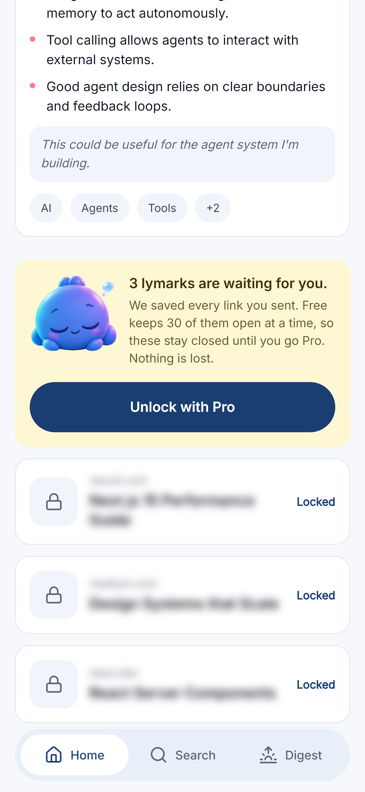
The obvious free-plan design is a limit that refuses: past 30 links, the capture fails. I shipped that first. Then I tested it on a real phone and saw how bad it is — you keep sharing links from other apps, none of them arrive, and you don't find out until you next open the app. The product quietly loses your data to protect its own pricing.
So the limit changed nature. Past 30, the link is still saved. It just arrives locked: there in your library, blurred, with the mascot asleep beside a line that says "We saved every link you sent. Nothing is lost." No model call is spent on a locked link, so the free tier still costs nothing to run. The moment the RevenueCat webhook confirms the entitlement, every locked link unlocks and the pipeline runs on all of them at once — you don't get an empty Pro, you get your own backlog, summarised.
The upgrade isn't a gate you hit. It's a key to something you already own.
The HAMM award would have been this work's natural home, but that category expects an app already published on the stores and Lymarks isn't there yet. Next Gen is the one I can honestly claim — the monetization work is here all the same, and I'd rather it be read than not entered at all.
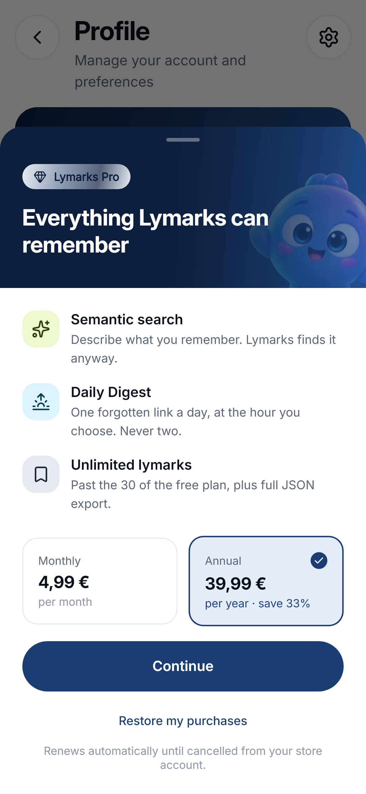
RevenueCat carries that whole flow: offerings drive the paywall prices, the
appUserID is the Clerk user id, and the entitlement is confirmed server side
by the webhook. The app never decides on its own that you're Pro — the store
confirms the payment, the server decides the right.
During the Shipaton the purchases run against RevenueCat's Test Store, so the
whole chain — offering, purchase, webhook, entitlement, unlock — is exercised end
to end without a Play listing. And no screen imports the SDK: purchases sit behind
a Billing contract. That is what makes the paywall testable against a fake store,
and what lets the app run with no store at all — which is exactly what you get when
you clone the repository.
How we built it
Flutter app ──► Cloudflare Worker API ──► Neon Postgres (pgvector + full-text)
                        │
                        ├─► Groq → Gemini Flash   summary, 3 bullets, category
                        ├─► Gemini                embeddings for semantic search
                        ├─► Clerk                 identity
                        └─► RevenueCat webhook    entitlements
Flutter and Riverpod on the client, Hono on Cloudflare Workers for the API, Neon Postgres with pgvector and a generated tsvector column for hybrid search. Page fetching is SSRF-guarded, with DNS resolved over DoH before every request and every redirect.
Everything is optimistic first: each gesture changes the local list immediately and reconciles with the server afterwards. Deleting is reversible for five seconds, and the real purge only leaves once the undo window closes.
See it in one minute, with no keys
git clone https://github.com/morel1999/lymarks.git && cd lymarks/app
flutter run
With no API keys the app boots in demo mode: 54 lymarks, every screen reachable, and no network calls at all. It isn't a mock layer bolted on for reviewers — it's the same code path the test suite and the reference renders run against.
The demo needs no server, but there is one, and it is live:
GET https://lymarks-api.lymarks.workers.dev/health answers
{"ok":true,"version":"0.1.0","db":"ok"}. Build the app with a Clerk publishable
key and the same binary talks to it.
It starts you on the Free plan on purpose, because that is where the part I'd most like judged actually lives: 30 lymarks open, the 24 most recent saved but locked, and a simulated purchase that opens all 24 at once. The README walks through the whole thing gesture by gesture.
Challenges we ran into
A feature can pass every test and still not exist. Offline reading was green
across the suite and completely unreachable on a real phone: the auth SDK awaited
a session-token fetch during startup, retried it eight times with exponential
backoff, and since that was the only await before the app started, Flutter never
drew a single frame. You saw the launch screen forever. It took an evening of
reading logcat line by line to find it. No unit test would have.
Reference renders that failed at random, on and off for days. The cause was in
the demo data: it called DateTime.now() once per item, so two links saved "nine
days ago" sometimes landed in the same millisecond and sometimes didn't — and
List.sort isn't stable in Dart, so their order flipped between runs.
Accomplishments that we're proud of
- The locked-instead-of-refused free tier. It changed how the product feels, and it came from testing on a device rather than from a spec.
- 121 behaviour tests and 32 reference renders on the app, plus the API's security suites. The renders caught real regressions, not just cosmetic drift.
- A design system with its own mascot, whose poses are colour-matched by a reproducible pipeline that lives in the repository: the target hue is measured off the asset the app actually ships, never written as a constant.
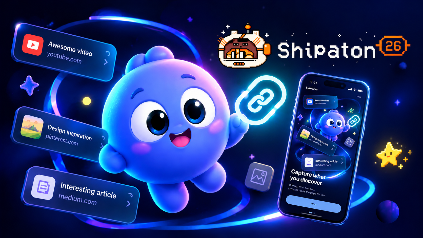
- The onboarding's two 3D scenes, held to that same discipline. Both arrived with the mascot at the wrong hue — 243° and 258°, where the app's own sits at 220° — and one of them as a 26 MB 256-colour GIF whose dark gradient was a dither pattern that crawls on an OLED screen. The build script measures the target hue off the shipped mascot instead of hard-coding it, removes the dither before upscaling rather than after, and neutralises a third-party logo that was legible on a card. 255 KB for both, at the exact pixel width of the screen.
- Documentation kept alive rather than written once, including a build journal that records what actually broke and why.
What we learned
That the gap between "it works" and "it works on a phone" is where the real work is. Three of the best things in this app — the locked free plan, offline reading, a launch screen that doesn't flash white — exist because something was wrong on a device and nothing in CI could see it.
What's next for Lymarks
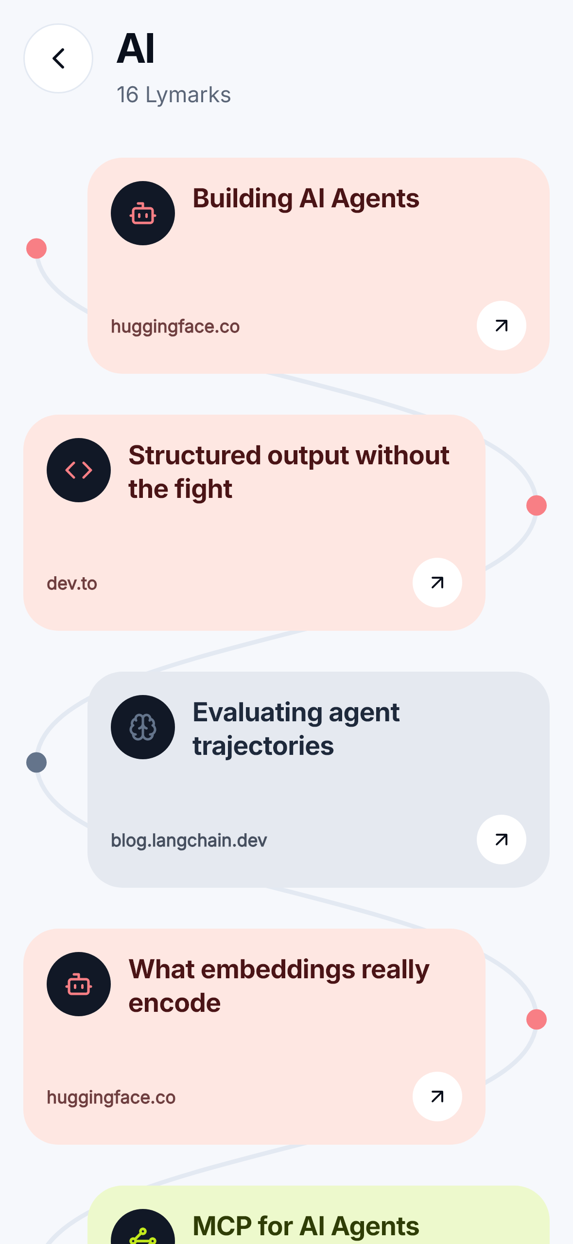
Automatic clustering: category paths currently run on a fixed taxonomy, and the server doesn't compute clusters yet. The Daily Digest has its schema and its screen but no scheduled job. Push notifications have no token plumbing. iOS is untouched, for want of a Mac.
These are in the README too. An honest map of what isn't done is worth more than a demo that pretends.
Built With
- clerk
- cloudflare-worker
- dart
- flutter
- gemini
- groq
- hono
- neon
- pgvector
- postgresql
- revenuecat
- riverpod

Log in or sign up for Devpost to join the conversation.