-
-

Padlock
-
BG Fish 1
-
BG Fish 2
-
Main Folder
-
Settings Gear
-
Logo
-
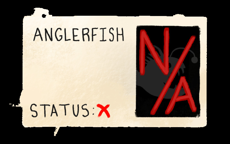
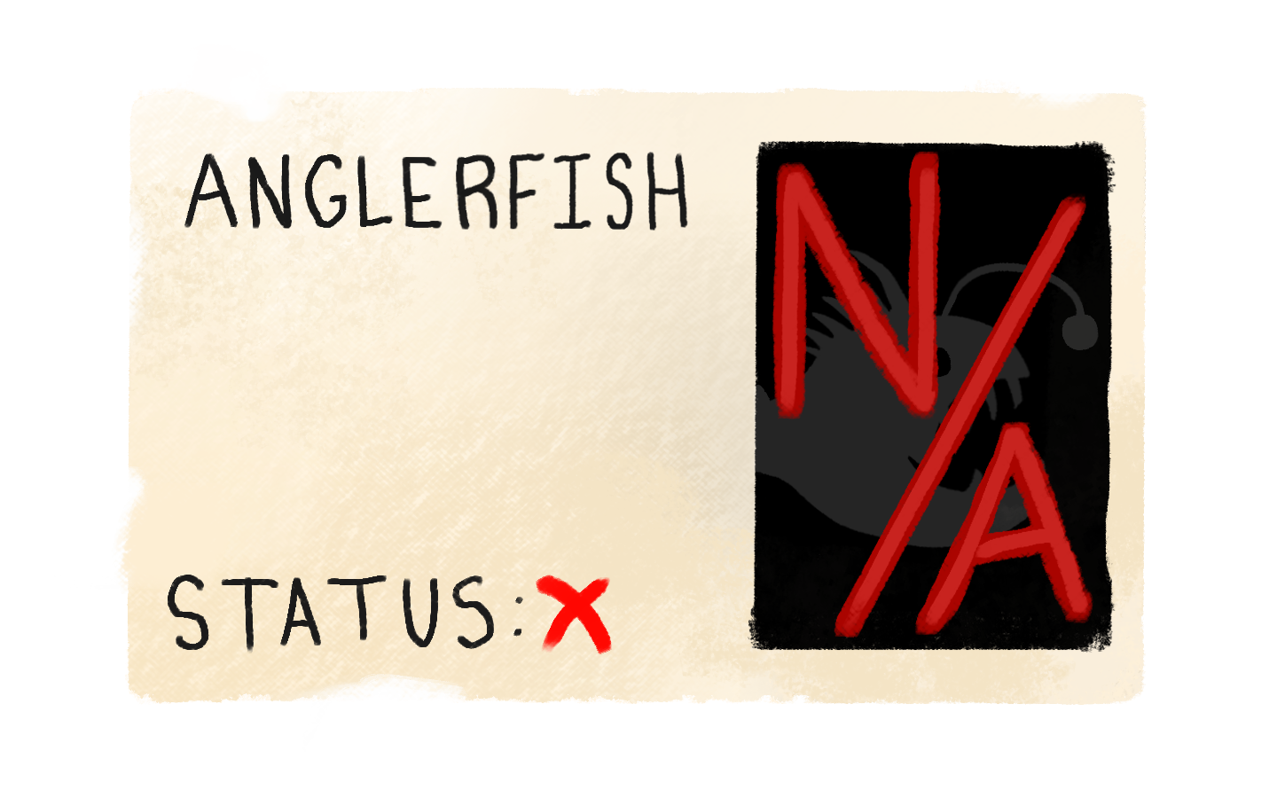
Anglerfish card (incomplete)
-
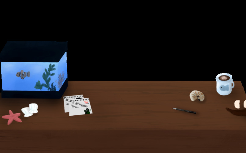
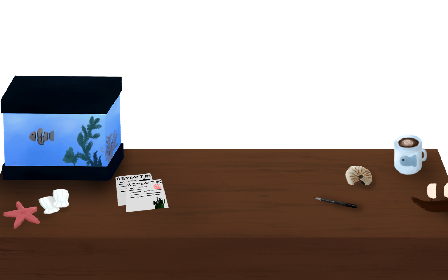
Desk
-
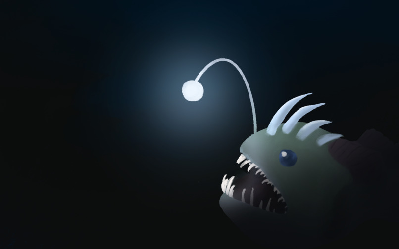
Anglerfish Painting
-
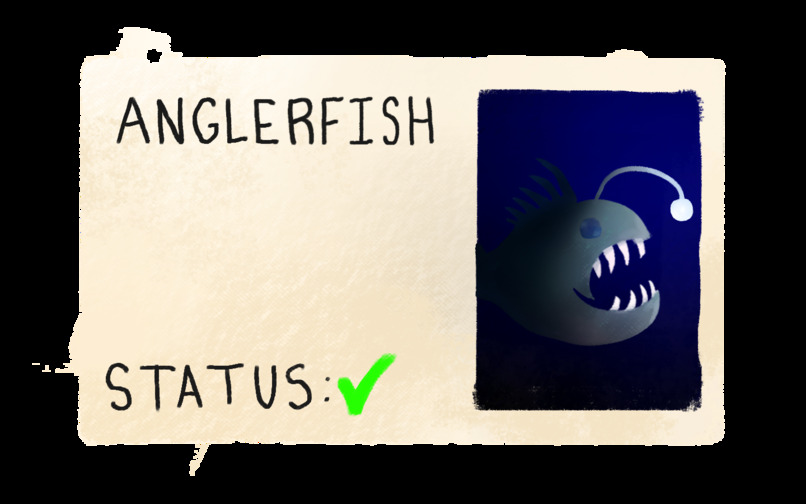
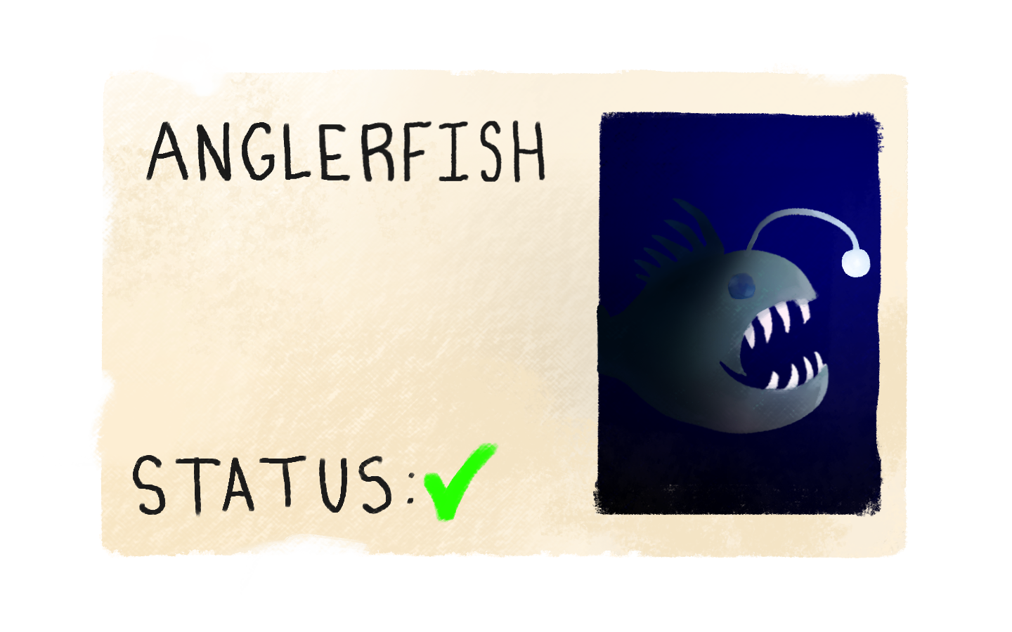
Anglerfish card (complete)
-

Redesign Lab BG


Inspiration
My mom, despite being very intelligent, often falls victim to deceptive, confusing websites and apps, known as "dark patterns." It usually ends with a subscription charge on her credit card or even stolen personal information. I don't want to see others be manipulated by this kind of practice.
What it does
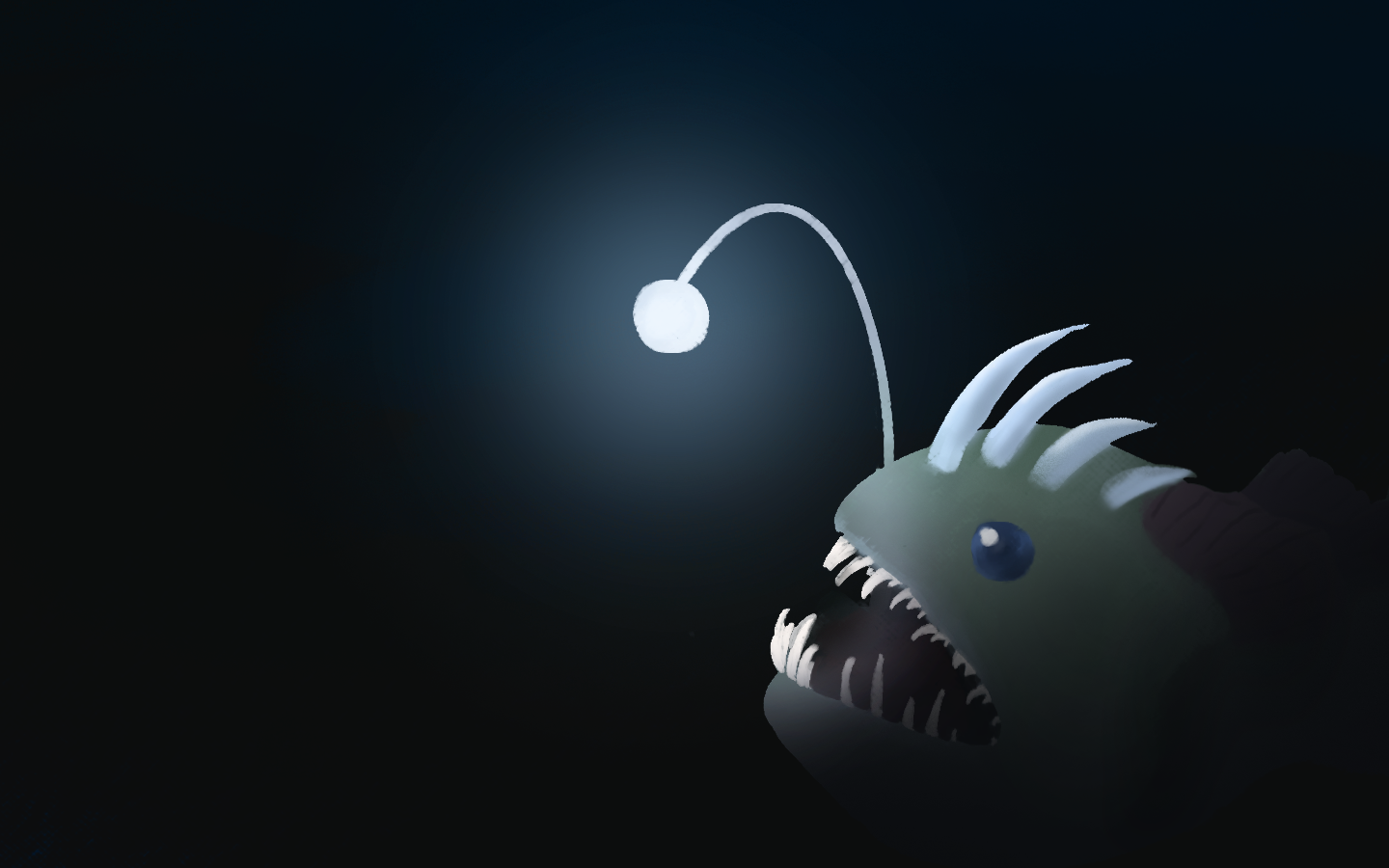
LURE teaches people to spot deceptive designs by letting them fall for one first. Each case is a deep-sea creature that mirrors a manipulative tactic. In the first case, the anglerfish, you're shown a glowing "free trial" offer. Whether you take the bait or escape, LURE then reveals the six tricks hidden in it, from a pre-checked add-on to a fake countdown timer. In the Redesign Lab, you fix each trick yourself and watch the offer turn into an honest version. It also includes accessibility settings for reduced motion, larger text, high contrast and a clearer font, and it can be completed with just a keyboard.
How we built it
I handled all the planning myself. I created every art asset on the site in Clip Studio Paint, experimenting with layer modes, brushes and new styles to give the site some charm. I then used those assets to lay out each screen in Figma. I used Claude by Anthropic to write the code (which I often had to manually tweak), turning my designs and vision into a working site. LURE is built with HTML, CSS and JavaScript, and is hosted on GitHub Pages.
Challenges we ran into
I mainly use Clip Studio Paint on an iPad, and constantly transferring files between that and my PC was quite troublesome. I ultimately resorted to creating some of the simpler graphics directly on my PC with a mouse, which worked fine for the most part. While I love digital painting, I also decided to go for a very specific, "rough" style for this website's art, which was new and difficult to adjust to at first.
Claude could not perfectly envision what I wanted out of my designs, so I had to make an enormous number of micro-tweaks to get everything the way I wanted. For example, the checkmark animation after completing a dive went through several stages. It started as a buggy pixelation effect, then became a boring fade, and went through several more iterations until I landed on the clean, impactful completion effect that's in place now.
Accomplishments that we're proud of
This was my first time building a full website, and doing so in the given timeframe was a huge accomplishment for me. I'm normally a very slow artist and take my time a little bit too much, so being able to finish all the art for the site was also awesome. I was really happy that the site ended up including all the tiny details I'd imagined from the start, like the little fish in the background of the Redesign Lab, the little ocean-themed trinkets on the homepage's desk, the particles drifting throughout the site, and more.
I'm also proud of how accessible LURE is. It has settings to reduce motion, enlarge text, switch to a high-contrast look, and swap the handwritten font for one that's easier to read. These start out matching the user's own computer settings. The whole experience can also be completed using only a keyboard.
What we learned
I learned how to paint in a new style, and how to work on one project for an extended period of time without burning out. I also learned what it takes to make a website accessible, from keyboard navigation to respecting reduced-motion settings. Finally, I learned how to use AI to build a website efficiently without losing its personality.
What's next for LURE
I'd like to finish the two locked cases: the jellyfish, about manipulative cookie-consent banners, and the mimic octopus, about ads disguised as real content. I wish I could have finished them during the hackathon, but I ran out of time. The more dives a user explores, the less likely they are to fall for deceptive design in real life.
Built With
- anthropic
- clipstudiopaint
- css
- figma
- html
- javascript


Log in or sign up for Devpost to join the conversation.