-
-

Homepage allows account creation with Facebook, G+, or email. Includes required materials, deadline countdown, & estimated time to complete.
-

Household definition (1/2): Eligibility heavily relies on reporting correct number of household members, so definition is surfaced upfront.
-

Household definition (2/2): This way users confirm understanding for entire definition. Mix of graphics & text enhance clarity.
-

Adding household members requires adding 1 child to continue. Household size calculated and confirmed with dynamic button CTA.
-

Intro to income section: interstitials congratulate user on progress and also prepare them for new topic of questions to answer.
-

Adding income mimics an "Add to Cart" pattern by person. In context tooltips. Income sections & types shown as reminders. Dynamic button CTA
-

Intro to contact info: interstitial to thank them for completing income section, while moving into more familiar sections as relief.
-

Framing SSN as Y/N prompt reduces stress by giving equal weight to various household scenarios. Form shows if Y clicked. Microcopy included.
-

Framing address as Y/N question reduces stress over eligibility for homeless. If Y clicked, form appears. Zipcode can autofill city/state.
-

Application Review. Information organized based on household members to optimize for user familiarity.
-

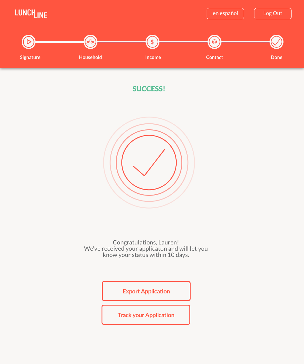
Successful confirmation!


Approach
We approached this project based on the four goals outlined by the contest makers. Our processes answer the need for accurate responses and foster an all-around superior user experience.
Web-based and forward-looking
Lunchline is an online application that perpetually saves users’ responses to a personalized profile. This lets applicants to return to review and complete their application on any device, at any time. Applicants receive reminder emails to start where they left off and submit before the deadline. When asked to reapply in following year(s), household information can be reviewed and tweaked as needed, alleviating the burden of starting from scratch. Of course, changes in status, income, and information can be edited and signed for accuracy.
Personalized behavior prompts
Welcoming language
We address applicants directly (“Thanks [NAME]!” … “No, I have no income” … “Let’s start with your income” …) to simulate an open, warm conversation. We reuse household members’ names to frame questions and answers in a way that's familiar to users.
Social desirability bias
A school specialist interview revealed that up to 50% of households she helps don’t have SSNs. We thought this fact deserved equal weight and more comfort than a tiny checkbox. We first ask “Do you have [a SSN]?” before showing an empty form field; doing so decreases anxiety around lacking an SSN. We reuse this comforting pattern when asking about a mailing address. Framing questions this way reassures users that their situation (lacking an SSN/homelessness) isn’t unique within the landscape of American households, and won't affect eligibility. Reassuring microcopy provides additional reassurance.
Reduced stress
Visual design was one of many elements used to reduce anxiety. Rounded corners for form fields, buttons, and icons enhance comfort. Iconography brings personality and playfulness to an otherwise routine experience. As companies like Yelp, Seamless, OpenTable, and grubHub have realized, a bright red-orange color palette attracts engagement and excitement around food experiences; an off-white background brings softness to a typically sterilized white.
UX best practices
Endowed progress effect
Psychology research shows that giving the feeling of initial progress makes people more likely to complete an activity than those who have an equally easy goal but aren’t given the foundational boost. To help motivate users to finish, our progress bar appears 20% completed after entering just two form fields (email and password for login).
User-Centric Design Processes
We conducted user interviews and prototype testing throughout the process to uncover both user insights and interface adjustments. Our 3 personas provided a reference for diverse household situations and our 2 user journeys monitored how this application would fit into a larger picture of applicants’ lives. One persona didn’t know a spouse’s income, so we allowed them to email others directly from the income page. Another persona had a somewhat ambiguous household (a mom with a steady boyfriend), so we surfaced a 2-part visual definition of who qualifies as a household member as the first step in the survey to clarify this important distinction. In our user journey, one parent was nervous about not having a Social Security Number, so we reduced anxiety by asking this as a Y/N question before presenting a form field.
Simplicity
Lunchline was designed and developed mobile-first to enhance simplicity across all devices. This was also important given that a significant percentage of lower income households have access to a smartphone.
Survey length
We tried to reduce survey length or form fields when possible; when in conflict, we believe keeping the survey simple is more important than keeping it short.
Complex questions are broken into small digestible steps asking for one piece of information at a time; this is especially helpful for short attention spans and more basic reading levels. Interstitials between survey sections congratulate progress and prepare applicants for new types of question topics.
We ask for Assistance Program first to let participants skip a large chunk of form fields. We opted against a similar order for the skip logic based on child statuses (foster, migrant, Head Start, homeless, runaway, etc.) because we found asking “Are all students in your household one of these statuses?” was too complicated and too leading. Applicants would have to juggle thinking about their children, if they were students, and all five of these statuses in one step; furthermore, our specialist interview said <5% of households in her school would have even 1 child with these statuses.
Edit checks for accurate form completion
Errors of Omission
Lunchline forces users to make a selection by disabling the “Next” button until they've provided the minimum information needed to move on (i.e. each household must have one child to continue; at least one child must be a student to continue; etc.). Instead of increasing visual strain of marking all required questions with asterisks (*), we’ve instead labeled the (much less common) optional fields as such.
Income is the most misreported information usually because users don’t understand what or how to report it. We placed helpful tooltips regarding income source specifics so definitions are clearly connected with income sources without being distracting. If a household members’ income isn’t known, users can email them with a prepopulated template requesting their income sources, frequency, and amount. We also force users to declare each household member's income (or lack thereof), so they must at least consider income source possibilities for everyone.
Errors of Understanding
We dissemble complex questions into more simple, direct prompts. For example, we first ask if the user even has a Social Security Number (Do I have an SSN?) before revealing a form field to input the last four digits. The income source section is another example where a complex question (What does your household make annually?) has been broken down into singular components (What is Person A’s income? >> From work? >> From wages? >> How often are they paid? >> How much are they paid?).
Errors of Counting
When appropriate, button call-to-actions (CTAs) are dynamic based on user responses. For example, for adding household members and adding income sources, the button will serve as a numeric reminder and confirmation for previously entered inputs. User testing also uncovered that asking for income frequency before quantity allows users to report income how they prefer, instead of trying to guess their total income beforehand.
Errors of Memory
Lunchline forces users to review answers before final submission. This is especially helpful if there is a delay between starting and finishing their application. The review page organizes information based on their household members rather than making them review the entire application questions again; this people-centric structure brings clarity to applicants in terms they're already familiar with ... their fellow household members!
Errors of Dishonesty
Given government research findings, we placed the signature certification as the first step of the application to reduce self-reporting errors. User-friendly copy accompanies the lengthy terms and conditions to bring clarity to what users are signing -- the promise to provide honest and voluntary answers.
Challenges we ran into
Timing: Our team didn't discover the project until early January, so we definitely lost some potential time to implement bigger ideas.
What's next for Lunchline
- Our interview with a school specialist revealed that many households fail to fill out the application because of illiteracy. Ideally, there would be a visual icon that would allow participants to "listen" to and fill out the application with audio-technology (screen reader, Google Voice Typing, etc.).
- Applicants should be able to track their application status online (similar to a very famous online pizza tracker...). Progress bar updates could be steps like Received >> Opened >> In Review >> Status Update Successful!
- At the end, the application can surface nutritional recommendations based on location, income, and household size.
- TurboTax authentication for easier income reporting/editing
- Form field validation: Users can receive an error or validation every time they finish completing a form field to give a tiny sense of accomplishment at every step. It also decreases the time and effort spent on fixing errors as they appear, rather than waiting to find out what went wrong when trying to move on.
- Optimized form fields: In-field, top-aligned form fields can provide quick scan-ability and visual clarity, as opposed to other types of form fields.


Log in or sign up for Devpost to join the conversation.