-
-

Lucid
Overview
Lucid is a concept for a system that helps people understand how their attention moves throughout the day. Most productivity tools track time through schedules and tasks, but they don’t reveal how focus actually shifts moment to moment. Lucid visualizes attention as a flowing timeline so people can see the shape of their day and reflect on how their attention was spent.
The Problem
People rely heavily on calendars and task lists to organize time. While these tools are useful for planning, they don’t capture how attention actually behaves throughout the day. A day filled with scheduled blocks can still feel chaotic, fragmented, or unclear in hindsight.
Because attention naturally moves between focus, drift, and rest, traditional productivity tools often fail to represent the true experience of a day.
The Idea
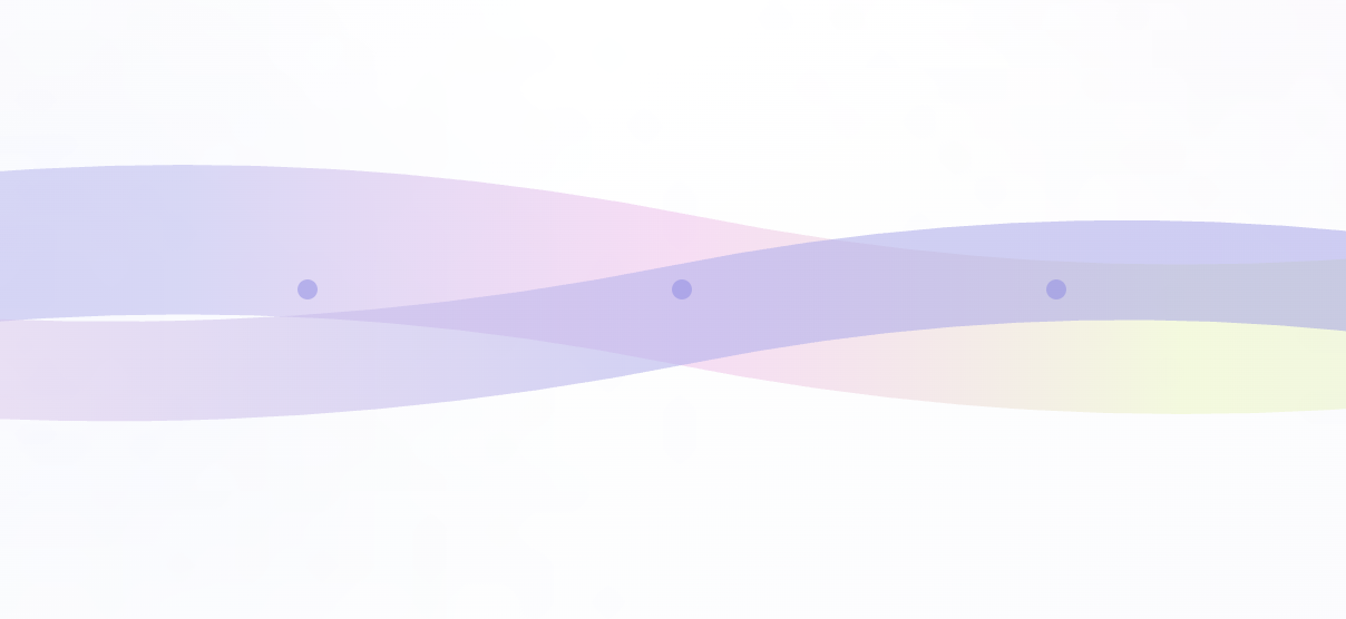
Lucid explores a different way to represent time and focus. Instead of rigid time blocks, it visualizes attention as a continuous “time river.” This flowing representation allows patterns to emerge across the day, including periods of deep focus, flow states, and breaks.
By turning attention into a visual shape, Lucid encourages reflection rather than strict productivity tracking.
How It Works
Lucid is built around three core ideas:
- Capture signals – Passive inputs from apps, routines, and activity patterns provide signals about attention throughout the day.
- Understand patterns – These signals are interpreted to identify shifts between focus states.
- Reflect on time – The results are visualized as a flowing timeline that helps users see how their attention evolved.
The goal is not to measure productivity, but to make attention visible.
Key Features
- Attention Indicator – A gentle real-time signal of a user’s current attention state.
- Attention Forecast – Pattern detection that predicts when a user is most likely to focus.
- Reflection Prompts – Questions that encourage users to review their day and understand attention patterns.
Together these features help build awareness of how attention moves throughout the day.
How It Was Built
This project was created using Figma Make as a design prototype. The interface and presentation were designed to communicate the concept clearly through visual storytelling.
The slides walk through the problem, the system concept, and the core visualization of the time river experience.
Challenges
One of the main challenges was designing a visualization that communicates attention without relying on rigid charts or traditional productivity metrics. The goal was to create something that felt calm and intuitive rather than analytical or overwhelming.
Balancing clarity with simplicity in the interface and slides was also an important part of the process.
Key Takeaways
Designing Lucid highlighted how visualization can change the way people understand their behavior. Representing attention as a continuous flow rather than discrete tasks offers a different way to reflect on how time is experienced.
The process also emphasized the importance of narrative in product design. A clear story helps communicate not only how a system works, but why it matters.
Vision
Lucid aims to help people move from autopilot to awareness. By making the shape of attention visible, it encourages reflection and more intentional use of time.
Built With
- design
- figma
- interaction
- make
- product
- ui/ux
- visual


Log in or sign up for Devpost to join the conversation.