-
-
Logo for the app
-
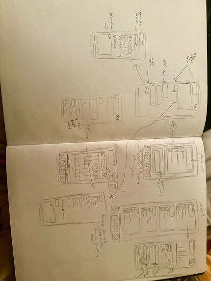
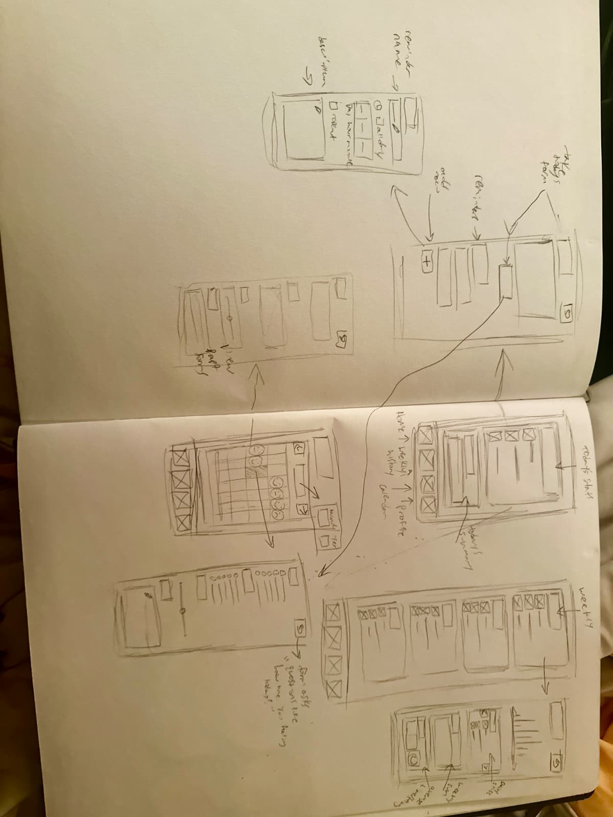
Initial hand drawn low fidelity design
-
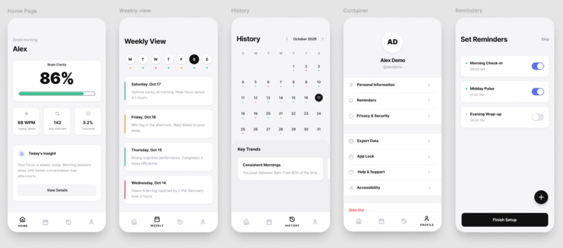
Figma high fidelity design

Clarity
What if your phone could tell you your brain was struggling before you even noticed?
Inspiration
We've all been there: that 3 PM slump when you're staring blankly at your screen, re-reading the same sentence for the fourth time, launching the same app for the sixth time in ten minutes... but unable to pinpoint exactly what's putting you off.
Mental fatigue is perhaps the most common human experience, but no app has ever bothered to track it. Every app tracks the obvious: your steps, your sleep, your heart rate. Mental fatigue is rarely considered. Your phone already knows when your brain is struggling. We just made the app that listens.
What We Built
Clarity passively monitors mental fatigue through your phone behavior. Through typing speed, typing errors, and app usage, Clarity tracks your current mental state.
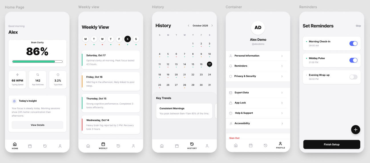
The app is built around five core screens:
1. Home: Daily Brain Clarity The centerpiece of the app is your Clarity Percentage. At a glance you know exactly where your brain is at. Below the score, three stat chips show your typing speed, app switch rate and error frequency. A personalized insight card beneath tells you what it means and what to do.
2. Weekly View A scrollable timeline of your week. Each day is summarized with a status indicator and a one-line insight for you to spot patterns across your week without digging through data.
3. History & Calendar A full calendar view where every date has a color-coded dot showing your cognitive state that day. Below the calendar, a patterns section contains your biggest personal insights "You're sharpest on Mondays" or "3pm is your foggiest hour."
4. Profile & Settings A clean settings screen personalized to the user, providing access to profile settings, reminders, help and support, as well as additional accessibilities such as color adjustments for those with color blindness.
5. Set Reminders Clear reminders for daily check-in or when to remind you to get back on track. Add reminders for keeping your brain in check.
The Formula Behind the Score
Clarity converts passive patterns into a single cognitive load number:
$$ \text{Clarity Percentage} = 100 - \left( w_1 \cdot T + w_2 \cdot A + w_3 \cdot E \right) $$
Where:
- \(T\) = typing error rate (normalized 0–1)
- \(A\) = repeated app opens per hour
- \(E\) = screen stare events exceeding 30 seconds with no interaction
- \(w_1, w_2, w_3\) = personal weights that adjust as Lucid learns your patterns
The higher your score, the sharper your mind.
How We Built It
Clarity was designed entirely in Figma from hand-drawn low fidelity wireframes to a fully interactive hi-fi prototype across five screens.
Our process:
- Discovery : identified cognitive fatigue as an unmeasured human sense
- Lo-Fi Wireframing : sketched all screens and flows by hand on paper
- Design System : established colors, type and spacing rules first
- Hi-Fi Build : translated every sketch into polished iOS screens in Figma
- Prototype : connected all five screens into a clickable user flow
Core design decisions:
- Frame: 393 x 852px : optimized for iPhone 17
- Color:
#F5F5F7background,#FFFFFFcards,#111111primary text - Accent colors:
#00C896sharp ·#FF8C61foggy ·#FF4D6Dtired - Typography: Inter : clean, precise and highly readable
- Philosophy: If an element doesn't serve a function, it doesn't exist
Challenges
Designing for an invisible sense Cognitive fatigue has no existing visual language. We had to invent one from scratch. Deciding how to represent something you can't see or touch was the hardest and most rewarding design challenge.
One number has to do a lot of work The Clarity Percentage needs to be instantly understood by anyone. Getting the visual weight, size and surrounding context down to each pixel took many iterations before it felt right.
Keeping it passive Every design decision was tested against one question: does this require the user to do anything? If yes, we removed it or automated it.
What We Learned
- The best UX requires zero effort from the user
- One clear number communicates more than ten complex charts
- Whitespace is not empty space, it is the design
- Designing for invisible human experiences forces you to be deeply intentional about every single decision
What's Next
- [ ] Apple HealthKit integration for heart rate variability data
- [ ] Apple Watch companion for continuous passive monitoring
- [ ] Calendar sync to schedule tasks at your personal peak hours
- [ ] Team mode for managers to protect their team's cognitive health
Designed for FigBuild 2026 "Extra-Sensory Perception" Challenge
Built With
- balsamiq
- claude
- figjam
- figma
- figmamake
- miro


Log in or sign up for Devpost to join the conversation.