-
-

Logo
-
-
-
-

LoveRace: A Probability Study of Human Connection
Inspiration
Dating advice often reduces a complicated question to a cliché: “There are plenty of fish in the sea.”
I have wondered for years what that really means. How many "fish" might actually fit what someone is looking for? How much does geography change the answer? What happens when age, gender, orientation, religion, family plans, income, lifestyle, and the number of people someone meets are considered together?
Years ago, I tried to build a version of this idea in Excel. I could sketch individual calculations, but the number of interacting variables quickly became difficult to manage. The statistical complexity was beyond what I could confidently implement, and turning a spreadsheet into a beautiful, understandable experience that anyone could visit felt even further outside my abilities. The idea stayed with me because I still had not seen a dating product answer this question honestly.
Most dating products are designed to display profiles and maximize engagement. They do not help people understand the scale of their search, the tradeoffs created by their preferences, or the assumptions hidden behind a compatibility claim.
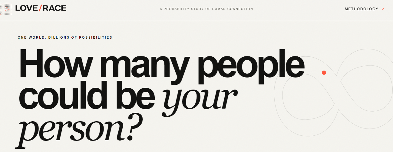
LoveRace became my attempt to make those questions visible. It treats finding a partner as a scenario that can be explored, not a future that can be predicted. With Codex, I was finally able to turn the spreadsheet-scale idea I had carried for years into a polished, data-informed, publicly accessible application.
What LoveRace does
LoveRace begins with the current world population or the combined population of countries selected by the user. It then narrows that population through a guided series of choices:
- Partner gender and sexuality preference
- Reciprocal dating openness
- Age range
- Likely relationship availability
- Religion or worldview
- Cultural or regional background
- Minimum income
- Family and lifestyle preferences
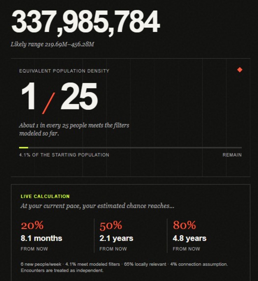
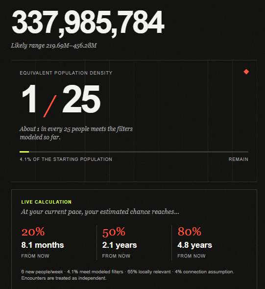
Every choice updates the estimated partner pool immediately. The result panel shows both the remaining population and an intuitive “1 in X” representation of how selective the current combination has become. It also displays the effect of each active filter.
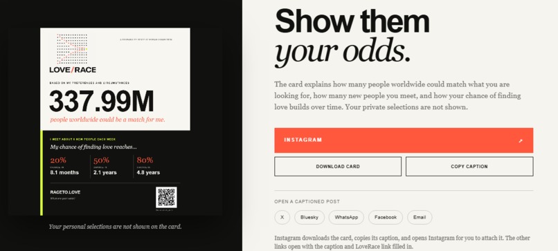
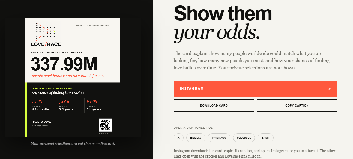
The last step introduces behavior and chance. Users specify how many genuinely new people they meet each week, how geographically relevant those interactions are, and an adjustable assumption for a meaningful mutual connection. LoveRace then estimates when the cumulative chance reaches 20%, 50%, and 80%.
The application never claims to know when someone will find love. Instead, it asks a narrower and more useful question: if these assumptions were true, what would the probability model imply?
How I built it
LoveRace is a dependency-free web application built with semantic HTML, custom CSS, and vanilla JavaScript. There is no framework, build process, database, or paid hosting requirement. It is published free through GitHub Pages, and its source is available in the LoveRace repository.
The application pulls current world population, country population, and GDP-per-capita data from the World Bank API. Documented fallback values keep the experience functional when the API is unavailable. The worldwide counter is projected between official releases so the opening screen feels alive rather than static.
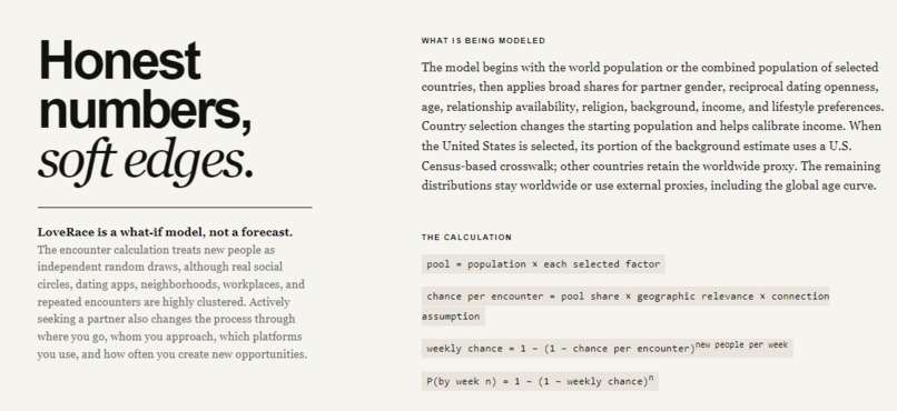
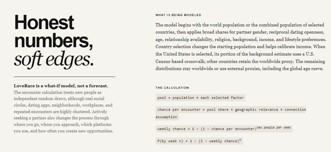
The partner-pool calculation starts with a population and multiplies it by the share represented by each active filter:
$$N_{pool} = N_0 \prod_{i=1}^{k} f_i$$
where $N_0$ is the starting population and each $f_i$ is an active demographic or preference factor.
The remaining population becomes an eligible share:
$$s = \frac{N_{pool}}{N_0}$$
The estimated chance for one encounter is:
$$p_e = s \times r_g \times r_c$$
where $r_g$ is geographic relevance and $r_c$ is the adjustable mutual-connection assumption.
If a user meets $m$ new people per week, the weekly probability is:
$$p_w = 1 - (1-p_e)^m$$
The number of weeks required to reach a target probability $q$ is:
$$t_q = \frac{\ln(1-q)}{\ln(1-p_w)}$$
LoveRace evaluates this for $q = 0.20$, $0.50$, and $0.80$.
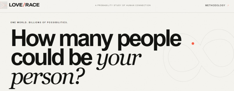
The interface was designed as an editorial data experience rather than a conventional dating app. A guided questionnaire occupies one side of the screen while the live model responds on the other. The visual direction combines a fashion editorial with a modern art museum: strong typography, black and warm white, fine rules, restrained color, and small evidence labels.
How I worked with Codex
Codex served as my primary development collaborator across product strategy, research, statistical reasoning, design, implementation, testing, and deployment. I supplied the idea, product judgment, critiques, and decisions. Codex helped me translate those decisions into working software and repeatedly test the result.
The process was highly iterative. I did not provide one prompt and accept one generated website. I reviewed the application in the browser, identified what felt confusing or unsupported, and asked Codex to investigate or rebuild those parts. Several examples show how that collaboration changed the project:
1. Turning an unclear visualization into an understandable result
An early population graphic used colored circles. It looked interesting, but I could not immediately understand what it was telling me. I told Codex that the visual was not clear enough and asked for a different concept that preserved the site's aesthetic.
We replaced it with an “Equivalent population density” treatment that expresses the current result as approximately 1 in every X people, supported by a restrained proportion bar and a ledger showing the effect of each filter. The new design is both more legible and more consistent with the editorial visual system.
2. Challenging an unsupported orientation estimate
The first version included a broad “mutual orientation estimate.” I challenged it because the definition was unclear and the default values needed to come from actual research rather than intuition. I gave Codex a concrete test case: if I am a trans woman, how many gender-aligned men might include me in their dating pool?
Codex researched and integrated multiple sources, including the UK Office for National Statistics sexual-orientation data, Blair and Hoskin's peer-reviewed study on transgender exclusion from dating, and the 2015 U.S. Transgender Survey.
We renamed the concept “reciprocal dating openness,” defined it in plain language, displayed the relevant source beside the estimate, added confidence labels, and kept the assumption adjustable. A trans-woman/gender-aligned-men scenario now uses a clearly labeled 2.6% low-confidence proxy rather than presenting an unexplained number as fact.
3. Letting product criticism reshape the experience
I repeatedly changed the product after seeing it work. I asked Codex to separate gender-aligned and trans partner categories, make final encounter inputs editable without restarting, change the ending action to “See results,” turn religion and cultural background into multi-select dropdowns, separate Jewish identity from the combined religion category, and remove language or visual treatments that felt distracting.
One late example involved the methodology page. We had added a bright green warning about random encounters. The information mattered, but the treatment was visually overwhelming and the surrounding copy repeated the same qualification several times. I provided a screenshot, asked Codex to remove the callout, keep “Honest numbers, soft edges,” and consolidate the explanation. Codex revised the structure, tested it in the browser, and deployed a quieter four-section methodology.
4. Using the model to critique the model
I asked a simple question about the age filter: does it change with the countries selected? The answer was no. The age curve was worldwide, even though country selection changed population and income calibration. That review led us to document the limitation directly instead of allowing users to assume more precision than the code provided.
We performed the same kind of audit across the application. We documented that demographic filters are multiplied as if independent even though they influence one another, that the 38% relationship-availability default is adjustable rather than country-specific, that background categories can overlap, that the displayed uncertainty range is a sensitivity cue rather than a formal confidence interval, and that real encounters are socially clustered rather than random.
5. Developing the visual identity through iteration
The LoveRace logo went through the same iterative process as the application. The first concepts leaned too heavily on familiar romance imagery and did not yet express what made the project distinctive. One version combined a black heart with a probability gauge. Although the gauge related to the calculation, I rejected the design because the black heart carried the wrong emotional connotation and the overall mark felt more like a generic dating logo than LoveRace.
I asked Codex to discard the earlier concepts and reason from the project itself: a large population, successive filters, narrowing possibilities, and one meaningful result. We then created a new direction using the application's warm editorial palette and data-visualization language. The final logo begins with a field of black dots representing many possible people. Coral dots converge through that field toward a single acid-green point, visually capturing the idea of moving from billions of possibilities toward one compatible person.
6. Moving from an idea to a public product
Codex also handled the practical steps that had made this project feel inaccessible when I first attempted it in Excel. It created and maintained the Git repository, wrote comprehensive project documentation, pushed the application to GitHub, configured GitHub Pages, monitored the deployment, and verified the public site. The result is a responsive application that anyone can open without installing anything and that costs nothing to host.
Challenges
Finding responsible data
No single worldwide dataset measures every combination of age, geography, gender identity, orientation, religion, income, relationship status, lifestyle, attraction, and willingness to date. The available sources use different populations, years, definitions, and sampling methods.
We responded by creating an evidence hierarchy instead of hiding the gaps:
- Live official population data are labeled as high confidence.
- Official statistics from one country are identified when used as international proxies.
- Limited or geographically concentrated studies are labeled as limited evidence.
- Adjustable assumptions remain visible and adjustable.
- Sources and methodological qualifications appear inside the experience, not only in a disclaimer.
Avoiding false precision
The arithmetic can be correct while the interpretation is still too confident. The model multiplies marginal demographic shares, but those characteristics are not independent. Age affects income and relationship status. Country affects religion, age structure, income, and social norms. Orientation, gender, and dating openness interact. Real social networks also cluster similar people together.
LoveRace therefore presents the result as a scenario, includes a sensitivity range, and explains that the range is not a formal statistical confidence interval. The methodology also acknowledges that actively searching for a partner changes the process beyond random encounters.
Explaining complexity without losing the user
The project needed enough detail to be honest without becoming a statistical report. We progressively disclosed evidence where it mattered, used plain “X in 100” explanations, linked directly to research, and kept uncertain assumptions adjustable. The greatest design challenge was deciding what needed to be visible immediately and what belonged in the methodology.
What I learned
The most important lesson was that transparency can be a product feature rather than a disclaimer.
A model does not need to claim certainty to be useful. It can help people see which assumptions drive a result, where evidence is weak, and which variables they can actually influence. In this case, meeting more people or changing geography can sometimes matter more than tightening another preference.
I also learned how quickly credible-looking precision can emerge when unrelated datasets are combined. A mathematically correct formula can communicate the wrong degree of certainty if its inputs and dependencies are not explained. Evidence labels, adjustable defaults, and honest methodology became as important as the calculations themselves.
On a personal level, I learned that AI collaboration can expand what I am capable of building without replacing my judgment. Codex made the coding, research integration, testing, and deployment accessible, but the quality of the project came from iteration: looking at what it produced, noticing what did not feel right, asking harder questions, and continuing until the product matched the idea I had carried for years.
Accomplishments I am proud of
I am proud that LoveRace:
- Turns an abstract and emotional question into an understandable interactive model.
- Exists as a polished public product after beginning years ago as an Excel idea I could not complete.
- Uses live API data, linked official statistics, and peer-reviewed research.
- Makes evidence quality and uncertainty part of the interface.
- Updates immediately as users explore different assumptions.
- Connects population-scale statistics to the practical behavior of meeting new people.
- Remains visually distinctive without pretending that love can be reduced to a definitive number.
- Runs without a framework, paid service, or installation process.
- Is hosted publicly and free through GitHub Pages.
Most of all, I am proud that the final project preserves the emotional reason I wanted to build it while being honest about what statistics can and cannot say.
What is next
Future versions could include:
- Country-specific age and relationship-status distributions
- Conditional modeling that captures correlations between variables
- Local income and cost-of-living distributions instead of GDP-per-capita proxies
- Additional peer-reviewed research about reciprocal dating preferences
- Scenario comparison and saved results
- Sensitivity analysis that ranks which assumptions most affect the answer
- A social-strategy mode comparing the effects of meeting more people, changing geography, or adjusting a preference
- Multilingual and localized versions
- Privacy-preserving anonymous research that could improve the model over time
The longer-term opportunity is larger than a dating calculator. LoveRace could become a general tool for understanding how personal preferences, geography, behavior, and probability interact.
Built With
- api
- bank
- codex
- css3
- data
- design
- github
- gpt-5.6
- gpt-sol
- html5
- javascript
- modeling
- openai
- pages
- probability
- responsive
- world


Log in or sign up for Devpost to join the conversation.