Inspiration
This year, YHack's theme is love. Our team kept asking: what is the most direct opposite of love? War. And right now, the world has never had more of it.
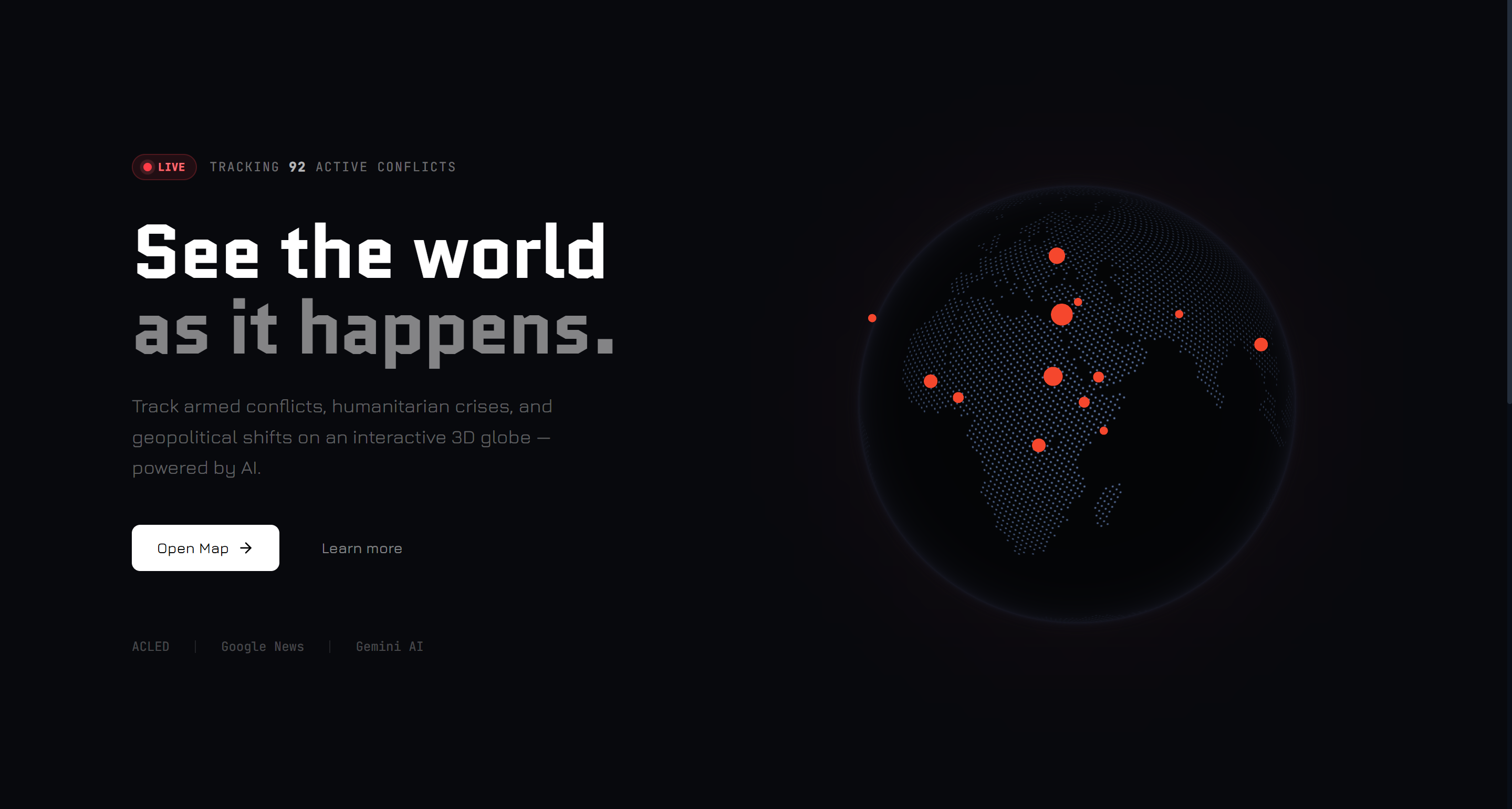
As of March 2026, ACLED (the Armed Conflict Location & Event Data Project) tracks 92 active armed conflicts across 132 countries, the highest concurrent count since World War II. Yet most people cannot name five of them. Conflict data exists, locked away in academic databases and behind paywalls. News coverage is episodic, spiking when things explode and going silent in between. Nobody has built a single, accessible, human-readable window into the full picture.
We built Love Over War because love requires awareness. You cannot care about something you cannot see.
The name LOW is intentional. Love Over War. A declaration, not just a product title.
What we built
LOW is an AI-powered global conflict intelligence platform with five core layers:
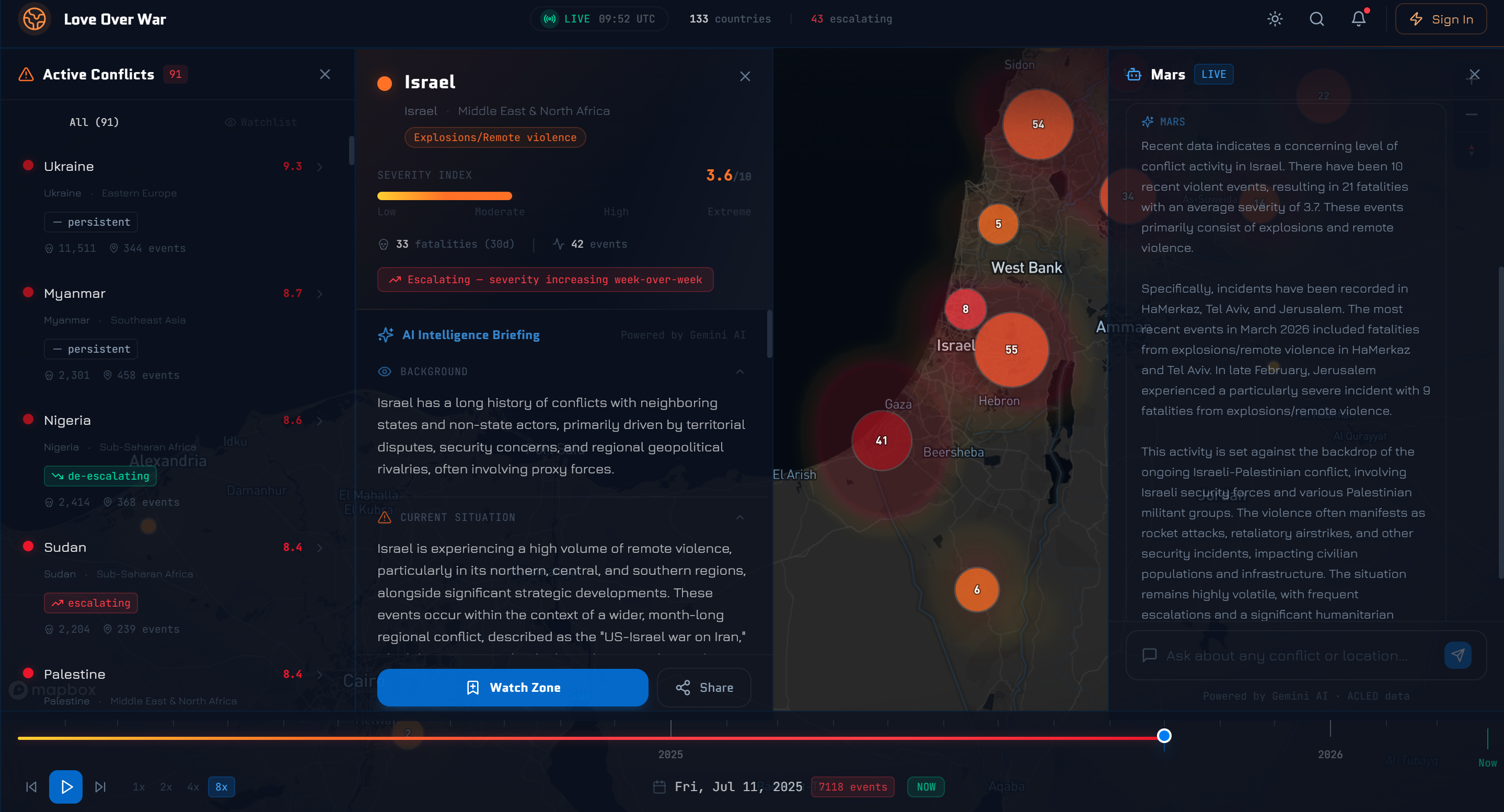
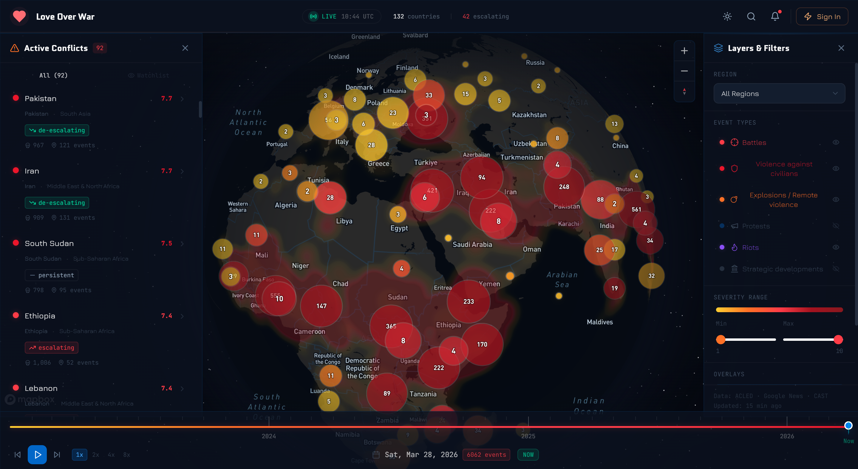
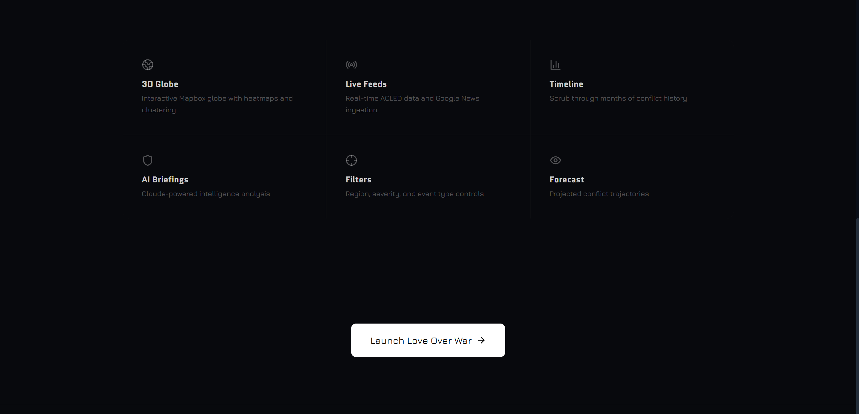
- Interactive 3D Globe — A Mapbox GL JS globe with heat-mapped severity markers. Color encodes lethality: yellow (low) → orange (moderate) → deep red (extreme). Every active conflict, visible instantly.
- AI Conflict Briefs — Powered by Gemini 3.1, when you tap a zone, Gemini synthesizes the last 30 days of ACLED event data and Google News API summaries into a 200-word plain-language brief: causes, key actors, humanitarian impact, and a 4-week outlook.
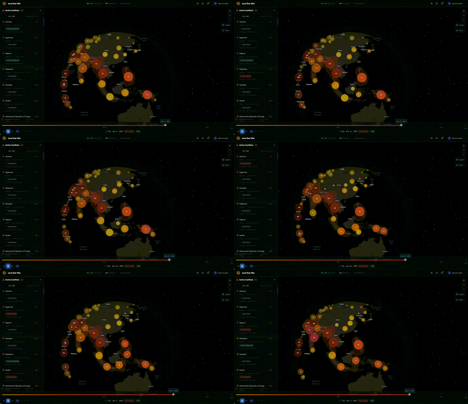
- Timelapse Playback — A draggable timeline slider lets you scrub from 2020 to now, watching conflicts emerge, escalate, and spread week by week in real time.
- Direct Aid Layer — Every conflict zone has a "Contribute" button linking to vetted humanitarian organizations (ICRC, MSF, UNHCR) or active GoFundMe campaigns. We close the empathy-to-action gap.
- Travel Safety Layer — A live risk-status panel showing danger levels per region, updated daily from ACLED. Designed for travelers, NGO field workers, and anyone crossing an international border.
- Daily Email Updates — If toggled on, new updates on conflict zones are sent to users' emails every day.
- A built-in AI chatbot — allows users to ask natural language questions: "Is it safe to travel to eastern DRC?" or "What caused the Sudan civil war?" — and trigger map navigation on your behalf.
How we built it
The full stack, assembled in 24 hours:
- Frontend: Next.js 14 (App Router) + Mapbox GL JS + Tailwind CSS + shadcn/ui
- AI: Gemini API for conflict briefs, chatbot, and email digests
- Conflict Data: ACLED API — used by the UN and World Bank
- News Layer: Google News API
- Database: Supabase (PostgreSQL + PostGIS) for subscriptions, cached briefs, and geospatial queries
- Deployment: Vercel (edge functions, push-to-deploy)
- IDE Zed and Claude Code - used pair programming, AI, and codebase wide search features
The severity score for each conflict is a composite index inspired by ACLED's Conflict Index methodology:
\( S = 0.35 \cdot D + 0.25 \cdot C + 0.20 \cdot F + 0.10 \cdot G + 0.10 \cdot T \)
where \( D \) = normalized deadliness, \( C \) = civilian targeting proportion, \( F \) = event frequency, \( G \) = geographic spread, and \( T \) = week-over-week trend acceleration. The resulting score \( S \in [1, 10] \) drives the color and radius of every marker on the globe.
Challenges
- Data freshness vs. performance: ACLED returns up to 5,000 rows per call. Pre-aggregating weekly snapshots into JSON files for the timelapse was critical to keeping the globe responsive.
- AI cost at scale: Generating Gemini briefs on-demand for every marker click would burn tokens fast. We built a daily batch pipeline that pre-generates briefs for the top 50 conflict zones and caches them in Supabase.
- Responsible framing: Displaying armed conflict data involves a lot of ethical weight. We deliberately designed the UI to foreground humanitarian context and action rather than voyeurism. Every brief ends with "How you can help."
- Mapbox 3D globe clustering: Dense clusters in regions like the Horn of Africa became visual noise at world zoom. Implementing distance-based clustering that expands on zoom was a non-trivial tuning problem under time pressure.
What we learned
We learned that the gap between data and empathy is a design problem. The information to understand every conflict on earth already exists, and what was missing was a human-centered interface.
Building LOW taught us that the most powerful thing AI can do in 2026 is not generate content for its own sake, but reduce fragmentation through the unification of credible information and turn complexity into clarity for those who need it.
Built With
- acled
- claude
- css
- gemini
- gl
- javascript
- mapbox
- next.js
- postgis
- postgresql
- python
- react
- resend
- shadcn/ui
- supabase
- tailwind
- typescript
- vercel
- zed


Log in or sign up for Devpost to join the conversation.