-
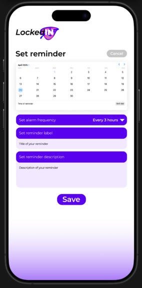
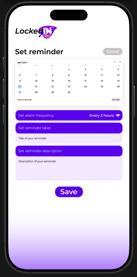
Set Reminder Page
-

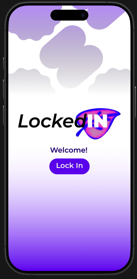
Landing Page
-
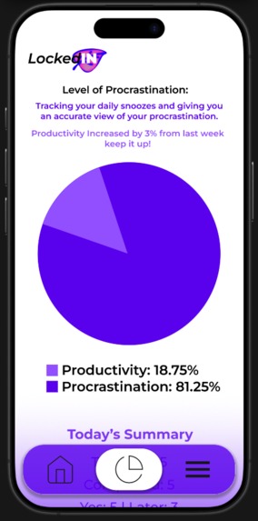
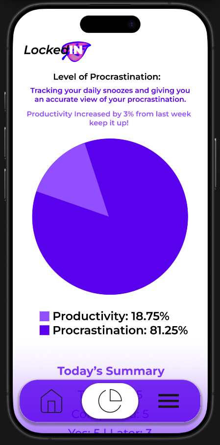
Stats Page
-

Home Screen
Inspiration
LockedIN was inspired directly by our lives as UCalgary students. We all know the feeling of keeping the big dates in our calendars – midterms, finals, assignment deadlines – but constantly forgetting the small tasks that actually keep us on track:
“Check D2L for new announcements”
“Review yesterday’s lecture for 10 minutes”
“Send that email to the TA”
Even simple life tasks like “do laundry” or “clean the fridge”
Those tasks are easy to postpone with “I’ll do it later,” and there’s no honest way to see how often we actually follow through. That “silent procrastination” builds up into stress, all-nighters, and feeling guilty.
We wanted something extremely simple that would nudge us throughout the day, ask for a tiny decision—yes, I did it or I’ll do it later—and then show us the truth about our habits in a visual way. That idea became LockedIN.
Problem
UCalgary students juggle lectures, labs, commuting, part-time jobs, clubs, and family responsibilities. While traditional calendar and to-do apps help with big events, they don’t:
Encourage frequent check-ins on small, recurring tasks
Capture how often students delay tasks instead of doing them
Give meaningful feedback about productivity vs procrastination
As a result, students feel disorganized and overwhelmed, even when they technically “have a schedule.” There is no lightweight tool focused on micro-accountability rather than just long to-do lists.
Our Solution – What LockedIN Does
LockedIN is a micro-accountability reminder app designed for students.
Core idea:
Set reminders → get alarms every few hours → tap Yes or Later → see your productivity and procrastination as simple stats.
Key Features (based on the screens we designed)
Welcome Screen – “Lock In” A simple welcome screen with the LockedIN logo and a single call-to-action button: “Lock In.” This screen sets the mood: calm gradient background, soft shapes, and a sense of “entering focus mode.”
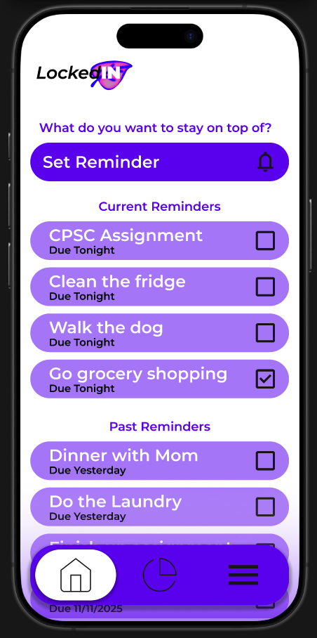
Home Screen – Current & Past Reminders
Prompt: “What do you want to stay on top of?”
Big Set Reminder button for quickly creating a new reminder.
Current Reminders for tasks due today/tonight (e.g., “CPSC Assignment – Due Tonight”).
Past Reminders for tasks from previous days (e.g., “Dinner with Mom – Due Yesterday”).
Checkboxes on each item let users mark tasks as done.
Bottom navigation with icons for Home, Stats, and Menu.
Set Reminder Screen
Calendar to pick the date.
Time picker for the first reminder.
Frequency selector (e.g., “Every 3 hours”).
Text fields for reminder label and reminder description.
A clear Save button. This is where students create reminders for both academic and life tasks and choose how often the app should bother them.
Stats Screen – Productivity vs Procrastination
Title: “Level of Procrastination”.
Short explanation that the app tracks snoozes and completions.
Large pie chart that compares:
Productivity (Yes taps)
Procrastination (Later taps)
Small insight line: e.g., “Productivity increased by 3% from last week – keep it up!”
“Today’s Summary” text showing total tasks, completed tasks, and Yes vs Later counts.
Together, these screens create a clear user flow without extra complexity.
How We Built the Project (Design Process)
LockedIN is a design-focused prototype, not a full coded app. Here’s how we built it:
Research & Brainstorming
Reflected on our own student routines and pain points.
Listed tasks we often forget and patterns of procrastination.
Decided to focus on frequent check-ins rather than complex scheduling.
User Flow Planning
Sketched the minimal set of screens we needed:
Welcome → Home → Set Reminder → Stats.
Wrote out the journey: create reminder → receive alarms → choose Yes/Later → see stats.
Wireframing & Visual Design
Created mobile frames in Figma
Chose a purple gradient palette to feel both calming and energetic.
Used rounded cards, large buttons, and strong hierarchy so students could read everything at a glance.
Ensured consistent typography, spacing, and button style across all screens.
Iteration
Adjusted text and layout to match the hackathon rubric:
Clear problem statement,
Clean flow,
Easy-to-understand visuals.
Added the stats pie chart to directly connect behavior (Yes/Later) with impact.
What We Learned
Simplicity is powerful. Our first instinct was to add more features (categories, tags, social sharing), but we realized that students are already overwhelmed. A few focused interactions can be more helpful than a feature-heavy app.
Visual feedback changes behavior. Turning Yes/Later taps into a pie chart of productivity vs procrastination makes habits feel concrete. We learned how visualizing data can motivate change more effectively than just showing a checklist.
Design is communication. We saw how color, spacing, and wording all communicate mood. Bright but soft gradients, friendly wording, and clean sections help reduce stress and make the app feel like a supportive friend, not a harsh taskmaster.
Scoping for time is important. Building four strong, cohesive screens was better than half-finishing eight. We learned to prioritize the core experience first.
Challenges We Faced
Balancing honesty with kindness. We wanted to show procrastination clearly without making users feel judged. Finding the right tone (“Productivity increased by 3% – keep it up!”) was surprisingly hard. We iterated on wording to keep it encouraging.
Designing meaningful stats with limited data. Since our interaction is just Yes/Later, we had to think carefully about what metrics actually matter. We decided on productivity percentage, procrastination rate, and small week-to-week changes.
Time constraints & screen selection. We didn’t have time to design every possible screen (e.g., settings, notifications preview). The challenge was to pick only the most essential screens that still showed a complete, believable user flow.
Making the interface feel student-specific, not generic. We had to tweak copy (“CPSC Assignment,” “Due Tonight”) and visual style to feel like it belongs to a UCalgary student context, not just any generic reminder app.
Impact & Future Directions
If implemented, LockedIN could:
Help students reduce last-minute stress by staying on top of small tasks.
Provide honest, visual feedback on habits that are usually invisible.
Encourage healthier routines (study breaks, water, meds, chores) along with academic tasks.
In the future, we’d like to explore:
Integrations with D2L or campus systems.
Smart suggestions for reminders during exam periods.
Gentle streaks and milestones to reward consistent effort.
Built With
- figma

Log in or sign up for Devpost to join the conversation.