-
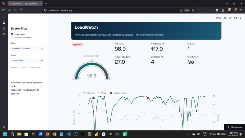
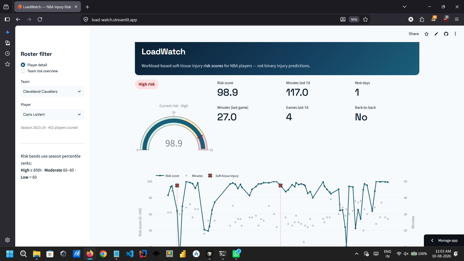
Player risk dashboard — season trend with soft-tissue injury markers and a 0–100 workload risk score (Caris LeVert, 2023–24).
-
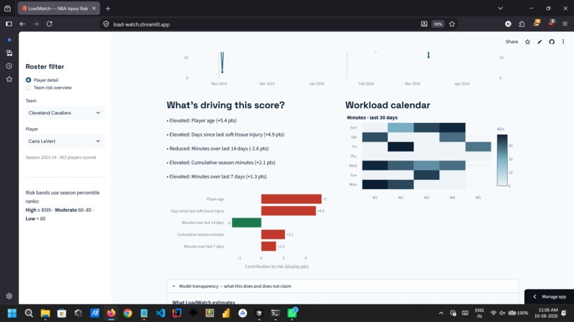
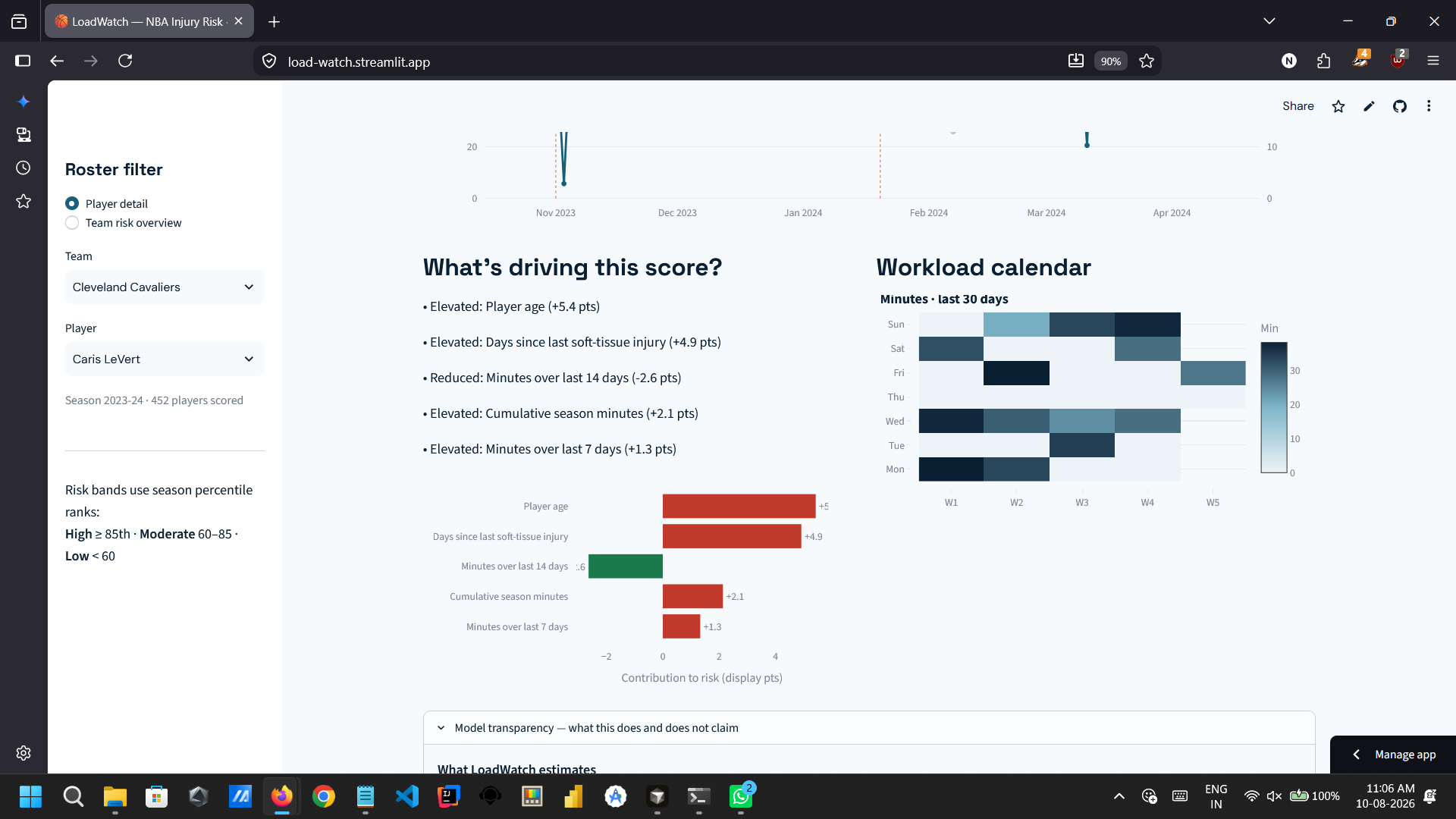
What’s driving the score? Age, injury recency, and short-window minutes — with a workload calendar below.
-
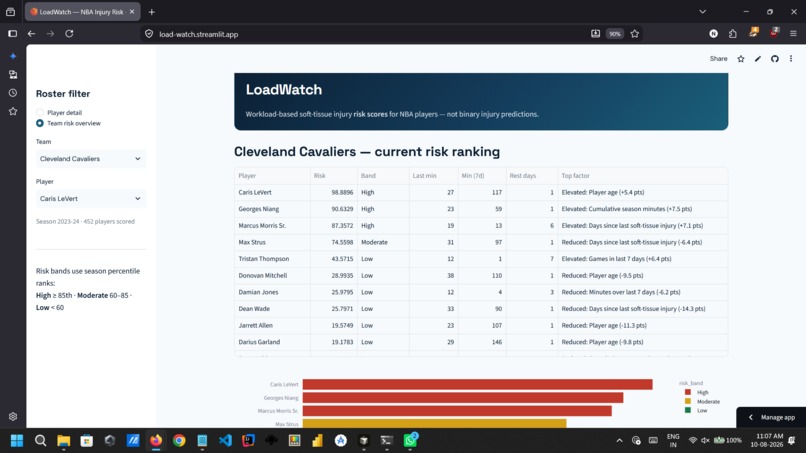
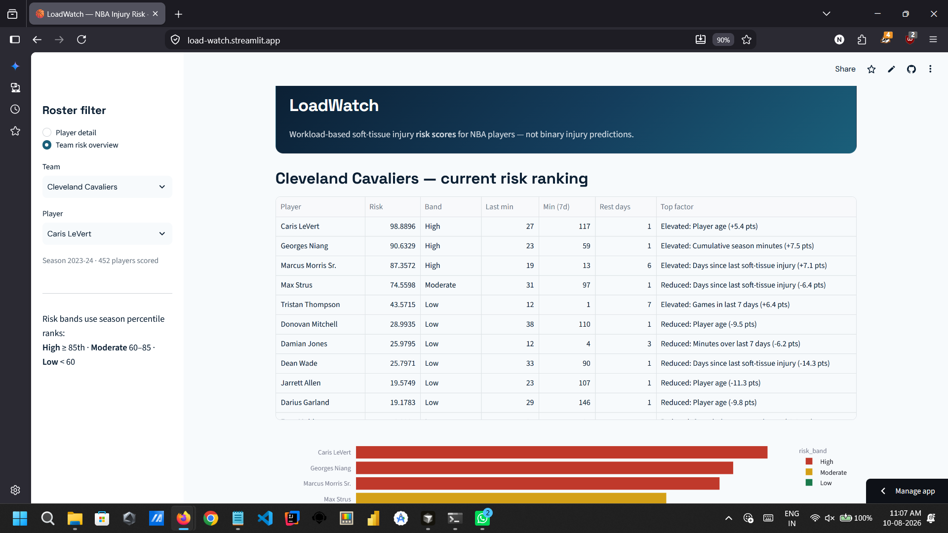
Who needs rest first? Team view ranks every player by 0–100 risk score with color-coded bands and workload context.
-
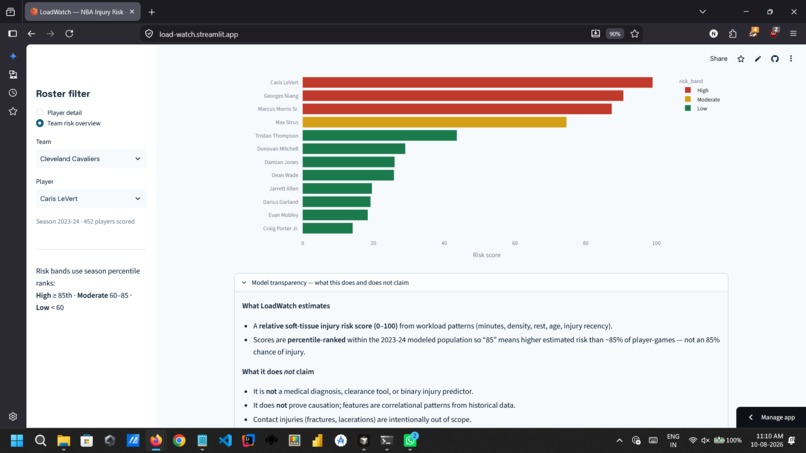
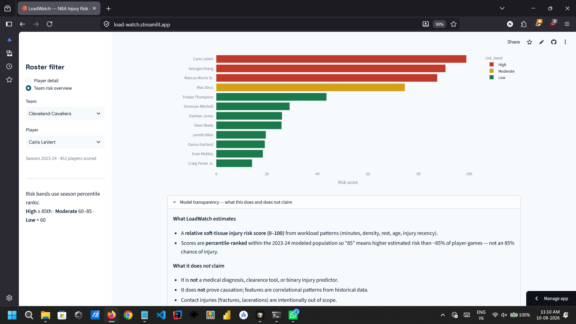
Honest scoring: 0–100 is a percentile rank, not “85% chance of injury” — plus a transparency section on what Load Watch claims and doesn’t.
Inspiration
Soft-tissue injuries—hamstrings, calves, strains, sprains—cost NBA teams wins, money, and playoff runs. They’re often linked to workload: heavy minutes, compressed schedules, back-to-backs, and short rest. Yet most public tooling either ignores load or treats injury as a binary “will he get hurt?” question, which overclaims certainty and breaks under severe class imbalance.
I built Load Watch to give coaches and front-office staff something more honest and actionable: a relative risk score (0–100) that ranks how overloaded a player is entering each game—not a medical diagnosis, but a workload signal they can use for minutes management and recovery planning.
What it does
Load Watch is a full-stack sports analytics app for NBA rosters:
Risk scoring: Every player-game gets a 0–100 soft-tissue injury risk score from minutes, schedule density, rest, age, and recent injury history.
Risk bands: Low (<60), Moderate (60–85), and High (≥85) for quick triage.
Explainability: SHAP highlights the top drivers behind each score (e.g., minutes in the last 7 days, back-to-back flag, days since last injury).
Streamlit dashboard: Pick a player to see season risk trends, injury markers, a workload calendar, and a team overview to compare who’s most overloaded.
I deliberately avoid binary injury prediction. Instead, I rank player-games by estimated relative risk so staff can prioritize monitoring and load management without false precision.
How I built it
Data pipeline
NBA Stats API (
nba_api): per-player game logs (minutes, matchups), team rosters (age), optional tracking distance.Injury labels: Official NBA pre-game injury reports via
nba-injury-report, with Prosportstransactions as fallback. Soft-tissue events filtered by keyword; contact/illness excluded.Name matching: Fuzzy matching (
thefuzz+difflib) between injury logs and NBA player IDs.
Features (known entering each game) Rolling minutes (7d/14d), games in last 7 days, back-to-back flag, rest days, season cumulative minutes, age, days since last injury, and distance when tracking data is available.
Labels
label = 1 if a soft-tissue injury is logged within the next 7 days after the game.
Models
- Baseline: logistic regression with balanced class weights.
- Main model: XGBoost with
scale_pos_weightfor imbalance. - Chronological train/test split (no random k-fold—avoids future leakage).
- Metrics: ROC-AUC and PR-AUC (preferred under imbalance).
- Risk score: predicted probability → percentile rank 0–100 within the season.
Stack: Python 3.11+, pandas, scikit-learn, XGBoost, SHAP, Streamlit.
Challenges I ran into
Sparse, noisy labels: Public injury data is incomplete; many “out” designations lack precise onset timing, and the positive class is heavily imbalanced (~95%+ negatives).
No biomechanics/GPS: Ionly have box-score and schedule proxies for load—not force plates or wearable GPS.
Tracking data gaps: Distance features drop when NBA tracking endpoints fail or return season-level aggregates only.
Name matching edge cases: Suffixes (II/III), trades mid-season, and Prosports vs. NBA ID mismatches required careful fuzzy logic.
Avoiding overclaiming: Binary “injury prediction” sounds impressive but misleads stakeholders; reframing as relative risk scoring was a product and modeling choice, not just a technical one.
Accomplishments that I am proud of
End-to-end pipeline: raw API/scrape → features → train → SHAP → interactive dashboard.
Chronologically honest validation instead of leaky random splits common in hackathon demos.
Explainable outputs coaches can actually discuss—e.g., “minutes last 7 days” vs. “age alone.”
Clear risk bands and team overview for roster-level load allocation.
Honest limitations section—I treat this as decision support, not medical advice.
What I learned
Under severe imbalance, PR-AUC matters more than accuracy, and ranking beats binary classification for real staff workflows.
Schedule compression (games_last_7d, low rest_days) often moves risk more than raw season minutes alone.
Recent soft-tissue history consistently ranks among top SHAP contributors—aligned with sports-science recurrence literature.
Public injury logs are usable for prototyping but not sufficient for production clinical decisions.
A simple, explainable dashboard beats a black-box model for hackathon judges and hypothetical front-office users.
What's next for Load Watch
- Integrate richer load signals (practice load, travel, altitude, opponent pace) when available.
- Multi-season backtesting and player-specific calibration.
- Alerting workflow: flag High-band players before back-to-backs with suggested minutes caps.
- Return-to-play module tying risk trends to rehab progression.
- API layer for embedding scores in existing team analytics stacks.
- Stronger injury onset labeling from proprietary or league-grade data sources.
Disclaimer: Load Watch is not medical advice. Scores reflect historical associations in public data, not causal effects or clearance decisions.
Built With
- data-visualisation
- machine-learning
- nba-api
- pandas
- python
- scikit-learn
- shap
- sports-analytics
- streamlit
- xgboost


Log in or sign up for Devpost to join the conversation.