-
-
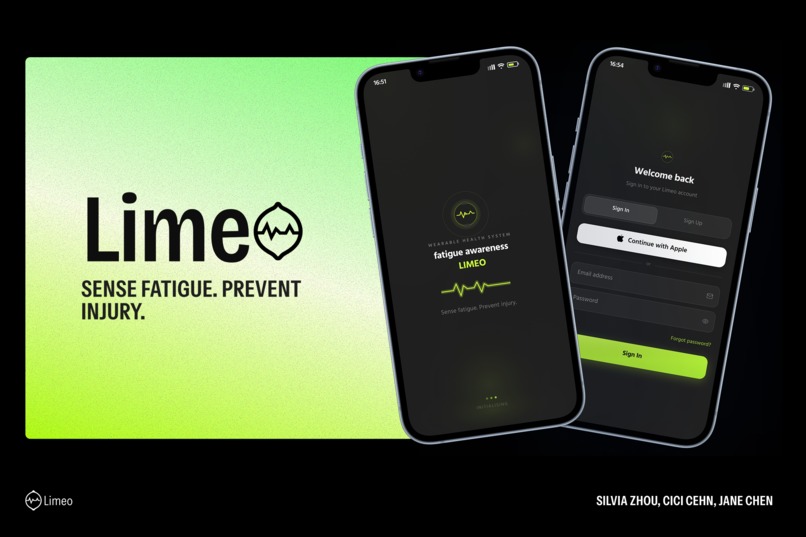
cover
-
page1
-
page2
-
page3
-
page4


Inspiration
This project was inspired by a real problem in high-risk sports such as skiing, basketball, and rock climbing. In these activities, people often continue moving even when their bodies are already becoming fatigued. Because muscle fatigue is not always immediately obvious, users may keep exercising past a safe limit, which can increase the risk of injuries such as ACL tears, meniscus injuries, and MCL injuries. We wanted to design a system that could help people notice rising fatigue risk earlier, before it becomes fully obvious in the body.
How we built it
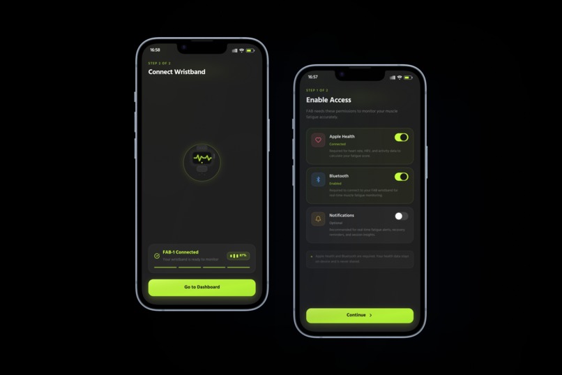
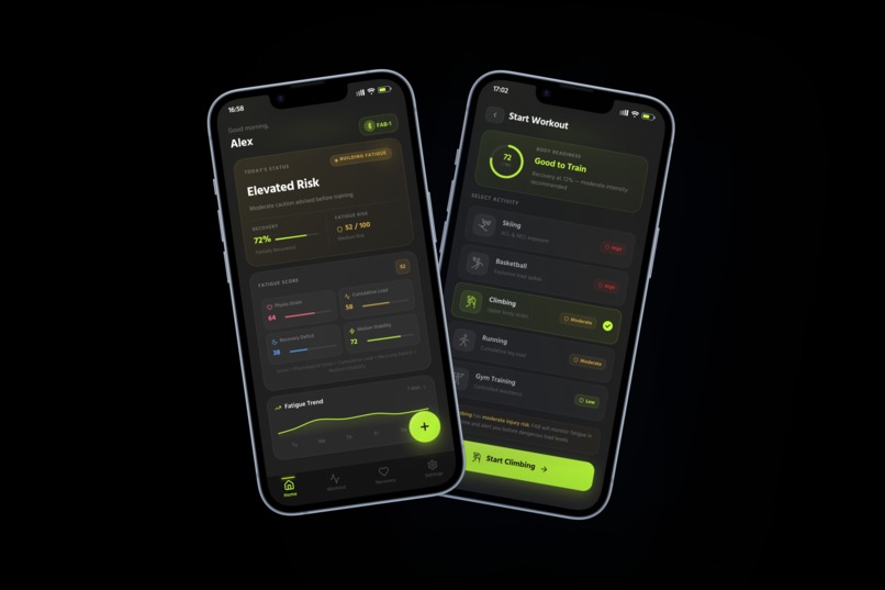
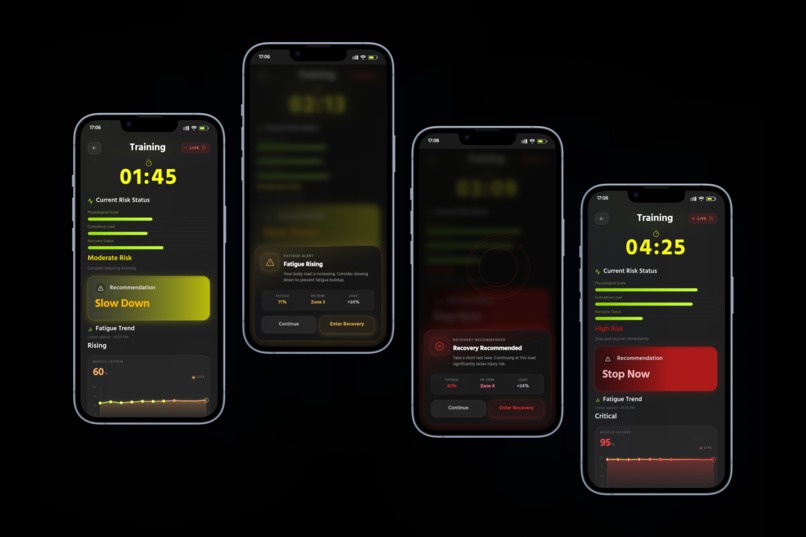
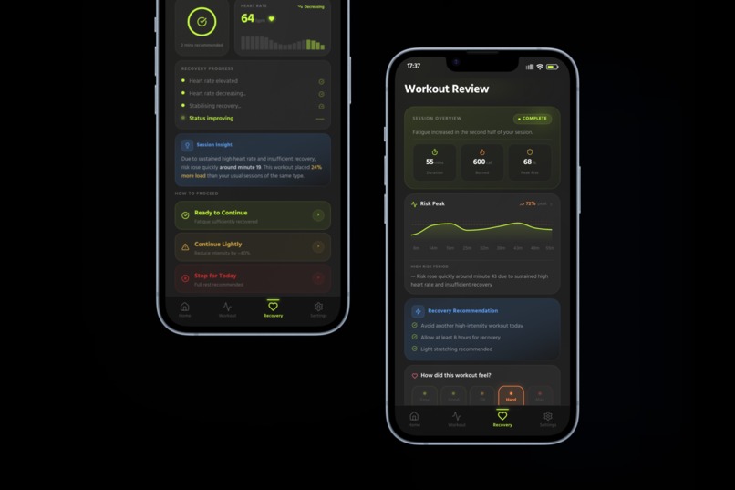
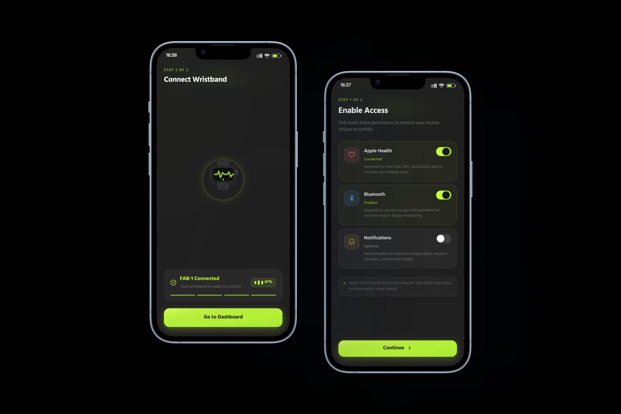
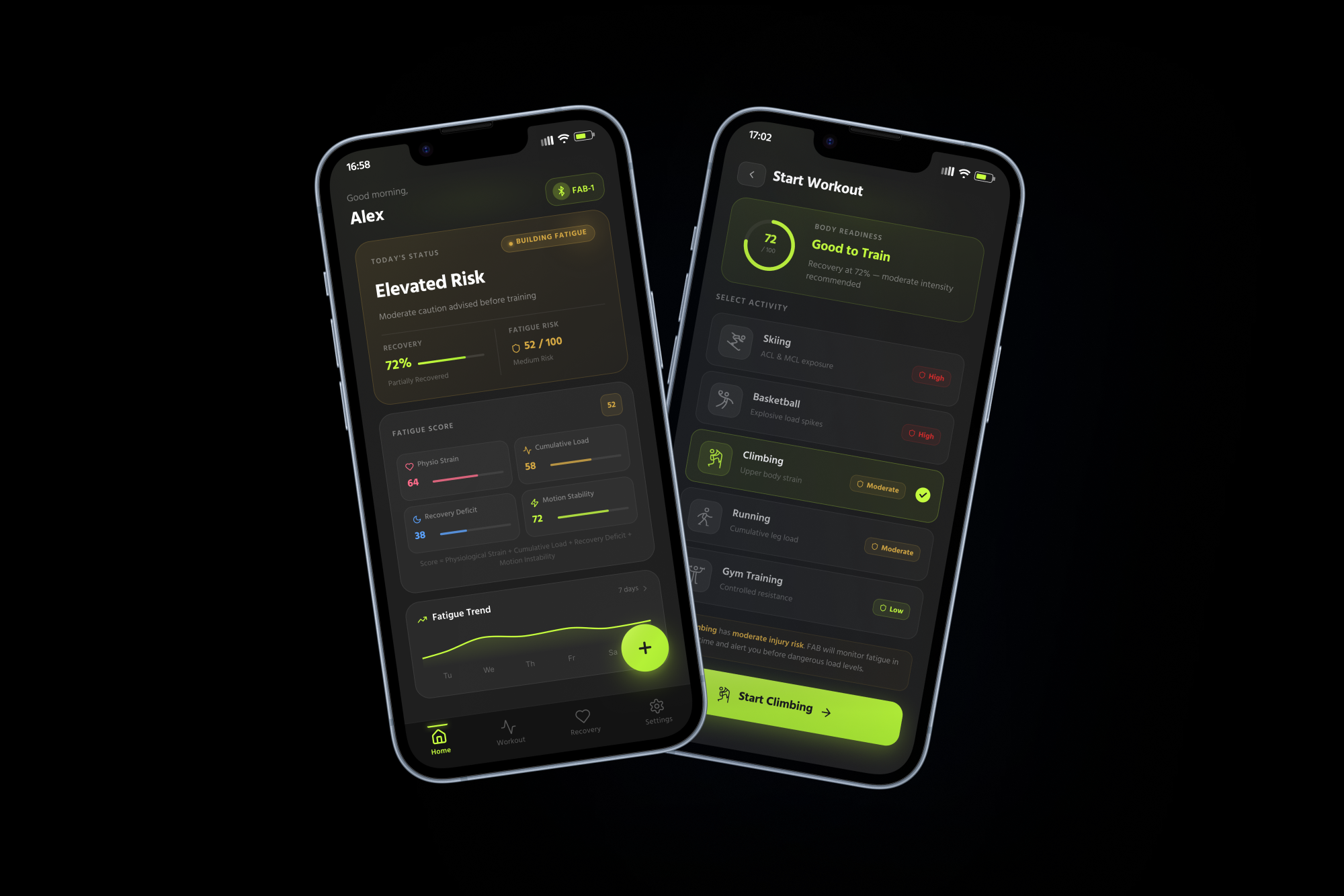
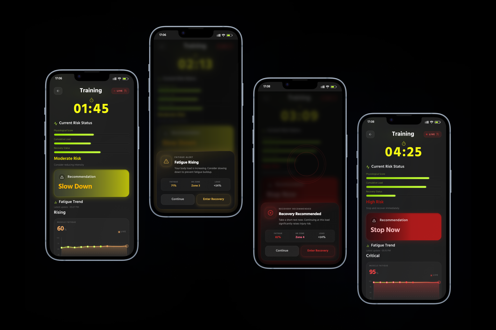
We built the project as a companion system made of two parts: a smart wristband and a mobile app. The wristband is responsible for real-time monitoring and alerts during activity, while the app handles onboarding, permissions, Apple Health connection, daily status, workout tracking, recovery guidance, post-workout insights, and settings. In the app, the home page shows Today’s Status, Recovery Level, Fatigue Risk, a recent fatigue trend, and a Start Workout button. During exercise, users can view their real-time fatigue level and risk state. If fatigue rises too much, the system can move into a recovery state with prompts such as “Resting…,” “Heart rate decreasing,” and “2 mins rest recommended.” After the session, the app provides a summary of the risk peak period, fatigue changes, recovery suggestions, and subjective feedback input.
What we learned
Through this project, we learned that the goal was not to build a medical diagnostic tool, but to design a clearer and more useful experience around body awareness. Instead of claiming to detect one exact muscle, we focused on how a wearable wristband and mobile app could work together to estimate fatigue risk from signals that are more realistic for this type of product, such as physiological strain, cumulative load, recovery deficit, and motion instability. This helped us think more carefully about the difference between raw health data and meaningful user feedback.
Challenges we ran into
One of the biggest challenges we faced was not only defining the product clearly, but also turning our design ideas into something that actually looked and behaved the way we intended. We first developed many parts of the interface by hand in Figma, sketching out the layout, structure, and flow ourselves. However, after importing our draft into Figma Make, the generated results often looked very different from what we had designed. The AI would sometimes misread the hierarchy of the page, rearrange sections in ways that did not make sense, simplify important parts too much, or create visual styles that did not match our intended premium glass-like Apple-inspired aesthetic. Some screens lost the balance and clarity we had carefully planned, while others felt too generic, too crowded, or visually disconnected from the muscle-fatigue theme. This became one of the most frustrating parts of the process because we could not simply generate the interface once and move on. Instead, we had to spend a lot of time going back and forth between our original hand-made draft and the AI-generated version, adjusting spacing, rewriting prompts, reorganizing cards, fixing visual hierarchy, and refining the layout again and again. In many cases, the AI output was useful as a starting point, but it still required extensive manual correction to bring the design back to our original intention. What made it especially exhausting was that even small changes in wording could lead to very different results, so the process often felt unpredictable and hard to control. There were moments when it felt like we were spending more time correcting the system than actually designing. Still, through all of that iteration, we gradually learned how to guide the tool more effectively and make stronger design decisions ourselves. In the end, even though the process was frustrating, we made it work, and we were able to turn our concept into a final design that felt much closer to our vision
What's next for Limeo
For the next step of this project, we would like to push it beyond a concept app and develop it into a more complete wearable experience. Right now, the project focuses on the app flow, the fatigue-awareness logic, and the relationship between the wristband and the mobile interface. In the future, we want to refine how the wristband would actually deliver real-time feedback through vibration, visual signals, and workout-state transitions. We would also like to test the design with more users, especially people who do sports like skiing, basketball, climbing, and gym training, to better understand how they interpret fatigue warnings and recovery prompts in real situations.
Built With
- chatgpt
- claude
- figma
- kling


Log in or sign up for Devpost to join the conversation.