-
Data Visualization

What it does
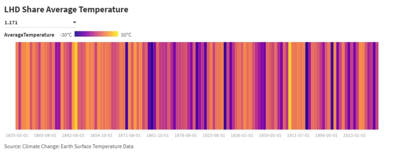
This simple websites provides a visual representation of average temperatures from the 1800s and 1900s.
How we built it
*using flourish and data found online
Challenges we ran into
*setting the scale, at first I didn't have a scale, but after messing around for a little bit, I added a scale which made my visualization make more sense
Accomplishments that we're proud of
*making a data visualization *displaying a data visualization on a website
What we learned
*how to create a data visualization *uses of data visualizations
Built With
- flourish
- html
- kaggle

Log in or sign up for Devpost to join the conversation.