-
-
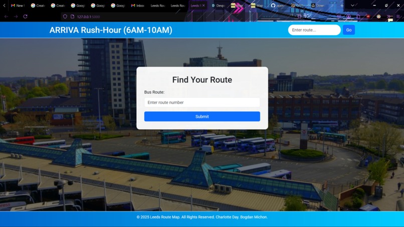
Front Page of our Web App
-
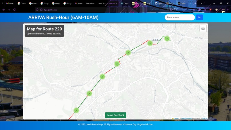
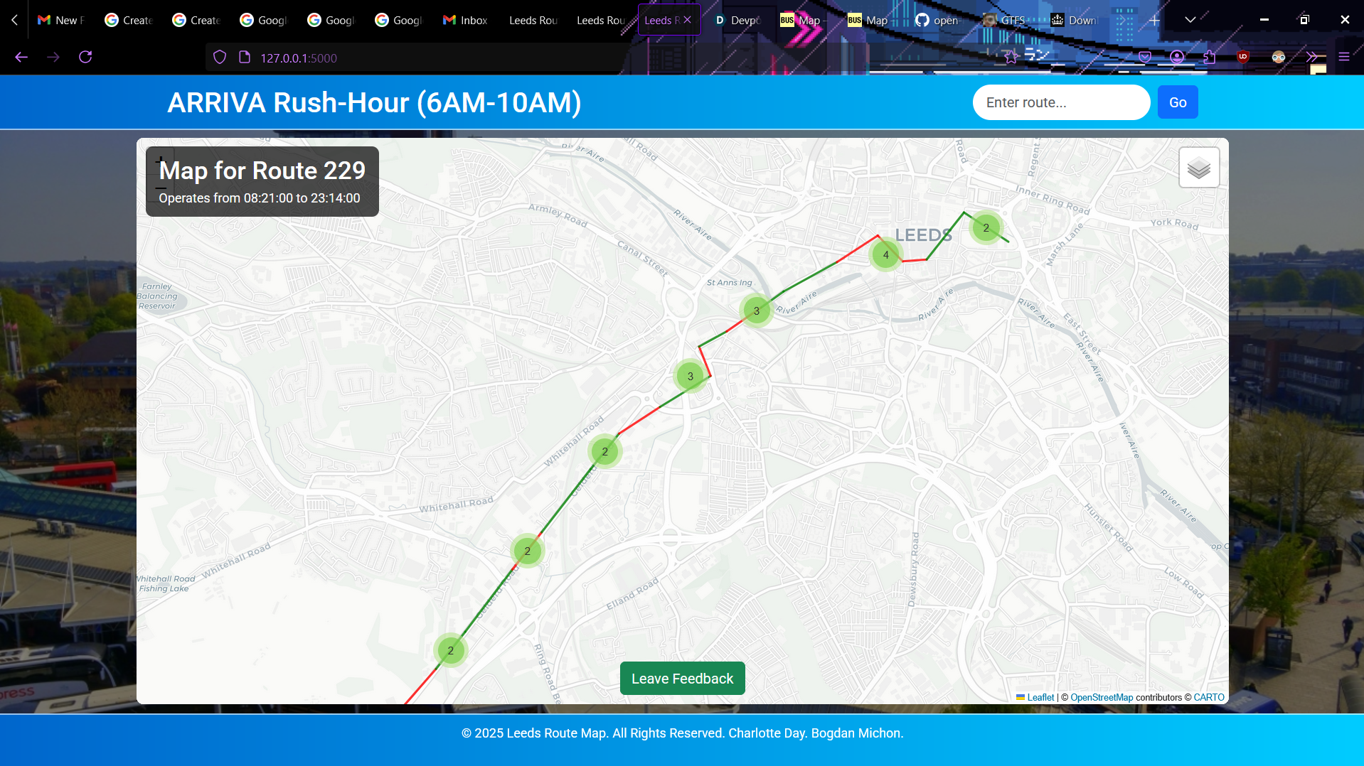
Map points for 229 Bus Service with color coded routes for lateness

Inspiration
We were inspired by https://bustimes.org/map, how it displays buys data on a traversal-able map.
What it does
Our application looks at the Arriva bus data in West Yorkshire collected for one day and we display routes for the buses. The lines connecting the bus stops are colour coded based on how late on average buses arrive at that stop. There is also an option to provide feedback on bus lines, which is currently emailed to an inbox but in the future would be stored and turned into statistics to show the affect of bus lateness on people.
How we built it
We have utilized multiple technologies for our project, such as Flask Web framework with Flask Mail for feedback. For our data we provided data sources from https://tomforth.co.uk/gtfsrtarchive/, as well as the Bus Open Data Service(https://www.bus-data.dft.gov.uk/).
Challenges we ran into
Extracting and using both GTFS and TransXChange datatypes was challenging technically and to understand due to our team never encountering them before. The volume of data within the archives was also too much for our laptops to process, so we had to restrict our prototype to 10ish routes.
Accomplishments that we're proud of
We are proud of our working web app, and the back end processing algorithm for calculating average lateness. We think that our UI for map is very clear in showing how late buses are across a route, which is exactly what we set out to achieve.
What we learned
We learned how to handle new data types, and how awful the bus lateness is.
What's next for Leeds Lateness Visualizer
We will expand the data used to all bus providers and routes in Yorkshire, and allow the user to select dates and times to view averages over. Lots more statistics can also be provided, for example, the archive also has information about bus capacities. As mentioned above, the feedback system needs to be fully implemented so that valuable statistics on how bus lateness affects the population can be gathered.


Log in or sign up for Devpost to join the conversation.