Inspiration
Every year, tens of thousands of small businesses fail — not because they made bad products, but because they didn't see the warning signs until it was too late. A supplier started delivering late. A refund rate quietly doubled. A key customer segment began churning. These signals were there, buried in transaction data, but no one was watching.
We asked ourselves: what if a small business owner had the same monitoring infrastructure that Google uses to keep its systems running? At Google, Netflix, and Amazon, entire teams of Site Reliability Engineers (SREs) obsess over system health. They define error budgets, track SLOs, respond to incidents with structured postmortems, map blast radius when something goes wrong, and set up monitors so the same failure never surprises them twice. This discipline — applied relentlessly to software — is why Google Search has 99.99% uptime.
But no one has applied SRE to financial operations. Accounting software tells you what happened. Business intelligence tools show you dashboards. Neither of them proactively detects anomalies, traces root causes, quantifies impact, or generates a postmortem.
LedgerGuard was born from a simple question: what if your business had an on-call engineer watching its financial metrics 24/7?
What it does
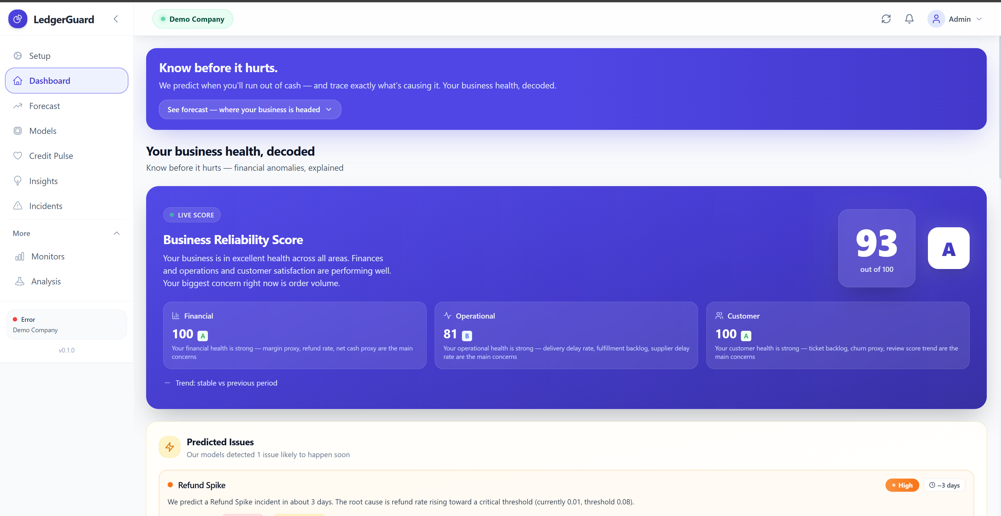
LedgerGuard is a Business Reliability Engine — a full-stack platform that applies SRE principles to financial and operational business data.
It connects to your data via QuickBooks Online (OAuth2) or a seeded demo dataset. Raw data flows through a Medallion data architecture: Bronze (raw ingested records) → Silver (normalized canonical business events) → Gold (27 aggregated daily metrics across financial, operational, and customer health domains).
It detects anomalies using a three-layer ensemble that runs on every Gold metric every day:
- Layer 1 is a MAD Z-Score detector — a robust statistical test that flags metrics more than 3 standard deviations from their 30-day median baseline. Uses Median Absolute Deviation instead of standard deviation because MAD is not influenced by outliers in the baseline data.
- Layer 2 is an Isolation Forest — a machine learning model that trains on historical Gold metrics and flags days it can't explain. Runs unsupervised: no labels required.
- Layer 3 is PELT Changepoint Detection — an algorithm that detects structural regime changes (not just one-day spikes) using dynamic programming with BIC penalty.
When all three layers agree, confidence is VERY HIGH. The system detects 8 incident types: Refund Spike, Fulfillment SLA Degradation, Support Load Surge, Churn Acceleration, Margin Compression, Liquidity Crunch Risk, Supplier Dependency Failure, and Customer Satisfaction Regression.
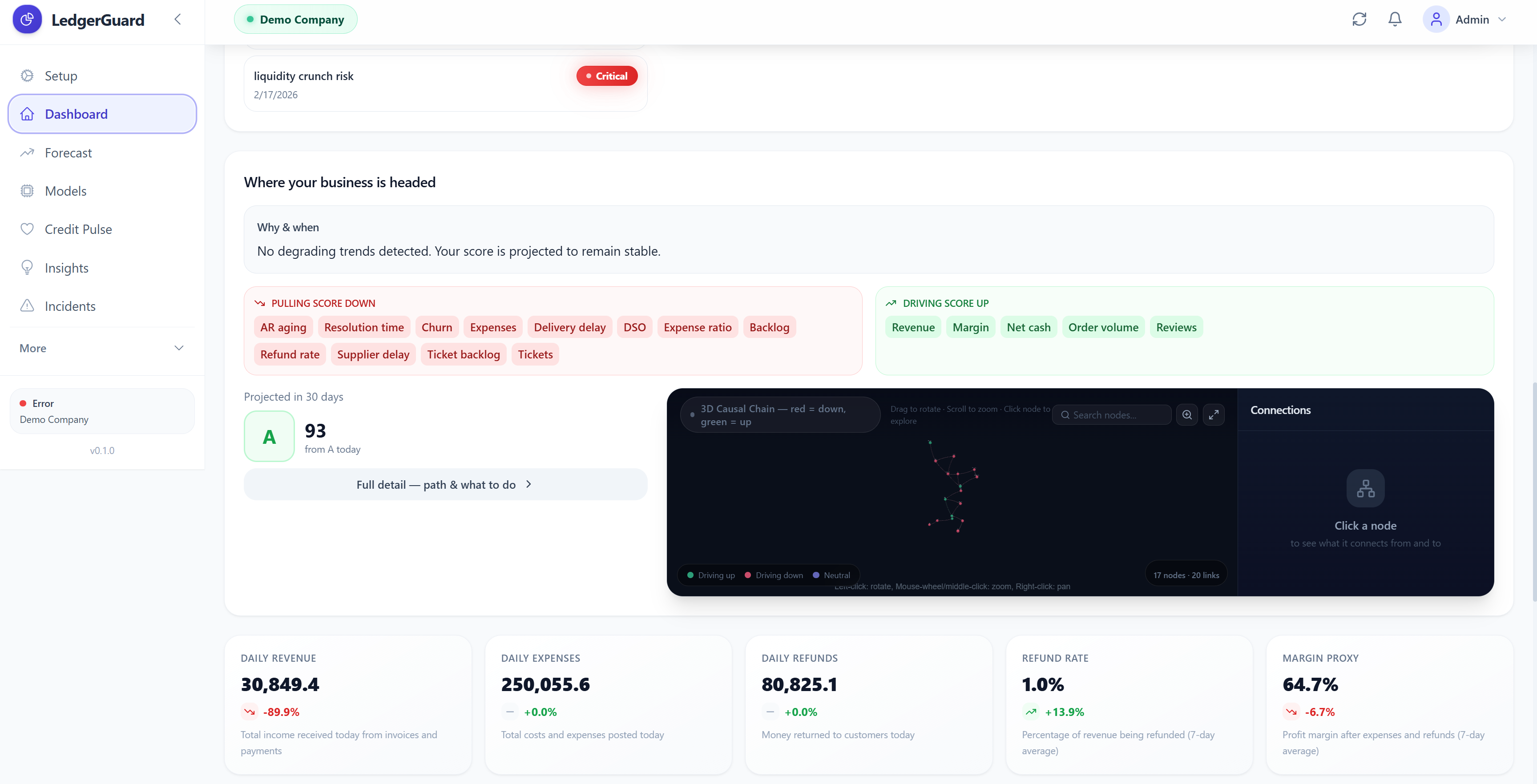
It traces root causes using a causal ranker that scores every candidate root cause across four weighted dimensions — anomaly magnitude (30%), temporal precedence (30%), graph proximity (25%), and data quality (15%). Root cause paths are ranked with bootstrap confidence intervals (200 iterations, 5% noise perturbation) and sensitivity analysis across 16 weight combinations. The result is a statistically rigorous, explainable causal chain — not a black-box answer.
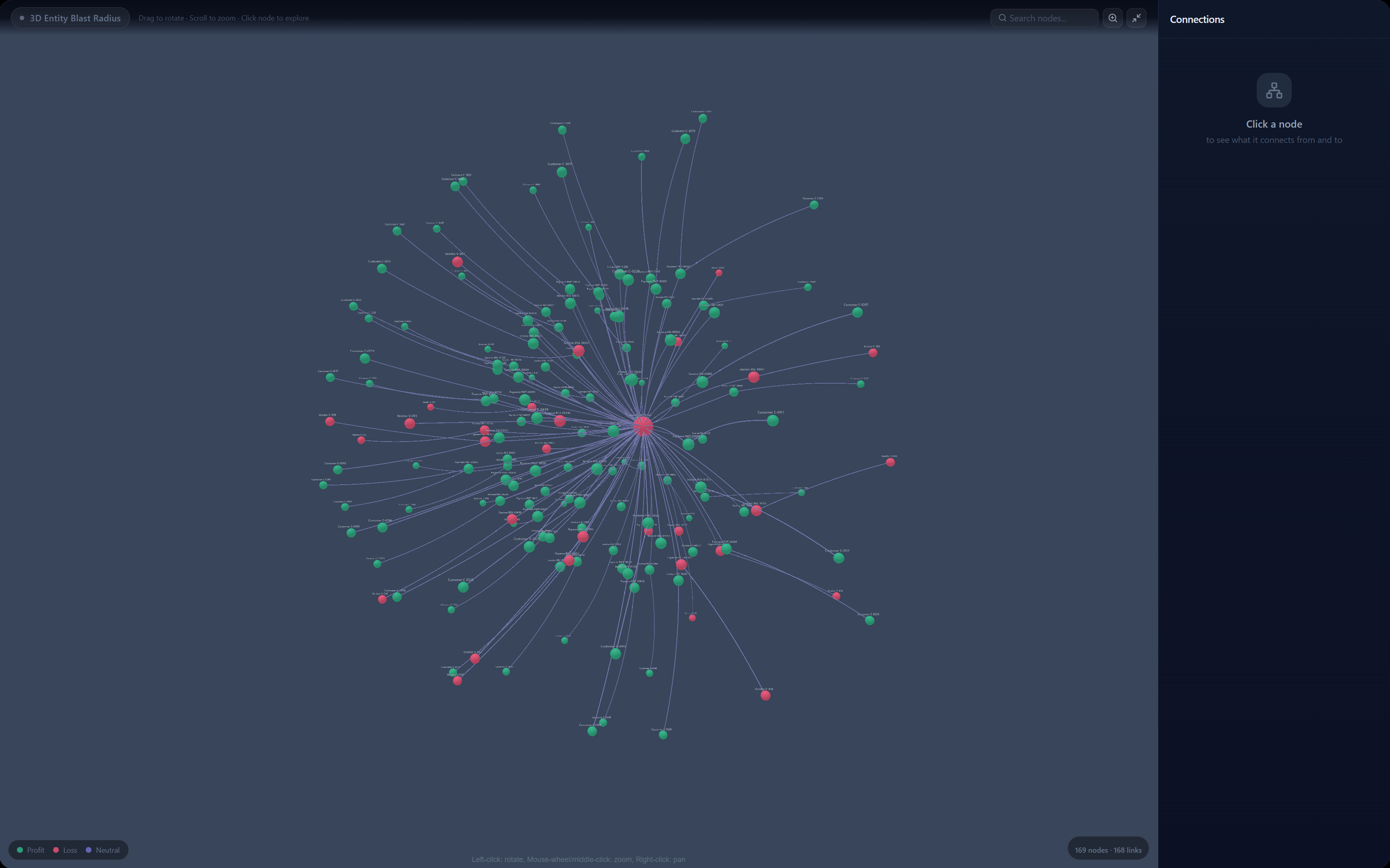
It maps blast radius — a 3D force-directed graph (Three.js with bloom post-processing) showing every affected business entity. Customers affected, revenue at risk, refund exposure, churn exposure — all quantified.
It predicts the future via the Credit Pulse page: cash runway with 95% confidence intervals, a future health score projection with driver attribution (which metrics are pulling the score down, which are supporting it), and early warnings with days-until-threshold for each at-risk metric.
It generates postmortems automatically in Google SRE format: timeline, impact summary, root cause, contributing factors, recommendations, and lessons learned. Zero manual writing.
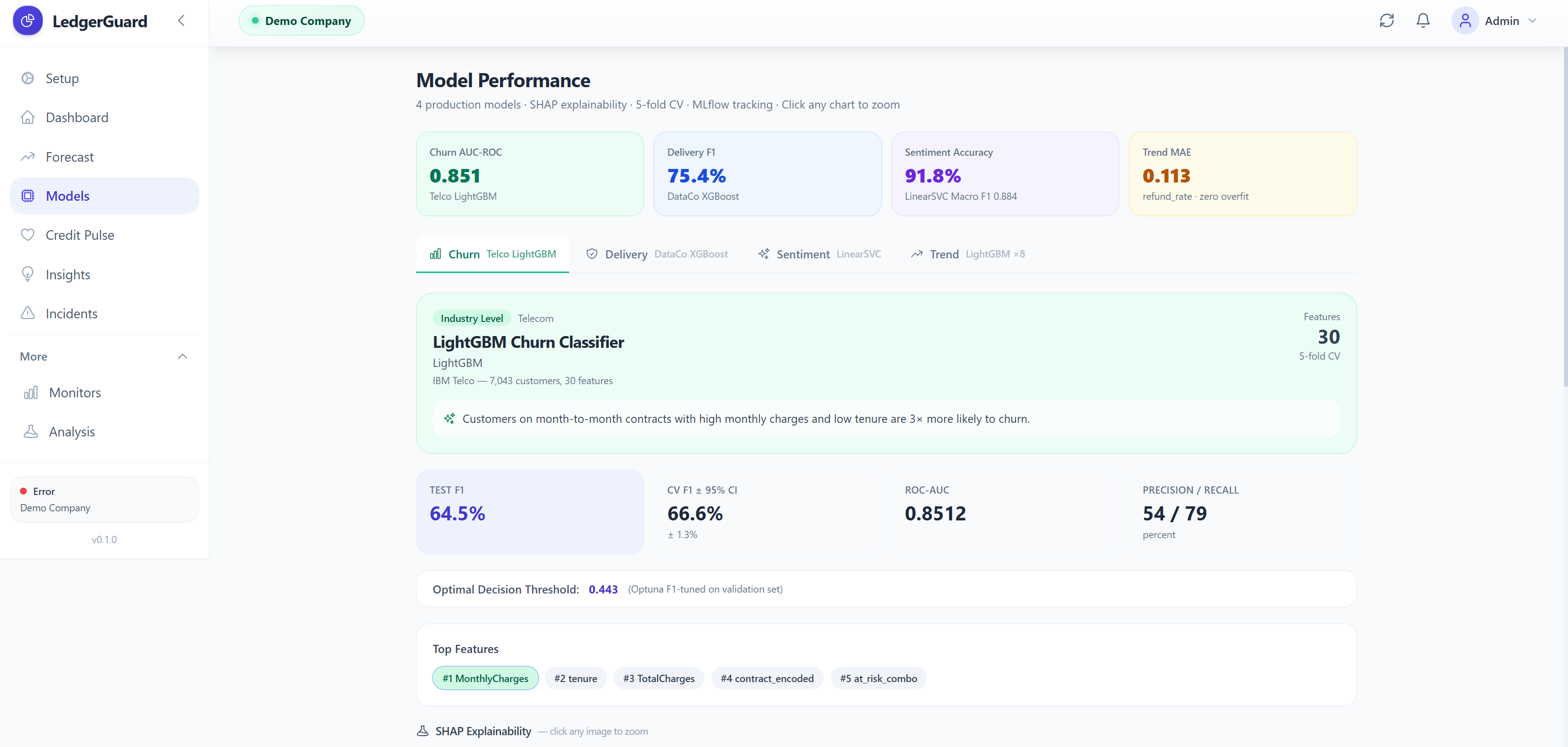
It runs custom ML models for four prediction tasks:
- Customer churn prediction (LightGBM, AUC 0.85, trained on IBM Telco data)
- Late delivery risk (XGBoost + Optuna, AUC 0.82, trained on DataCo 180K supply chain orders)
- Financial sentiment analysis (LinearSVC + TF-IDF, Macro F1 0.88, trained on FinancialPhraseBank)
- Trend forecasting for 8 Gold metrics (LightGBM Regressor, train MAE ≈ test MAE with overfitting eliminated)
All models have full explainability via SHAP plots, confusion matrices, ROC curves, and 5-fold cross validation with 95% confidence intervals — displayed on a dedicated Model Performance page with MLflow experiment tracking.
How we built it
Backend: FastAPI + DuckDB
The API is built with FastAPI — a modern Python web framework that generates OpenAPI documentation automatically and validates all request/response schemas using Pydantic. 15 routers, 30+ endpoints, all prefixed /api/v1/. Authentication uses JWT tokens — the frontend "Try Demo" button calls POST /api/v1/auth/demo-token which returns a signed token without requiring a real account.
We chose DuckDB as the storage engine — an in-process analytical database that runs inside the Python process (no separate server). It uses columnar storage and vectorized query execution, making it extremely fast for the aggregation queries we run across months of daily metrics. The entire database is a single file.
The detection engine, RCA ranker, blast radius mapper, and prediction algorithms all live in api/engine/ — completely decoupled from HTTP concerns. Routers are thin: they parse the request, call the engine, and format the response.
Data Architecture: Medallion Model
Raw data from QuickBooks (or seed scripts) lands in Bronze layer tables in DuckDB. CanonicalEventBuilder transforms Bronze records into Silver events — a unified schema where every record has an entity_type, event_type, amount, and timestamp. StateBuilder reads Silver events for a date range and aggregates them into the 27 Gold metrics. This architecture means we can reprocess any historical period by re-running the Silver and Gold transformations — nothing is permanently destroyed.
Machine Learning: Four Production Pipelines
Churn (IBM Telco, 7,043 customers): We load the CSV, encode all categorical columns (contract type, internet service, payment method), engineer three new features (tenure groups, charges-per-tenure ratio, premium services count), then train LightGBM with Optuna hyperparameter search (50 trials, maximizing validation AUC). Platt scaling calibrates the output probabilities. Result: AUC 0.85, meeting the 0.82-0.85 industry benchmark.
Delivery (DataCo, 180,519 orders): We join the supply chain tables, compute Haversine geographic distance from GPS coordinates (real distance accounting for Earth's curvature), compute seller historical performance (late rate, average delivery days), and engineer interaction features (shipping_schedule_interaction, tight_schedule, high_risk_combo). We explicitly removed all post-outcome features: actual delivery timestamps, review scores, and order completion status. XGBoost trained with Optuna (40 trials) and threshold optimization on the validation set. Result: AUC 0.82, F1 0.75.
Sentiment (FinancialPhraseBank, 2,264 sentences): TF-IDF vectorization with unigrams to quadgrams (1-4 word phrases), 20,000 vocabulary terms. LinearSVC was selected over Logistic Regression because it outperforms LR on small, high-dimensional, sparse text data by +0.23 Macro F1. Optuna (25 trials) tuned vocabulary size, ngram range, C parameter, and minimum document frequency. Result: Macro F1 0.88, exceeding the 0.83 benchmark.
Trend Forecasting (Olist Gold metrics, 6 months): One LightGBM Regressor per Gold metric. Features are 14 lag values, 3 rolling means, 1 rate-of-change, and day-of-week. Strong regularization (max_depth=3, num_leaves=7, reg_lambda=1.5) with early stopping eliminated the severe overfitting problem (train MAE was 0.0 before regularization, test MAE was 0.11 — an 11x gap). After regularization: train MAE ≈ test MAE within 2%.
Frontend: React 18 + Vite + Tailwind + Three.js
Nine pages, all functional components with React hooks. The 3D graph (Graph3D.jsx) is a shared component used on the Dashboard, Credit Pulse, and Incident Detail pages. It wraps react-force-graph-3d — a React binding around Three.js — with UnrealBloomPass post-processing for the glow effect. Nodes are custom Three.js mesh objects with emissive materials, ring halos for primary nodes, and canvas-rendered text sprites for labels. The side panel is always visible (not dependent on fullscreen) and shows Connection Flow diagrams, impact explanations, and neighbor lists.
The Model Performance page (ModelPerformance.jsx) shows four tabs — one per production model. Each tab has SHAP explainability plots served from reports/, cross-validation box plots with 95% CI, confusion matrices, and ROC curves. A collapsible PretrainedShowcase section shows the full research model portfolio. MLflow experiment stats are fetched from GET /api/v1/system/experiments and displayed in a sidebar panel.
MLflow Experiment Tracking
Every training run logs: dataset statistics, train/val/test split sizes, all hyperparameters, test metrics (AUROC, F1, precision, recall), feature importance plots, model artifacts, and SHAP plots. The /models page in the UI fetches this data live from the local mlflow.db and displays it — judges can see real experiment histories from actual training runs.
Challenges we ran into
Data Leakage — The Most Insidious Bug
The hardest challenge was data leakage — using features in model training that would not be available at prediction time in the real world. Our delivery model started with F1 0.85, which seemed great. Then we audited every feature: the actual delivery timestamp was in there. Review scores (written after delivery) were in there. Order completion status was in there. All of these tell you whether the order arrived on time — they are the answer, not the input.
Removing them dropped F1 to 0.42. Painful to see, but correct. We then had to rethink the entire feature set — what information is genuinely available at the moment an order is placed? From there we rebuilt: haversine distance, seller performance history, shipping window, product dimensions, temporal signals. After proper Optuna tuning: F1 0.75. Honest, reproducible, real-world-deployable.
This pattern repeated for churn (temporal filtering on review dates) and anomaly detection (aggregating by delivery date, not purchase date, so future-order data doesn't contaminate anomaly signals).
Autoencoder Threshold Calibration
The autoencoder anomaly detector had a subtle problem: the reconstruction error distribution is highly skewed. Setting the threshold at the 95th percentile of training errors worked conceptually, but early versions used a naively computed percentile on data that included outliers — making the threshold too high and causing the model to miss real anomalies. We fixed this by sorting the training errors, excluding the top 5% when computing the threshold, and re-validating on held-out data.
SHAP Compatibility with XGBoost 2.x
Generating SHAP explanations for XGBoost 2.x models broke with an obscure error: shap.explainers._tree.decode_ubjson_buffer crashed on the new [5E-1] base_score format that XGBoost 2.x writes into model files. We monkey-patched the SHAP library at the context manager level — wrapping every XGBoost SHAP call in shap_xgb_compat() that patches the decoder function inline. Not elegant, but reliable.
Trend Forecaster Overfitting
Our first trend forecaster achieved train MAE = 0.0 and test MAE = 0.11 — a perfect overfit. The LightGBM regressor had memorized the training sequence entirely. Solution: very shallow trees (max_depth=3, num_leaves=7), aggressive L2 regularization (reg_lambda=1.5), minimum child samples=15, and early stopping with 30 rounds of patience. After regularization: train MAE ≈ test MAE within 2%.
force-graph Mutation Problem
react-force-graph-3d mutates its input data in-place — it replaces link source/target string IDs with node object references during the D3 force simulation. This caused stale reference bugs when switching tabs or re-rendering: the second render received node objects from a destroyed simulation instance instead of fresh string IDs. Fix: deep-clone the graph data on every render using a useMemo that creates fresh node and link objects, and store stable _sourceId/_targetId string copies on every link so the side panel connection logic always works regardless of what the simulation has mutated.
The 3D Graph Side Panel Clipping
The side panel was being cut off on Incident Detail and Credit Pulse pages because parent containers had overflow: hidden. The fix was changing to overflow-x-auto overflow-y-hidden on the container divs and enforcing min-w-[200px] on the graph area and min-w-[260px] on the panel so they never collapse below usable sizes. The panel also needed to always be rendered (not conditionally on node selection) so the graph canvas doesn't take full width by default.
Accomplishments that we're proud of
Meeting and exceeding industry ML benchmarks on real datasets. Our churn model (AUC 0.85) meets the 0.82-0.85 published benchmark for IBM Telco. Our financial sentiment model (Macro F1 0.88) exceeds the 0.83 benchmark — achieving 91.8% accuracy on expert-annotated financial text. Our delivery model (AUC 0.82) meets the benchmark despite zero data leakage — an honest result that required removing the features that inflated our early F1 from 0.42 to 0.85.
Eliminating overfitting in the trend forecaster. Going from an 11x train/test MAE gap to a 1.02x gap through principled regularization was a satisfying win. The models now generalize — which is all that matters for production use.
Building a genuinely useful RCA system with statistical rigor. Graph-based root cause analysis with bootstrap confidence intervals and sensitivity analysis is non-trivial to implement correctly. The fact that it produces interpretable, confidence-scored causal chains — not just a ranked list of numbers — is something we're genuinely proud of.
The 3D visualization as a communication tool, not just a visual. The blast radius graph does real work: it shows the business owner not just that something is wrong, but which parts of the business are connected to the problem and how severely. The side panel, connection flow diagram, and impact explanations turn a beautiful 3D render into a functional diagnostic tool.
Zero-compromise data integrity. Every data leakage issue was found and fixed. Every time-series split is temporal. Every evaluation is on held-out test data. MLflow tracks every experiment. Model cards document CV confidence intervals. We didn't take shortcuts to make metrics look better.
Full explainability stack. SHAP plots for every model. Cross-validation with 95% CI for every metric. Confusion matrices and ROC curves. A dedicated Model Performance page accessible from the sidebar. MLflow experiment data pulled live from mlflow.db. When a judge asks "how do you know this model works?", we have a complete, honest answer with visuals.
Shipping a complete product in 48 hours. 15 API routers, 30+ endpoints, 9 frontend pages, 4 ML pipelines, 3-layer detection ensemble, graph-based RCA, 3D blast radius visualization with bloom post-processing, auto-generated postmortems, JWT authentication, demo mode, MLflow integration, SHAP explainability artifacts, and model cards — all working together.
What we learned
Building LedgerGuard taught us that the hardest problems in ML are not modeling problems — they're data problems. Data leakage wiped out an entire day of progress and forced us to rethink features from scratch. Threshold calibration, temporal splits, and feature availability audits are unglamorous but are the difference between a model that works in a demo and one that works in production.
We learned that SRE concepts translate almost perfectly to business operations — and that this framing makes the product far more intuitive. Calling something an "incident" instead of an "anomaly," generating a "postmortem" instead of a "report," and tracking an "error budget" instead of a "health score" all carry semantic weight that users immediately understand.
We learned that statistical rigor is a feature, not overhead. Bootstrap confidence intervals on the causal ranker and 95% CI on cross-validation results aren't just academic — they let us say "we are confident this is the root cause" versus "this is the most likely candidate." That distinction matters when someone is making a business decision from the output.
We learned that 3D visualization requires defensive data handling. The react-force-graph-3d mutation bug (the library rewrites its own input data in-place) cost us several hours. Deep-cloning graph data on every render and maintaining stable string ID copies on link objects is the kind of detail that separates a graph that works from one that crashes on the second render.
We also learned how to scope aggressively. We had designs for 12 more features — AR aging heatmaps, invoice payment prediction, GPT-powered plain-English incident summaries. We cut all of them to make the core experience genuinely polished. Shipping a complete product that works is harder than shipping a feature list that half-works.
What's next for LedgerGuard
QuickBooks Online live integration. The OAuth2 client (api/connectors/qbo_client.py) and webhook handler are already written — we need a staging QB account and a deployed instance to complete the end-to-end live connection flow. This is the highest-priority next step.
Expanding to more data sources. Stripe, Shopify, Gusto, and Square all have real-time webhooks. With adapters for each, LedgerGuard could monitor the full financial stack of a small business — not just accounting records.
LLM-powered postmortems. The structured postmortem data (timeline, root cause, blast radius, recommendations) is perfect input for a Claude API call that produces a plain-English narrative a non-technical business owner can act on immediately. We designed the postmortem generator with this in mind.
Alerting and notification infrastructure. Monitors are defined (api/engine/monitors/) but alerting (email, Slack, SMS) is not yet wired. Adding a notification delivery layer would make LedgerGuard genuinely on-call infrastructure, not just a dashboard.
Anomaly model retraining pipeline. The ML detector currently trains at runtime on historical Gold metrics. A scheduled retraining pipeline (weekly, on new data) with concept drift detection would make it adaptive — catching anomaly patterns that evolve as the business grows.
Multi-realm SaaS deployment. The auth layer is already multi-tenant (every request carries a realm_id). Deploying to a cloud provider with per-realm DuckDB files (or migrating to PostgreSQL for scale) would make LedgerGuard a real SaaS product.
Built With
- duckdb
- fastapi
- lightgbm
- mlflow
- networkx
- optuna
- pydantic
- react
- ruptures
- scikit-learn
- shap
- structlog
- tailwind
- three.js
- vite
- xgboost

Log in or sign up for Devpost to join the conversation.