-
-

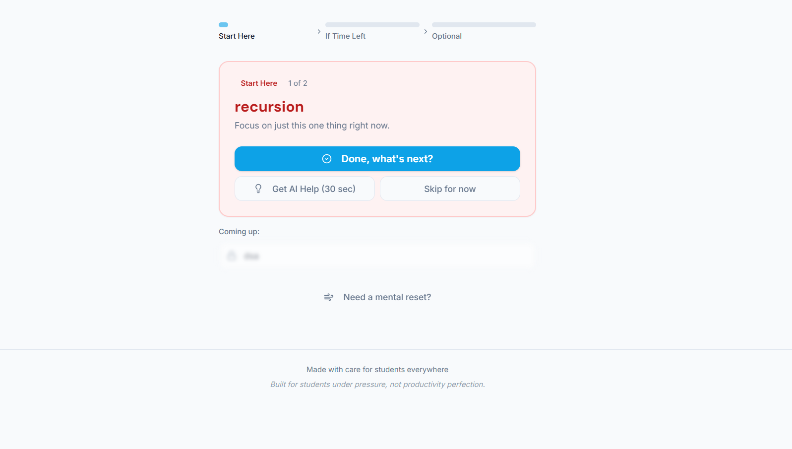
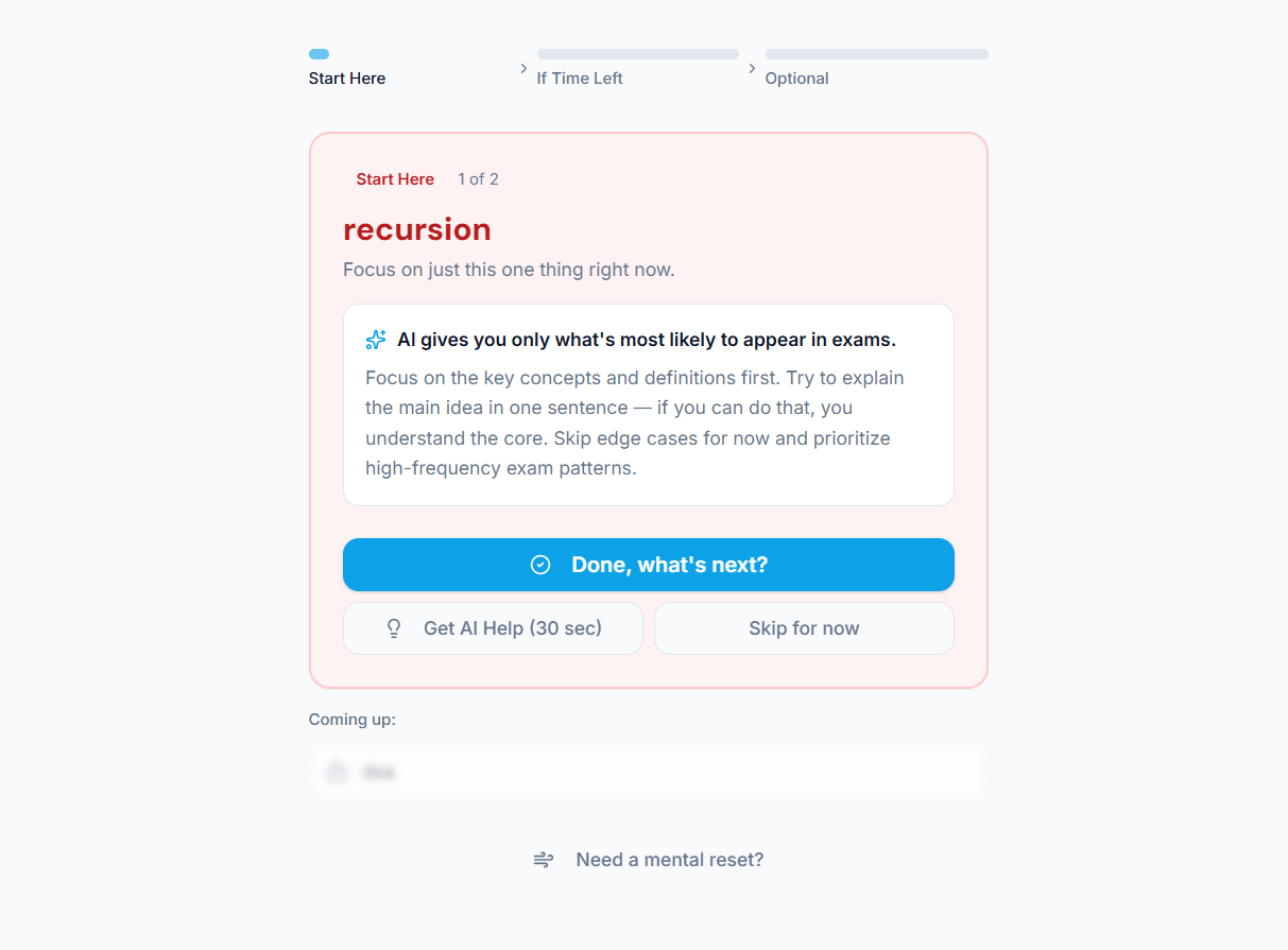
The app selects one high-impact topic at a time to reduce decision fatigue and improve focus.
-
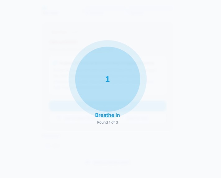
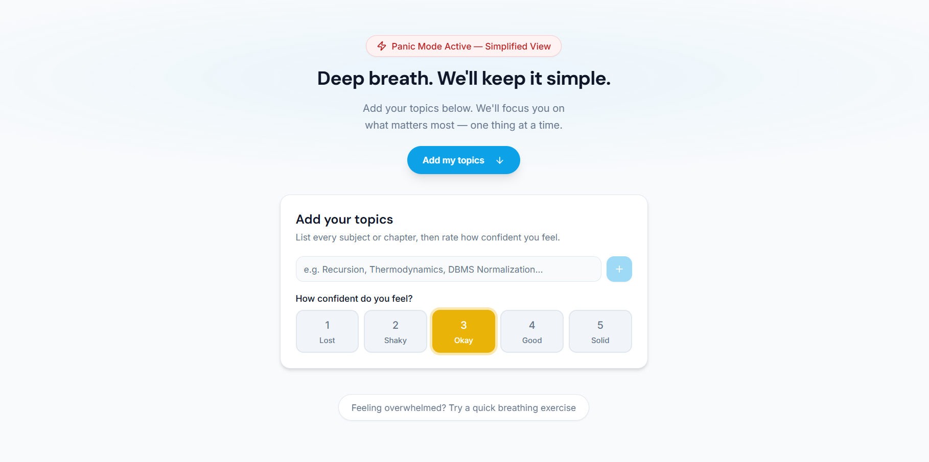
A built-in breathing exercise helps students reset mentally during moments of high stress.
-
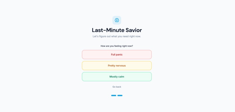
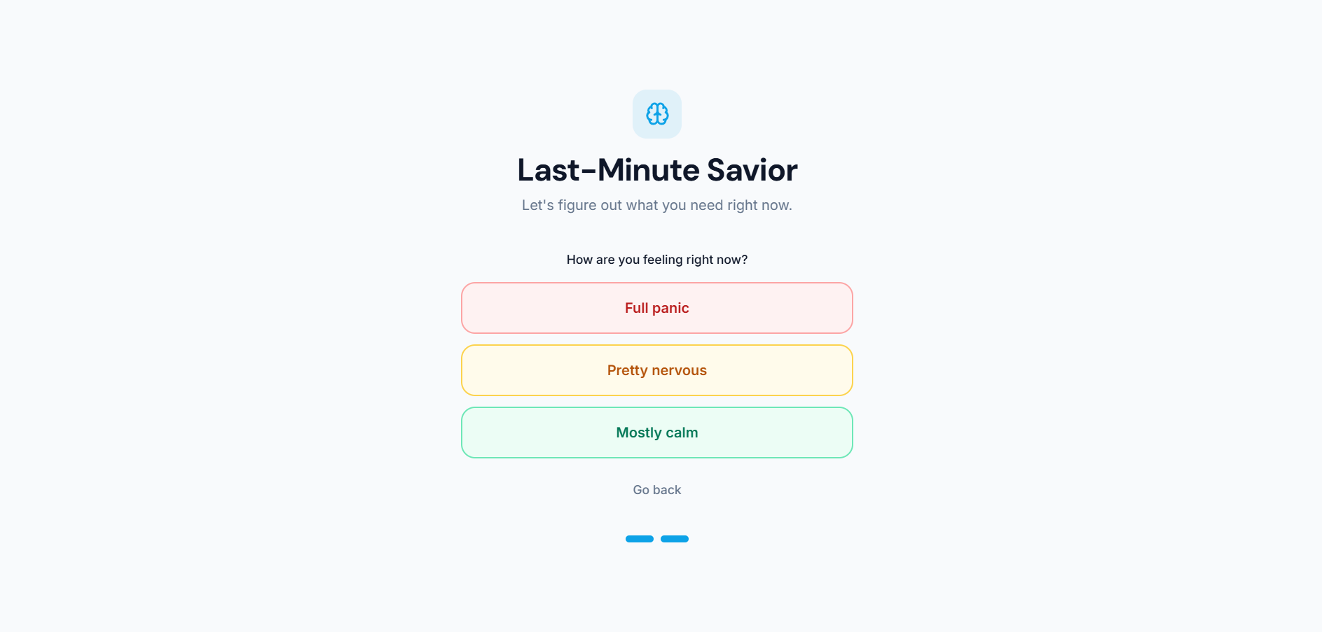
Students choose how they feel mentally, allowing the experience to respond to stress and panic, not just study needs.
-
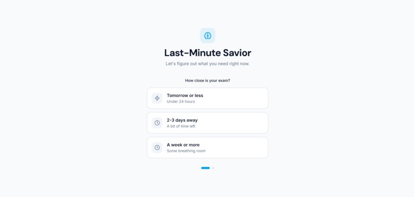
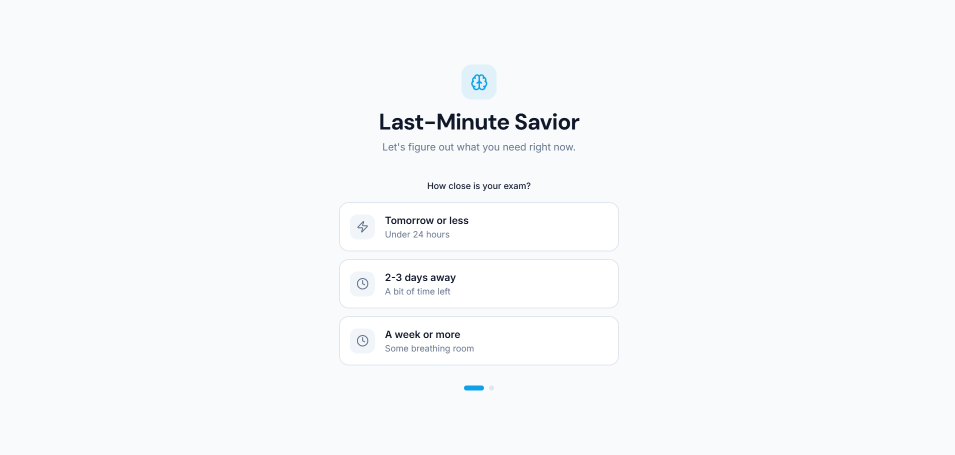
Select how close your exam is so the app instantly adapts guidance based on real urgency, not long-term planning.
-
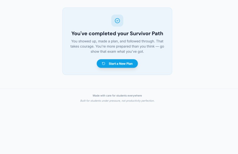
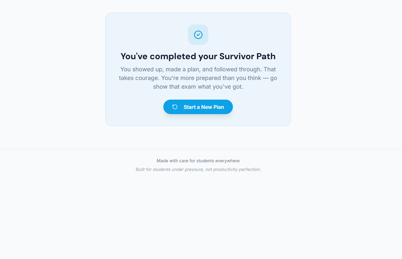
Completion screen reinforces confidence and reassures students before they face their exam.
-
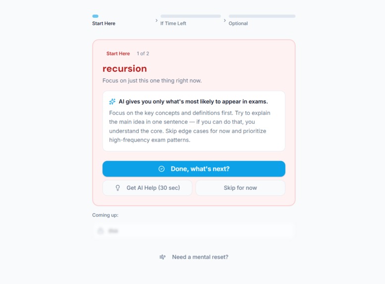
Concise, exam-focused guidance highlights what is most likely to appear, saving time under pressure.
-

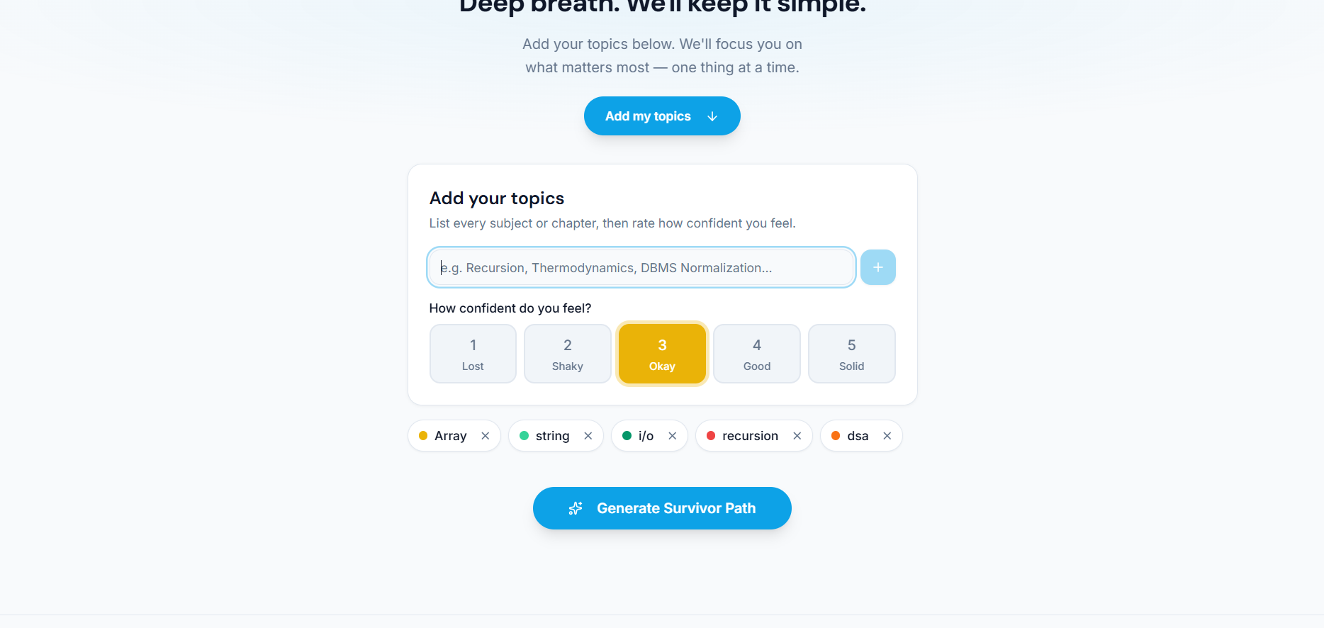
Students add topics and rate confidence levels so weaker areas are prioritized without overwhelming them.
-
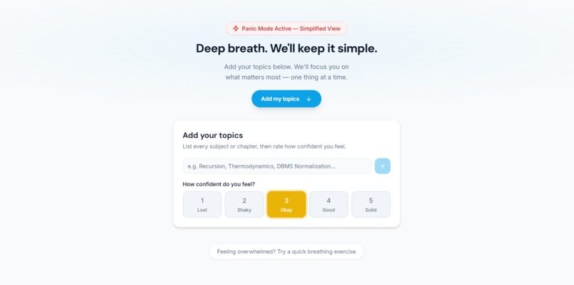
Panic Mode activates a simplified interface that removes distractions and helps students calm down before focusing.

Inspiration
Every student knows this feeling.
The exam is close.
The syllabus is huge.
The mind feels frozen.
At the last minute, students don’t struggle because they are lazy or unprepared —
they struggle because they are overwhelmed.
Too many topics.
Too little time.
Too much panic.
Most study tools assume students are calm, organized, and planning days in advance.
But what about students who are studying at the very last minute —
when stress is high and clarity is low?
I wanted to build something that doesn’t judge students, doesn’t overwhelm them, and doesn’t try to turn panic into productivity.
Last-Minute Savior was created for that exact moment.
What This Project Does
Last-Minute Savior is not a planner.
It is a decision-making survival tool for students under extreme exam pressure
who don’t know what to study when time is running out.
Instead of giving long schedules, the app:
- Detects panic and stress levels
- Reduces choices instead of adding more
- Shows only one task at a time
- Gives honest, realistic guidance about what is actually possible
- Helps students calm down and regain focus
The goal is simple but powerful:
reduce panic, remove confusion, and guide the student step-by-step.
How I Built It
The app is built as a modern, responsive web application using React and Next.js, with a strong focus on user experience.
Every design and logic decision was guided by one question:
Will this make a stressed student feel calmer or more overwhelmed?
Key ideas behind the build:
- Minimal UI to avoid mental overload
- Clear, human language instead of productivity jargon
- Mobile-first design for students studying anywhere
- Logic-based prioritization instead of rigid schedules
The UI and logic work together to guide students through a short
“Exam Survivor Path” rather than a long timetable.
Challenges I Faced
The biggest challenge was not technical —
it was designing for students under stress.
I had to constantly ask:
- Is this helping the student, or adding pressure?
- Is this feature necessary, or distracting?
- Can this decision be simplified even more?
Removing features was often harder than adding them. Finding the balance between usefulness and emotional clarity was the most important challenge of this project.
What I Learned
This project taught me that:
- Good UX is about removing decisions, not adding features
- Simplicity can be more powerful than complexity
- Technology can support mental wellness, not just productivity
- Designing for real human emotions matters
Most importantly, I learned that even small, thoughtful tools can make a real difference for students when they need it the most.
Built With
- css
- next.js
- pnpm
- react
- typescript
- vercel


Log in or sign up for Devpost to join the conversation.