-
-
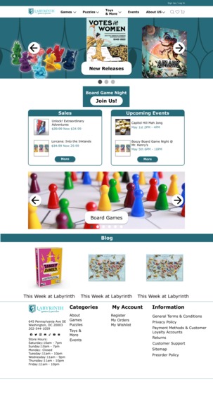
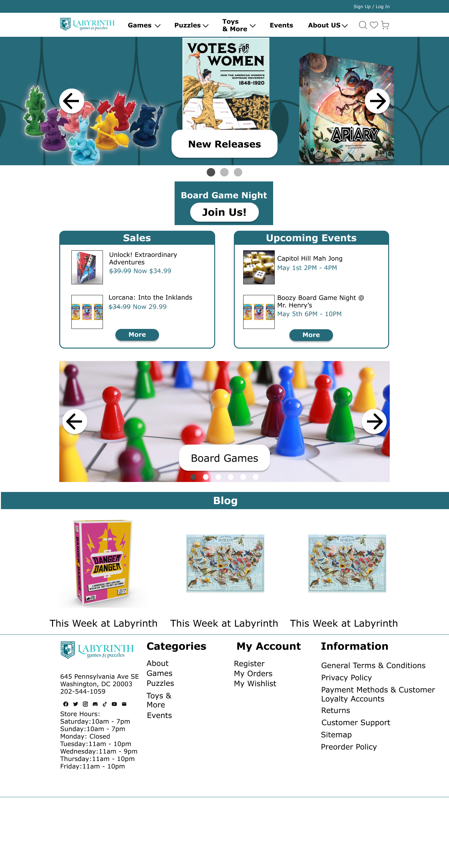
Homepage for the hi-fidelity prototype
You know what sucks? Trying to make friends as an adult.
You really take for granted how easy it was to ask another kid if they wanted to see a cool bug you found, and suddenly you had a friend for life.
I was lucky enough to meet my adult friend group at a local game store called Labyrinth Games & Puzzles, a community landmark in Washington, DC that offers space to play the board and card games you buy there.
Defining the Problem
The COVID-19 pandemic forced Labyrinth to move their operation online, and for the most part they did a pretty good job, but it was almost purely additive, leading to an overwhelming and confusing design. I took it upon myself to update it to be more welcoming.
Through research focusing on the online shopping experience, I was able to summarize my problem as:
Online shoppers need a well-organized and informative website to shop on because they don’t want to have to invest a lot of time and effort into purchasing something they could get elsewhere cheaper and easier.
Research Phase
Now, I’m a big fan of board games, but you can’t get too specialized with a design without alienating a wider audience, so I researched this issue by focusing on people’s online shopping experience.
First, I interviewed 4 users for 15 min each about their experiences with online shopping, and my biggest takeaways were:
People prefer the in-person shopping experience, but price and speed of delivery will convince them to shop online instead.
They value abundant, clear information about the product they’re buying.
Usability testing of the current site validated my concerns, showing users struggling to accomplish expected goals.
This led me to create a persona of the average Labyrinth customer and a user journey for their experience with the current site. I had enough to get started.
Ideation & Conceptualization
I knew that the homepage was the first thing that needed updating, especially the global menu options up top. I need to consolidate them to remove some clutter and compartmentalize things. A card sort I performed during research showed me that users generally grouped things into 5 categories: Games, Puzzles, Toys & More, Events, and About Us.
I also cleaned up the home page so more calls to action were above the fold, and reduced the clutter on the filters pages.
Aside from that concern, I added user reviews to pages, a feature that my interviewees mentioned as a big factor in their purchases.
Design & Prototyping
I built a mid-fi prototype based on my sketches that I could test. I tasked usability testers with:
Finding out the store’s history (a major selling point for a community landmark like Labyrinth).
Comparing the #1 best selling game and the #2 best selling game using the comparison feature, and purchasing the one with the best user rating.
Finding out when board game nights are.
Testing & Validation
The results were fruitful, resulting in fewer errors and quicker process time, but identified some additional issues with my designs. (Testing was performed with 4 users over 15 min each over Zoom). People weren't sure how to compare products on the page
Results & Impact
I used these sketches to update the prototype into a hi-fidelity version you can visit by clicking the bolded text. The updated menus, iconography and checkout pages will help streamline the user process further, making the online version of the Labyrinth store just as welcoming as the in-person one.
Key Takeaways & Lessons Learned
This experience taught me an important lesson: don’t get ahead of yourself.
By focusing on the main pain points of my research, I created some new speedbumps in the users’ journey that I was able to address through testing and iterations.
Labyrinth did a great job adapting to the pandemic and is back to in-person events, but they should take this time to update their website to have that same ease-of-access and comfort as their in-person experience.
I want to do more usability testing on this hi-fi prototype, and after some changes, present it to Labyrinth to see how we can work together to make them a tabletop mainstay both off and online. That way, even more people can make life-long friends by undermining each other’s attempts to collect cardboard tokens.
Built With
- figma

Log in or sign up for Devpost to join the conversation.