About the project
Inspiration
We worked with KW Habilitation (https://kwhab.ca/), which supports seniors and adults with intellectual and developmental disabilities in Waterloo Region. Social media is how many people keep up with friends and family, and with their community. But Facebook is crowded with features, full of tiny buttons and walls of text, and has no built-in safety guardrails when interacting with possibly malicious individuals like scammers. So, we wanted seniors and adults with intellectual and developmental disabilities to be able to use it on their own, and safely.
What it does
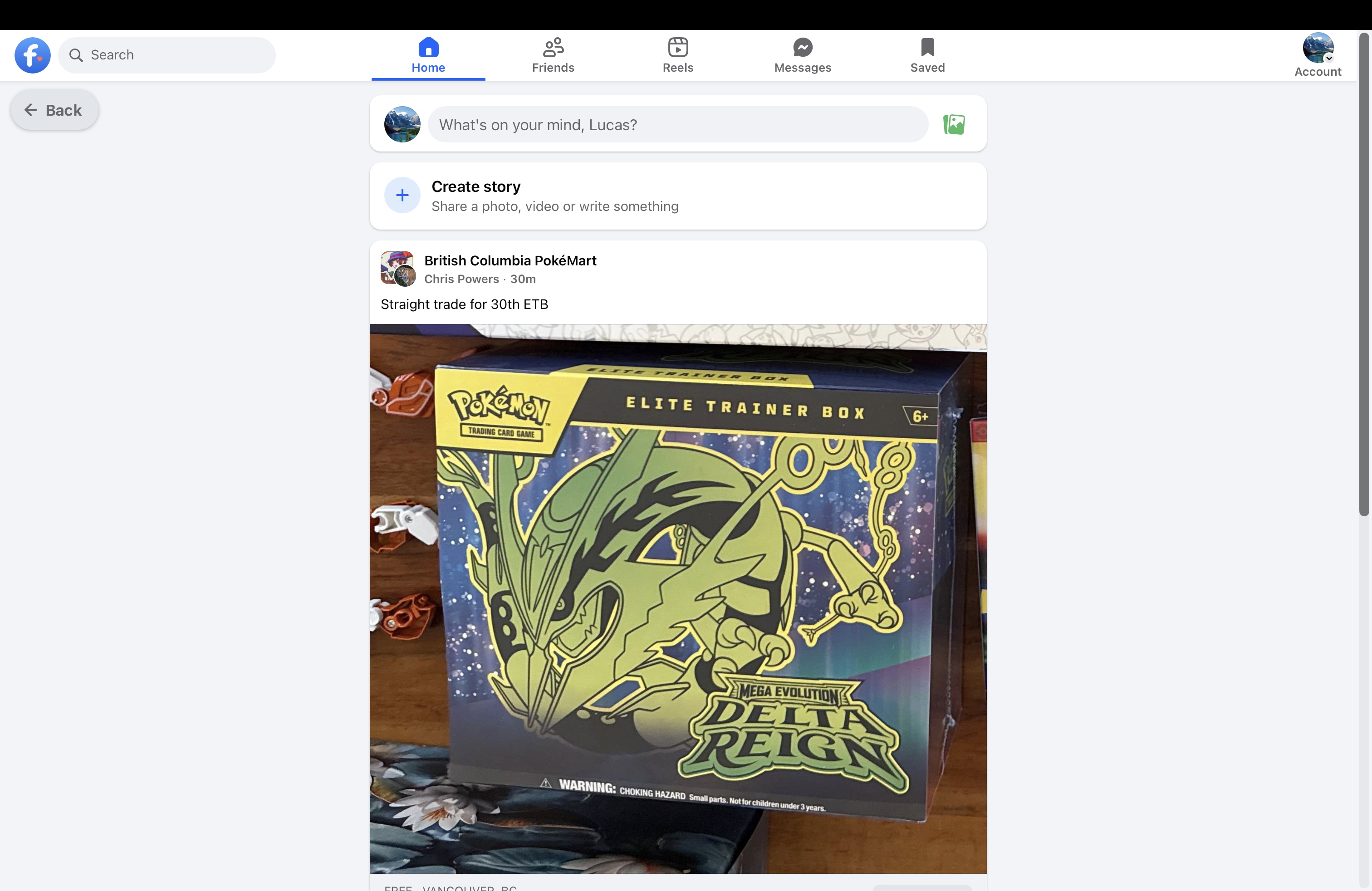
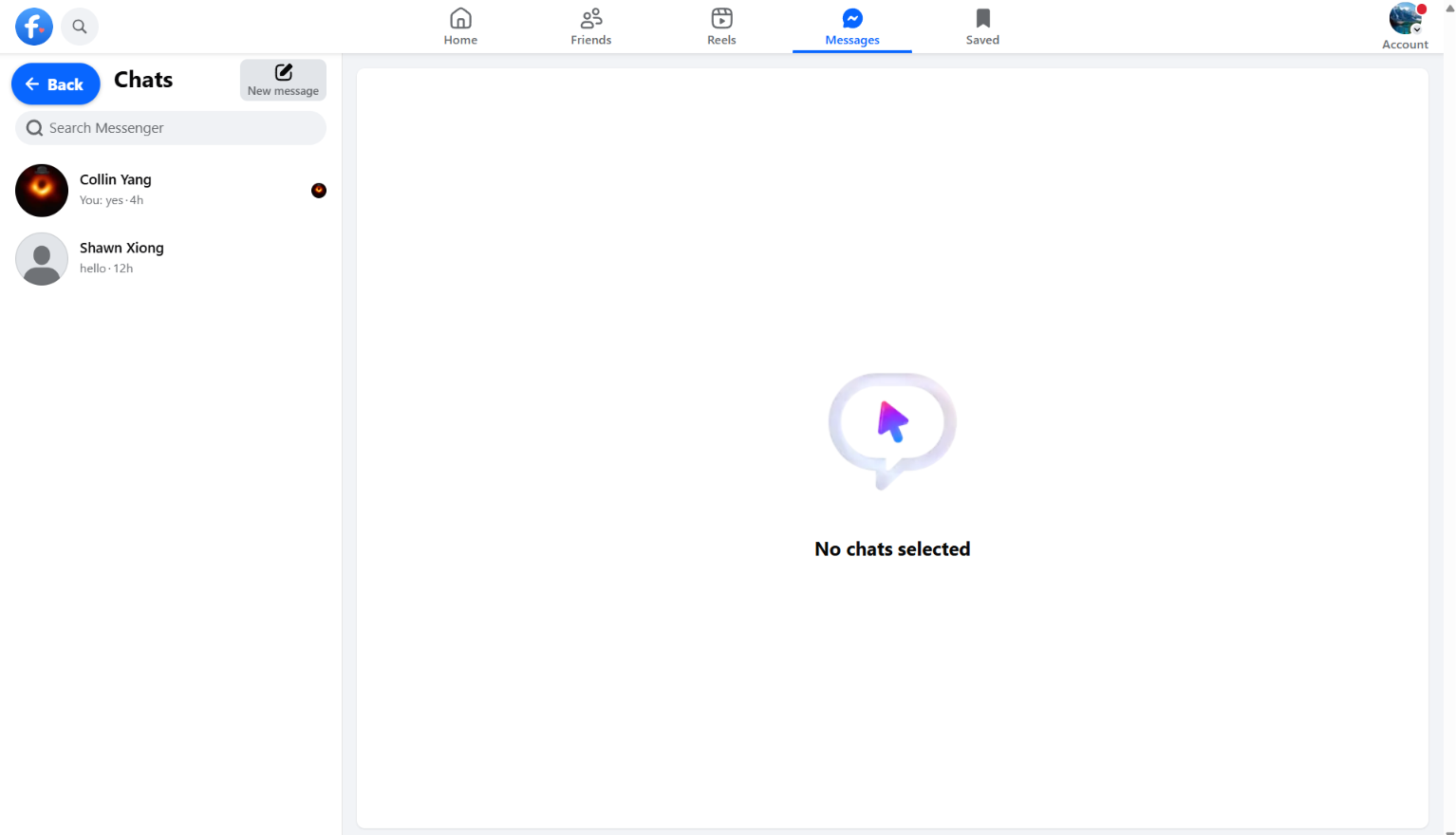
KW Connect is an app for Windows, Mac, Android and iOS that opens the real Facebook, then simplifies it, makes it easier to see and use, and adds safety guardrails. Users keep their own account, their own friends and their own conversations.
Simpler: Confusing and overwhelming buttons, paths, and
More accessible: we know there isn't a one-size-fits-all approach to this, so we created an onboarding screen where the user and their support person can decide what accessibility features they need. They are always able to edit these settings at any point in the future, involving
- Text size, bold text and button size apply everywhere. Button size scales everything you can tap, for people with tremors or limited fine motor control.
- Read aloud: one button reads a post or message out loud in a natural voice (ElevenLabs). For posts with a photo, an AI first looks at the picture, so details that only appear in the image (a flyer's date and place, who is in a photo) are read out too.
- Talk to type: a "Speak to type" button on every text box turns speech into text (ElevenLabs Scribe).
Safer
- Incoming Message monitoring: when a conversation looks like a scam, a request for money or codes, grooming, sexual content, threats, or someone in danger, Gemini writes a plain-language summary and the app texts or emails the user's support people.
- Outgoing Sensitive-info warning: before a message, comment or post is sent, the app checks it for anything that looks like a card number, SIN, password or PIN, or a card number, and asks "Do you want to proceed?". The user stays in control.
- Block and Report buttons sit right on other people's profiles, instead of being buried in a menu.
Balanced. For every feature, we had to consider the balance between user independence and hiding it to make the experience more accessible. We kept the user in charge. They can still post, message, comment, share and add friends. Warnings ask instead of blocking, and support staff are told about risky conversations, but they can't read every message.
How we built it
- Flutter app hosting Facebook's own website in a web view (WKWebView on Mac and iOS, Android's system WebView).
- 36 self-contained UI customizations (CSS and JavaScript injected into the page), one per area of Facebook that we changed.
- A bridge between the page and the native app. Facebook's own scripts can read anything inside the page, so every API key, every call to an outside service and every support contact's details stay on the native side.
- Gemini with structured JSON output for message safety, with backup models when one is rate-limited, and repeat alerts only when the severity goes up.
- ElevenLabs for text-to-speech and speech-to-text, and Cloudinary AI Vision for photo-aware post summaries.
- Twilio (SMS) and Resend (email) to deliver alerts to support people.
- A native first-run setup screen, where the user and their support person pick accessibility settings and enter support contacts.
Challenges we ran into
- Facebook fights being customized. Class names are scrambled and change, and the page re-renders constantly. We had to target stable attributes like accessibility labels, and react to every change Facebook makes to the page.
- Hidden "Sponsored" labels. Facebook draws the "Sponsored" label through a chain of SVG references so scripts can't read it. We follow the chain to find ads.
- Making everything bigger without breaking the layout. Scaling every button by up to 200% inside a site we don't control took a lot of measuring and special cases.
- Keeping secrets out of the page. Facebook's scripts can see everything injected into the page, so we designed the bridge so that no key, phone number or email ever enters it.
- Phones get a different Facebook. Facebook serves phones a completely different mobile site, so we request the desktop site and adapt it to small screens instead.
Accomplishments that we're proud of
- A real, everyday Facebook account, that we made usable for people who couldn't comfortably use it before, without making them switch to a separate "safe" app with nobody they know on it.
- Safety features that respects the user's autonomy and privacy.
- Dynamic accessibility features that users can customize to fit their needs.
- One codebase running on Mac, Windows, Android and iOS.
What we learned
- Accessibility is more than bigger fonts. Plain labels, a less overwhelming interface, a Back button that's always there and various methods of input/output all matter.
- Every guardrail takes away a choice, and there’s a delicate balance between independence and safety.
What's we see as next steps
- Hopefully, we’ll be able to continue working with KW Habilitation. First, we have to decide the scenarios for keeping certain settings and fine tuning our work. Right now, our decisions are our own, and may not reflect what’s best for the intended users.
- Test it with the people KW Habilitation supports and their staff, and adjust based on what they tell us.
- Add an optional progression that let users gradually bring back the Facebook features and UI we removed, at their own pace, so they can work up to using the full Facebook independently.
Built With
- css
- dart
- elevenlabs
- flutter
- gemini
- javascript


