-
-
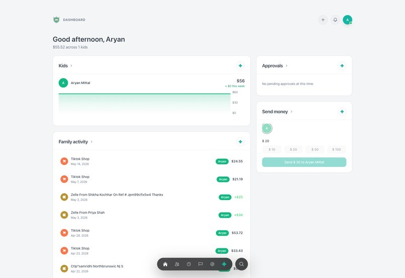
parent desktop dashboard
-

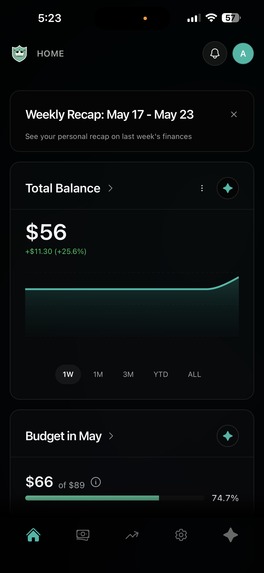
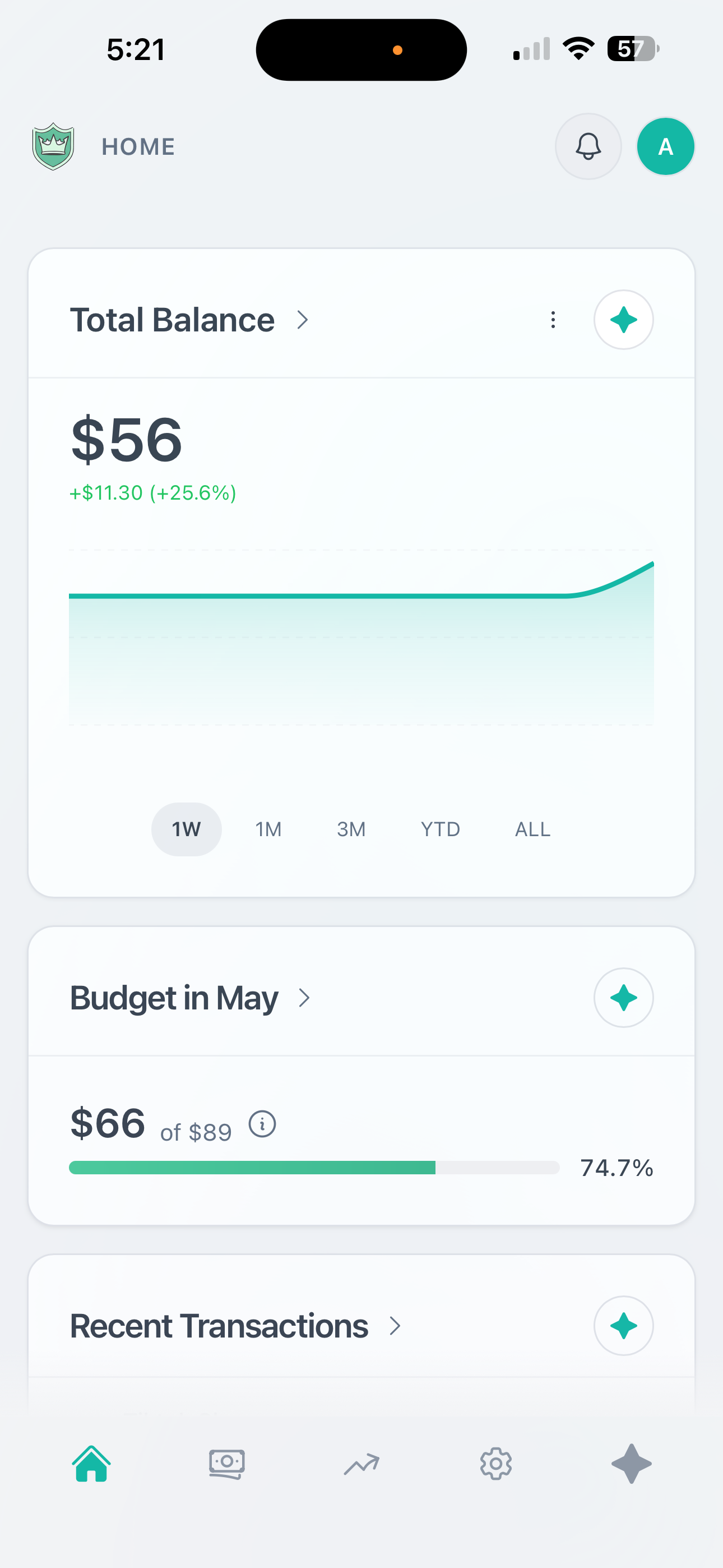
Teen/Adult Mobile Dashboard Light Mode
-
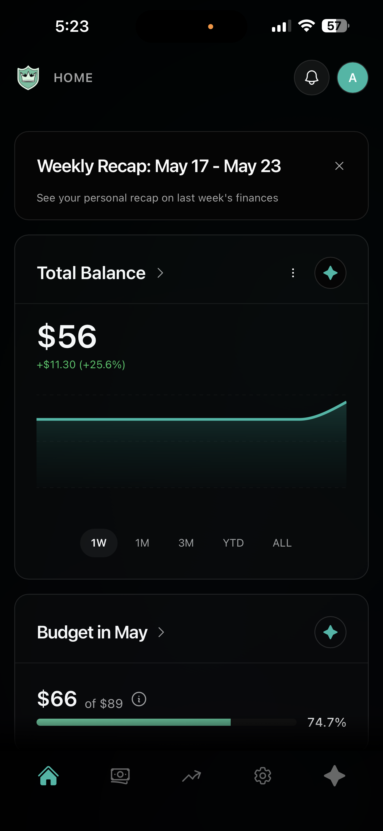
Teen/Adult Mobile Dashboard Dark Mode
-
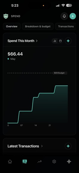
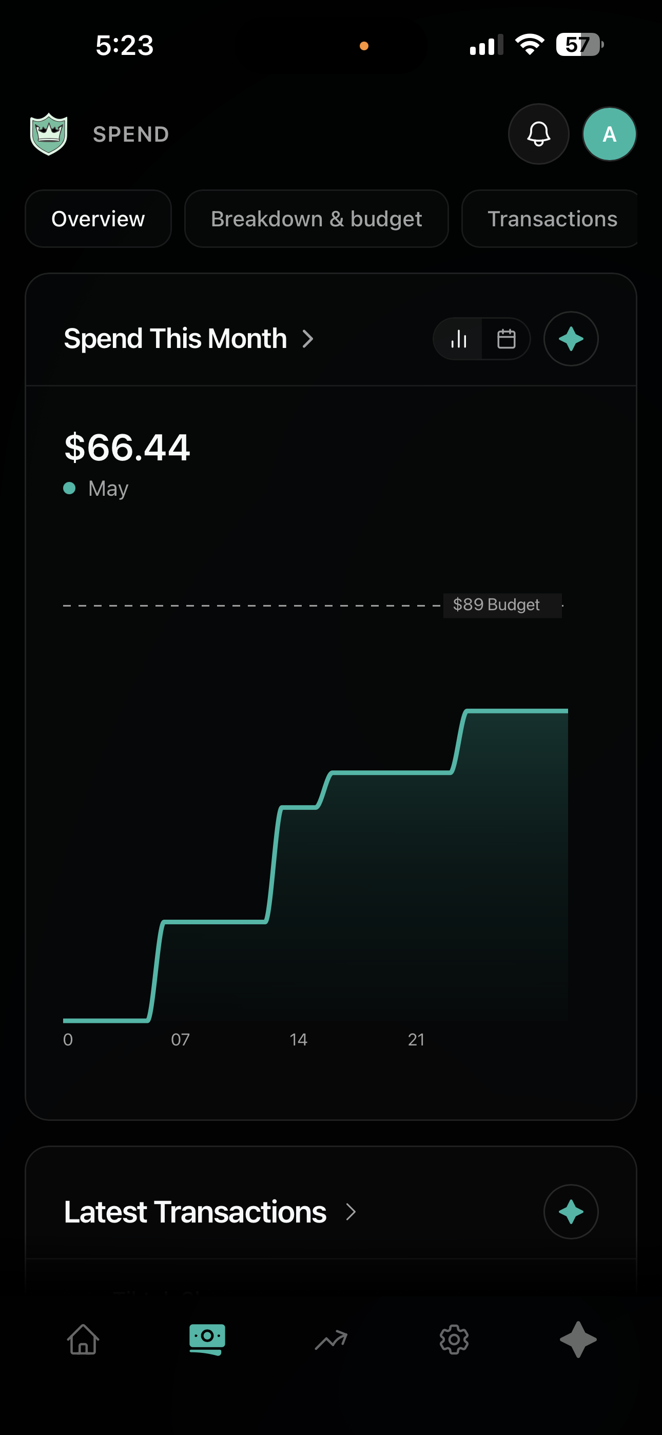
Teen/Adult Mobile Spending Overview Dark Mode
-
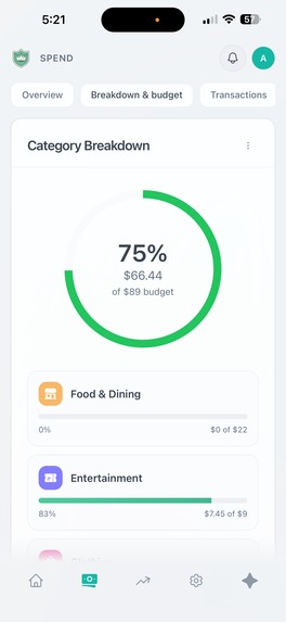
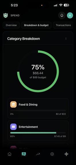
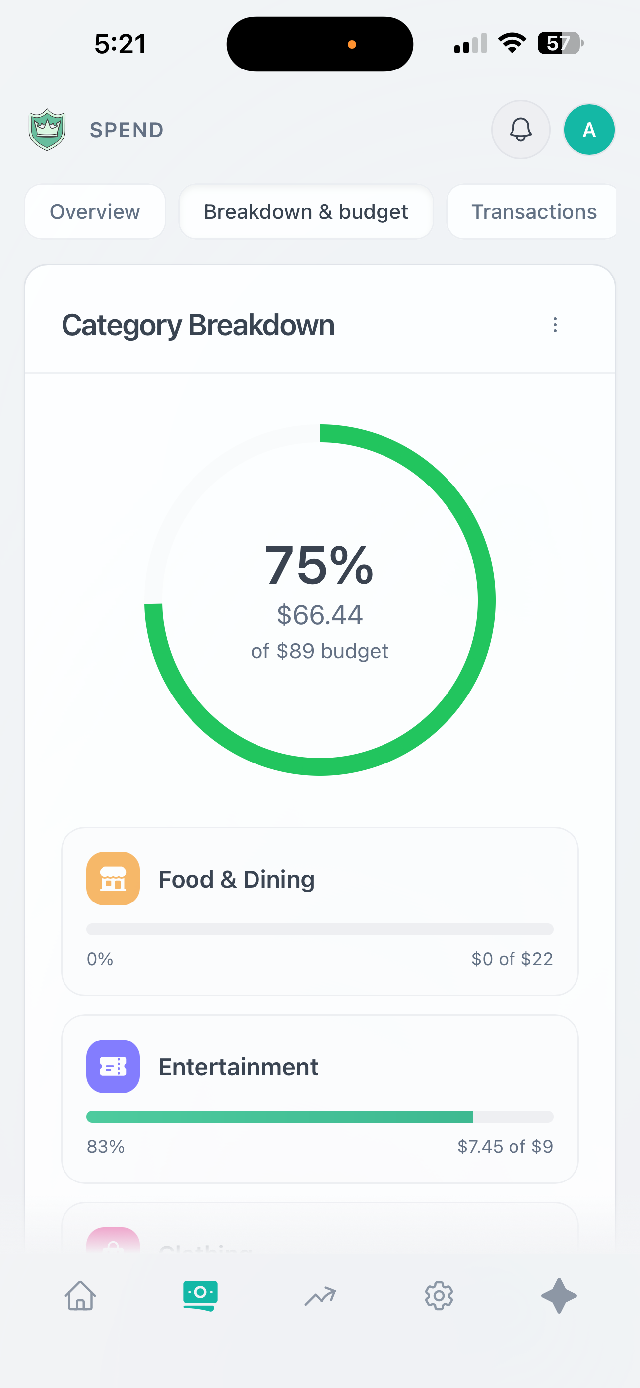
Teen/Adult Mobile Budget Page Light Mode
-
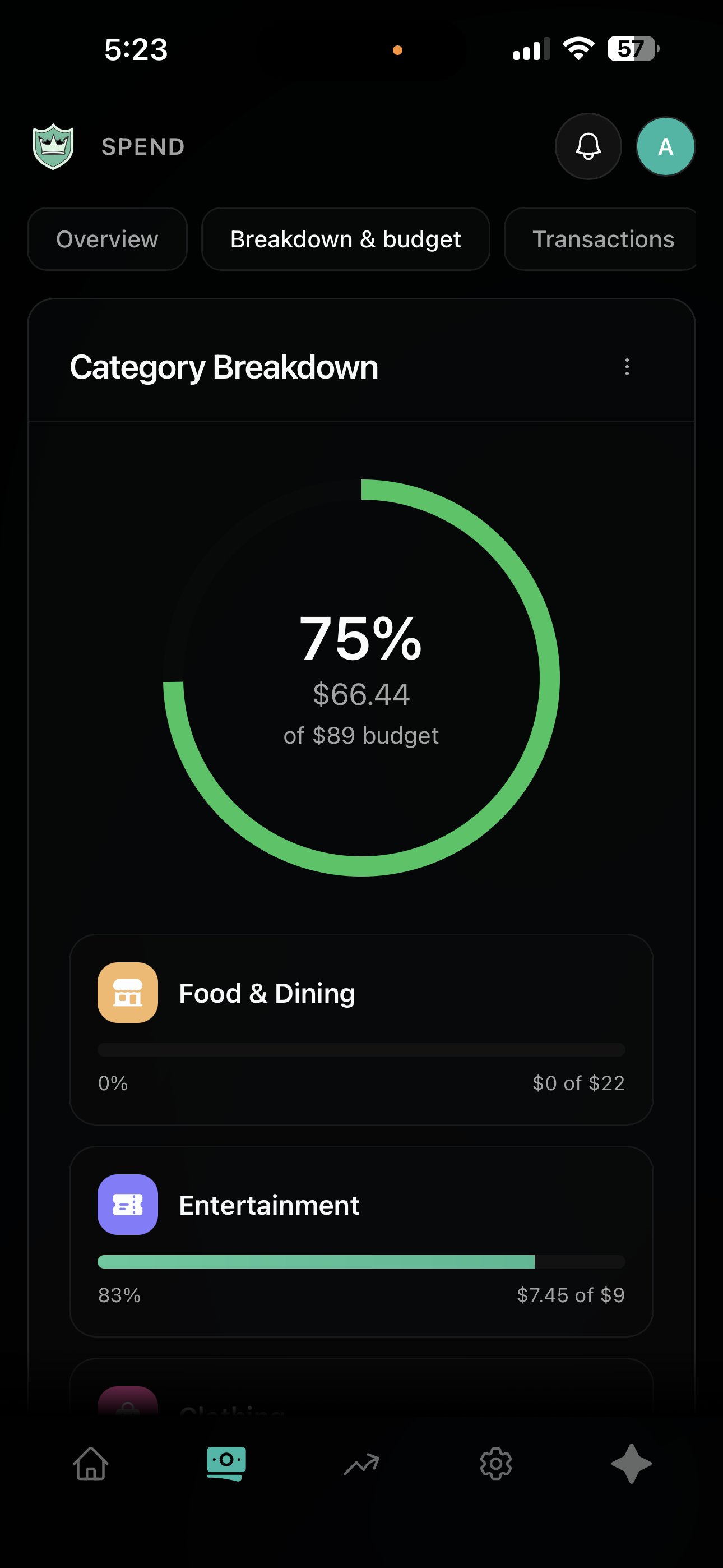
Teen/Adult Mobile Budget Page Dark Mode
-
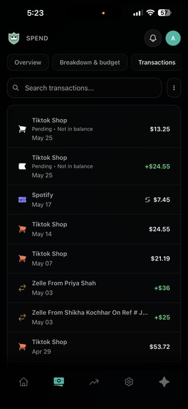
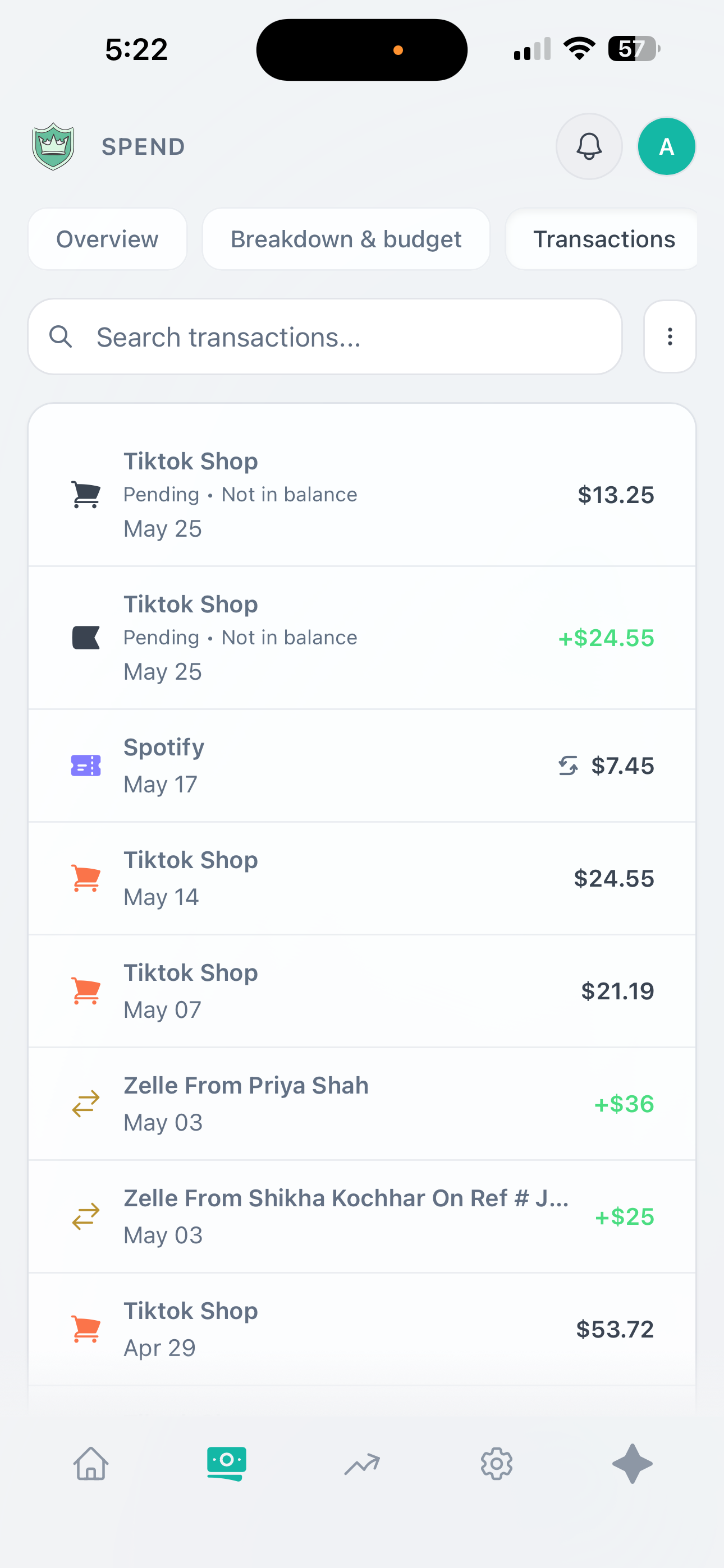
Teen/Adult Mobile Transaction Page Light Mode
-
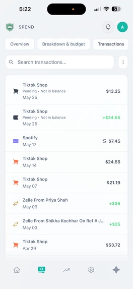
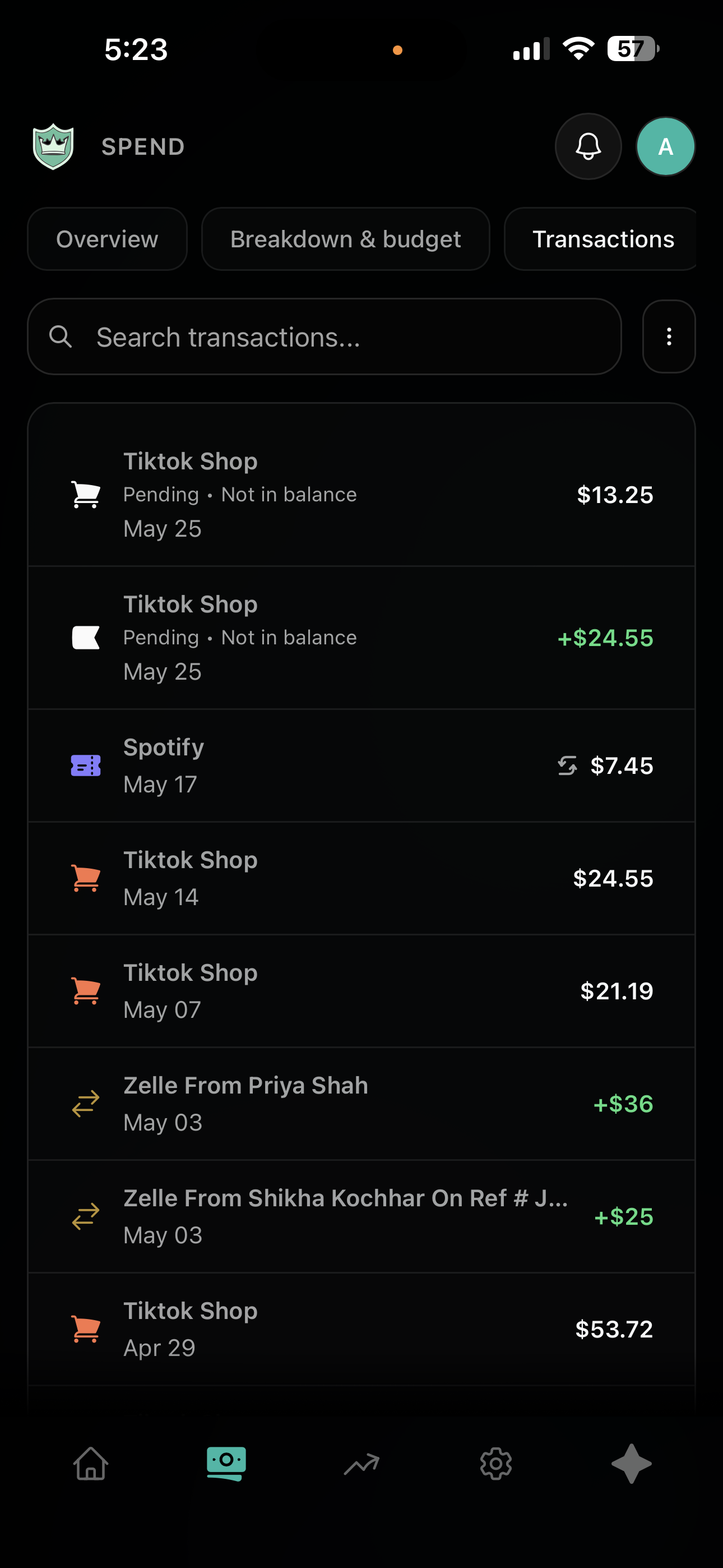
Teen/Adult Mobile Transaction Page Dark Mode
-
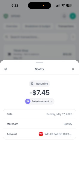
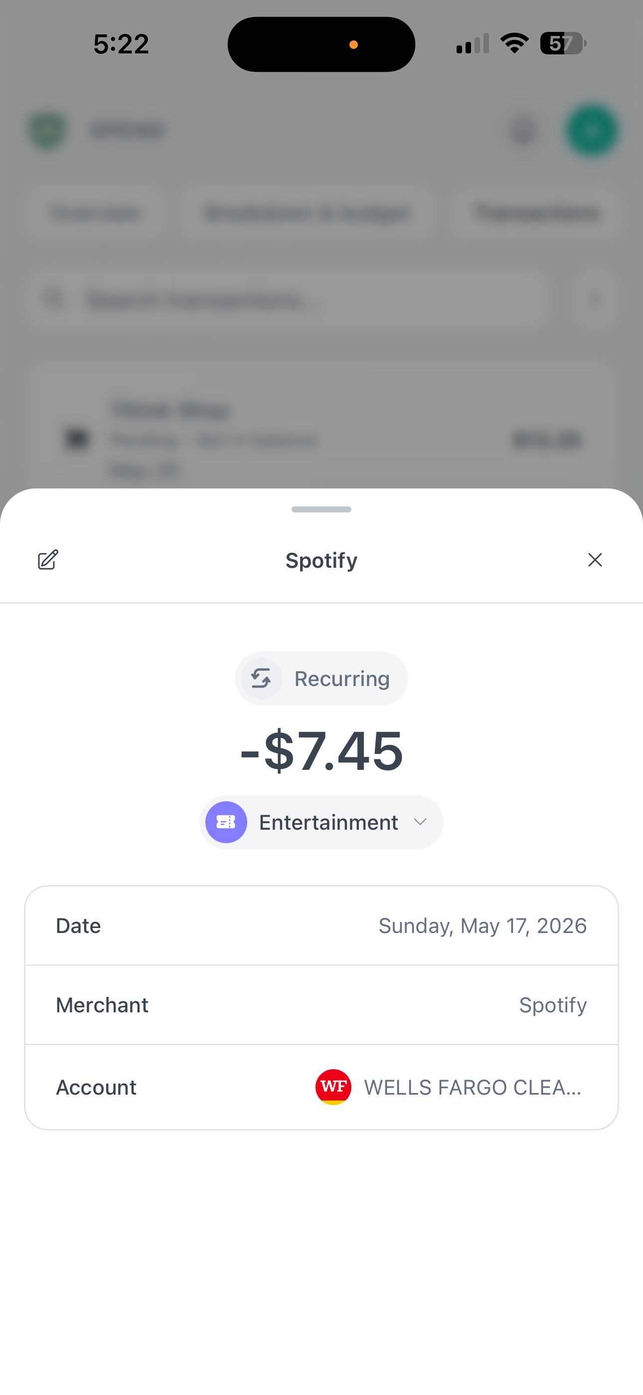
Teen/Adult Mobile Transaction Detail Light Mode
-
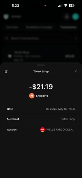
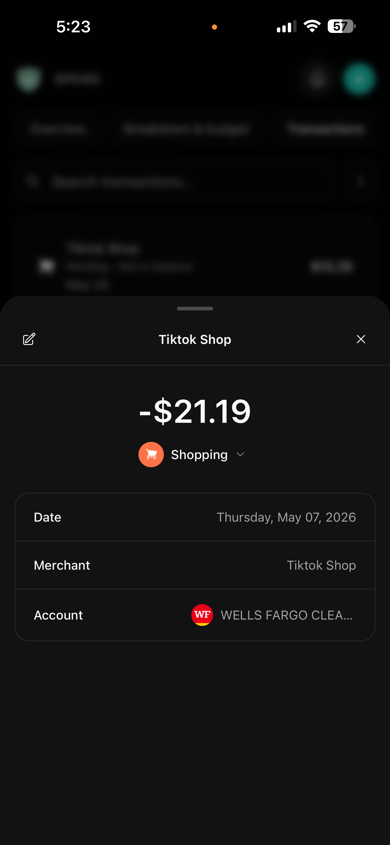
Teen/Adult Mobile Transaction Detail Dark Mode
-
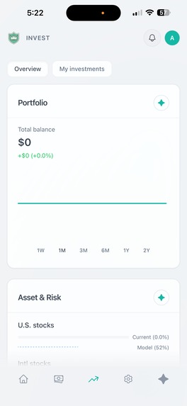
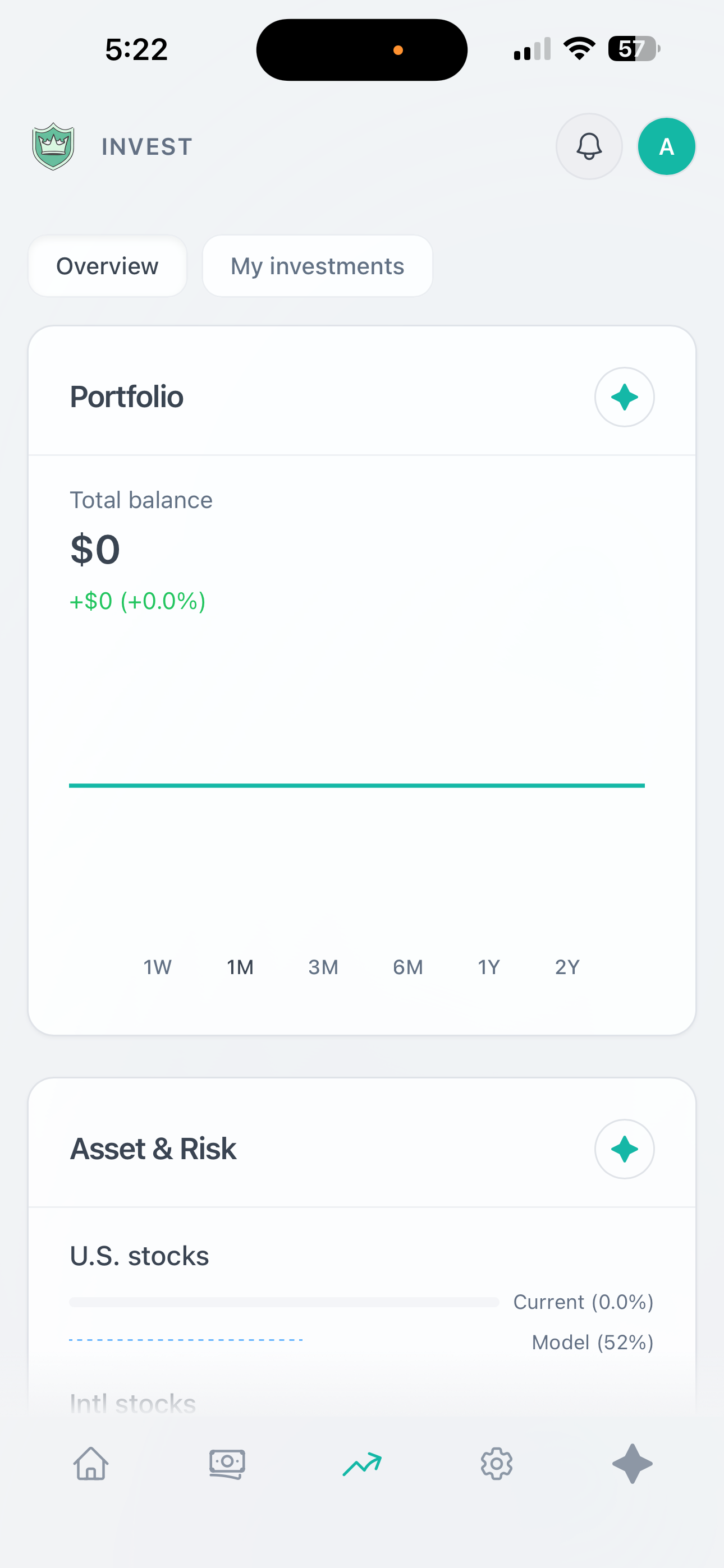
Adult Empty State Investment Page Light Mode
-
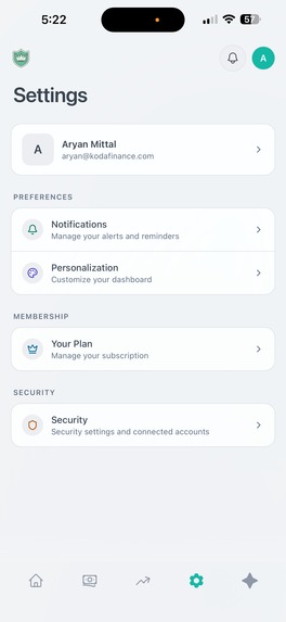
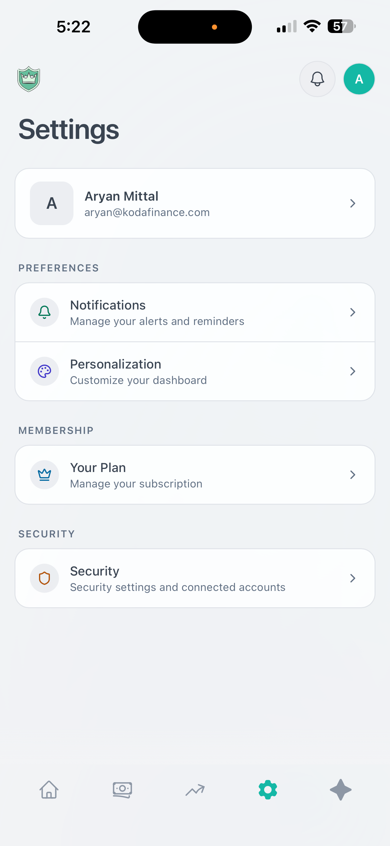
Mobile Settings Page Light Mode

Inspiration
Teens and young adults are thrown into the real world with zero financial literacy. Most finance apps are built for adults who already know what they're doing — they're clunky, overwhelming, and definitely not something a 16-year-old would voluntarily open. We talked to hundreds of high school and college students, and the same thing kept coming up:
"I want to be better with money, but everything out there feels like it was made for my parents."
There's a massive gap. Schools don't teach personal finance. Parents struggle to have money conversations. And the few apps that target younger users are either too basic (just a spending tracker) or too complex (full-on investment platforms). Nobody was building something that felt native to how Gen Z actually interacts with technology — mobile-first, social, gamified, and genuinely helpful.
On top of that, parents had no clean way to oversee their teen's finances without being invasive. There was no tool that let a family manage money together while still giving teens the autonomy they need.
We built Koda Finance to fix all of this.
What It Does
Koda Finance is a personal finance app built specifically for teens, young adults, and families. It combines real bank account integration, AI-powered financial coaching, gamification, and parental oversight into one platform that actually feels good to use.
Real banking, not manual entry. Users connect their actual bank accounts through Teller's API. Transactions sync automatically, balances update in real-time, and everything is categorized intelligently. No spreadsheets, no manual imports.
An AI financial assistant named Koda. Powered by GPT-4, Koda is a conversational financial coach that lives inside the app. It answers questions about spending habits, helps set up budgets, suggests savings goals, explains financial concepts in plain language, and logs transactions through natural conversation when users don't have an account linked.
Gamification that actually works. An XP system, trophies, levels, and achievement badges turn financial responsibility into something that feels rewarding. Users earn points for logging transactions, hitting budget targets, contributing to savings goals, and engaging regularly.
Parental oversight without the creepiness. Parents can link their accounts and add their teens as children in the app. They get a dashboard showing spending patterns, savings progress, and financial health — without seeing every individual transaction. Designed to start conversations, not surveillance.
Multi-role architecture. The app handles teens, adults, parents, and admins as distinct user types, each with their own dashboard experience and feature set. A parent's experience looks fundamentally different from their teen's — because it should.
Design: The Core of Everything
Design4Future is a hackathon about building things people can actually use — and that's exactly the lens we brought to every product decision in Koda Finance. We didn't treat design as a coat of paint on top of the functionality. Design was the first question we asked, and it informed every feature we built.
The Problem with Finance Apps Is Mostly a Design Problem
The reason teens don't engage with personal finance tools isn't apathy — it's friction. Every interface we studied during research felt designed to demonstrate complexity rather than reduce it. Our core design principle became: every screen should make the user feel more capable, not more confused.
Contextual AI — Always One Tap Away
One of our most deliberate UX decisions was making AI assistance contextual and ambient rather than hidden behind a separate screen. Every dashboard card — whether it's the Budget Overview, the Spending Breakdown, or the Savings Goals tracker — has a dedicated AI button directly embedded in it. Tapping it opens the Koda assistant with context already loaded for that specific card.
This means a user looking at their budget doesn't have to navigate to a chat interface, explain what they're looking at, and then ask for help. They tap the button on the budget card, and Koda already knows: this is their budget, here's what's over, here's what's under. The AI responds to what's in front of the user, not a generic question.
The AI Panel — Perplexity-Style, Finance-First
The full AI panel in Koda Finance is designed around a pattern that power users already know: the persistent side panel, inspired by how tools like Perplexity surface information without pulling you out of your current context. It slides in from the right, keeps the dashboard visible behind it, and lets users move fluidly between their data and the conversation.
The assistant isn't just answering questions — it has tool-calling capabilities that let it take action directly from the chat:
Adjust budgets in real-time — a user can say "lower my food budget by $50" and Koda does it, reflecting the change immediately in the dashboard behind the panel
Scan spending patterns — Koda pulls transaction history, identifies trends, and surfaces insights without the user navigating anywhere
Recognize income patterns — the assistant identifies recurring deposits, flags irregularities, and proactively surfaces observations the user might have missed
Create goals, log investments, and categorize transactions — all through natural conversation
The result is an AI layer that feels genuinely useful rather than a gimmick bolted onto the side of a spreadsheet.
Dashboard Design — Clarity Over Density
The dashboard is built around the principle that a user should be able to understand their full financial picture in under 10 seconds. Every card has a defined purpose, a clear visual hierarchy, and a single primary action. We made deliberate choices about what not to show — there is no data dumped onto the screen without a reason for it being there.
Color is used semantically throughout: spending approaching or over budget shifts toward warm tones; healthy balances and achieved goals are green; neutral data stays neutral. Users develop an intuitive read of their financial health just by looking at the palette of their screen.
Mobile-First, Then Everything Else
Every layout decision was made on mobile first. The navigation is thumb-friendly. Cards are sized for one-handed scrolling. The AI panel opens with a single upward swipe. Touch targets are sized generously. Nothing important is buried more than two taps deep.
This matters especially for the teen demographic. If it doesn't feel natural on a phone, it doesn't get opened.
Gamification Design — Earned, Not Cheap
The XP system, trophies, and level progression were iterated extensively. Early versions felt either too easy or too grindy. We rebuilt the reward mechanics around actual user behavior data — not just what felt fun to us as builders. Trophy animations are intentionally restrained: satisfying without being cartoonish. The progression system is visible but not dominant.
Parental Dashboard — A Different Product, Same Codebase
The parent-facing dashboard is not a restricted version of the teen dashboard. It's a genuinely different interface — designed around the parent's mental model (oversight, guidance, safety) rather than the teen's (personal tracking, goals, rewards). Different navigation, different card types, different visual hierarchy. The result is an app where every user type feels like the product was built for them specifically.
How We Built It
Frontend: React + Capacitor + Electron
Backend: Firebase (Firestore, Auth, Cloud Functions)
Banking Integration: Teller API — real account connections with automatic transaction sync
AI Assistant: OpenAI GPT-4 with tool-calling and role-aware context
Payments: Stripe (Pro subscription tier)
Mobile: Capacitor + PWA with full offline support and native iOS/Android builds
Deployment: Vercel + Firebase
Challenges
Teller API integration was rough. Getting bank account connections to work reliably across hundreds of different banks required building a full retry and normalization layer — every bank returns data slightly differently, and the OAuth flow needs to handle edge cases like expired tokens.
Building an AI assistant that doesn't hallucinate financial advice took significant prompt engineering. We added guardrails around what Koda can and can't do, and grounded every response in the user's actual financial data rather than general assumptions.
Multi-role auth and routing. Supporting four distinct user types with completely different dashboard experiences required careful architecture. The routing logic alone — checking auth state, onboarding completion, role type, and redirecting accordingly — created a significant number of edge cases.
Gamification that feels earned, not cheap. We iterated through multiple designs before landing on a progression system that felt genuinely satisfying, rebuilding the reward mechanics based on real user behavior data.
Accomplishments We're Proud Of
We hit real milestones during development and early marketing. Our Instagram page crossed 1,000 followers and our TikTok did the same — validating that the concept resonated before we even finished building. We acquired 200 initial users through social media content and word-of-mouth in high school and college communities.
A fully functional bank account integration syncing real transaction data in real-time
An AI assistant that adjusts budgets, scans spending, flags income patterns, and creates goals through conversation
A complete gamification system with XP, levels, and trophies that users genuinely engage with
Role-specific dashboard experiences that feel purpose-built for each user type
A contextual AI layer embedded directly into every dashboard card — not hidden away
What We Learned
Talk to your users early and constantly. We reworked multiple features after getting real feedback. The parental oversight feature went through three complete redesigns before landing on something both parents and teens felt comfortable with.
AI integration is an art, not just an engineering task. The quality of the AI experience is almost entirely determined by how well you structure prompts and manage conversation context.
Gamification is harder to get right than it looks. We iterated on reward mechanics based on actual user behavior data, not just what felt fun to us as builders.
Design decisions compound. Every small UX choice — where a button lives, how a panel opens, what color an indicator is — compounds across an entire session.
What's Next
Investment tracking and education. Full portfolio tracking, stock market education modules, and simulated investing for teens who aren't old enough for real brokerage accounts.
School and community partnerships. Bringing Koda into high school financial literacy curricula, with aggregate analytics for schools that don't expose individual student data.
More proactive AI. Expanding Koda's ability to surface insights before users ask and exploring voice-first interactions for mobile.
International expansion. Exploring banking API partnerships in other markets to bring Koda beyond Teller's US coverage.
Built With
- firebase
- google-cloud
- mastercard-open-finance
- next
- node.js
- react
- resend
- teller
- vercel
- yahoo-finance

Log in or sign up for Devpost to join the conversation.