-
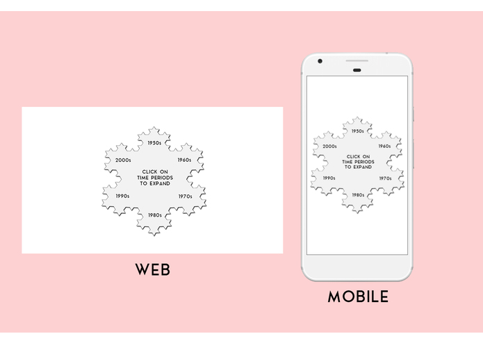
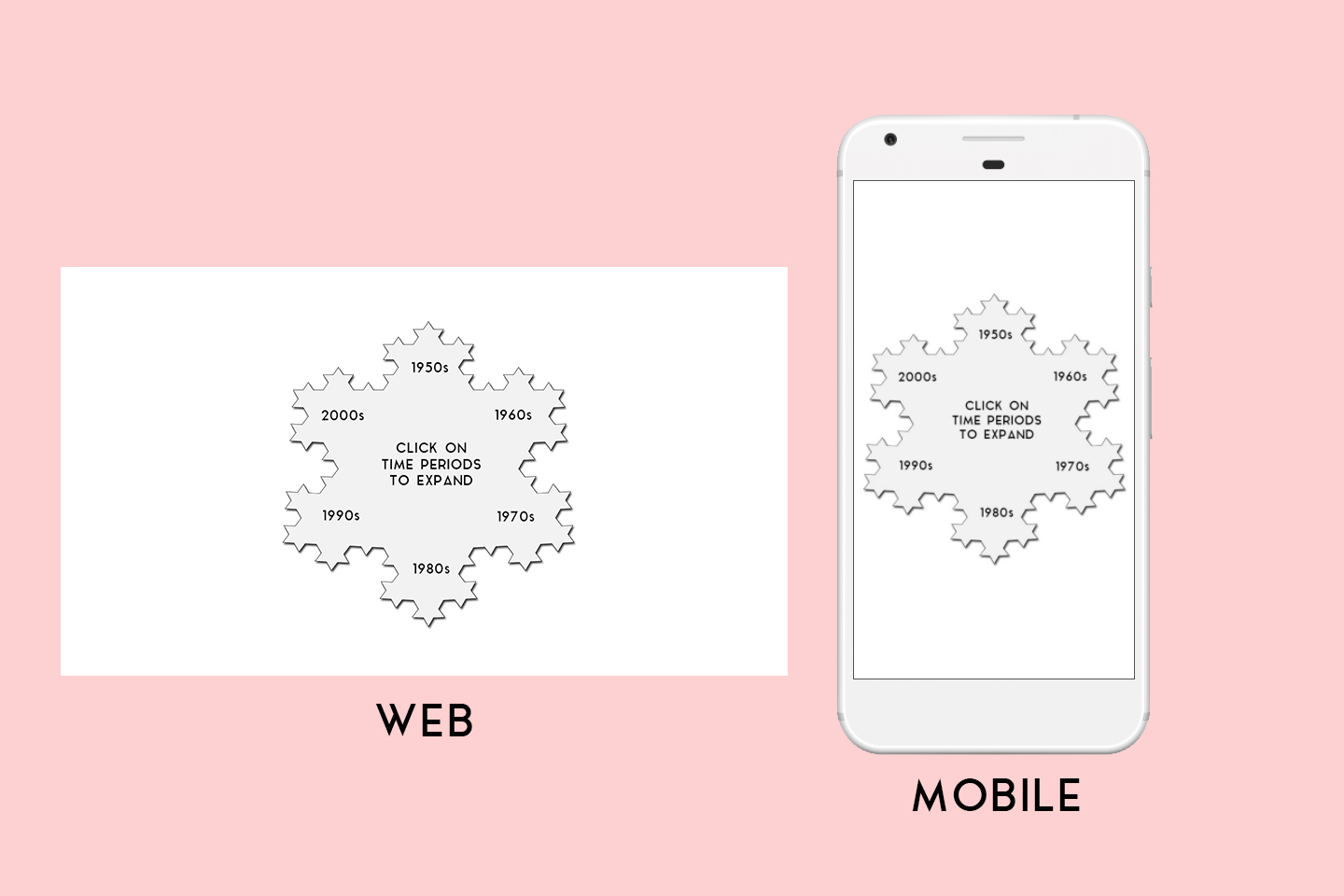
Opening view of visualization
Inspiration
Most time visualizations involve a lot of scrolling and only display a few years at a time. I wanted to create a visualization that divides huge time periods into sections and gives the user a choice, thus segmenting the large time period into smaller ones. It's always said that history repeats itself. So do fractals.
What it does
A fractal ties really neatly into visualizing time. It can be used to visualize large time periods as well as small ones. Clicking on the time periods gives event data in detail. In the mock-up I've chosen a Best Picture Winner schedule to visualize as an example, hence there was no need for dividing years into months. But that too can be done, as this is after all a fractal, and on clicking a year, it will be divided further into months. This can be used to create intricate visualizations on a large scale.
How I built it
I used Photoshop and the Marvel app.
Accomplishments that I'm proud of
The design across website and mobile is consistent and can be implemented using basic web development technologies.
What I learned
I learned about the Marvel app for creating mock-ups and how easy and useful it is.
What's next for Koch Snowflake
Maybe implement it using HTML/CSS/JS?
Built With
- marvel

Log in or sign up for Devpost to join the conversation.