-
-
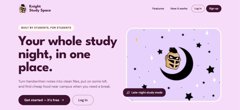
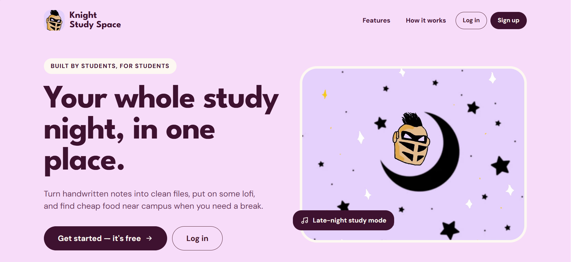
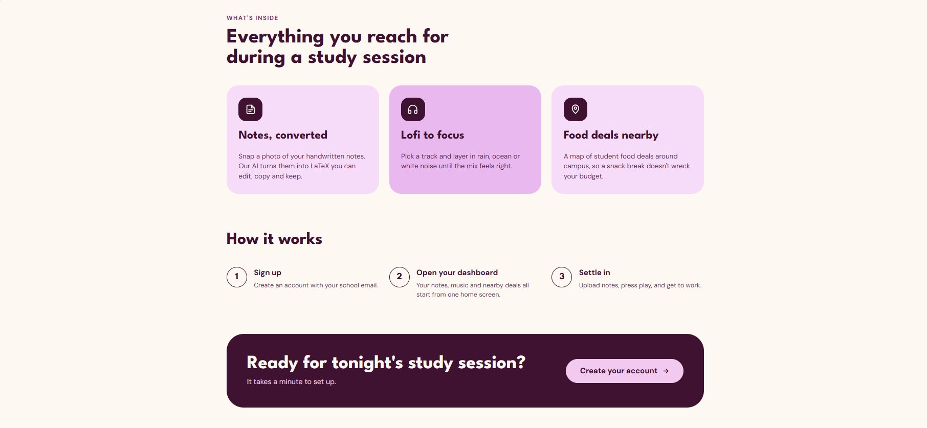
Top half of the landing page of the website!
-
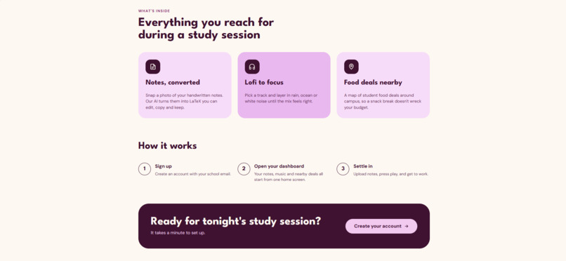
Bottom half of the landing page of the website!
-
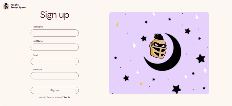
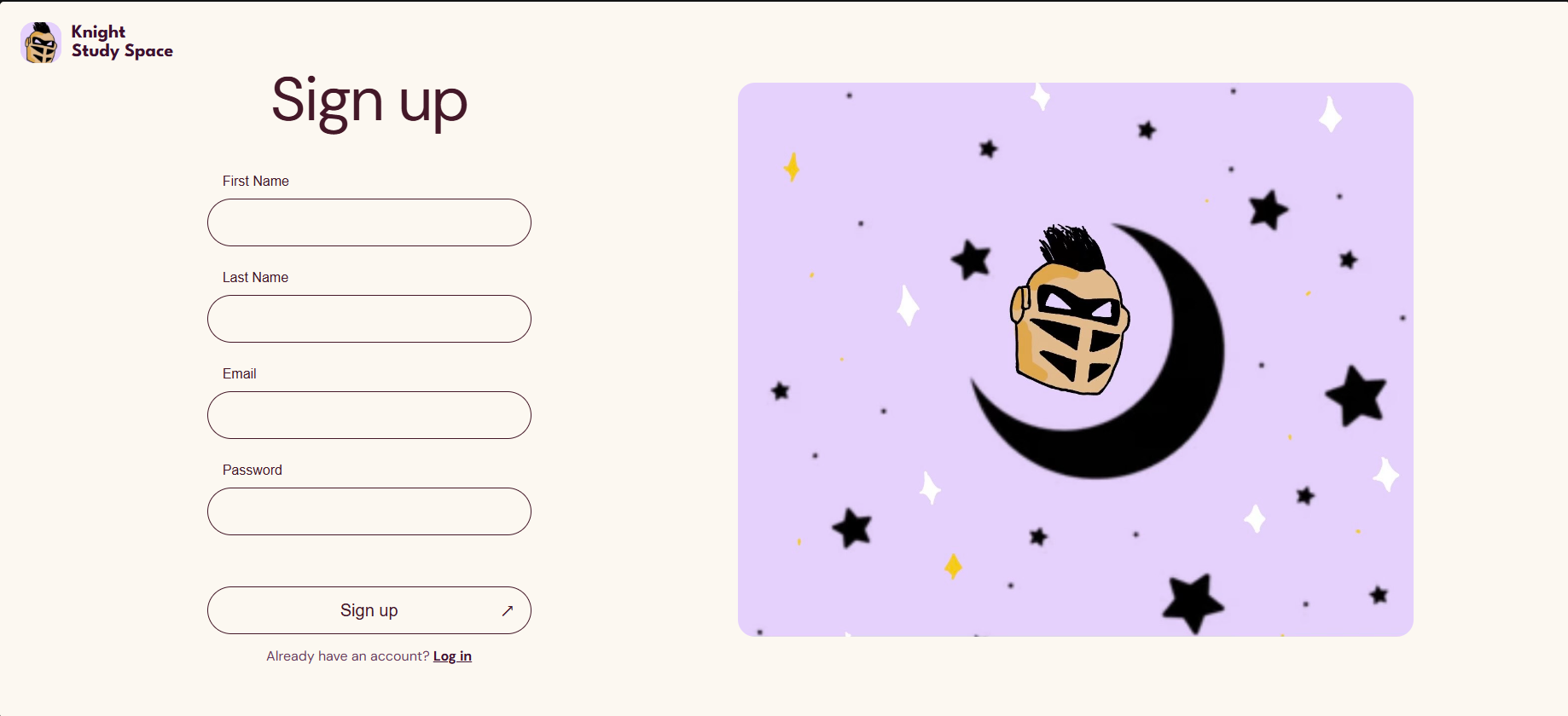
Sign up page prior to user accessing dashboard or functionality.
-
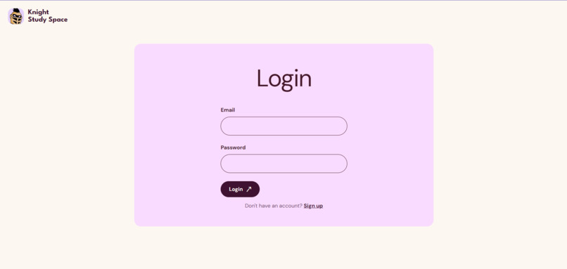
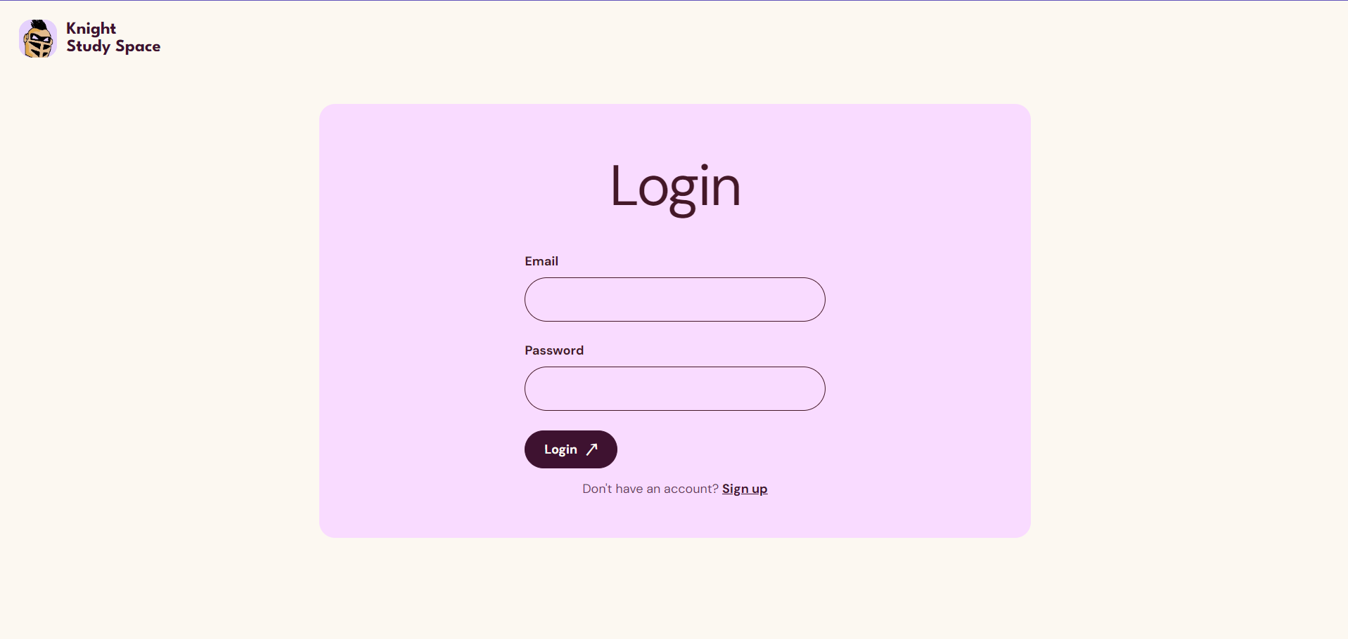
Login page prior to user accessing dashboard or functionality.
-
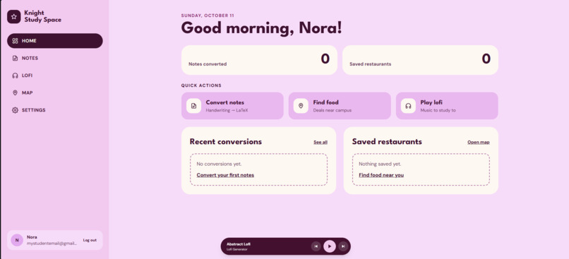
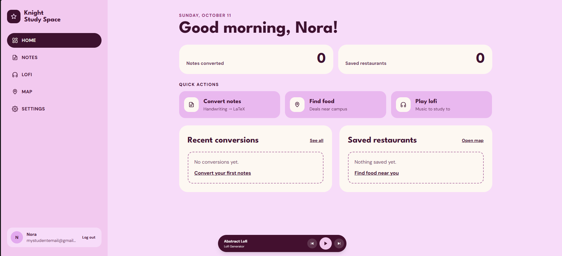
Users dashboard with shortcuts and nav bar.
-
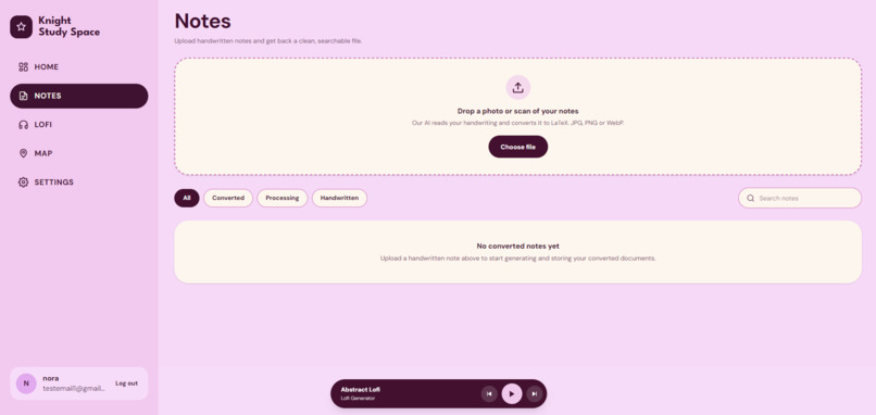
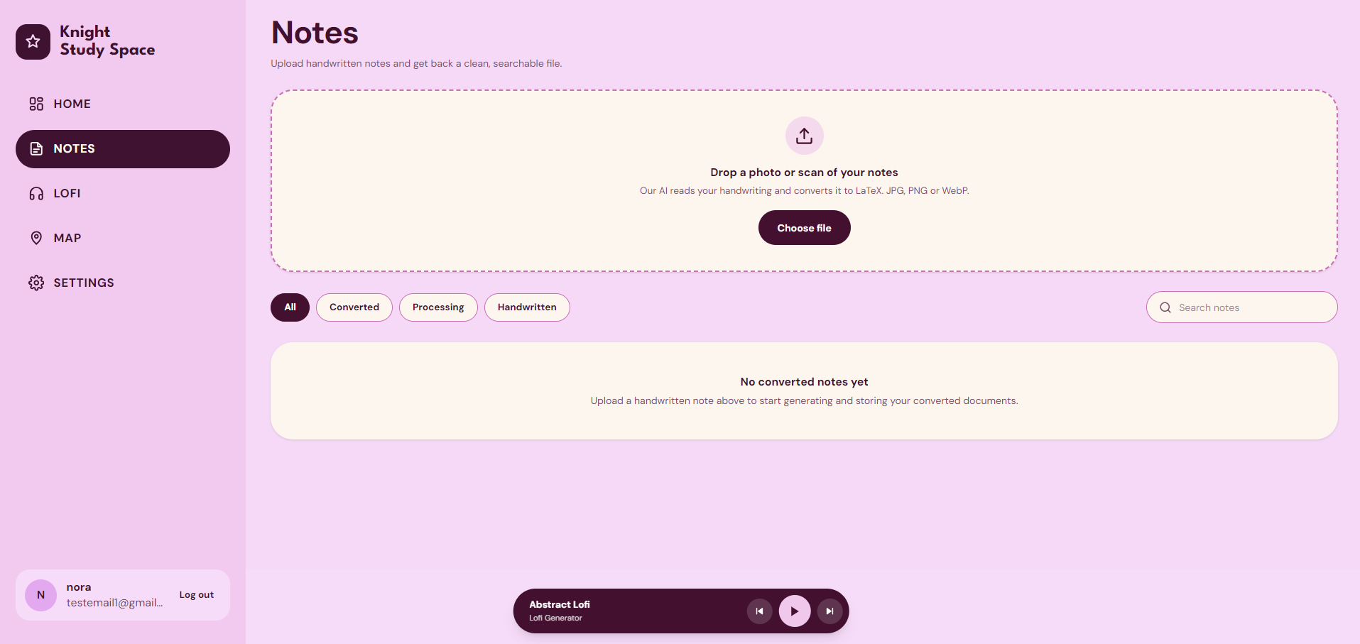
Notes upload page with a filtering system
-
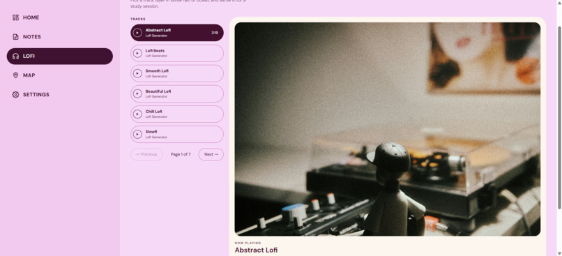
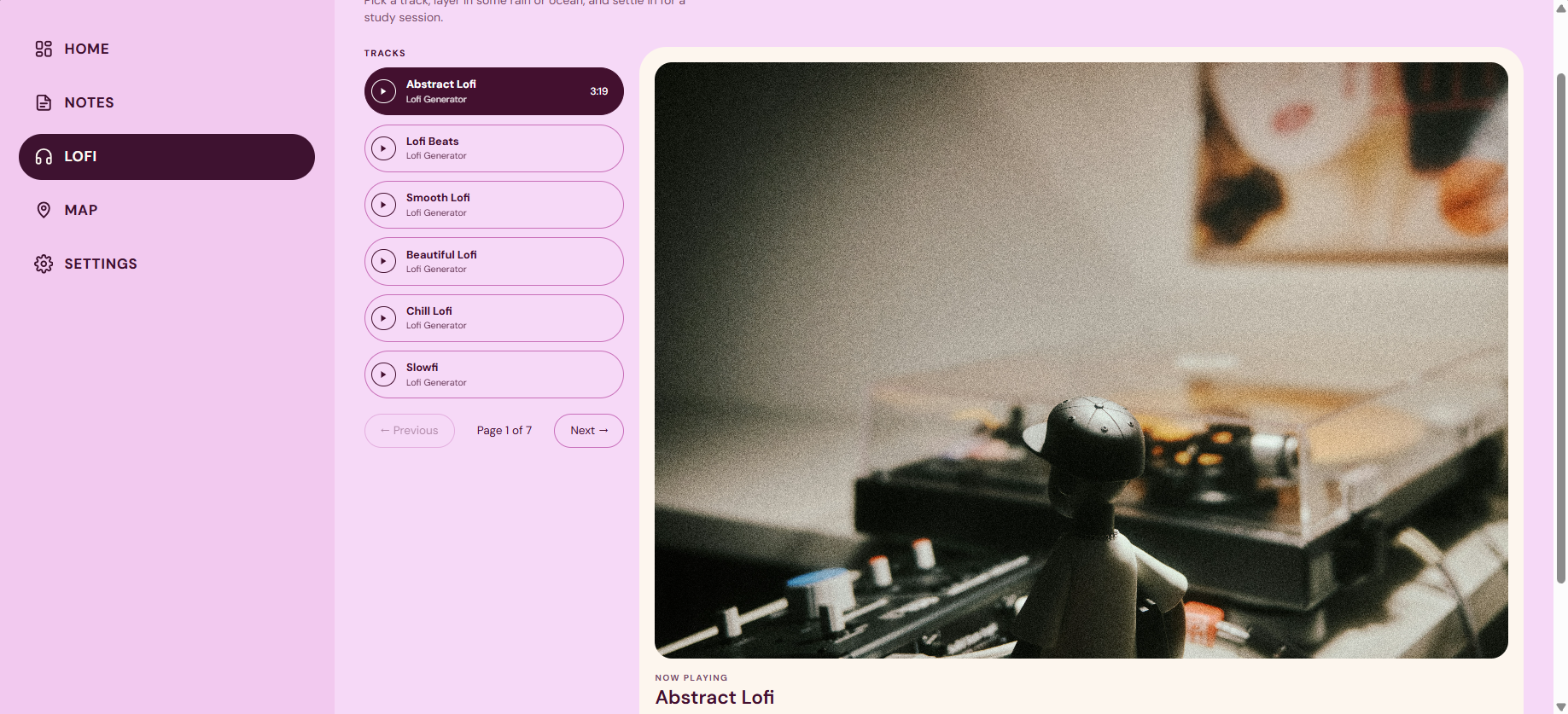
Lofi page with multiple tracks for the user to pick from and volume settings.
-
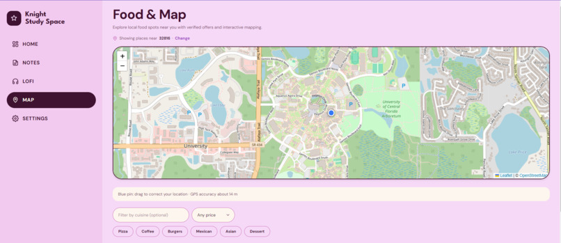
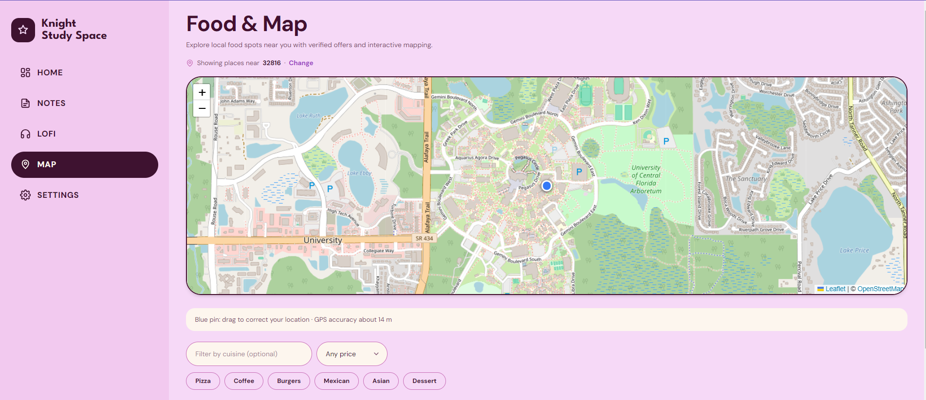
Map page that uses the students location to provide information about local deals and restaurant ratings.
-
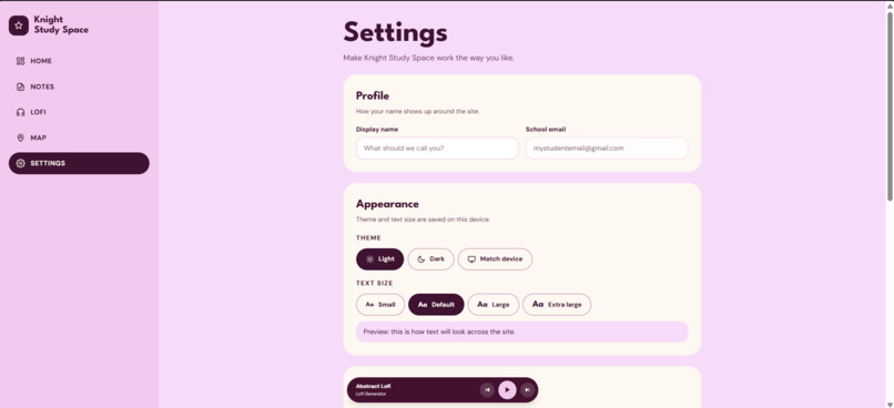
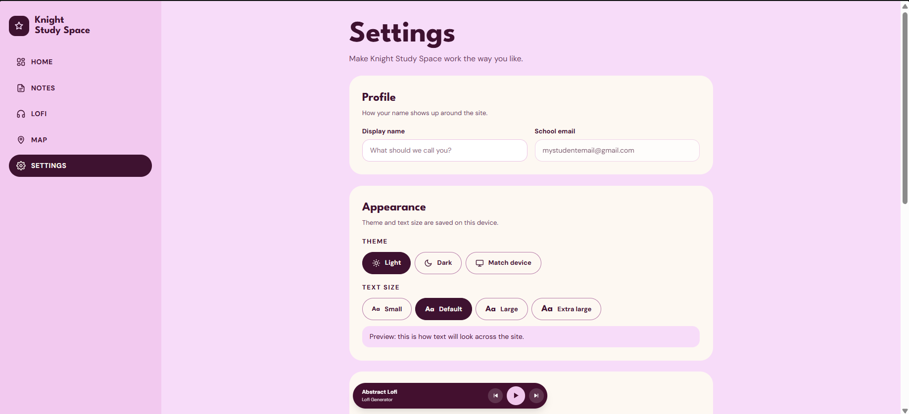
User settings with function that allow them to alter their profile settings and site layout.
-
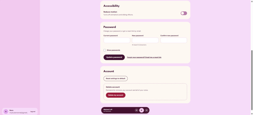
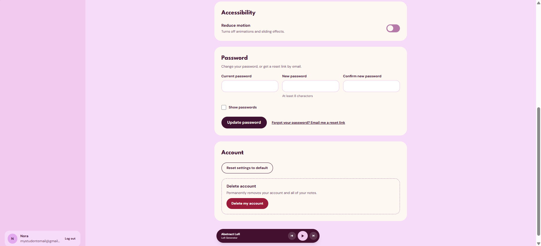
More settings options for the user including accessibility features, updating their password, or deleting their account.
-
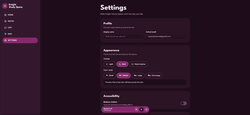
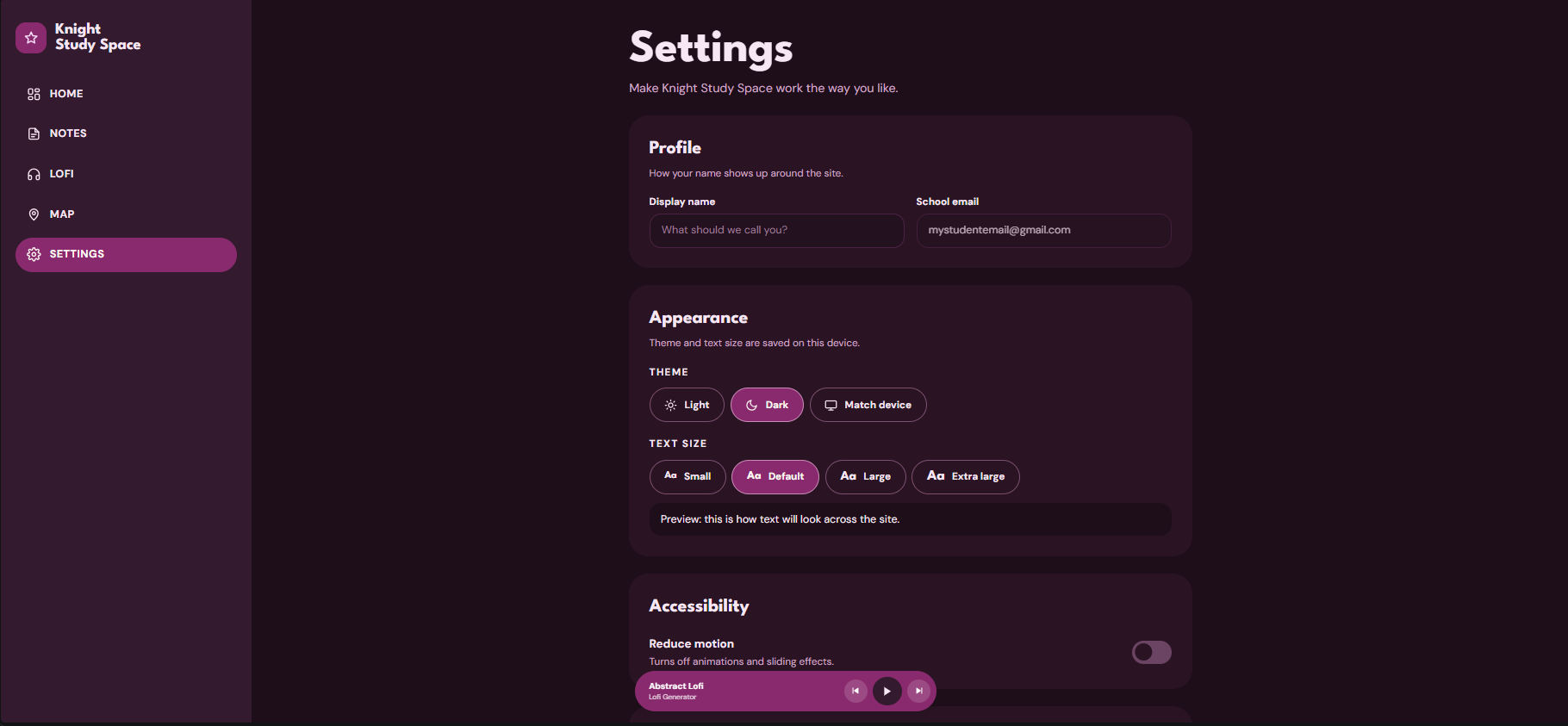
The settings page displayed in dark mode.
Inspiration
What inspired us to create this project is being a UCF stressing out for midterms or finals and wanting a late-night munchie to take that stress away.
What it does
Knight Study Space is an all-in-one study companion for UCF students:
- Dashboard: a home screen with quick actions, counts of notes converted and restaurants saved, and recent activity.
- Notes: converts handwritten notes into LaTeX.
- Lofi player: a study-music player with a mini player in the sidebar, so your music keeps playing as you move between tabs.
- Food finder: shows restaurants near campus on an interactive map, with distance, ratings, price estimates, and a link to each menu or offer. You can filter by cuisine and price, set your location with GPS or a ZIP code, and save favorites.
- Accounts and settings: sign up and log in, a display name, light, dark, or match-device themes, adjustable text size, and a reduce-motion option, all saved on your device.
How we built it
We worked together as a team to plan out the website, design the interface, and build its features. We split up different responsibilities and used what we knew about web development to bring our ideas to life.
- Frontend: React and TypeScript with Vite, styled with Tailwind CSS.
- Backend: Python and Fastapi.
- Map: React-Leaflet with OpenStreetMap tiles, plus browser geolocation with a draggable pin to correct your position.
- Shared audio: a single audio element lives at the app root, and the Lofi tab and sidebar mini player both control it through shared state.
- Reusable components: a shared
CardandButtonkeep every tab consistent, with CSS modules for buttons. - Dark mode: a
data-themeattribute on the app wrapper, with a theme stylesheet that swaps the light colors for dark ones. - Responsive layout: a flex-wrap layout that collapses the sidebar into the page on small screens.
Challenges we ran into
Along the way, we had to do a lot of testing, troubleshooting, and figuring things out as we went. One of our biggest challenges was getting everything to work the way we wanted it to, especially for the AI. It struggled a lot with understanding the user's handwriting. However, we mostly overcame this curve.
Accomplishments that we're proud of
- Three different tools in one polished, consistent interface.
- A mini player that follows you across every tab without interrupting your music.
- Accessibility built in from the start: text sizes, reduced motion, keyboard-friendly controls, and clear focus states.
- Integrated external APIs to pull live data into the site, connecting our React + TypeScript frontend to outside services instead of relying on static content.
- Worked hands-on with AI models for the Notes page, which converts users' uploaded handwritten notes into clean, formatted LaTeX files.
- Improved the AI's accuracy through iterative testing, running trial-and-error rounds on real handwritten samples and refining our approach based on where the output fell short.
- Built a location-aware interface that uses the user's location to show nearby college food deals on an interactive map, so each student sees results relevant to their area.
- Designed and developed a full user flow, from the landing page and sign-up/login through to a dashboard with navigation to the Notes, Lofi, and Food Deals pages.
What we learned
This project taught us a lot about web development, problem-solving, and teamwork. We realized that building a website involves more than just writing code. It takes planning, communication, patience, and a lot of trial and error, but it was an amazing experience and we loved doing it.
What's next for Knight Study Space
- Finish the account features because we had more that we wanted to implement, but didn't have time
- Add more lofi tracks and playlists, including shuffle and repeat.
- Add verified student deals and discounts for the food finder.
- Add more study tools, such as a focus timer and a way to organize notes by course.
Built With
- fastapi
- pix2text
- python
- qwen
- react
- tailwind.css
- trocr
- typescript
- vite


Log in or sign up for Devpost to join the conversation.