-

Our Logo
-

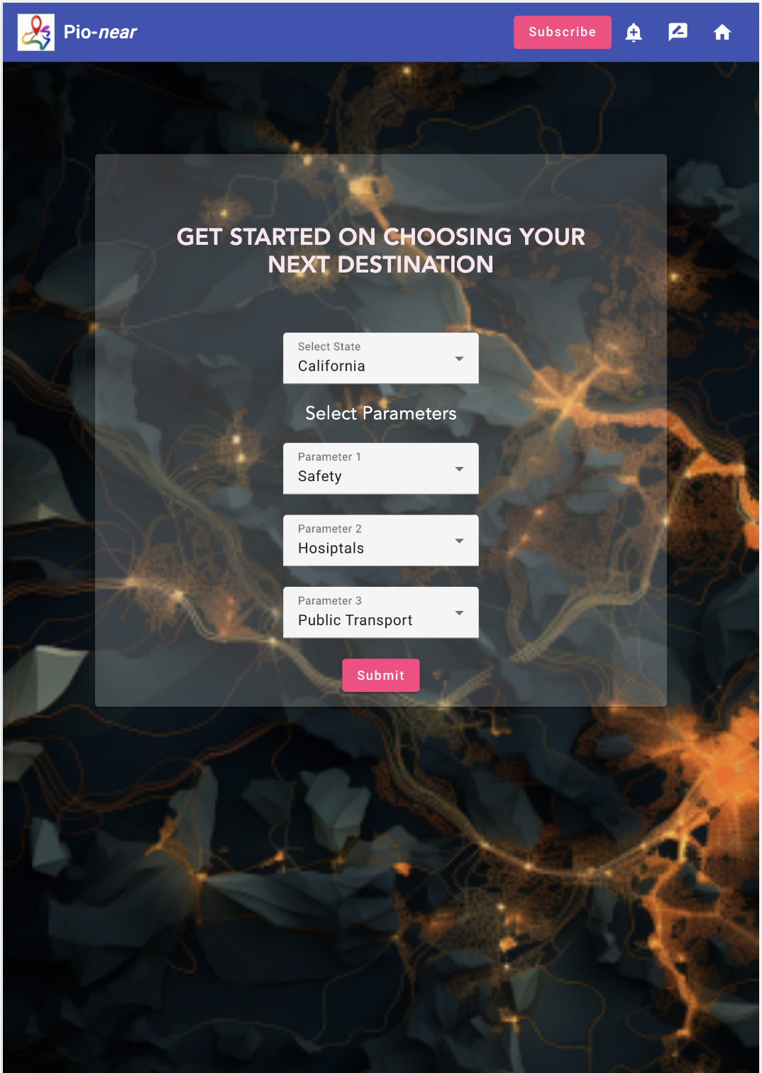
Home Page
-
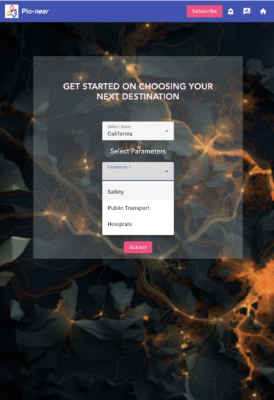
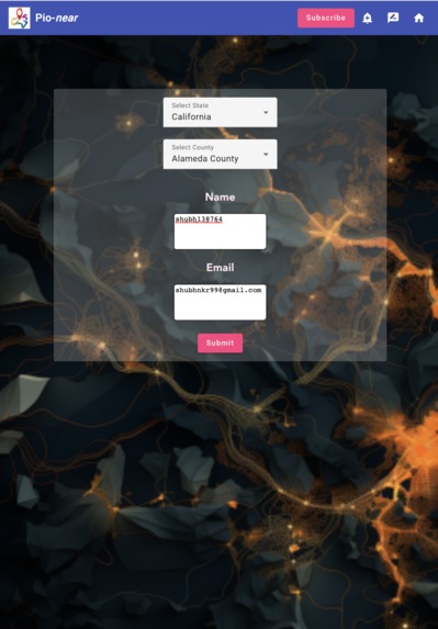
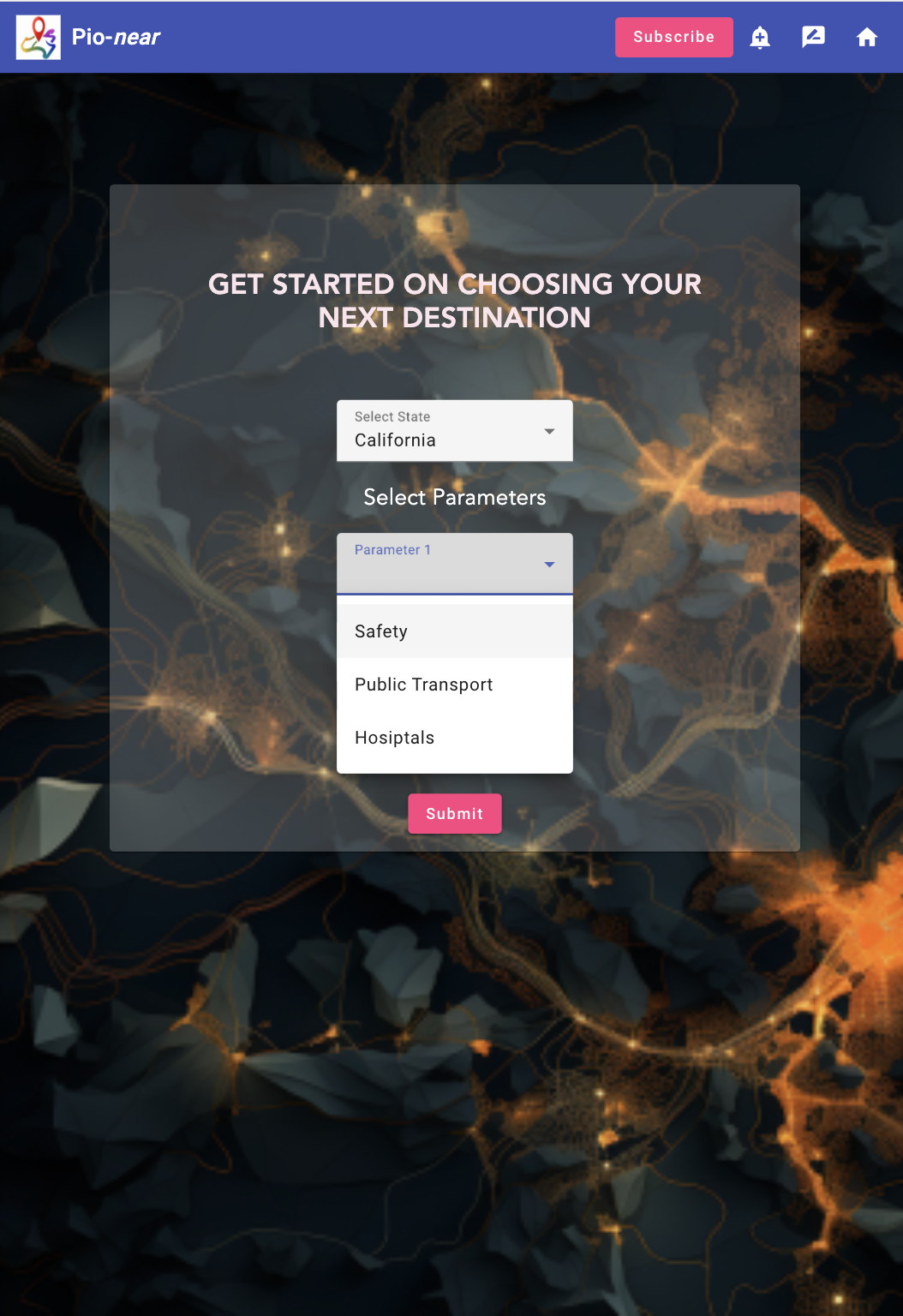
Attribute Options on Home Page
-
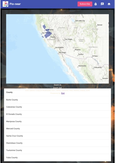
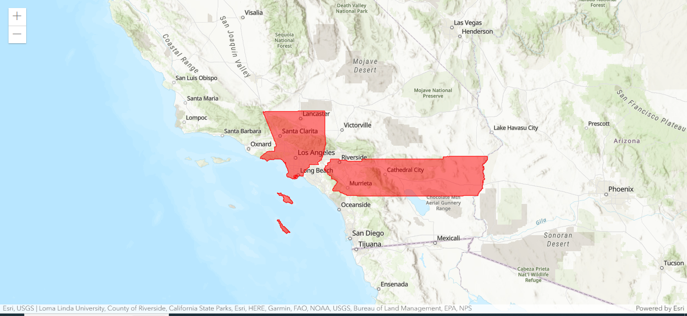
Recommended Counties
-
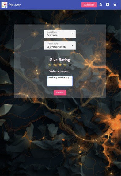
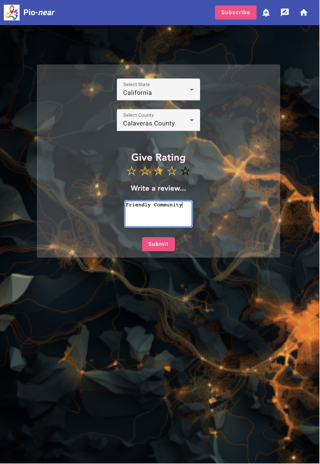
Review Page
-
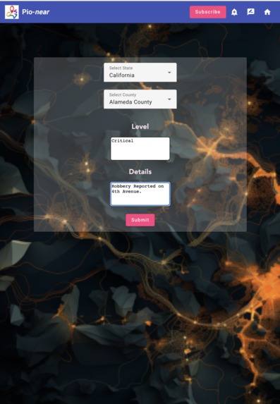
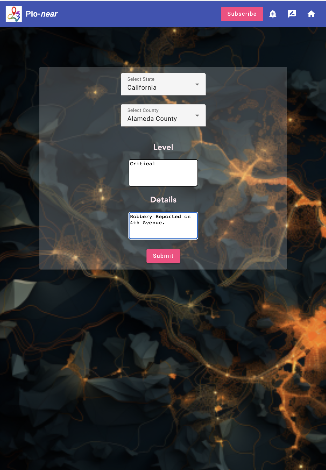
Alert Feature
-
Subscription System
-
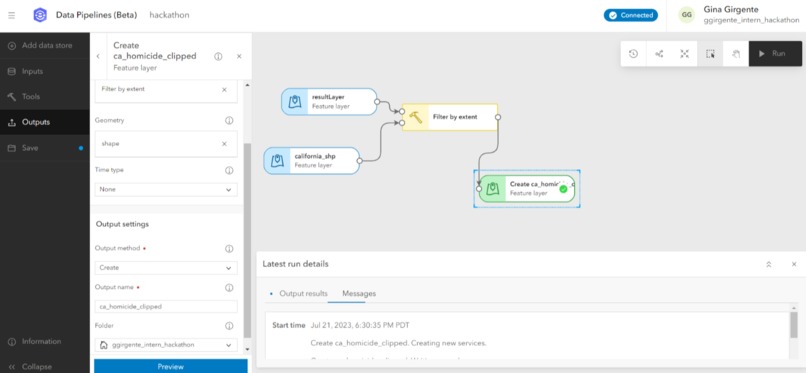
Using Data Pipelines
-

Using ArcGIS Maps SDK to display a web map
-
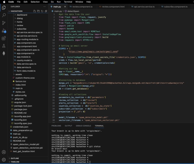
Part of our backend code
-
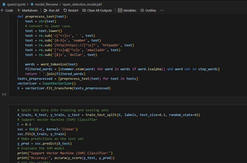
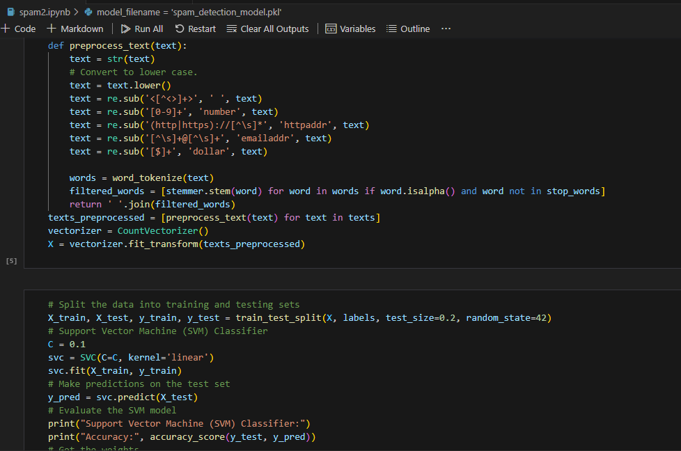
Part of our SVC model code


Inspiration
With most of us travelling domestically or internationally for this internship, we all bonded over the struggle of finding housing. What areas of Redlands are safe? Where can I find affordable renting options? Is there an area with grocery stores within walking distance since I don't have a car? What public transportation options are there for commuting to work everyday?
As interns, we wished there was an app to tell us what areas meet our unique requirements for relocating in a simplistic, easy way. Well, now there is.
What it does
Meet Pio-near, the app of your dreams. Within the UI, select a state of interest within the United States. Then choose attributes about your new home that are important to you, such as safety and hospitals. Then, rank your data by most important to least important. Finally, sit back, relax, and feel the stress wash away as Pio-near displays a result map highlighting counties in the state you selected that meet your qualifications.
Are you hesitant to just base your relocation decision off of cold data? Don't worry, we thought of that too. Enjoy the added warmth of reviews from real-life people as they live in different locations, complete with ratings for the county and a short description to explain their review.
Interested in a specific county's reviews or want to be part of a dynamic community? Easily subscribe to user ratings/reviews for counties by entering your email in our subscription feature of the app.
Additionally, if you feel the need to make a rating that alerts all users via a push notification in the specific county you select, you can easily do so by clicking our Alert button. But don't worry about this feature being used with malicious intent; we have an anti-spam filter based on machine learning to dynamically become more accurate over time.
Moving is hard, but using Pio-near is easy!
How we built it
We used ArcGIS Pro, ArcGIS Online, and Data Pipelines for analyzing and preparing the GIS data, which we got from Living Atlas, the Census Bureau, and state government websites. We used Angular and ArcGIS Maps SDK for JavaScript to build our front-end for the best user experience. In the safety alert feature, we used Support Vector Classifier (SVC) to detect spam reports.
Challenges we ran into
As a team, we found it very hard for the geographers and developers to communicate needs and confusions with each other. It was also a challenge to figure out how to display our data in the app, as none of us are experienced in working with apps.
Accomplishments that we're proud of
We had never heard of Data Pipelines before, but successfully used it to clean our data. We had never used ArcGIS Maps SDK for JavaScript to display a web map before, but successfully used it in our app.
What we learned
We learned how to use Data Pipelines, display dynamically changing maps in an app; ArcGIS Maps SDK for JavaScript, display an Esri map in our App with county feature layer and show selected counties with different color.
What's next for Pio-near
In the future, we would like Pio-near to become more granular so that users can evaluate where within counties that they would like to live. An addition of live, constantly updating data, like housing and renting prices, is also planned.
Built With
- angular.js
- api
- arcgis-maps-sdk-for-javascript
- arcgis-pro
- data-pipelines
- esri
- google-gmail-oauth
- javascript
- mongodb
- node.js
- python
- svc-machine-learning


Log in or sign up for Devpost to join the conversation.