About the Project
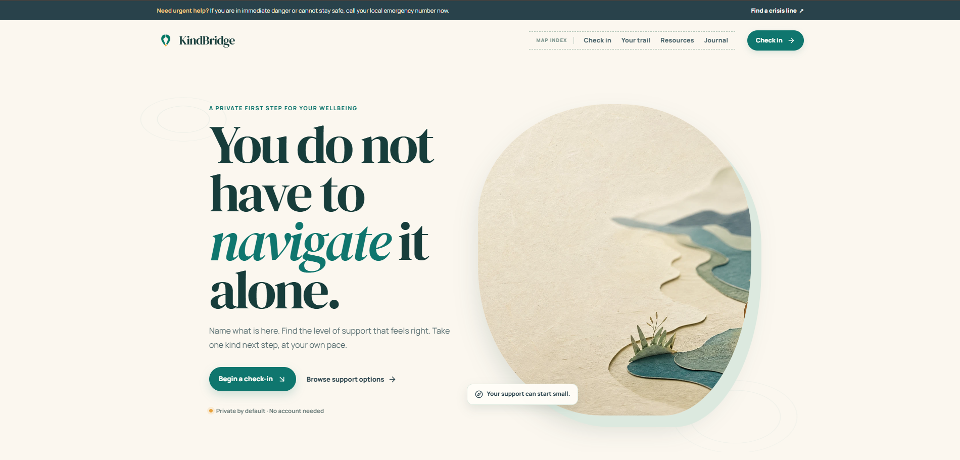
KindBridge is a private mental-wellness support navigator for the moment when someone knows that something feels off, but does not yet know what kind of support would help. Rather than asking people to diagnose themselves or complete a long assessment, KindBridge begins with a simple question: “Where are you, really?”
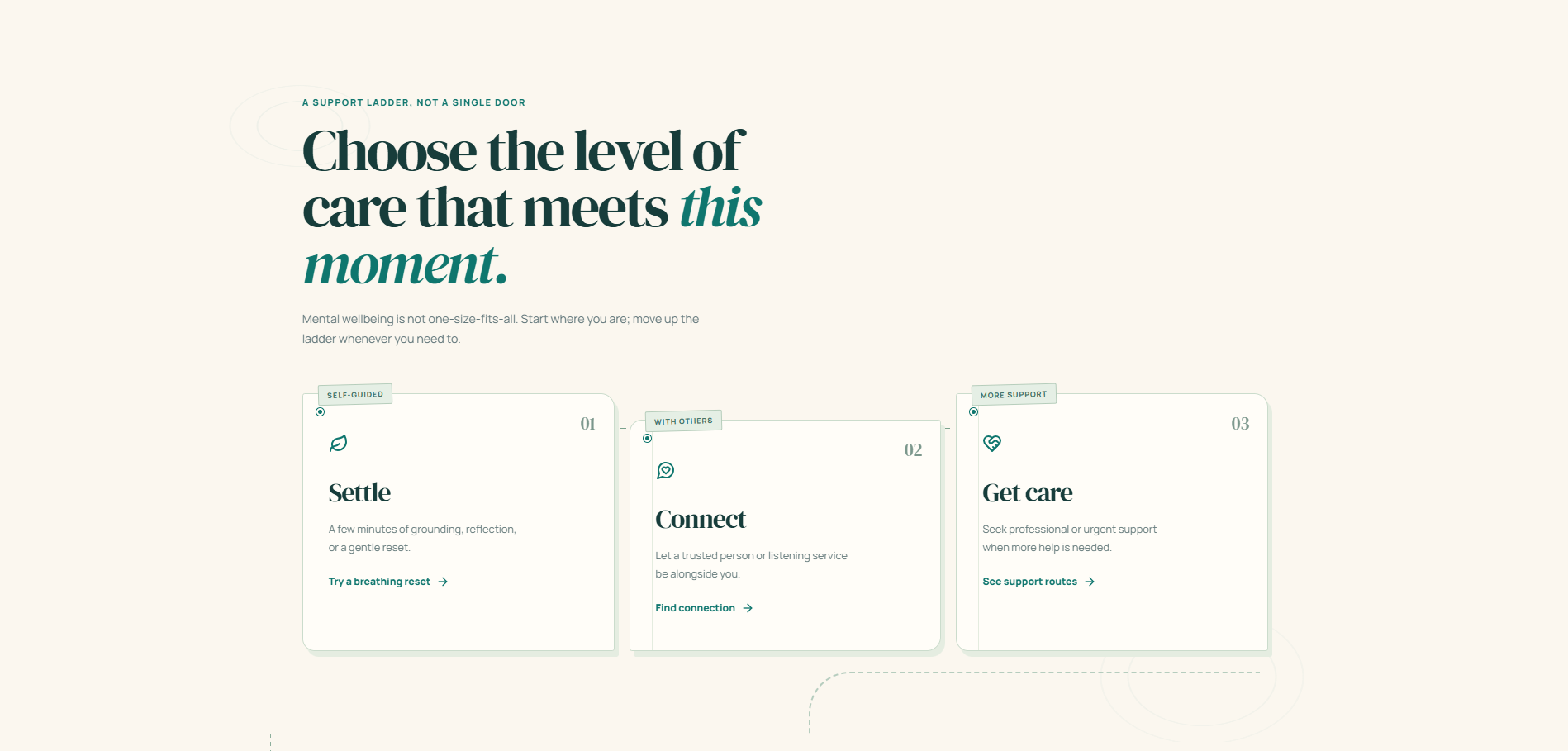
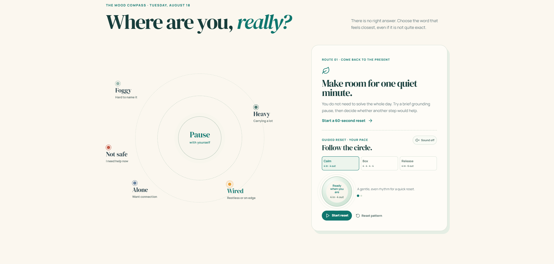
The project lets a person place a pin on a feeling such as Foggy, Heavy, Wired, Alone, or Not safe. From there, it suggests a next step on a three-level support ladder: settle with a guided reset, connect with another person, or find urgent help. The goal is not to make wellness into a score. It is to make the first step feel smaller, clearer, and more human.
A kinder next step, wherever you are.
What Inspired Me
I was inspired by the gap between recognising that you are struggling and knowing what to do next. Support can feel hard to access when a person is overwhelmed, cannot find the right words, or feels that their problem is not “serious enough” to deserve care. Yet mental-health systems remain under-resourced worldwide, with wide gaps in access to treatment and support.
I wanted to design for the in-between moment: before someone is ready to book an appointment, but after they have realised they should not carry everything alone. KindBridge treats emotional wellbeing as a landscape to navigate rather than a performance to optimise. A trail can have pauses, detours, and different levels of care; it does not need to be perfectly linear.
The resulting visual language is called Quiet Cartography. Paper textures, contour lines, route tabs, map pins, and connected paths turn the interface into a calm field guide. This was an intentional alternative to a clinical dashboard or a gamified streak tracker.
How I Built It
I built KindBridge as a responsive React and TypeScript web application, styled with Tailwind CSS and a custom editorial design system. Framer Motion powers the interface transitions and animated breathing cues, while Lucide icons provide clear, consistent visual signals. The product is designed to work well across desktop and mobile screens.
The Mood Compass is the core interaction. A user selects the feeling that is closest to their present experience, and KindBridge reveals the appropriate route. A pause route opens a customizable breathing reset with three selectable patterns: Calm 4 seconds in,4 seconds out4\text{ seconds in}, 4\text{ seconds out} 4 seconds in,4 seconds out , Box 4−4−4−44-4-4-4 4−4−4−4 , and Release 4 seconds in,6 seconds out4\text{ seconds in}, 6\text{ seconds out} 4 seconds in,6 seconds out . Optional soft chimes are generated directly in the browser with the Web Audio API, so the feature does not require uploaded audio files or third-party tracking.
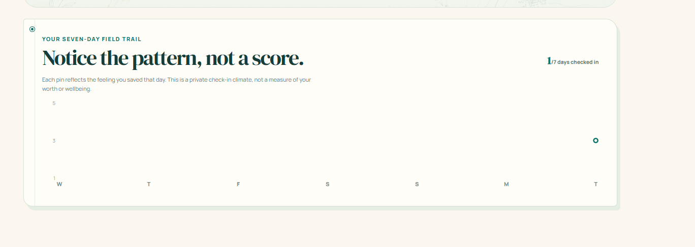
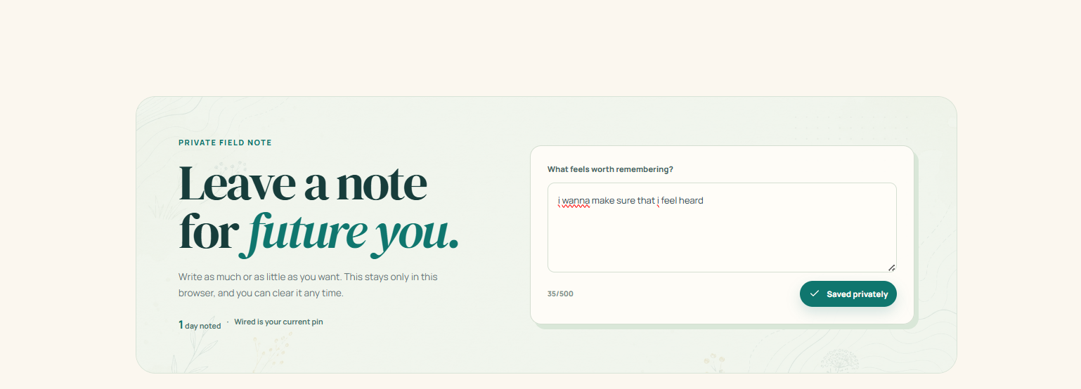
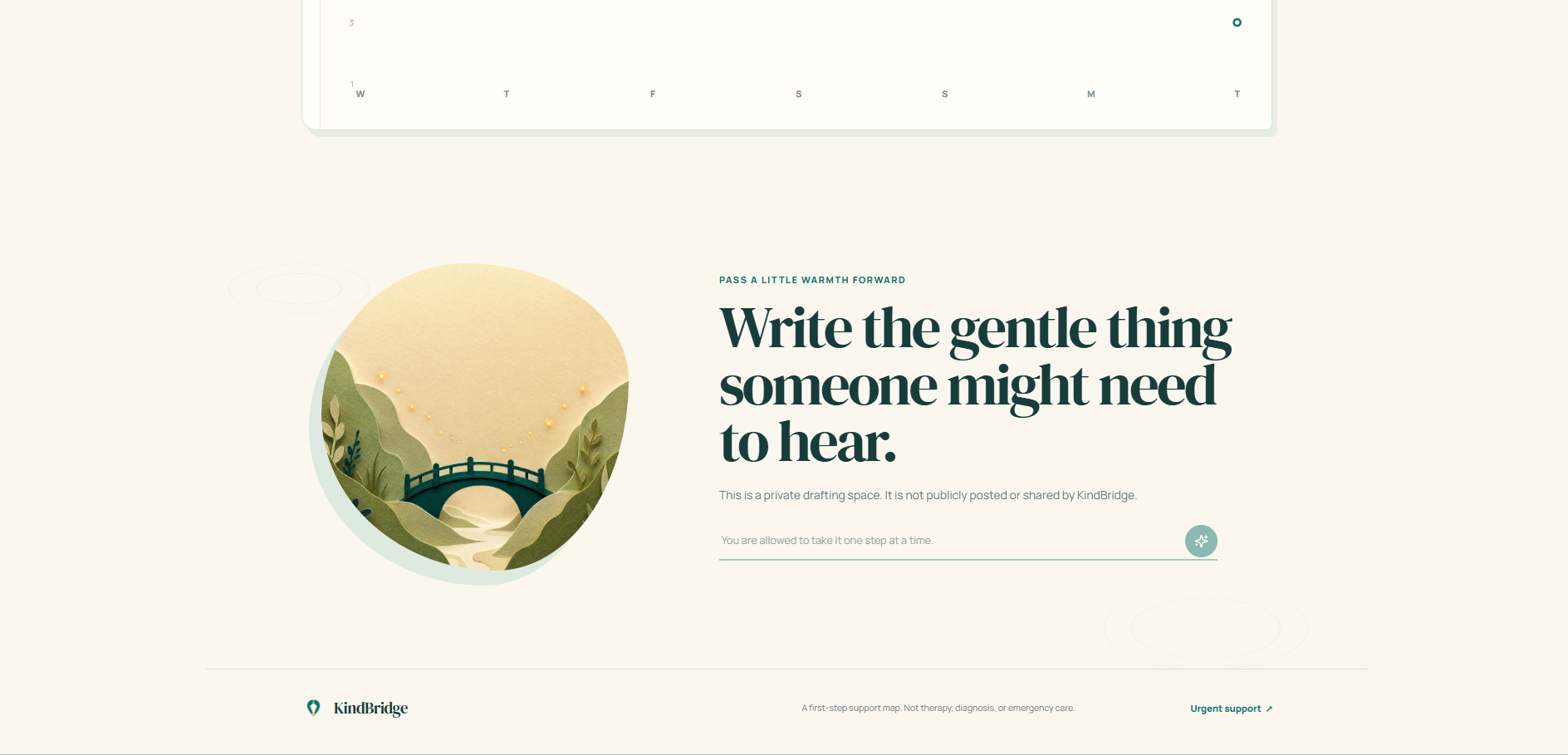
The journal includes a private field-note space and a seven-day mood trail. Entries are saved only in the user’s browser through localStorage; no account, database, or server-side personal profile is required for the prototype. The chart deliberately leaves days with no entry blank rather than creating fake progress data. Its design principle can be expressed simply as:
mood trail={daily self-reported check-ins}≠a clinical score\text{mood trail} = {\text{daily self-reported check-ins}} \neq \text{a clinical score} mood trail={daily self-reported check-ins}
=a clinical score
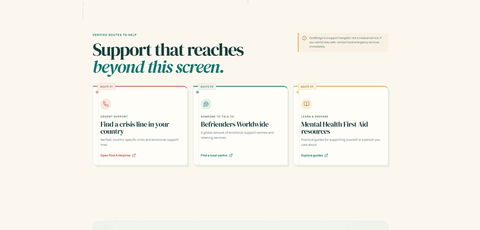
For people who need more than a self-guided pause, the app links outward to established support directories, including Find A Helpline and Befrienders Worldwide. These external routes are clearly labelled: KindBridge is not a crisis service, a diagnostic tool, or a replacement for professional care.
Challenges I Faced
The main challenge was building a mental-wellness experience that felt supportive without pretending to provide medical advice. I addressed this by making the product’s boundaries explicit. The Not safe route does not try to solve a crisis inside the app; it foregrounds immediate safety language and routes people toward local emergency services and verified support directories.
Another challenge was designing a mood chart responsibly. A traditional chart can imply that “higher” always means “better,” or that a person should constantly improve. I avoided that framing by using a neutral field-trail metaphor, one saved check-in per day, blank days for missing data, and language that encourages noticing patterns rather than judging them.
I also wanted the breathing feature to feel immersive without becoming distracting. The solution was to make sound optional, keep animation tied to the breathing phase, use short interaction timings, and honour the device’s reduced-motion preference. The result is calm by default, but still gives the user control.
What I Learned
This project taught me that impact-oriented design is often about reducing friction rather than adding complexity. A small, thoughtfully worded choice can be more useful than a feature-packed interface when someone is distressed or uncertain. I also learned that privacy can be a product feature: keeping reflections in the browser can make a first-step tool feel more approachable.
Most importantly, I learned to treat safety boundaries as part of the design, not as a disclaimer added at the end. KindBridge is useful precisely because it knows what it is not. It helps a person orient themselves, take a small next step, and reach real human support when that is what the moment requires.
References
[1] World Health Organization, “Mental health.” [2] Find A Helpline, “Free, confidential support from a helpline or hotline near you.” [3] Befrienders Worldwide, “Find support now.”
Built With
- audioapi
- css3
- lucide
- react
- tailwind
- typescript
- vite

Log in or sign up for Devpost to join the conversation.