-
-

Which genes have an abnormal behaviour? and where??
-

t-SNE dimensionality reduction.
-

A simple but important sketch.
-

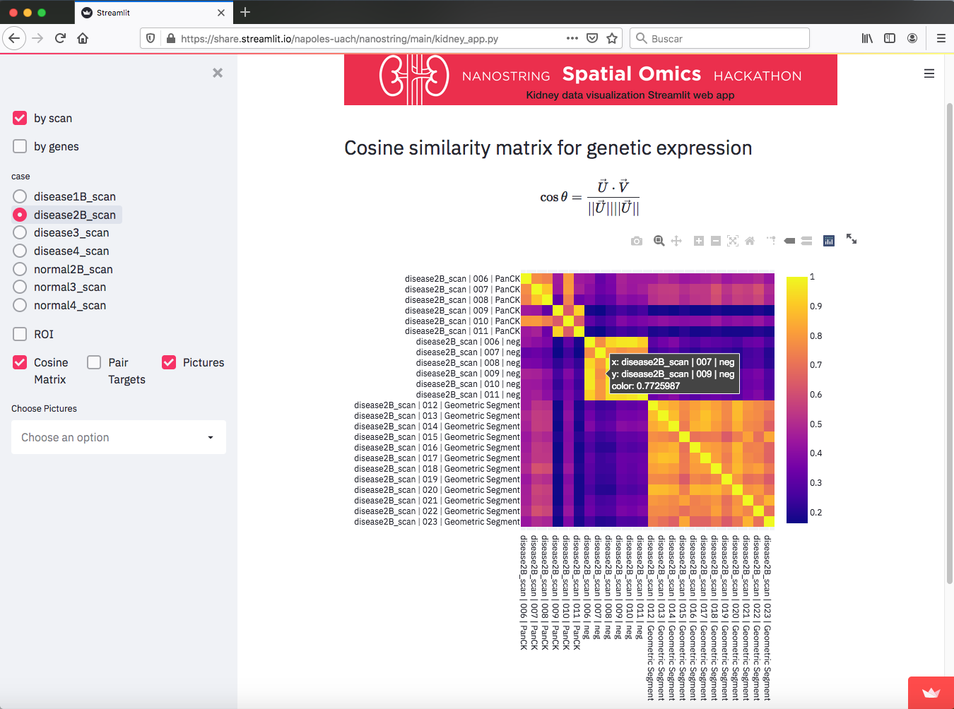
Cosine similarity Matrix. Each vector has about 16000 entries, so the cosine of the angle between pairs is a way to extract information.
-

The intro to the web app.
-

Pair plot for comparing genetic expressions for two ROI
-

How the ROIs are distributed in each slide, and how they look.


Inspiration
Having about 16000 genes for each sample makes understanding what is going with the kidney function like a paramount task. So my main idea from the beginning was to find a way to enclose all the information by means of simple operations. At the end, I feel that I did it in a satisfactory way.
What it does
First, if you want to test the project, go o the following link:
![]()
If there are no problems, you will see the app on your browser. Feel free to explore it. It has some tools to explore the dataset provided for this Hackaton
How we built it
This web app was build using Streamlit, and other python libraries like plotly, and pandas. However, many of the main utilities were built by me specially for this project. Here I would like to deepen on two utilities, the "Cosine similarity Matrix" and the "gene importance".
1) I came up with the "Cosine similarity Matrix" because I was thinking on how to compare the genetic expression of the different ROI in a slide. The idea is to consider all the gene expressions as the entries of a vector, thus pointing in some direction. So if two of them are similar, then they would have close values for components (gene expression). Then by doing the Cosine of the angle, this would be a number close to 1. if not, that might indicate that these vectors are not similar. This actually happens, as it can be seen in the matrices for the different slides. We can see how for normal slides, the elements of the matrices are close to one (yellow color), but for disease slides they look with many variations indicating that the genes are going crazy for those cases.


So yeah, it is interesting to see that the cosine matrix can give insight on what happens for these samples.
2) These is not so easy to explain in a few words, but for "gene importance" i mean which are the genes that are worth to explore because they are a lot, so it is desired a way to make the more important to emerge. So for this task, I was thinking that it could be possible to compare all normal samples and see how they express genes. Here I did the hypothesis that normal sample would express more or less the same for most genes, so looking for all the normal samples, if we calculate the variance this would have a not too large value. On the other side, if some of the samples has an abnormal value that would cause the variance to increase. This is what I think it would happen to the disease samples, and consequently its variance would increase significantly. Thus the ratio (var disease/var normal) would give a large number. Then we can take the logarithm and work with the exponents. Sorting the data from highest to lowest allows to easily check which are the genes that have a largest ratio, and thus this indicates that something weird is happening with that gene. Then at a final step, is not difficult to find where is that anomalie taken place by just again sorting the values of the expressions for that gene among all the ROIs.
Challenges we ran into
To barely understand a field that I knew almost nothing before.
Accomplishments that we're proud of
To resume all the information in a single tool.
What we learned
To learn many things about biology, genes, and kidney, which was great!!
What's next for Kidney data visualization Streamlit web app
I just like to know more about the diseases in the data and see if the gene anomalies that I have found are meaningful.


Log in or sign up for Devpost to join the conversation.