-
-
Can you tell I want out of the midwest?
-
-
-
-
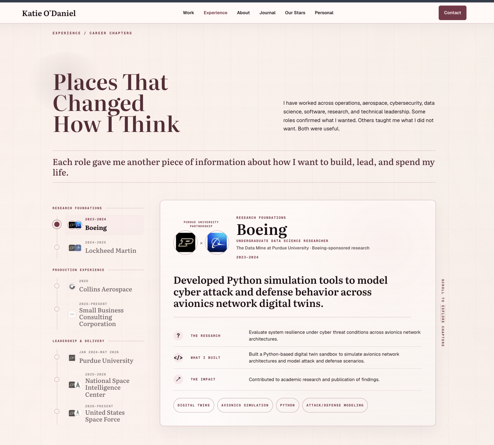
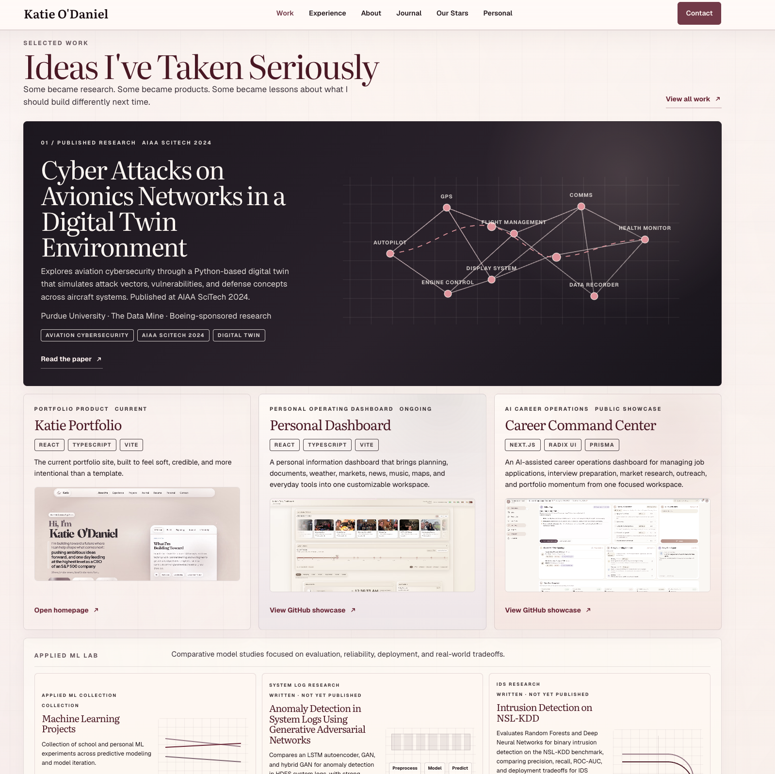
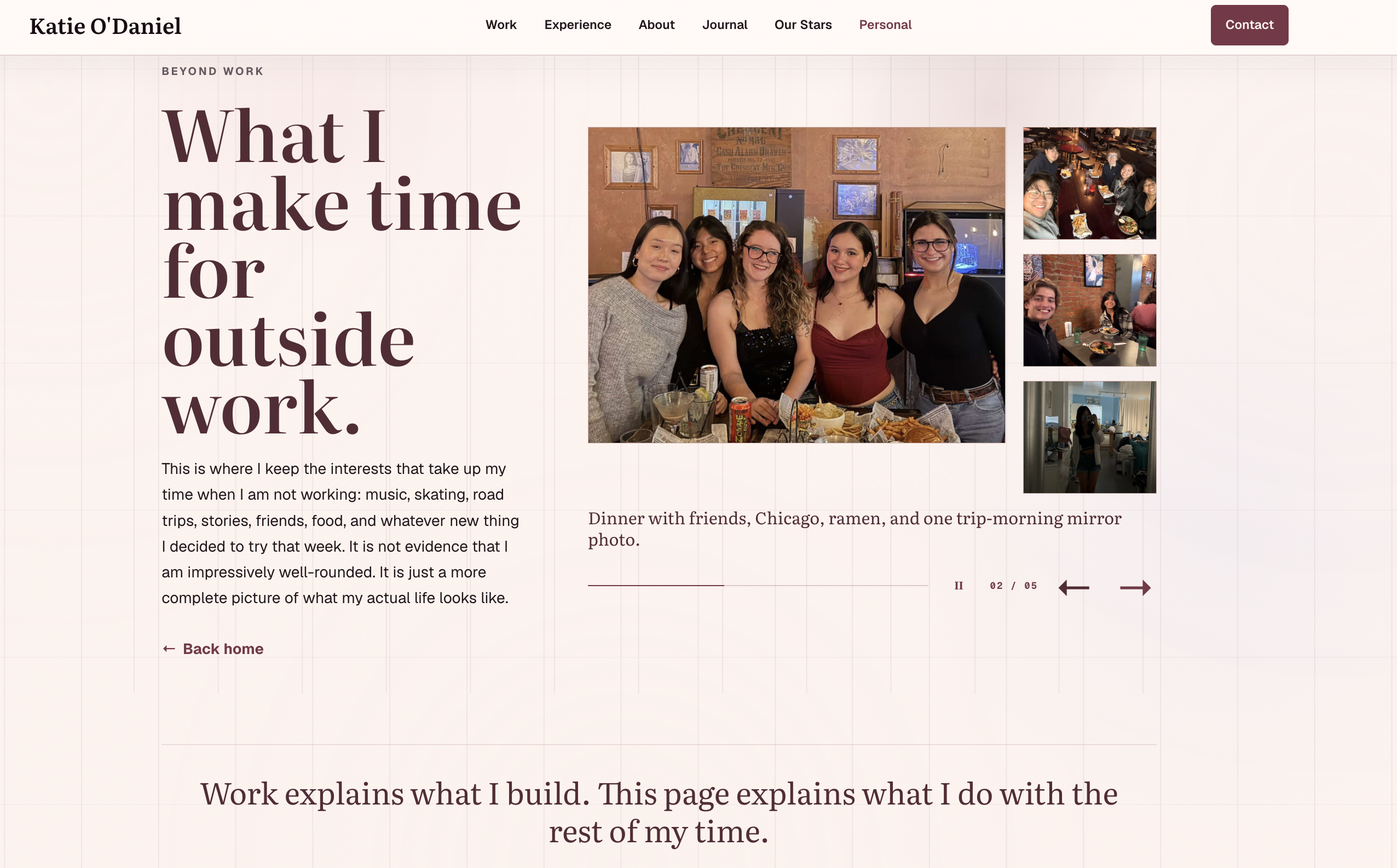
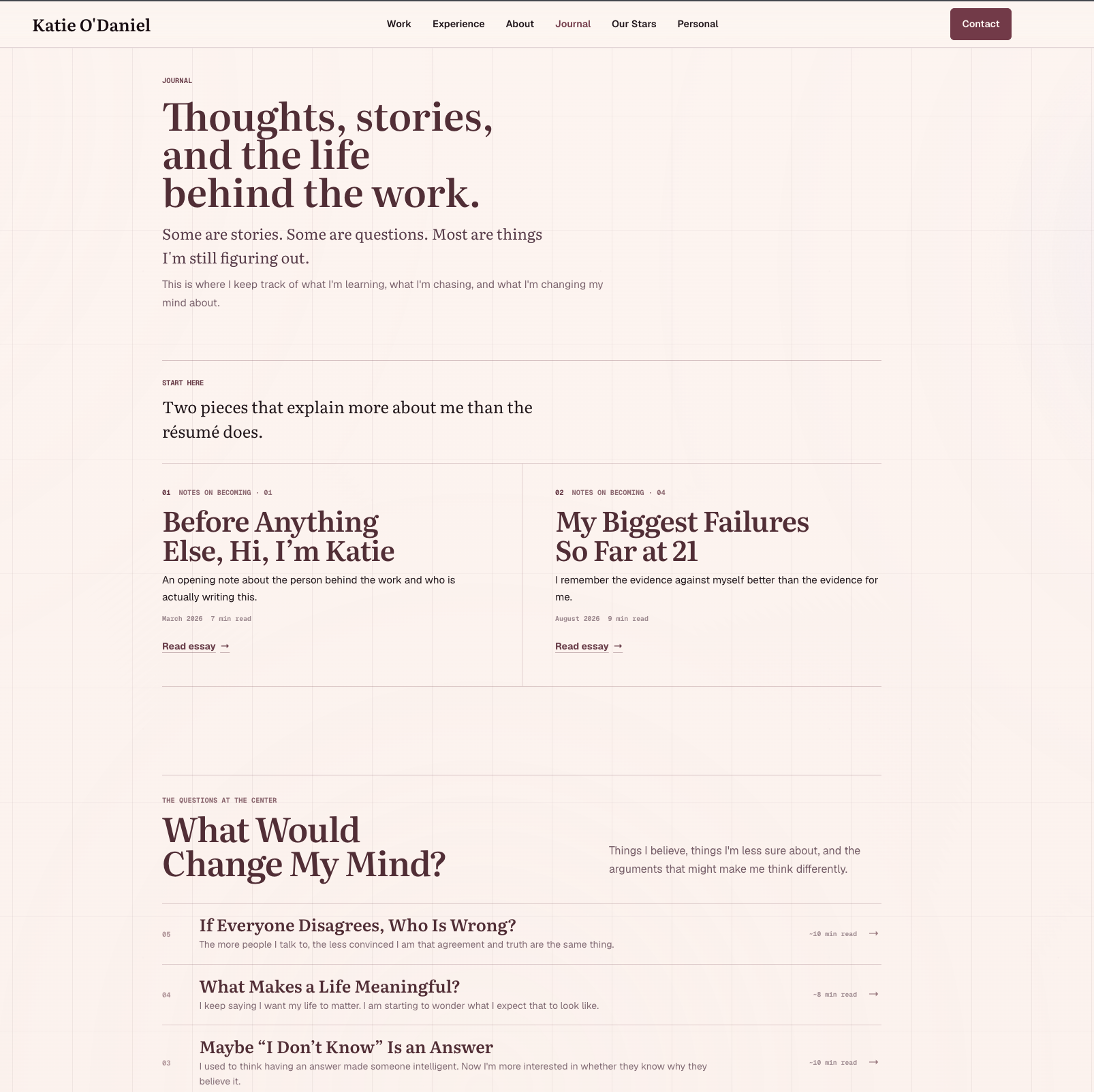
Inspiration
I built this website because I was stressed out.
I had a lot going on with school, career decisions, projects, applications, and trying to figure out what I actually wanted next. At some point, I thought that instead of continuing to overthink everything, I should just build something.
So I started making a personal website.
At first, the idea was simple. I wanted somewhere to put my projects, experience, and the things I had worked on. But the more I built it, the more I realized I did not want it to feel like a résumé copied onto a webpage.
A résumé can show where I worked, what I built, and which technologies I used, but it leaves out a lot of what actually shapes how I work. It does not show what I am curious about, what I have failed at, what I am questioning, the experiences that changed my direction, or who I am outside of school and work. :contentReference[oaicite:0]{index=0}
That became the real idea behind the website.
I wanted to create one place where someone could see both sides of me. There is the professional side, including software, AI, data, product thinking, projects, and experience. Then there is the personal side, including writing, music, friendships, travel, identity, questions, failures, and the things I am still figuring out.
The website slowly turned into something closer to an interactive editorial profile than a traditional portfolio.
I am still figuring out what I want my career and life to look like, and I decided I did not want the site to pretend otherwise. Instead of presenting a perfectly finished version of myself, I wanted it to feel like a record of someone who is still building, learning, changing her mind, and asking what comes next.
What it does
My portfolio is a multi-section personal website that combines professional work, long-form storytelling, interactive navigation, and personal archives into one cohesive experience.
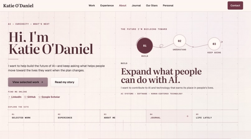
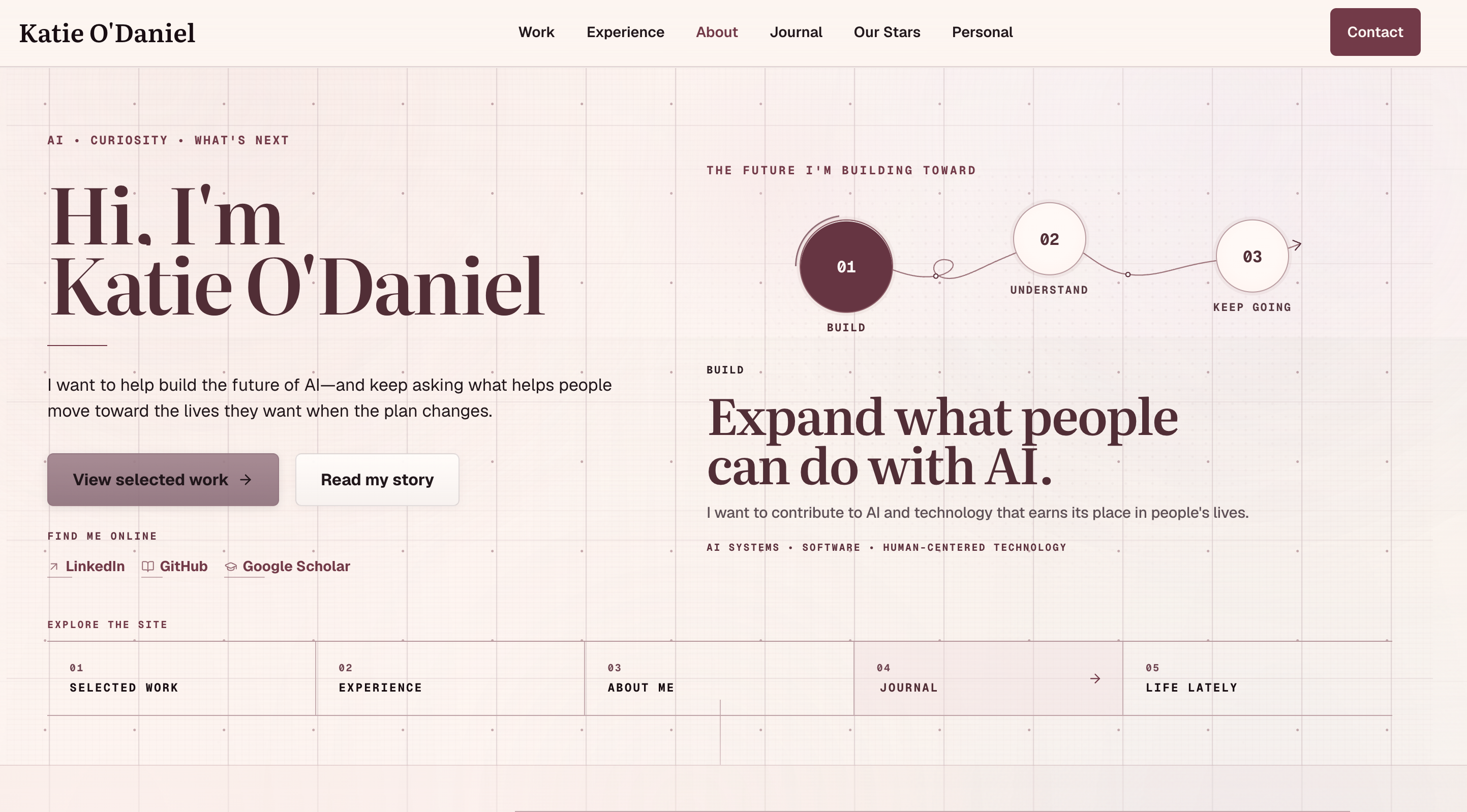
The main navigation includes Work, Experience, About, Journal, Our Stars, Personal, and Contact, with the homepage acting as an introduction to the larger story of the site. :contentReference[oaicite:0]{index=0}
Home
One of the central ideas is a three-part path:
Build → Understand → Keep Going
That framework represents how I currently think about my future: build useful things, understand the people those things affect, and continue learning rather than expecting one fixed career plan.
The homepage also provides shortcuts into selected work, my experience, my story, my journal, and my personal life so visitors can decide which side of the site they want to explore.
The repository specifically describes the homepage as containing an editorial Purpose / Ambition / Direction feature rather than a conventional developer-portfolio layout.
Work
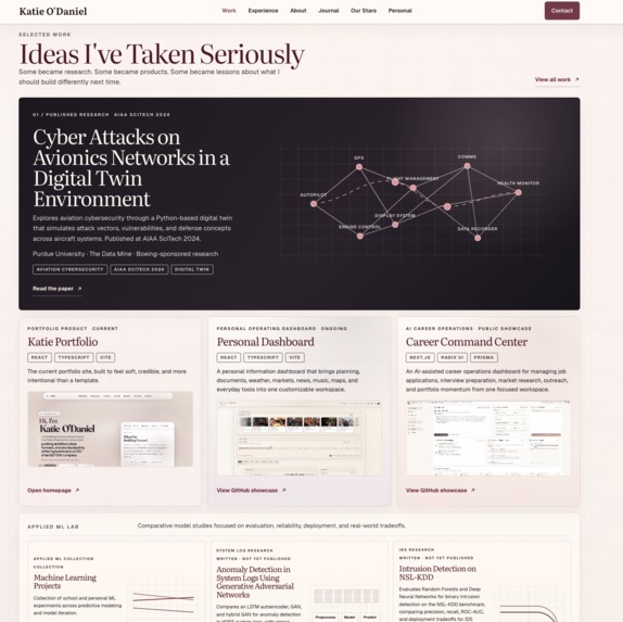
The Work section is the professional portfolio side of the site.
It is designed to show projects as things I actually thought through and built rather than simply displaying a grid of screenshots.
Projects can communicate:
- the problem I was trying to solve
- why I chose to build it
- the technologies involved
- product and design decisions
- technical implementation
- constraints and tradeoffs
- what I learned
- where I would take the idea next
I wanted the project experience to communicate my decision-making process, not just the finished interface.
The site has also gone through iterations that introduced dedicated How I Build and Personal Projects experiences as part of the portfolio design.
Experience
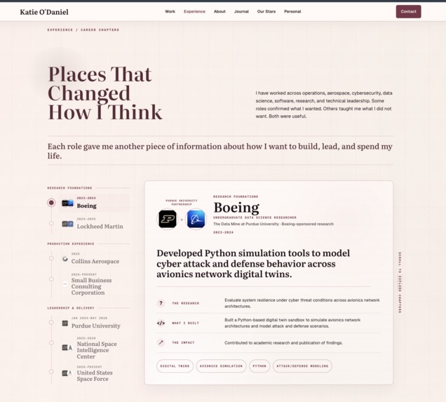
The Experience section gives the more traditional professional context behind the portfolio.
It provides a place for internships, technical work, leadership experiences, university projects, and other roles while still keeping the editorial visual language of the rest of the site.
Instead of allowing my experience section to become the entire identity of the website, I deliberately made it one chapter of a larger story.
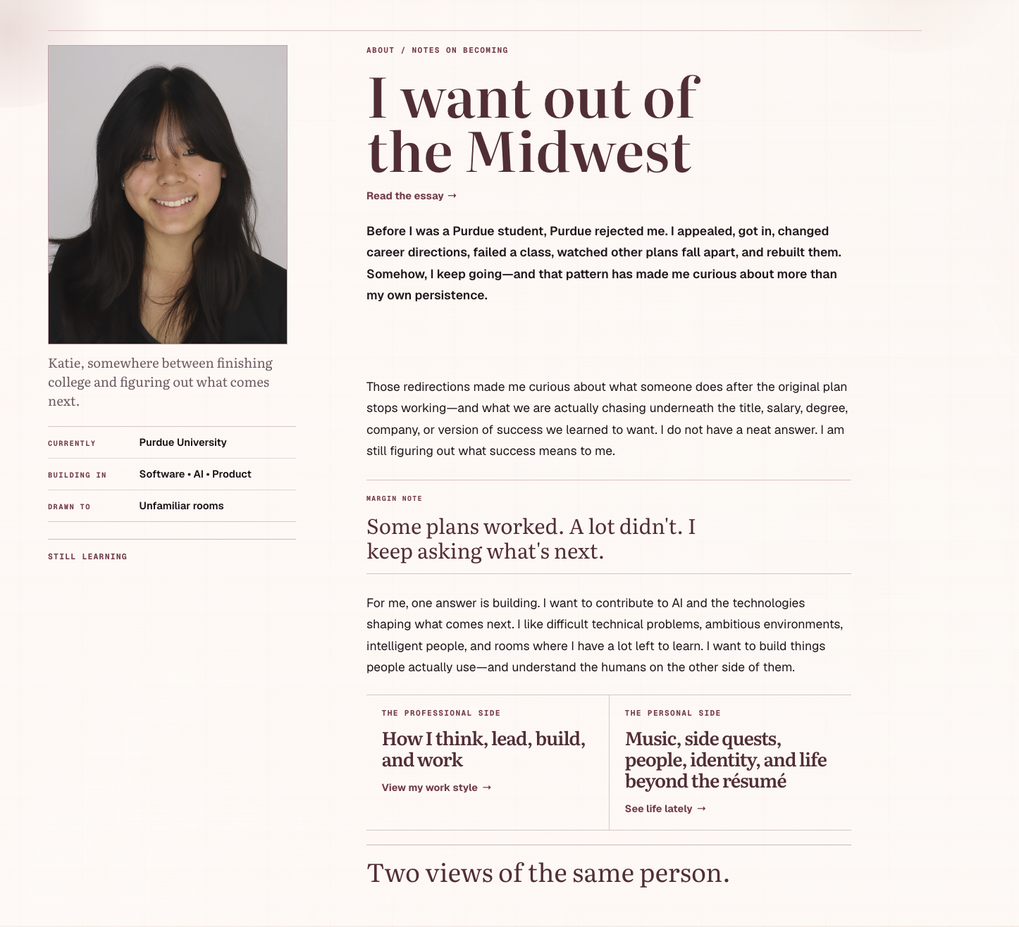
About
The About page explains the person behind the work.
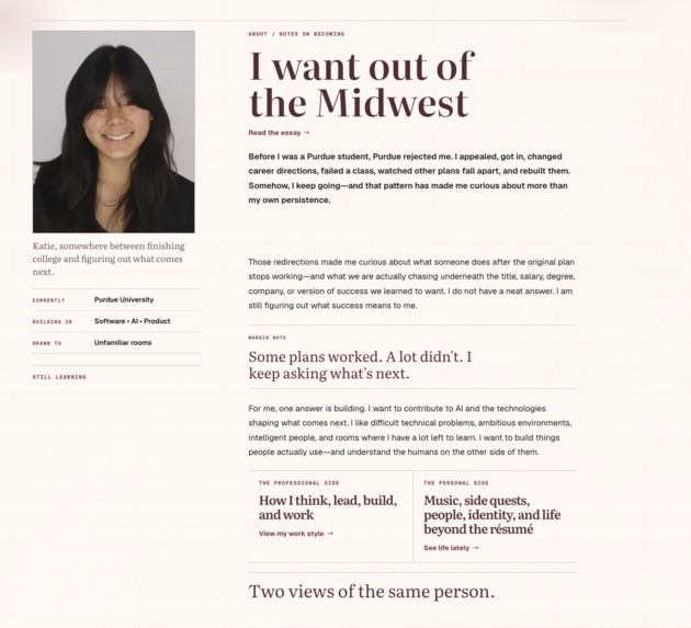
It combines a portrait, current information about where I am in life, what I am building in, what I am drawn toward, and longer-form writing about how my plans have changed.
One of the central themes of the page is that my path has not been linear.
I have changed directions, failed at things, reconsidered plans, and continued building anyway.
Rather than hiding that uncertainty, I wanted the portfolio to make it part of the story.
The About experience also creates a bridge between two sides of the website:
The professional side
- how I think
- how I lead
- how I build
- how I work
The personal side
- music
- side quests
- people
- identity
- writing
- life beyond the résumé
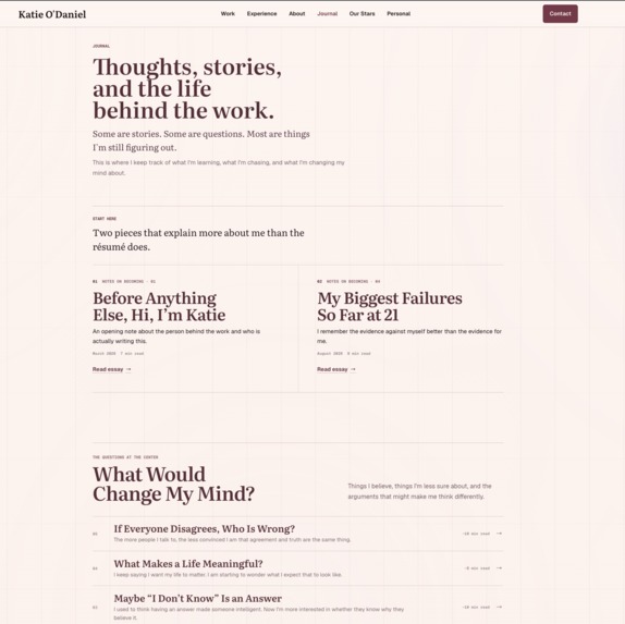
Journal
The Journal is one of the parts of the site that makes this project different from a traditional portfolio.
It is a collection of essays, questions, and personal writing about what I am learning and what I am changing my mind about.
Instead of only publishing technical articles, I use the journal to explore ideas like failure, ambition, uncertainty, meaning, success, and how people form beliefs.
The journal includes featured essays as well as an ongoing series built around questions.
Examples include:
- Before Anything Else, Hi, I'm Katie
- My Biggest Failures So Far at 21
- What Would Change My Mind?
- If Everyone Disagrees, Who Is Wrong?
- What Makes a Life Meaningful?
- Maybe "I Don't Know" Is an Answer
I wanted this section to show how I think when there is not necessarily a clean technical answer.
The project history also shows that the Journal and broader personal storytelling experience were intentionally expanded as part of a recent redesign. :contentReference[oaicite:3]{index=3}
Our Stars
Our Stars has its own dedicated place in the site's navigation and was included in the recent storytelling expansion of the portfolio.
It represents another part of the site that is intentionally outside the conventional portfolio structure.
Rather than making every page serve recruiting or career purposes, I wanted space for projects and stories that are personally meaningful to me as well.
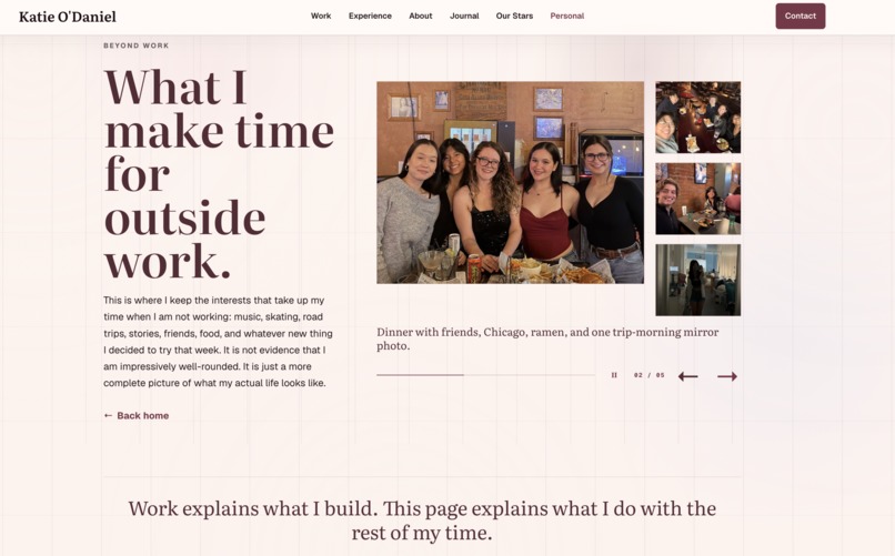
Personal
The Personal section answers a simple question:
Who is this person when she is not working?
The page is designed as a personal field guide.
It includes areas such as:
- Music
- Ice skating
- Travel and road trips
- TV, shows, and movies
- Side quests
- Friends and memories
The page combines writing, photography, galleries, and smaller interactive sections.
Instead of placing a small "Interests" line at the bottom of an About page, I gave these parts of my life enough space to actually tell their own stories.
For example, the Music section explains why music has remained one of the most consistent things in my life and creates room for playlists, piano, songs tied to memories, and different genres I return to.
The photo-driven portions of the Personal page are also meant to make the website feel lived-in rather than overly polished or corporate.
Contact
The site includes a dedicated Contact experience so visitors can reach me directly rather than needing to leave the website first.
The contact form is connected through Formspree and includes form validation. :contentReference[oaicite:5]{index=5}
The site also connects visitors to my professional profiles, including places such as GitHub and LinkedIn.
Design
One of the biggest parts of this project was the visual system.
I wanted the website to feel more like an editorial publication, journal, or personal archive than a standard developer portfolio.
The design uses:
- large serif typography
- smaller editorial labels
- a restrained warm color palette
- fine grid lines
- generous but intentional spacing
- borders instead of excessive cards
- photography
- asymmetrical layouts
- chapter-like page structures
- small navigation details and annotations
- recurring visual motifs across professional and personal sections
The grid is intentionally visible in many areas of the site. It creates structure without making every section look identical.
I also tried to avoid the visual style that many portfolio templates fall into: oversized gradients, floating glass cards, generic tech icons, and identical project tiles.
I wanted someone to recognize the website as mine even if my name disappeared from the top.
Technical implementation
The site is primarily written in TypeScript and CSS, with HTML and a small amount of JavaScript also used throughout the project. The repository currently reports approximately 49% TypeScript and 47% CSS.
The project uses:
- TypeScript
- CSS
- HTML
- JavaScript
- Vite
- Node.js / npm
- Cloudflare Workers
- Wrangler
- Formspree
- GitHub
The local development workflow runs through Vite, and I use linting, production builds, and local previews before deployment. :contentReference[oaicite:7]{index=7}
Production is served using Cloudflare Workers assets. Deployment is intentionally manual rather than automatically publishing every GitHub commit. :contentReference[oaicite:8]{index=8}
Before deployment, I:
- update the protected main branch
- run linting
- create a production build
- test the production preview
- upload the verified version through Wrangler
- verify the production site after release
The repository also uses a branch-based Git workflow so feature work can be separated, reviewed, merged, and then deployed from a verified main branch. :contentReference[oaicite:9]{index=9}
Performance
As the site grew, one challenge was that a personal website with many images, routes, essays, and interactive areas can become unnecessarily heavy.
I worked on reducing image and route-loading costs and removed unused and duplicate personal archive images instead of letting the project continue accumulating assets indefinitely. The repository history reflects dedicated performance and image-cleanup work. :contentReference[oaicite:10]{index=10}
That was important because I wanted the website to remain visually rich without making visitors wait for content they may never open.
Challenges
Making a portfolio feel personal without making it unprofessional
This was probably the central design challenge.
A professional portfolio naturally pushes toward accomplishments, projects, skills, and résumé language.
A personal website can move in the opposite direction and become disconnected from what someone might need to understand professionally.
I did not want either extreme.
The challenge became designing a system where a recruiter could quickly understand what I build while someone else could spend much longer reading essays, exploring photographs, or learning about the questions I care about.
Designing one system for very different kinds of content
A project case study, an essay about failure, a career timeline, and a gallery from a road trip are completely different content types.
I had to create enough shared visual language that they still felt like parts of one website without forcing every page into the same layout.
That led to the editorial system of typography, grids, small labels, borders, recurring spacing rules, and chapter-like sections.
Deciding what belongs on a professional website
Building the Personal and Journal sections forced me to decide how much of myself I actually wanted a portfolio to contain.
My answer became: enough to make the site human, but only things I intentionally choose to publish.
That distinction became important to the entire project.
Keeping a growing site maintainable
The website evolved through several redesigns and increasingly included projects, writing, personal photographs, journal content, and new routes.
That meant I also had to think about:
- asset organization
- route performance
- duplicate images
- development branches
- deployment consistency
- linting and builds
- responsive layouts
- visual consistency across old and new sections
The repository now uses a defined development and deployment workflow to make those changes safer. :contentReference[oaicite:11]{index=11}
What I learned
This project taught me that frontend development is not only about making individual components look good.
A website starts to feel intentional when the content model, navigation, typography, interaction patterns, technical architecture, and actual story all support the same idea.
I also learned a lot about editing.
There were many times when making the site better meant removing something rather than adding another section, animation, card, or visual effect.
I learned to ask:
- Does this help someone understand me?
- Does this belong here?
- Is this interaction useful or just decorative?
- Can this page tell its story more simply?
- Does this still feel like the same website?
- Is the personal content adding meaning rather than noise?
- Would I still want this here if I were not trying to impress anyone?
Technically, I gained more experience with TypeScript, responsive frontend development, asset optimization, Vite, Cloudflare deployment, form integration, Git workflows, and maintaining a larger website as it evolves.
But the larger thing I learned was how much product thinking goes into something as seemingly simple as a personal website.
The hardest question was never "How do I code this section?"
It was:
What should this website actually say about me?
What's next
I do not really consider the portfolio finished.
That is intentional.
As I build new projects, change directions, write new essays, learn new things, and change my mind about old things, the site can change with me.
Future work can include new project case studies, additional journal entries, expanded personal archives, more interactive storytelling, continued performance improvements, and new experiments in how technical work and personal narrative can exist together.
I want the website to remain a record of where I am now without pretending that where I am now is permanent.
Built With
- cloudflare
- css
- formspree
- html
- javascript
- node.js
- typescript
- vite
- workers
- wrangler

Log in or sign up for Devpost to join the conversation.