-
-

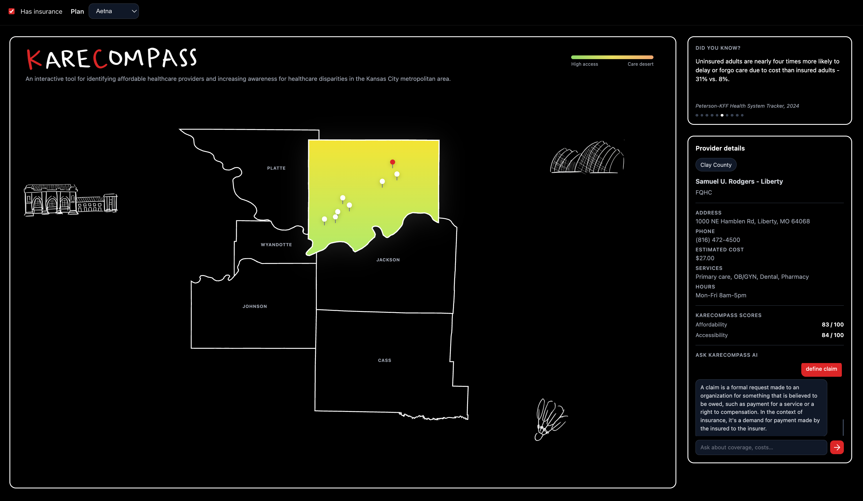
County selected on the map
Inspiration
We built KareCompass to tackle a real and widespread problem: navigating healthcare is confusing and often overwhelming. Many people don't have a clear way to compare providers in their area or understand what their insurance actually covers. We wanted to create a simple, interactive tool that makes healthcare decisions easier and more transparent for everyone.
What it does
KareCompass is an interactive healthcare navigation platform centered around the Kansas City metro area. Users begin by selecting a county on the map, which highlights the regions and displays nearby providers as cost-labeled pins.
Clicking on a provider opens a detailed side panel showing affordability, accessibility, and an overall score, allowing users to quickly compare options. Users can also input their insurance to optimize provider rankings within that county.
To further enhance accessibility, KareCompass includes an AI assistant that explains healthcare information, including insurance terms and common questions, helping the user better understand their choices in real time.
How we built it
We built KareCompass using a modern frontend stack including React, JavaScript, HTML, CSS, and Node.js, focusing on creating a responsive and interactive user experience.
To design the map, we used Figma to create a custom layout of the Kansas City metro area. We then exported the design as SVG files, allowing us to integrate interactive map elements directly into our application.
By embedding the SVG into our React components, we were able to programmatically control individual counties-adding hover effects, click interactions, and dynamic highlighting. When a user selects a county, the relevant provider data is displayed as interactive pins across the map.
Overall, we combined design tools like Figma with React, SVG-based interactivity, and Node.js to create a seamless mapping experience.
Challenges we ran into
One of our biggest challenges was integrating the Gemini API for our AI feature. We encountered issues with incorrect API keys and misconfigured requests, which required debugging our API calls and authentication setup. We also ran into local conflicts, such as an existing server already running on the same port, which prevented our app from launching until we identified and terminated the process.
Accomplishments that we're proud of
We're most proud of building a fully interactive experience where users can explore healthcare providers visually and receive meaningful insights instantly. The dynamic side panel and scoring system work together to make complex data easy to understand.
We're also proud of integrating an AI assistant that enhances the user experience by simplifying healthcare terminology and helping users feel more confident in their decisions.
What we learned
Through building KareCompass, we gained hands-on experience with modern technologies like React and learned how to design and manage interactive, component-based user interfaces. We also explored Figma for UI/UX design, translating visual conceptions into functional code using SVGs.
Additionally, this was our first time working with APIs, where we learned how to handle request, debug issues, and integrate external services into our application. Beyond technical skills we improved our ability to collaborate using Git and adapt quickly while building a full object.
What's next for KareCompass
Next, we want to refine the map's interactive features so that selecting counties and providers feels seamless. We also plan to improve the AI assistant to provide more personalized and context-aware responses.
Additionally, we want to expand our dataset to include more providers and real-world data, and further enhance the UI/UX to create and more polished and professional experience.


Log in or sign up for Devpost to join the conversation.